Home of the Scrapbook Campus › Forums › Challenges › November SKETCH Challenge
Tagged: Sketch Challenge
- This topic has 19 replies, 14 voices, and was last updated 3 years ago by
Anonymous.
-
AuthorPosts
-
November 12, 2021 at 9:37 pm #67248
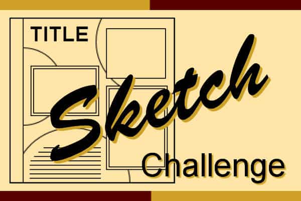
Learning scrapbooking is often done with practice, looking around for inspiration, and trying to recreate projects we admire. Sometimes, we can be inspired by finished projects, but sometimes, we also have to use our imagination to interpret something.
This challenge will give you an opportunity to envision something from a “boring” base, and you will have to imagine the end result differently. The sketch is only a written idea, and you can fly with it, modify it, and customize it to fit your vision, your photos, your supplies.
This sketch has lots of room to add stories about your photos, or you can focus on the stories instead of the photos.

And if you want more information on using sketches, check out this article.
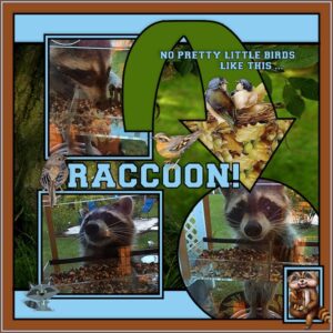
November 14, 2021 at 12:37 pm #67563I always enjoy these sketch challenges. Not too long ago, I bought one of those clear bird feeders with suction cups to hang on the window behind my computer. I WAS after some little Florida birds. The instructions said distinctly, to be patient … it sometimes takes birds a while to be brave enough to come to it. I waited. Then a few days ago, I heard something knocking on the window. The curtain was closed so I opened it to find … no, I did not have any birds, I had a very SMART raccoon that figured out if she jumped up on the storage bin, then hung way over to the grill … she could then leap to the hose reel mounted on the house … and get to the bird feeder. I have a awarded her a diploma for good thinking!!! I guess when you get hungry enough you figure out a plan! She was adorable standing on her tippy toes on the hose reel just scoffing as much as she could. Needless to say, the bird feeder came down the next morning. 🙁
November 14, 2021 at 9:46 pm #67594Minka! What a great story! Love your layout!
Here’s mine:
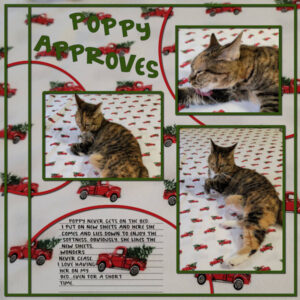
Poppy refuses to sleep with me but she loves to get on the bed when I am changing the sheets. These are new flannel sheets and she seems to like them…she even stayed for some time. I left to do other things and finished making my bed after she left.
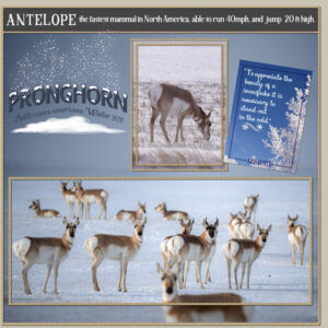
November 15, 2021 at 11:10 pm #67642November sketch challenge. I’m afraid I didn’t stick entirely to the sketch. I rotated the page, the two bottom frames I replaced with one large rectangle frame, to accommodate the photo. I used the main photo to create a paper, blur, darken, after I selected the antelope promoted to a new layer. Antelope on my doorstep. During the winter months I see herds of around 25-30. Other times of the year I see a few does with one or two bucks.
Bonnie and Minka, I love your layouts, although we used the sketch, our layouts couldn’t be more unique.
November 16, 2021 at 1:28 pm #67667The results above are great everyone.
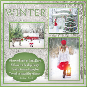
Here is my result. Winter with lots of snow will soon be upon us.
November 17, 2021 at 6:41 am #67707Lovely projects! 🙂
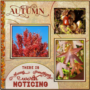
November 17, 2021 at 4:20 pm #67753And here is my take on this Sketch Challenge. Because it is still very much autumn over here, no winter at all, I did an autumn layout. This time I followed the sketch, I simply like it and used the autumn colors in my photos. All the frames and circles have an autumn gradient which is in the gradientsfolder. Autumnleaves tube; fonts are Arienne, Outline and Better Valentina which has a lot of glyphs (one of Creative Fabrica freebies). The background is made from a photo with a frosted glass overlay and a blend mode.
I started this layout already on saterday but was “interrupted” by a very nice upgrade offer, pricewise (€ 29,99 for the Ultimate) and had to install everything and customize my workspace again. After 2 days I found out that I had forgoten to put the repeat icon in the layers palette! But I’m up and running now,
<h4></h4>November 17, 2021 at 6:19 pm #67763I used circles instead of rectangles, and rectangles instead of the circles
I placed the border on the left, at the top
I made the background from a photo
the pictures of the mushrooms were taken as always during the daily walk with my dog.November 17, 2021 at 11:10 pm #67772Love the results on this challenge so many lovely different variations xx
November 17, 2021 at 11:46 pm #67773I must be getting thick in the head, where do I download the November sketch template from.
November 18, 2021 at 12:02 am #67774Shirley, a sketch is just a line drawing that you use as an inspiration. You don’t download it, and there are no layers. You are thinking of TEMPLATES.
November 18, 2021 at 6:50 am #67780November Sketch challenge. A new experience for me, I haven’t done shadows, and there is a reason for that. (something happened ) just a little whoopsie, but it was getting late and I thought it doesn’t look too bad so here it is. I thought I would do Christmas then i could use Carole’s candy sticks and stars.
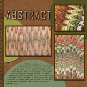
November 19, 2021 at 12:33 am #67805Here is my try at the Sketch Challenge. I’m blown away by the layouts made by everyone here and on FB. It’s inspiring to see where I can go when I get more experience under my belt (I’m a long way off). I’m keeping it very simple so I can at least complete a layout. It was great to get the email about Sketches, which I’d never heard of. I think this is just what will help me to produce more layouts rather than sitting at the computer thinking what do I do? These abstract images can be a little ouchy on the eyes (sorry), glad they are small.
November 19, 2021 at 3:49 am #67806Susan: very nice! It looks like a wall in an art gallery. Very well done and I can see the sketch layout in your design which was perfect for this project.
November 19, 2021 at 12:56 pm #67810Thank you Ann. I see such beautiful work and I need to remember I am at the beginning of this journey. Your words mean a lot to me. I have no idea what to do (design-wise) when I sit down to make a layout in PSP. No plan. This is disconcerting to me as I literally have 1000’s of idea of photo’s I want to make in my studio. I guess that’s because I’ve had photography as a hobby since I was 17 (almost 40 yrs). I guess I cant expect to see the designs in my head for scrap layouts until I’ve put in enough time. I’m greatful for the Sketch type layout. The designs are perfect for me to learn with.
November 19, 2021 at 1:21 pm #67811Susan: That’s why I take every class that’s offered. I get layout ideas from every one, even the Quick Page Busy Busy class has been great to learn how to modify an existing layout. I actually went and created a template from the last assignment so I could start from scratch (sort of like a sketch, I guess, but with layers). There’s a tutorial here on the campus for creating templates: I found it very helpful.
November 19, 2021 at 2:44 pm #67816Thank you Ann, I just downloaded it and will try it out this weekend. Early call to work today, it’s the busy time. I should have taken the Quick Page Busy Busy class. You are right, even with the Bootcamp, I keep learning more and more. I should follow your lead and make the time regardless. There’s my New Years Resolution!
November 20, 2021 at 2:54 pm #67866Here’s my Sketch Challenge. I like the way this design worked out. I made a template of the sketch and used cass-raster to mask script which helps with placing the photos. Here’s the kids at their wedding reception.. DANCIN’
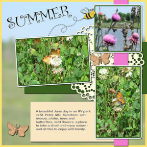
November 30, 2021 at 10:26 pm #68434Some changes but I think most of it is there. Made a template of the sketch, then changed what I did with it. The background and pictures were taken this summer on that long vacation that Joe, Laurie and I took. I blurred and reduced the opacity of the background which was a picture of the RV park. The title font is Curlz MT; narrative font is Arial Rounded MT Bold. Frame on the background is mine as are the cream and dark green papers and the pink ribbon. The doily is from Cass Fire & Ice; the butterflies are from PS – Jessica Dunn; the bee and its path are from PS – Janet Kemp.
December 1, 2021 at 4:07 am #68440Anonymous
- 335

- Enthusiast
Mary Solaas: Oh, I love this… so full of summer feelings
-
AuthorPosts
- The forum ‘Challenges’ is closed to new topics and replies.


