Home of the Scrapbook Campus › Forums › Showroom › Feedback Request › Need ideas for captions for a storyboard array of photos
- This topic has 15 replies, 3 voices, and was last updated 2 years, 6 months ago by
Suzy.
-
AuthorPosts
-
June 16, 2022 at 10:12 pm #78089
Hi, all,
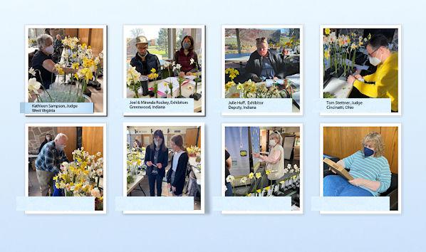
I want to do a storyboard array of photos of people wearing masks before a daffodil show.
It will look — more or less — like this:
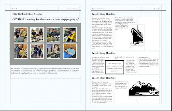
Below is a close up of what I have come up with, but it’s boring and too big and bordering on downright ugly…but I don’t want metallic titles or anything 3-D. Just some kind of flat paper/cardboard tabs with the names of the people in the photos. I’m not sure how members will be reading this newsletter — desktop, pads or phones, but shadows can look murky and not like shadows at all. They are also usually “banded” where you can see each row of pixels.
I have eight of these photos, PLUS another 30 or so of the flowers at the show, so I don’t want to get into anything I can’t easily replicate using a script or copy ‘n paste. Oh, and we don’t sew, so stitches would be so very out of place it would be laughable. I could add a staple or a thumbtack…something nice and flat and small like that.

I have used this style for another newsletter,but I want to get away from that exact style for this newsletter.
I will keep what I have if I have to, but I thought there might be some other ideas here and wanted to ask around. :))
Thanks,
Suzy
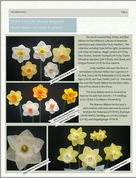
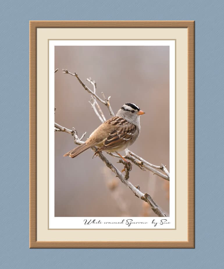
June 16, 2022 at 11:09 pm #78107For individual photos, you could use what I did for the Sparrow, without the wood frame, use another plain paper underneath, to use a paper clip or staple, using neutral colours, they won’t distract from the photos, but give a bit of a lift. Having a wider border on one side will allow for text.
The other two, you could create masks to slot in photos. Once you have created the template, it will be straight forward. Again, you won’t have a need for the frames I created for my pages. It would be easy enough to create a rectangle page for the multi photos. These may give you some ideas.
June 16, 2022 at 11:22 pm #78111Here are a few more pages I’ve done, that may give you ideas.
June 16, 2022 at 11:48 pm #78114Those are lovely – and exactly what I’m doing! So how’s that for service? Thank you, Sue!
Tell me about the background treatments on the Rose and the bees and butterflies — those look like gradients. How do you get them so subtle? I think it adds quite a bit to the design, but I do not think I have anything like that in my presets…mine are all sort of violent colors, maybe orange to purple back to orange again. Magenta and Neon Yellow.
This is what I was doing this afternoon…. It was using the Photo Effects. This is Dark Vignette Photo Effect. Maybe too subtle on the settings, though. I’ll know more when it goes up here. Sadly, it took me a very long time on PSP 2022. I am not handling the switch to 2022 very well. :((
Suzy
June 17, 2022 at 12:08 am #78115I create a lot of my own gradients, you will find a blog post on creating gradients. Quite often if I want to soften the colour a tad, I will flood fill a layer with white and place it below the gradient and lower the opacity on the gradient. Or use a much lighter colour of the gradient, and then lower the opacity on the gradient. I like to add a subtle texture. There are quite a few that come with PSP.
June 17, 2022 at 12:15 am #78116Ok. I was just going through my templates to try to find some that are lined out in a grid, but not much luck– I have thousands of templates, and they are all worthless because I can’t spend hours looking for the perfect one. I should just delete them all!
Soooo, next stop was the Creation Cassel Script Store (LOL) and I found not one, but TWO scripts for making templates…because I am not measuring every cotton pikkin’ square out pixel-by-pixel for every photo.
The problem with the daffodil photos is that they tend to be different sizes. Big collections are usually bigger than singles for example, and there is a lot of text with the names of the flowers.
I wish I had started with the winning daffodils and saved this stupid thing for last….it’s not even a good article, but there were so many people there wearing masks I thought it might be useful for posterity — But I might just buy the scripts to have.
I’m tired, but will address this in the morning…thanks, Sue!
June 17, 2022 at 12:19 am #78117I think I would be inclined to choose a colour from the photo, preferably a yellow using the pointer tool, and tone it right down. Also use a matching colour to create an outer flat thin border, like in the sparrow page. I don’t do anything that will distract the eye away from my photos. The outer flat border, will help focus the eye on the photo.
June 17, 2022 at 12:33 am #78118The template scripts will save you a lot of time. I use guides, and then the selection tool, using snap to guide. I have created several guide templates. Which saves on time.
June 17, 2022 at 12:35 am #78119If I’m not mistaken, Carole has a gradient maker script.
June 17, 2022 at 11:34 am #78129Suzy, Carole does have a gradient creator, here is the link.
June 18, 2022 at 4:19 pm #78157I wrote a whole big post back on this and it hasn’t shown up – it was such a time consuming post, I wonder if I forgot to hit send when I got to the end? LOL! Let me wait another 1/2 day and I’ll rewrite it. It was rather magnificent and I doubt I can duplicate it. LOL! 🙂
June 18, 2022 at 4:36 pm #78158Suzy, forgetting to send after you have writtten a blogpost has happened to me more then once and it still does sometimes. I go to submit and when clicking on the button I move my cursor if I’m in hurry or just not precize enough. I learned to live with it. LOL!
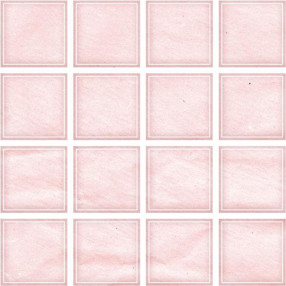
June 18, 2022 at 10:06 pm #78134Hi, Here are my templates using the Speedy Scrap script :)) Then I broke the rows apart to add more caption space.
Is this what you meant? Because I could make these storyboards al day long!
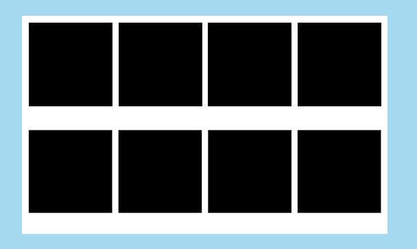
ere are 5 photos across — in case I ever need it, LOL!
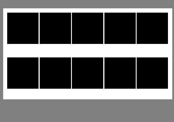
I could have made these all day long! You pick whether you want round or rounded corner or square. The how many rows, how many columns, and Voila!
And then I found this in my stash – these are harder to use, because there is just one layer, but I liked the border. Never used it before and I’m not sure it won’t be visually confusing, but I thought I’d throw it out there.
I saw the gradient script – it looks too hard. We don’t get many of those colorful horizons here.
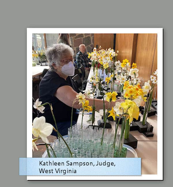
Oh, and I forgot — the blue tags on that photo is because I had a blue bg. and that blue is a color of many elements in the newsletter. (A style color)
This is what it looks like in the blue _but then I added a gradient just to see and forgot to delete it.
I was thinking the darkers colors made it pop, but its still a layered file and I can switch it back and forth. I don’t have the rest of the 2-page spread finished, so I’m not sure which will look better, though this blue is certainly more ‘gardeny’. But yes, I did have it as blue, with blue tags. (It goes out maybe July 1-3, so July 4th here)
Do you like the blue or the gray? Assuming I don’t use yellow – I didn’t realize that guy’s yellow sweatshirt would be so dominant!
June 18, 2022 at 10:33 pm #78169I prefer the pastel blue, may I suggest you try a soft primrose colour. Not a vibrant yellow like Daffs. I would also be inclined to either make the tags smaller, or create a white Polaroid frame around the photos, to add text. Like I did in the bees and butterflies page. I either calculate to place the guides, for the placements of the photos, or use objects, distribute, space evenly horiz or vertical. But for you using the script, you don’t need to do that. Perhaps the script doesn’t allow you to create a Polaroid frame. After all you are the creator, and as long as you are happy with the layouts, that is what matters.
June 18, 2022 at 10:38 pm #78170When submitting, I think you may have clicked on submit, but didn’t give it enough time to process.that is what I have learnt. I allow a few seconds to submit before I either leave the campus or go back to the forum.
June 19, 2022 at 1:15 am #78177There’s my post!!! I didn’t forget to hit send! (Okay maybe t wasn’t as magnificent as I thought it was, LOL!)
Bees and Butterflies page – dang it! I knew that template script was too easy! (There is no space between the photos, and I think you’re right — that space is necessary in this case. ) There are two more template scripts in the store, and I own both of them, but I cannot find them. Don’t ask – this is part of the moving into PSP 2022 that isn’t going well.
Ok, primrose yellow coming right up. Well, I have to reboot it appears, but I will post it in yellow. And change the tags to yellow? I’ll go back and read what you said. And making them smaller after I get all the names and locations typed in. They will all be the same length. I deleted 80 EIGHTY gradients this afternoon! I have no idea how they got on there in the first place, but they were the awful violent ones I was talking about. Now I can see that I actually have a few usable gradients, and a few really nice ones.
I have a guy helping me with the style so he newsletter is more easily read on a phone….. That’s why they are so big – the text is really big. But he’s said size of text doesn’t matter as long as the columns are narrow, er I think that’s what he’s saying. I am sending him a test publication to see which articles are easier to read. I’m going to excruciating detail now so the issues all look the same..this one and the next one and the next one…
Going to see other comments and then reboot, then do Primrose….I’ll probably be posting when you have your morning coffee, er I mean tea???
Thanks, Sue
-
AuthorPosts


- The forum ‘Feedback Request’ is closed to new topics and replies.


