Home of the Scrapbook Campus › Forums › Challenges › May Theme Challenge – Picnic
- This topic has 11 replies, 5 voices, and was last updated 6 years, 7 months ago by
redradar.
-
AuthorPosts
-
May 5, 2018 at 5:34 pm #18590

Since this month, we have a Picnic theme for the blog, what will you show us? With summer coming (sooner for some than others), do you have plans for a picnic? Or do you have a tradition of a family picnic or a church picnic every year? Or just a simple picnic indoor if the weather is not cooperating?What will you share with us?
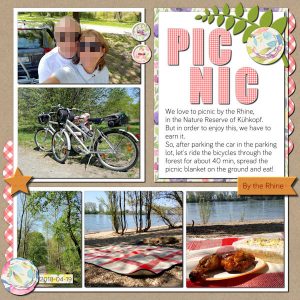
May 10, 2018 at 5:51 am #18679Here is my contribution to this challenge.
As a base, I used “Photo Mat Full” template from Scrapping with Liz. The background paper is a freebie from Eyeinspire – “koolkrafties1”. I also used “Subtle Botanica” patterns freebie from Creative Market.
From Cassel I used the “Picnic Alpha” freebie for the title and the Picnic Pattern for the scallop. The flowers were made with the “Layered Flowers Script“. I made the buttons (Cassel’s tutorial) and the Wood burning text effect (LAB 8-01).
Like I said it before, I would not have all these scrapbook pages if were not for Cassel’s challenges. 🙂
May 10, 2018 at 7:00 am #18680Lovely Picnic Page Cristina !… I think your layout has a storyboard style and looks great ! … hope you enjoyed your day out as it looks like a beautiful spot to have a picnic.
best wishes,
Dawn.
May 10, 2018 at 7:53 am #18681Dawn, thank you so much! You are always so kind. 🙂 <3
This place is really special for us… It is nice and quiet and usually we don’t see many people. In spring and summer, there are more activities in the water: cargo ships and cruise boats… On weekend and holidays also kayaks and jet skis…
May 12, 2018 at 7:42 pm #18700I really like your page, Cristina, and how the picnic pattern in the scallop matches the picnic cloth in one of your photos. Very nice! It looks like a very inviting spot for al fresco dining too.
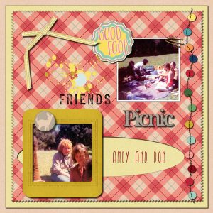
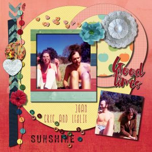
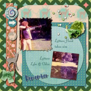
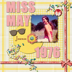
I dug around and found some old picnic pictures for this challenge, and also combined it with some Lab exercises.
Here’s one with a pinked edge and Iron Furnaces font (from Lab 8-04):
May 12, 2018 at 7:43 pm #18702May 12, 2018 at 7:45 pm #18704This one has the Star Paper Pattern and Rainbow Starburst from Lab 8-04 and the Little Lord Fauntleroy font (from Lab 8-05):
May 12, 2018 at 7:46 pm #18706And I finally got around to using the Picnic Alpha and Cass’s freebie Spring Confetti Tube, along with the Little Lord Fauntleroy font (from Lab 8-05).
This was a fun challenge; thank you!
May 12, 2018 at 9:53 pm #18711Hello Rae.. your picnic pages are lovely… a great job of combining the theme picnic with some of the Lab tutorials….. the way you have stitched those little circles on two of the pages make a great element …
Dawn.
May 13, 2018 at 1:09 am #18715What very nice pages everyone has done, lots of colour and different layouts.
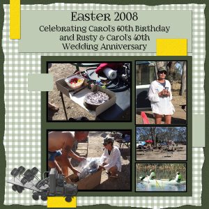
My page has used the Lab 6-12 Layout with a couple of changes (two medium photos instead of 1 one large). The photos are of a weekend we had camping to celebrate our friends’ joint 60th Birthday & 40th Wedding Anniversary. The truck element was a metal wine rack which was their present from the family which I adjusted the saturation so it was more visible. I changed the gingham square to green to suit the photos and the font is Foglighten 07.
It was a great weekend only marred by the me going for a walk and ending up badly breaking my ankle!! I always said “walk” was a four-letter word!
May 13, 2018 at 4:48 am #18720Rae, thank you so much for your comments! I really appreciate. 🙂 I love all of your layouts… They are very different from each other but all lovely! You are very creative choosing and arranging the embellishments… For me, this doesn’t come easily unless I am using a template 😉
Marlene, thank you. 🙂 I also like very much your layout and the color you chose for the gingham. Everything matches so well together. You all must have had a good time with the exception of you breaking your ankle… No fun there 🙁
May 13, 2018 at 3:44 pm #18733Dawn, thank you so much for your kind words but those little stitched circles element wasn’t made by me. It was created by Marisa Lerin of Pixelscrappers in an element set for their “Picnic Day” bundle. Guess you noticed that I liked it so much that I used it twice!
Marlene, I love what you’ve done with that photo layout. Your pictures are well composed too. Sorry to hear about your mishap, though.
-
AuthorPosts
- The forum ‘Challenges’ is closed to new topics and replies.


