Home of the Scrapbook Campus › Forums › Challenges › May 2022 – TUT/TECH Challenge
Tagged: TUT/TECH Challenge
- This topic has 34 replies, 4 voices, and was last updated 2 years, 7 months ago by
Sue Thomas.
-
AuthorPosts
-
May 11, 2022 at 5:59 pm #76583
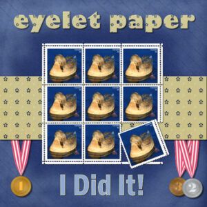
You know the saying…”it takes a village” (to raise a child). In this case the village is the Campus and I’m the young grasshopper (child). Here’s a tongue-in-cheek layout of what started my journey into learning more about Data Files in PSP. I was missing some of the creative content that comes with PSP and through the help of Carole and Campus members Sue T, and Rene M I was able to get my content…and even found a creative pack from another version on PSP and i have that now too. The stamps and eyelet paper are from the Open House tutorials. I have much to learn about data files. I used my brush tool and it was unhappy with me as I seem to have many duplicates (the brush still worked after the initial stink-eye it gave me). Out of curiosity I told it to save it to the clipboard and I copied it into word thinking I’d just go delete the few copies. It’s 276 pages in a word doc. ?. I think there could be a teachable moment here on how to understand these setting, how to organize and set them up. Where i had maybe 2-4 items in the file locations list for one of the resources, I now see many locations. I have lots to learn about this and I think it’s important stuff to know and understand.
-
This reply was modified 2 years, 7 months ago by
Susan Ewart. Reason: spelling, grammar, AKA the usual culprits
May 11, 2022 at 6:35 pm #76585You did it! Your perseverance paid off. Beautiful page. Don’t be in to much of a rush to try and learn everything about PSP. Even seasoned PSPer’s have only scratched its surface. May I make a suggestion, and it is not a criticism. Good idea to use the eyelet pattern to fill the text, but instead of using 100%, try reducing the size, so you get more of the pattern in each letter. It’s only a small detail, but will make a difference to the overall look. See what you think.
May 11, 2022 at 6:55 pm #76586I will do that Sue, thank you. I am just off to work. Look for it tomorrow. I agree, I could live till I was 300 and still be learning.
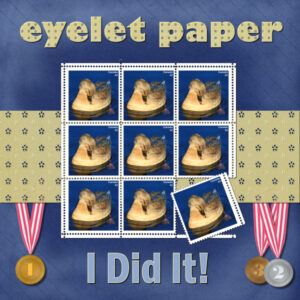
May 12, 2022 at 1:33 pm #76592Here’s the revision with the Eyelet Paper filled at 40%. I played around with a lot of size and settled on this one. the original I see I put at 75% (of the eyelet paper used in the patterns-materials palette). What a difference the small pattern makes. The 75% one looks more like it has measels. the 40% looks more like a mini version of the paper. Thank you Sue, keep prompting me to push my design to better heights, this is how I will learn to “see” better. It’s really helpful, especially when I put them together, the smaller pattern is more balanced.
May 12, 2022 at 6:17 pm #76609I’m pleased you like the adjustment you made. As do I. As you said it’s all to maintaining a balance.
-
This reply was modified 2 years, 7 months ago by
-
AuthorPosts
- The forum ‘Challenges’ is closed to new topics and replies.


