Home of the Scrapbook Campus › Forums › Showroom › Masks Workshop 2022
Tagged: Day 2 Mask Workshop
- This topic has 562 replies, 61 voices, and was last updated 2 years, 1 month ago by
Lesley Maple.
-
AuthorPosts
-
February 24, 2022 at 7:41 pm #72465
I’m enjoying seeing what everyone is doing. I am watching the daily videos but unable to actually do anything because of my computer issues. I do plan on doing them when I get the computer issues straightened out whether this one is upgraded or a new one ordered and put into service (which could be late March when I looked the other day, darn chip shortage). Until then I will just admire everyone else’s work!
February 24, 2022 at 7:42 pm #72466I think I like the idea of creating my own masks. It makes it easier to fit the subject you want to display. In some ways it is seems even easier to create than using a ready to use mask.
February 24, 2022 at 7:43 pm #72467Day 3 – I am certainly looking for spring.
And I am certainly enjoying this workshop.
I was having difficulty putting the elements in a way that looked good. But I liked the final product. Using round corners on the rectangle that I placed the text upon looked much better than square corners for this one.
Even though I have used the Kaleidoscope many times, I really like the method of using it to form a seed pattern to use to create a paper for background.
Even though I have never considered Scrapbooking as something that I wanted to pursue, I am liking some of the creations.
Carole, thank you again.
And thank you to all who post and share their ideas which inspire me.
February 24, 2022 at 8:00 pm #72469My result for Day 4.
Love this vintage photo which I got from Pixabay. Font used – Lucida Handwriting.
I enjoy looking at all the results of others. So many ideas.
February 24, 2022 at 8:59 pm #72471Here is my Lesson 4
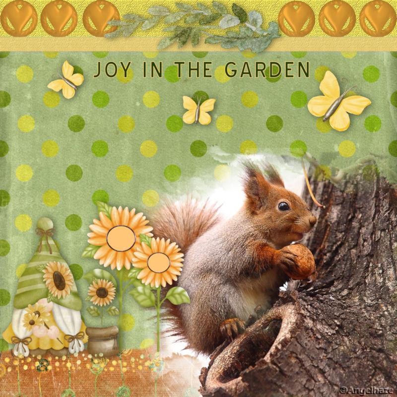
Joy in the garden
 February 24, 2022 at 9:18 pm #72473
This is my day 4. I am a southern gal. This winter has been my first opportunity (in a very long time) to experience a lot of snow.
February 24, 2022 at 10:38 pm #72497Magical!
February 24, 2022 at 11:04 pm #72500As you can see from this posting, I am having a problem. When I place the plaid at the bottom of the layout (as you are supposed to do if it is to be the background), the plaid is showing through the main picture. I have tried a lot of things to overcome this, but nothing works completely. I even tried putting a duplicate mask with no picture in it beneath the main mask group. That came the closest to fixing the problem. However, one is not supposed to have to do that! HELP!
February 24, 2022 at 11:19 pm #72502I had the same problem on the plaid mask. What I ended up doing was to redo the main mask. When I created the second mask, I notice the opacity on the layer was set at 88% I changed it to 100. Also I made sure that the mask area was black instead of gray.
My second attempt was not transparent.
February 24, 2022 at 11:25 pm #72504Day 4 – Frustratingly PSP2020 kept shutting down each time I started to brush, it has never happened before. I cleared cache and temp files reset dns and workspace everything I could think of – thought I would leave it overnight to let it settle but today it still shuts down. So 2021 it is.
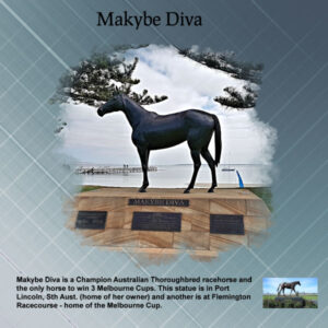
Makybe Diva ran some amazing races and won the Melbourne Cup 3 years and so far the only horse to do so, she is also the only mare to win the cup twice.
Corrie, in order to see where to stamp I lower the opacity of the black mask layer to see the photo edges and where to stamp. (have to remember to reset it back to 100%). Your idea to feather is a good one I will try that next time.
-
This reply was modified 2 years, 10 months ago by
Euka.
February 25, 2022 at 12:15 am #72507Thanks, Laurie. I’ll do it again and try that out.
However, this is the extra for project 2 and that problem didn’t happen. The font is Carmina Blk BT with inner bevel and shadow.
February 25, 2022 at 12:29 am #72509Laurie – thanks. I knew it had to be something with that template as it didn’t happen with any other I’ve used. So, here is the right project 2.
Woops! I just noticed I used the plaid from the extra instead of the plaid made for it! Time to shut down & go to bed!
-
This reply was modified 2 years, 10 months ago by
Mary Solaas.
February 25, 2022 at 12:54 am #72511Anita, (#72366) the “artsy” type of mask tends to be meant to show a photo with fuzzy edges. To take advantage of that feature, have you considered enlarging the top photo? Often, it will lose some details due to those edges but we expect that with that type of mask.
Sharla, (#72369) after doing those so many times, I tend to troubleshoot quite fast. There are some common situations that are now, easy to identify. That is why I always say that if one has a problem, post about it so someone can help. Glad you got it now.
Sue, (#72371) I guess feathering and blurring might end up with similar edges. (#72418) That is a very interesting font that you used on the title.
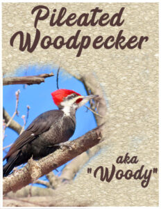
Ann, (#72375) no wonder it is a favorite. That is a great page. (#72413) Shh… don’t tell them yet! 😉 If I could offer a suggestion, I think the font is a little hard to read. If I had not read your text, I would have had difficulties differentiating the C and E. Even on the word “Woodpecker”, the difference is minimal. Now, since you are using a special name for it, that is unfamiliar to many, it is hard to know if it is “Pileated” or “Pilcated”.
Randy, (#72379) remember the mnemonic: “black will block, white is a window”. In your case, your “window is not clean” because it is grey. That area needs to be white on the mask to let the image show through. If you increase the contrast of that mask layer, it will turn grey into black or white (depending on how light/dark it is).
Liz, (#72388) you might want to consider either putting something or some brush stroke underneath the title, or tone down the background paper to make the title easier to read. It is a bit of an unusual font, which makes it a bit hard to read.
Mary, (#72390) glad to see you join in. And yes, the grey mask is meant to give a fainter look, but many people prefer to turn them to white to see more of the details. (#72396) Beautiful colors. (#72440) By changing just the title, you can definitely use that page for a great greeting card. (#72500) As Laurie mentioned, the opacity might be an issue. The other thing could be that the white is not really white.
Lynda, (#72392) nice combination of colors, pattern, and poem. (#72462) Good practice! Your result is great.
Henry, (#72394) can you consider enlarging the top photo so the mask would give it that fuzzy effect on the edges instead of just showing as grey stains?
Anne, (#72398) beautiful colors. I am curious what is the “fuzzy” black under the title? (#72420) Great shot!
Fiona, (#72402) that is very creative!!!
Christiane, (#72404) no need to be sorry. Post when you can. Looking forward to your projects when you have time to post them.
Hank, (#72406) is that picture one of your home? You seem to have used other interesting effects on it. Do you remember what you did to it?
Gerry, (#72408) nice use of the mask. And if you want more snow, maybe we can send you some!
Royanne, (#72408) I had to make you work a little before showing you how to make things easy 😉
Lavada, (#72401) it looks like your Brush Variance Palette is docked and oddly sized. Pull it out to keep it floating and then you can stretch it manually, just like you can stretch an image window. Give this a try. Also, see if you can get a fuzzy edge on the left side of your photo to be consistent. Another option would be to move everything to the left edge of the page.
Sherie, (#72422) glad that you finally found out how to create those soft edges. You can create so many interesting effects with masks!
Ellen, (#72424) although I never had my 2022 freeze on me, I do find it slower. I thought it was just my computer being a little insufficient, but with more people mentioning the same thing, maybe that is not my fault after all. I have a feeling that you are going to create more masks in the future!
Marie-Claire, (#72427) what is the name of your dog again? (#72429) I think I recognize those paw prints. Are they one of the freebies from the blog? (#72453) That background is surprisingly subtle and lets the edges of the mask show very well.
Lyn, (#72431) did you create the background with the kaleidoscope?
Susan, (#72442) I have to say that I kind of dislike spiders. I don’t mind looking at them on the outside, through a window or such, but after one experience where my brand new apartment was occupied by 35 BIG black spiders (a body of about an inch diameter), I had nightmares for days! Using the text from the fur of the raccoon is a great way to tie things together.
Connie, (#72447) although I assume you might have found some new brushes, did you know that you could use the basic round brush tip, reduce the opacity and play with the position jitter and still get some interesting edges.
Corrie, (#72451) no, that tip is not in my book. Personally, what I have done in the past is to lower the opacity of the mask layer a little, just enough to make out the main element of the photo. But again, there are always more than one way to do something in PSP!
Bonnie, (#72453) what was holding you from doing this project? I am glad you had a blast in the end. (#72460) That font is fantastic! Is this going to be ending up as a double-page?
Rene, (#72465) isn’t it incredible how a shortage of a little chip can have such a big impact on so many things in our lives? Know that you will still have access to the workshop as part of your membership.
Bill, (#72466) yes, when you create your own mask, you have all the flexibility to showcase what you want from your photo.
Randy, (#72467) although I would not mind “converting” you to a scrapbooker, you can definitely use most of the techniques shown for many other types of projects! The scrapbook projects are still a great way to practice. And your result shows that you are getting more skilled with your PSP.
Lois, (#72469) what background did you use for that page? It matches perfectly with your image.
Louyse, (#72471) that is such a cute display of a cute photo. Can you share what you used and where you got that? We always love to know where supplies come from (aren’t we all nosey? 🙂 )
Laurie, (#72473) that solid blue background really helps showcase that photo. And if you want more snow, and you want to share with Gerry, I send you some for free. You only have to pay for shipping 🙂
Euka, (#72504) interesting that you have issues with 2020 while Ellen has issues with 2022! I see you tend to use the same tip I use to know where to UNmask.
If you have not posted any project yet, it is still not too late. You don’t even have to post them all if you only want to show a few. I hope you take a little time to read ALL the comments in this long post. As others have mentioned before, I often answer questions or offer solutions and suggestions that could be useful to you, in other projects.
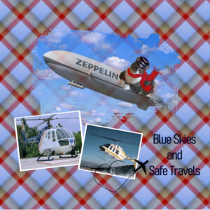
February 25, 2022 at 4:11 am #72514Mask Workshop Day 2; Continuing with the Theme of Transportation, I selected Air Travel for this project.. Graphics are from Art Explosion, and Creative Fabrica, Flying Ace Mr. Mooch has graciously volunteered to pilot the Zeppelin. The Font is a simple one called Bahnschrift Light. Thank you Carole for pointing out that by enlarging the photo the Mask will look better. I noticed that when I played with today’s project. I will re-do the other one using that very helpful tip.
February 25, 2022 at 5:14 am #72515Carole, Yes that was created with Kaleidoscope. I did a few tries till I got one I liked and I really love that one. I Love the effect that it is a bit like sun rays radiating out from the centre of the image. The white is the dresses, the peach colour is the arms. With a touch of green from the grass. I love how it turned out.
-
This reply was modified 2 years, 10 months ago by
Lyn Lou.
February 25, 2022 at 5:42 am #72519Enjoyed creating a mask in this tutorial – for me it felt easier creating one than adapting one. I used one of the water colour brushes suggested and a kit from digital scrapbook. The photo is one of mine taken on a local walk.
February 25, 2022 at 6:44 am #72521Anonymous
- 335

- Enthusiast
here is my result for Masks Workshop Lesson 4
February 25, 2022 at 7:34 am #72522(#72427) what is the name of your dog again? (#72429) I think I recognize those paw prints. Are they one of the freebies from the blog? (#72453) That background is surprisingly subtle and lets the edges of the mask show very well.
Carole, the name of my dog is ‘Poncho’
Indeed, the paw prints come from your blog
For that background, I selected a square from the white wall at the top of the windmill with some of the shadows added. With brightness and contrast I adjusted the entire background so that it wasn’t too dazzling or too darkI should add some more explanation, but it’s often late when I upload my work, and then I’ve messed around so much to get the desired result, that I can’t quite remember what I’ve done ?
-
This reply was modified 2 years, 10 months ago by
Marie-Claire.
February 25, 2022 at 8:53 am #72524Lynda #72117 Marie-Claire, Love what you did with this lesson. Are these your photos, they are lovely.
Lynda, I notice I haven’t seen your message.
Thank you, and to answer, yes so far I still use my own photos. But they will eventually run out. We haven’t been on vacation much.
The pictures I take now are only on our walks with the dog.
So always the same environment, and our dog is very much my model. Unfortunately, there is not much diversity.February 25, 2022 at 9:28 am #72526My lesson 3 project.
February 25, 2022 at 9:59 am #72528I revised the font for the heading, using Bring Heart this time. Hope it is more readable.
February 25, 2022 at 10:01 am #72530Here is my revised Mask Workshop Day 1 project. Thank you Carole for the tip to enlarge my photo so it will look better with the mask.
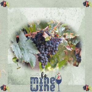
February 25, 2022 at 10:40 am #72533Hi, With the picture I chose, I did not have any brushes that kind of matched, so I opened a blank canvas, did the mask as per the video only in black, then I found a wine bottle and glass in Berna’s Playground, Saying Goodbye Freebie. I used the hue and saturation to make the elements black, then merged with the mask. I then did the instructions from Lesson 1 to turn it into an actual mask, then added my photo. The frame and grape element are from a free mini I downloaded from Digicats called Rosario’s Pizzeria. The wordart was from The free Ultimate Quotes Bundle 3, which I am sure I downloaded from Creative Fabrica. I guess I could have made brushes from the elements, which I did after with the wine glass, and it was easy to do. After making it I realized I probably should have used the hue and saturation to darken it, as I would have to darken it afterwords, unless I wanted it to be faded as it shows in the pic.
February 25, 2022 at 10:45 am #72534Sherie, (#72533) if you wanted, you could create a brush tip from the wine glass and then use it around your mask. It would be quite unique!
February 25, 2022 at 11:17 am #72535CAROLE
Re: Lois, (#72469) what background did you use for that page? It matches perfectly with your image.
The background was made using a colour from the image and adding a texture (not sure where I got it from) to it with a soft blend. I then added a page frame overlay that I obtained from Digital Scrapbook using a burn blend.
February 25, 2022 at 12:24 pm #72536Marie Claire,
I totally understand. We have been house bound since last March and it gets tiresome taking the same photos day after day and there are no kids running around now. We did get some beautiful ice crystals on the trees the other day. Looked like jewels. Fortunately, I have a lot of pictures from previous times.
Your dog is beautiful. Reminds me of my grandparents collies.
Keep up the good work.
Lynda
February 25, 2022 at 12:29 pm #72537Everyone is doing such a great job of sharing. We are going around the world, seeing beautiful children and pets, great homelands and travels. With Carole as our host, we are learning to make all those things standout with her great PSP lessons.
Keep up the good work.
Thanks to all,
Lynda
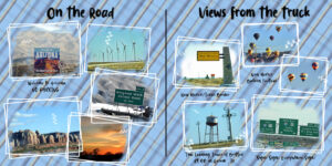
February 25, 2022 at 12:34 pm #72539OK, I’m ready with lesson 5. I made a two page scrap with several photos of our most recent RV travel. I used the colors in the balloons and sky to make the plaid and lesson 5 for the masking technique. I arranged the photos and merged visible to a new layer then made the mask on all the photos at the same time. All the photos, except the sunset were taken from the truck (tow vehicle). That was fun!
-
This reply was modified 2 years, 10 months ago by
Lynda DiGregor.
February 25, 2022 at 12:39 pm #72541Anita,
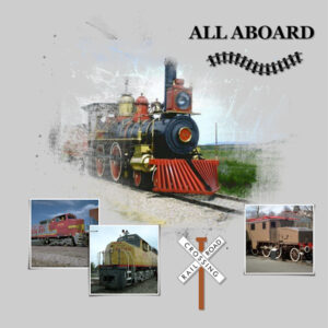
Love your train and your zeppelin … so cool!
Lynda
-
This reply was modified 2 years, 10 months ago by
Lynda DiGregor.
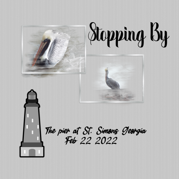
February 25, 2022 at 12:43 pm #72543here is day 5 the hints you gave me yesterday helped with the brush variance stretching it was the answer thank you..
-
This reply was modified 2 years, 10 months ago by
-
AuthorPosts
- The forum ‘Showroom’ is closed to new topics and replies.


