Home of the Scrapbook Campus › Forums › Showroom › Masks Workshop 2022
Tagged: Day 2 Mask Workshop
- This topic has 562 replies, 61 voices, and was last updated 2 years, 1 month ago by
Lesley Maple.
-
AuthorPosts
-
February 23, 2022 at 5:58 pm #72310
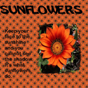
think im getting it a bit more now here is my sunflower page — unusual because its orangs!
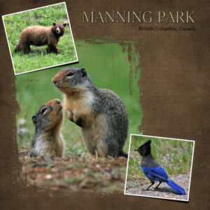
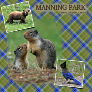
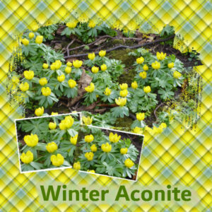
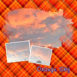
February 23, 2022 at 6:18 pm #72315February 23, 2022 at 6:19 pm #72316Guess who has the day off? Guess who “should” be adult-ing and doing housework but is playing with PSP instead? This is the extra mask from day 2. I actually did the the solid background one first, it’s the one I like the best. I like making plaids, it’s a surprise each time and it just fun making them. The first plaid I did (the light one with hard to read title) I forgot to try the brush technique under the title and the second plaid (which is way too over the top for me) I tried it but with not great results. Probably from my death grip on the mouse.
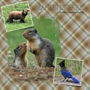
Manning Park was about 1 hour 40 min from where I lived in BC. On my birthday in June we’d go to see the ground squirrels (mother natures present to me) as they are only above ground for a short period. The steller’s jay and the ground squirrels were in the day use area which was busy with black bears (about 5 of them) that day. I was laying down to photograph the squirrels and I could hear my husband quietly calling me. I had being keeping an eye on the bears in front of me but didn’t realize one had come between me and my vehicle. It was a weird day, where people were getting out of their cars and walking around and there were bears walking around and no person or bear seemed concerned (except us). Surreal. I made a quiet retreat to the nearby outhouse. The brown bear in the photo in another area of the park.
February 23, 2022 at 6:45 pm #72317Hello Cassel here is my page with the kaleidoscope paper and the mask:
Nature Alive
 February 23, 2022 at 7:14 pm #72320
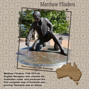
Day 3 – Matthew Flinders statue in Port Lincoln, Sth Aust. The map of Australia was from a set of continents by Cassel.
Lots of interesting plaids and kaleidoscopes being created, both techniques are fun to play and create with.
February 23, 2022 at 7:15 pm #72322Day 3 Mask and Extra
February 23, 2022 at 7:22 pm #72323Our Teacher is the Best,
Birds of a feather in this group! everyones work is so good. You all rock in case no one told you today. That Grandsons so Adorable I think he looks like his Grandmother. 🙂
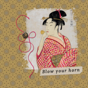
February 23, 2022 at 7:22 pm #72325This time around I decided to use woodblock print in the public domain instead of a photograph. I chose the kaleidoscope swatch from her obi. This could get to be very addictive.
-
This reply was modified 2 years, 10 months ago by
Connie Collier.
February 23, 2022 at 7:26 pm #72327Anonymous
- 335

- Enthusiast
My result for Masks Workshop Lesson 2
February 23, 2022 at 7:30 pm #72328Joyce,
I love that. I spent most of my school years in Burbank, Ca. Not one room by any means but California just the same. It was in the 60’s , so much fun. Not as crowded as it is now. Easy access to Hollywood Blvd., Sunset Blvd., the beaches and so much more. Loved every minute.
Lynda
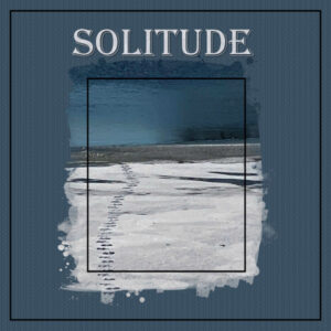
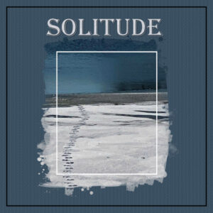
February 23, 2022 at 7:39 pm #72330We are wintering at an Indiana lake this year, and there are Canadian Geese that call this little lake their winter home. A few weeks ago I noticed a solitary set of goose tracks on the frozen, snowy lake. I didn’t find a Kalidescope pattern I really liked for this picture, so I tried using ‘Pattern’ instead.
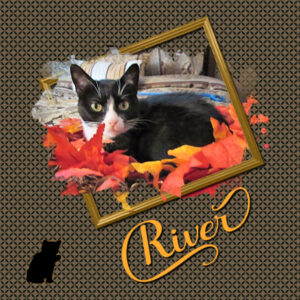
February 23, 2022 at 7:54 pm #72332River decided that she would repurpose the old wreath.
I used a different mask from the same collection that better suited the photo. There needs to be a warning on the kaleidoscope feature. Either that or a timer that limits the user to 20 minutes.
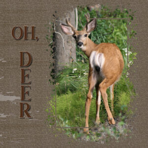
Carole – the nature photos are courtesy of a college friend who lives in Tennessee. My photographic specialty is “The Blur.” I have a large portfolio of amazing blurs. I’m thinking about pitching an exhibition idea to a local gallery.
-
This reply was modified 2 years, 10 months ago by
Gerry Landreth.
-
This reply was modified 2 years, 10 months ago by
Gerry Landreth.
February 23, 2022 at 8:03 pm #72334So true Gerry, I used to think social media platforms were a time “vampire” but now it might be Kaleidoscope paper that is.
Here is the extra from Day 3. I made a textured background. I don’t know how, I was madly clicking buttons and it just happened. I have a layer with the texture and somehow I put a texture on the solid layer below so it was full of holey transparent bits so I put yet another layer under that. As to how I even got the texture in the first place is a mystery to me. It was fun though. Font is Rachel Brown from Creative Fabrica. Photo is mine.
Laurie, beautiful layout. You did much better with “pattern” than I did.
PS…the other “vampire” in the house is the couch…we call it the “buttocks vampire”, once you sit it sucks the energy out of you and you stay put longer than you should.
-
This reply was modified 2 years, 10 months ago by
Susan Ewart. Reason: Cant spell to save my life
February 23, 2022 at 8:10 pm #72336Love this page with all the layers and colors!
February 23, 2022 at 8:23 pm #72338Once I saw my design in a smaller size, I thought it was too overall dark. I replaced my inside black frame with a white one.
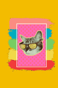
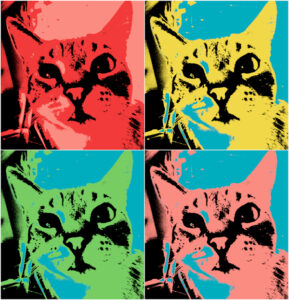
February 23, 2022 at 8:44 pm #72341This is something silly using an extra template from Day 1. My project for that day featured one of my cats, Rudy. My sister gave me a t-shirt with this graphic. She got the idea when I put Santa hats on him and River, my other cat.
It’s sort of an homage to Warhol. Rudy is not new to pop art. The other portrait was created using a Cassel script. Again, something silly.
-
This reply was modified 2 years, 10 months ago by
Gerry Landreth.
February 23, 2022 at 9:09 pm #72349Gerry, I love your Rudy Warhol. I’d wear THAT t-shirt!
February 23, 2022 at 9:27 pm #72351Day 1 – I know I am late getting started with this workshop, but it is a busy week for me. I took a brief break from my work tonight to play with the day 1 mask template.
White is a window, is that right? I have to remember that!
I guess I failed to pay attention to the dates when I signed up! I am not sure how many days I will be able to complete. But I have been following this page daily, and watching all the posts. I don’t remember who asked about a pdf of the instructions to print–if you go to print on your browser, you can change your printer to save as a pdf.
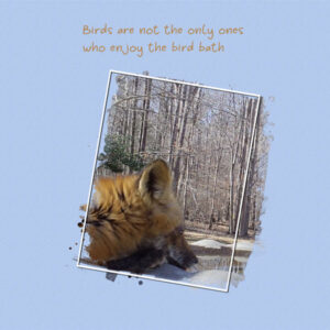
February 23, 2022 at 10:09 pm #72353Mask Workshop, Day 3. Another photo from my trail camera. I moved it to the birdbath. I love this photo. Fox getting a drink. I gave up on the kaliedoscope. I made many using 3 different photos. I just don’t like such a busy paper. I think it had a lot to do with the colors. The background paper overwhelmed the photo…colors too bold, I think.
February 24, 2022 at 12:21 am #72360I could not achieve the results I was looking for with the kaleidoscope function. Guess I am going to need more practice. The Masks I think I have got the hang of.
Really enjoying seeing everyone’s posts. Lot of great ideas and very talented people.
February 24, 2022 at 12:49 am #72361Sue, I LOVE snakes. The feel of them wrapping around my arm is so cool. I agree with you and Ann, they are amazingly soft feeling. I have experience with the anal gland “present”. icky. Corrie, I love that you made those little frames darker. May I ask how that was done? I did that extra layout too and wished I could’ve made those darker. Such beautiful and interesting layouts from everyone and the kaleidoscope papers I’m seeing are to die for! The extra tips are greatly appreciated. Thank you.
Fiona, I too go over and over the videos and I make lots of notes. In calligraphy we learned the 3 P’s; Practice, Patience and Perseverance, I have to remind myself to follow that.
February 24, 2022 at 1:28 am #72363Anonymous
- 335

- Enthusiast
my result for Mask Lesson 3
February 24, 2022 at 1:48 am #72364Susan, (#72234) you would be amazed to hear that a lot of creativity is from looking at things from a different angle, and obviously, we had a different angle for that card template 🙂 Let’s just roll with it! Your use might then lead to something else that will be different, etc. And by the way, I am a night owl (and I sleep in). (#72271) Didn’t I warn you about the addictive characteristics of the kaleidoscope? I thought I did. Is that an albinos peacock? (#72316) Plaids really are fun to play with. (#72334) That textured paper is a gem. Make sure you keep that in a safe place so you can reuse it in other projects. It is great!
Sharon, (#72240) maybe you can showcase that Border Terrier to show her you also care about him? (#72360) See how it will become easier with practice!
Euka, (#72244) yes, playing with the opacity of a layer can achieve a different layer when something seems overpowering. And to your comment about the number of participants, it probably is the most popular workshop so far (over 250 registered and 52 posters!) (#72320) I recognized that wooden Australia immediately.
Sharla, (#72248) is it possible that you were trying to brush on the wrong layer? You can’t brush on a vector layer, and you would not get much result if you try to brush inside of the brush mask. Maybe you would need to add a raster below your text first?
Fiona, (#72250) if you make a selection that does not quite pick the colors you want, you can move the selection using the right-click, so you can move it where it would cover the colors you want. Give that a try. (#72292) I agree that some techniques are not quick. That is also why there are scripts 😉
Sandra, (#72259) yes, we often focus on the image, because we know everything about it. It would be when we share those pages with others that we can realize that even though “a picture is worth a thousand words”, it does not always tell the whole story, and definitely does not translate our memory.
Lynda, (#72261) that is great to see an example of multiple “artsy” masks used on a single layout. And the result is beautiful. (#72322) Did you use the kaleidoscope tool to create the large background pattern?
Richard, (#72262) looking forward to your projects.
Sherie, (#72264) your blending of other papers yielded a good result. Did you try a smaller scale for the pattern? That can often work if the full size is overwhelming. (#72273) Those kaleidoscope patterns can be very subtle when you pick the right one!
Sue, (#72276) did you also blur the edges of the masks?
Laurie, (#72279) you might want to consider rearranging the layers so that your title is above the mask group so it would not be covered. (#72330) That is quite a photo you took. This is a great example of paying attention to details around us! There is so much that could be showcased.
Royanne, (#72283) I guess you are already comfortable with the basics of masking if you can tweak them like that. Beautiful photo and great quote too.
Ellen, (#72190) are you an RVer? I think we have a couple among our members! You might connect. Great use of the template. (#72299) Did you use the kaleidoscope for the background? It looks great.
Hank, (#72268) so you created your own mask already? You are ahead of me! 🙂 You might want to reduce the offset of the shadow so it will look like you put the letters on the paper instead of them floating above. (they might run away!)
Lavada, (#72293) he definitely looks ready! Maybe you can add a little shadow to the ticket, and maybe add another one. After all, it is more fun to watch the movie with someone, right?
Ann, (#72296) it won’t be long he will be chatting and chatting and chatting! it will come sooner than later.
Joyce, (#72297) you have such great old photos! Did you restore them or are they still in such great condition?
Anne, (#72306) plaids are easy to remember after you have done it a few times. Sometimes, it is a matter of understanding the process then the steps make sense.
Corrie, (#72307) that combination is lovely. The whole page is well thought out.
Liz, (#72307) see how practice helps? You still have a few pages to practice on!
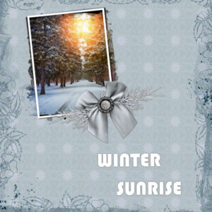
Lois, (#72315) what a stunning contrast between the sunset and the background. That really makes the sunset the star!
Louyse, (#72317) you are really having fun creating those pages with additional details. You seem already comfortable with the masks.
Connie, (#72325) it is so interesting how the background pattern looks so different when sized down and seen larger. It matches the photo very well.
Pirkko, (#72327) great page. I wish I was able to even keep those Christmas cactus alive. The last ones I had, I could not keep them alive (that is sad, isn’t?) (#72363) Those puppy eyes! they can get anything from you!
Gerry, (#72332) that is a great out-of-bound effect, even if it is not exactly the same. As for a “Blur” exhibit, I know one photographer who has been winning various prizes for his photography, and everything I have seen of him, is blurred. And REALLY Blurred. So you would be in good company! As for a time limit on the kaleidoscope, I will suggest that to the development team 😉 (#72341) I see you used the brush stroke the same way I would use them. If you just change the image with a different photo, you could create a greeting card. And then, you can make many of them with a similar background!
Linda, (#72351) there is plenty of time to start. Better late than never. Glad to see more wildlife. Great photos. And yes, the mnemonic is “Black will Block, White is a Window”
Bonnie, (#72353) it is amazing all the pictures you are getting from that trail cam! Out of curiosity, why did you install one? Is it for wildlife pictures or to catch unwanted trespassers?
Keep them coming. Note: if you have been missing some of the emails, let me know and I’ll address that. If you are posting in the forum and your post does not seem to appear, let me know. Sometimes, legit posts are caught in the spam folder. I can pull them out if you let me know.
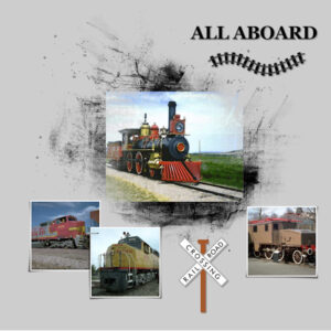
February 24, 2022 at 2:14 am #72366Masks Workshop Day 1. I will be using the theme Transportation throughout this workshop.Day 1 will be about trains. I used the Georgia Font that came with my Windows Fonts. Graphics are from Creative Fabrica and Art Explosion. I find masks not to be as easy as I thought. One really has to be sure where all those layers have to be placed. But in time, I know I will feel more comfortable with using masks. I like the effect one can get with them.
-
This reply was modified 2 years, 10 months ago by
Anita Wyatt.
February 24, 2022 at 6:10 am #72369Carole wrote “is it possible that you were trying to brush on the wrong layer? You can’t brush on a vector layer, and you would not get much result if you try to brush inside of the brush mask. Maybe you would need to add a raster below your text first?”
Thank you so much Carole. I was trying to use the brush on the wrong layer.
February 24, 2022 at 8:03 am #72370Carole, I have thought about a trail camera for a long time. Then a neighbor shared some pictures his camera had captured. Then he emailed a sale on a website for one of his cameras and finally I took the step and got one myself. My neighbor helped me set it up and the rest is history. Initally, I was not impressed with the photos but then the camera caught a couple of good ones. I have had a problem with trespassers some and that’s why I wanted a camera…but this is just too much fun. I may even buy another. The trespass problem is resolving itself…but I have a camera if I need it to catch a trespasser.
February 24, 2022 at 8:20 am #72371Carole, in reply to your question, no I don’t use the blur on my masks. Once I have created the mask, I will duplicate, close one, merge the other group, using the magic wand, select the mask, contract, feather. I don’t feather every mask I create, I find it peters out the edges well to blend well into the background paper.
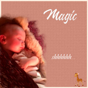
February 24, 2022 at 9:16 am #72375I reviewed the layout for this class that I had last year and need to show it off because it is, hands-down, my favorite! I will proceed to work on a new one but in the meantime, here’s Magic (yes, that’s her name) …
February 24, 2022 at 9:39 am #72379Mask 2 – I have found the masks challenging. I cannot always get the images to be clear. I am not exactly sure in some cases why they look washed out. I have been trying adjusting brightness and other things to improve. Maybe just something that will come with time.
I like the plaid. My plaid background is actually two Patterns in separate layers that I used the Blending mode to get what I wanted. My first pattern was pretty much two colours which made the main image hard to separate from the background.
The font I used is freehand591 BT
February 24, 2022 at 9:43 am #72381I can see why this is a favourite. It is a work of art! Thank you for sharing with us. To anyone who reads this and has not seen me comment, sorry about that, there are so many beautiful things to look at. Refreshing and challenging!
-
This reply was modified 2 years, 10 months ago by
-
AuthorPosts
- The forum ‘Showroom’ is closed to new topics and replies.


