Home of the Scrapbook Campus › Forums › Showroom › Masks Workshop 2022
Tagged: Day 2 Mask Workshop
- This topic has 562 replies, 61 voices, and was last updated 2 years, 1 month ago by
Lesley Maple.
-
AuthorPosts
-
February 22, 2022 at 1:55 pm #72175
Part of the issue with the pictures is the angle, one is concaveon purpose, it was a wall in the museum, the other was me:-) and I am not use to working with photos and or improving them, I really work with tubes, masks and templates:-) So there is a lot I need to know about this kind of PSP work…..:-)
 February 22, 2022 at 3:07 pm #72180
Project #1 complete! This is a great learning experience and good practice. I did have a problem with one of the small masks but I figured it out.
I love the projects that everyone has posted on this site. So much talent.
February 22, 2022 at 3:57 pm #72184Here is my Day #2
February 22, 2022 at 4:32 pm #72189Didn’t find this easy but i like the finished result
February 22, 2022 at 4:44 pm #72193result of day 2.
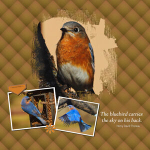
February 22, 2022 at 4:48 pm #72195Eastern Bluebird
Photos by: Susan Arther Jarrett, Murfreesboro, TN 02/2022
February 22, 2022 at 5:12 pm #72197If I told anyone how long this took me, and how many times I had to watch the steps and re-watch and then again, before I could even get any steps to work…you wouldn’t believe me! I must be thick as two boards b/c that was a real challenge for me. But it’s done, and I don’t think I will ever convert a .psd template to a mask again in my life. Whew.
February 22, 2022 at 5:42 pm #72200To all the newbies: weldone! I know how much time you have to spent to make this work, I was there last year when I did this workshop for the first time. Now it is so much easier and you will get there too.
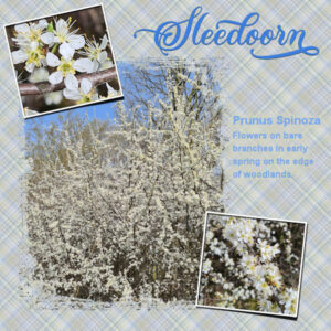
My day 2 with again the Extra template. I made a couple of plaids before I had one I liked, but I lowered the opacity of the plaid in order not to overpower my photos. The font is Almond script, a recent freebie by Creative Fabrica with lovely glyphs.
February 22, 2022 at 5:47 pm #72202Day 1 redone. I didn’t like the font I used on this first one and have altered it so I will be consistent throughout this workshop. I do that just because I like it that way!
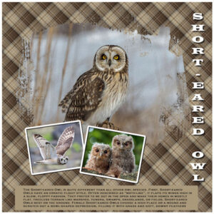
February 22, 2022 at 5:49 pm #72204Here’s my Day 2 – I had to use last year’s as my template and even then, it was odd. [Don’t ask! LOL] Here’s my Short-Eared Owls with their own plaid (I LOVE making plaids!) and a little journaling to tell their story.
February 22, 2022 at 5:58 pm #72205here is day i had forgotten about plaids as i do not use them much but will start now that i had a refresher in that.
<p style=”text-align: center;”>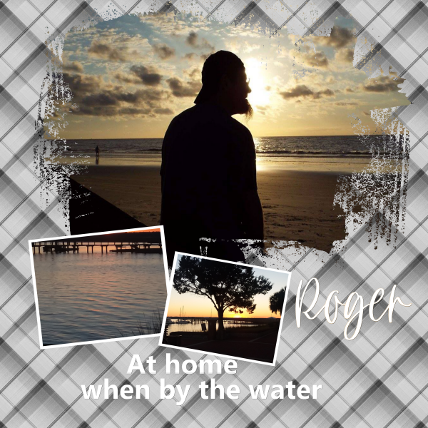 </p>February 22, 2022 at 6:35 pm #72211
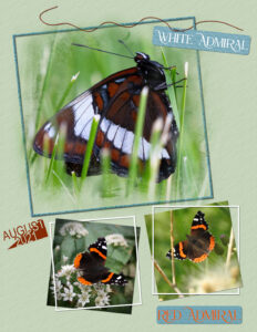
Here is my day 2. The White Admiral is a macro shot. She allowed me to get really close, as she spent the night in that position, and was warming up in the rising sun, before flying off. The other two are closeups, taken last summer. I used a Photoshop mask on the White Admiral Butterfly, and edited it to my liking. I used the split text technique for the date, and phrase strips for the two labels. I used the pen tool to create the fine weaved string. There is a tutorial for the staple and the other techniques in the creative scrap. I prefer relevantly plain backgrounds for my pages. I did create 3 plaids, none of which appealed to this layout. Carole, I did add a small drop shadow to the split text, but I didn’t like it, so removed it. As I’m sure your keen eye sight will pick up on it. 🙂 lol
Ann, are using the Audubon site you directed me to, for your Owl photos, they are great?
Fantastic pages being created by everyone!
February 22, 2022 at 6:51 pm #72213Day 2, such great talent here. Loved looking at everyone’s masterpieces.
February 22, 2022 at 6:54 pm #72214 February 22, 2022 at 6:56 pm #72216
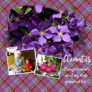
Day 2
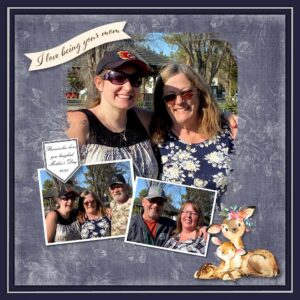
Quite colorful ?February 22, 2022 at 7:17 pm #72217Lovely, sentimental page Marie-Claire, but not your usual delicate soft style of creativity, which I love so much. If I may be as bold as to suggest you put the text into a label or tag, the background makes the text a little hard to read.
February 22, 2022 at 7:55 pm #72219My Day 1 mask.
February 22, 2022 at 8:02 pm #72221Day 2. My friend and her brother.
February 22, 2022 at 8:33 pm #72222Hank – lovely. Made me think of Treebeard!
Everyone is doing such a wonderful job. So many ideas using the same starting point!
February 22, 2022 at 9:09 pm #72224Ok, Lesson 2! Learning, learning, learning! I must be missing something though with the text areas. I can’t edit them, so I have to delete them completely and add my own layer. Is that right? Looking forward to tomorrow and beyond!
February 22, 2022 at 10:47 pm #72226February 22, 2022 at 11:06 pm #72228Anonymous
- 335

- Enthusiast
Here is my result for Mask Workshop
February 23, 2022 at 12:11 am #72230Susan, (#72129) it is interesting that you have used the brush strokes to convert as a mask, while I thought it would be used to simply add solid colors under the photo. But I guess that is the creativity at work and the versatility of templates.
Laurie, (#72133) beautiful photos and elegant font.
Euka, (#72136) isn’t it frustrating when you hit a wall and it is such a small detail that caused all that? I love how you added a “generic” photo behind the mask.
Bill, (#72140) you will see that through repetition of the steps, for seven days, it will get easier with time.
Cristina, (#72145) it is interesting that you used the brush strokes as a mask (like Susan did) but also as the same masks as the photo itself.
Sharla, (#72150), yes, it can be a bit challenging in the beginning, since it is a new “concept”, but you will see, you will get the hang of it by the end of the workshop. And I have to say that you succeeded with your first project.
Hank, (#72151) how do you prepare for Earth Day? What will you do? You still have exactly 2 months to go!
Lynda, (#72157) as you can notice, if you decrease the scale, it won’t overpower the layout as much. Another option is to place a solid color underneath and to decrease the opacity of the plaid. Many possible combinations.
Gregory, (#72159) did you manage to design some plaid patterns yet?
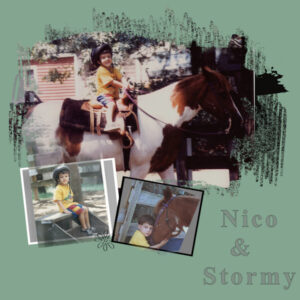
Marie-Claire, (#72162) beautiful page. Is that you in the picture? (#72216) It might be colorful but it is not overpowering your photos. Good match.
Connie, (#72173) that plaid is perfectly matching your photos, obviously 🙂
Ellen, (#72175) is this a project made following Lesson 1 or 2 of the workshop, or are you showing something else?
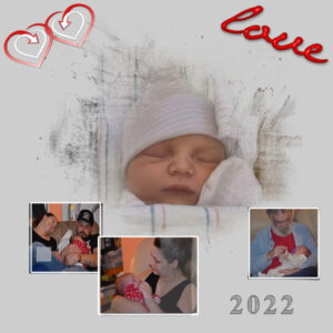
Sharon, (#72180) glad you are getting it. I would warn you about flipping elements once they have their shadow. The heart on top seems to have been flipped after the shadow. Is that possible?
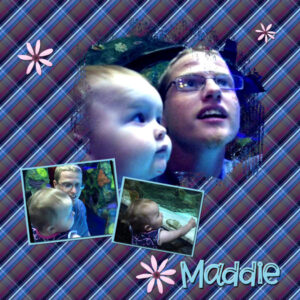
Sandra, (#72184) who is Maddie?
Liz, (#72189) did you want the small pictures on the top project to be faint? They are because the area was grey. If you want the photos to stand out, you would not have to redo anything, but just increase the contrast of the mask layer to get more black/white and less grey.
Frans, (#72193) those are great photos.
Gerry, (#72195) do you take a lot of wildlife photos? Looking forward to more!
Julie, (#72197) I promise, the next one will be done faster, and then faster. Practice helps!
Corrie, (#72197) plaids are so easy to make that you can definitely make a lot and then pick your favorite.
Ann, (#72204) are those your own photos? Do you have owls on your property?
Lavada, (#72205) watch out! Plaids can be addictive.
Sue, (#72211) split text is still text so it usually does not need a shadow. If you add one, the text should be large enough to give the impression it is cut paper instead of printed text.
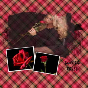
Louyse, (#72214) beautiful photos! Since you have some shadowing on the flower, have you considered adding some shadowing to the small photos? In order to do so, you would have to merge the mask group first.
Marvin, (#72219) it looks like we see the straight edges of the photo. Can you enlarge the photo to fill the whole mask? Otherwise, you can select outside of your photo (on the photo layer), modify with feathering of at least 100 pixels, and then hit the DELETE key a few times to soften those edges. That is a wonderful layout!
Bonnie, (#72221) that is a very fall-like project. I see you used either a shadow behind the text or a blurred copy to keep it legible.
Joyce, (#72224) to answer your question, the Text area is just a placeholder and you cannot edit it. So, removing it and replacing it is the way to go.
Lois, (#72226) may I suggest that you either remove the stroke on the text OR make it the same color as the fill? That particular font tends to lose the fine lines when you add a stroke. Unfortunately, the stroke is not just added on the outside of the text but it “eats” inside the edges too, making any fine detail disappear. Beautiful photos.
Pirkko, (#72228) that out-of-bound effect is very creative and well done too!
If you have not posted yet, you are encouraged to join in the conversation. Even if you are just posting SOME projects and not all of them.
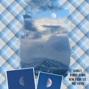
February 23, 2022 at 12:21 am #72234hahaha, I wish I could say it was creativity at work Carole (with those brush strokes). More like I thought I was supposed to do that. oops. Here is my layout for today. A work in progress for sure. First time doing and using a plaid. My issue is I couldn’t shrink (or enlarge or squish or fatten) the mask, before I made it a mask, to fit all the little brush strokes in photo area. They are showing black as expected. If I made my picture bigger to cover it then I lost important parts of the photo (the moon and mountain at the bottom). I tried sizing the mask and my photo all sorts of ways. What I really need is to be able to erase parts of the mask that don’t work with what I envisioned. Is there a way to do that? I really love the idea of masks. I think making my own mask specific to the photo will be a much better result. Now I’m going to grab a tea and enjoy the new layouts for today. ?
February 23, 2022 at 12:33 am #72235Susan, (#72234) yes, there is a way to modify a mask. We will look into that in a future lesson.
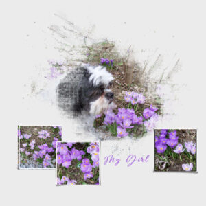
February 23, 2022 at 12:40 am #72240My Day 2 project. I was rather busy today so I am going to try and do the plaid background tomorrow. I am a full time at home caregiver to my disabled husband whom I have to do tube feedings 3 times a day and change his bandages. I technically do everything to keep our home, yard and transportation running smoothly. I also have a 12 year old Border Terrier who is jealous of my computer. She cannot fathom why I would want to spend time looking at a screen and tapping away on a keyboard instead of playing ball, taking her outside, giving her a Puppy massage or feeding her and giving her treats. But I would not trade either one of them for anything in the world. They both have my heart completely.
February 23, 2022 at 12:51 am #72241Awesome Carole. Thank you. You are up late, do you ever sleep?
February 23, 2022 at 1:58 am #72242I am starting a bit late, but looking forward to my second time with masks.
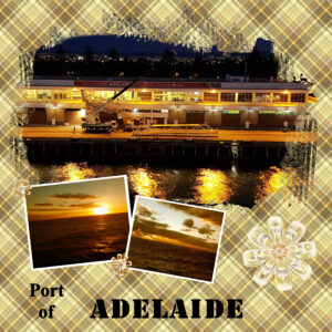
February 23, 2022 at 3:14 am #72244Day 2 – Leaving Adelaide as part of a cruise to Kangaroo Island. I reduced the opacity of the plaid as it was a bit overpowering. The sine bow/flower I made and placed here to fill a gap which I will replace with journaling.
I think this is the most participants I have seen post in a workshop and I am loving the colours, images and variety of the postings.
-
This reply was modified 2 years, 10 months ago by
Euka. Reason: posted wrong image
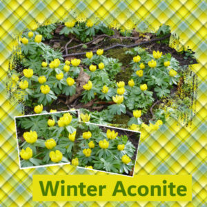
February 23, 2022 at 5:34 am #72248Managed to follow the instructions until the section where the brush was used behind the text – I guess my settings were wrong somewhere because no matter what I tried I just couldn’t get the brush to do anything so I made a background rectangle instead. Will try again another time. I’ve carried on with using photos of aconite taking recently.
-
AuthorPosts
- The forum ‘Showroom’ is closed to new topics and replies.


