Home of the Scrapbook Campus › Forums › Showroom › Masks Workshop 2022
Tagged: Day 2 Mask Workshop
- This topic has 562 replies, 61 voices, and was last updated 2 years, 1 month ago by
Lesley Maple.
-
AuthorPosts
-
February 27, 2022 at 5:31 pm #72824
Fiona, making sure that you are on the scalloped frame layer, select the paint brush and paint out the white spots with black. Then create the mask, by following the instructions. Unless you have a particular problem creating the mask.
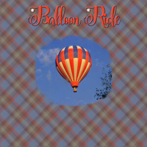
February 27, 2022 at 6:24 pm #72826Mask Workshop – Day 4- I am having a hard time with the masks, but I plan to” master the masks” with lots of practice. I had fun however with the brush (mcbad watercolor 017) and added 2 small brushstrokes to the text. Font is:Carolina Script. The balloon graphic is from Art Explosion and I was trying to work the brush so the balloon picture would end up like a circle. Then I made a plaid background from what I learned in week 2 and turned up the opacity a bit more on the background.
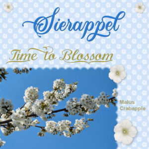
February 27, 2022 at 6:55 pm #72828MasksWorkshop-7. What a pity this workshop is over and I have loved every day of it and all the different layouts that are made. A big thank you to Carole!!!
Here is my last tree in bloom. I made a background with a small flower instead of a dot. My usual font for the title and the Calligraphy font for Time to Blossom.
February 27, 2022 at 7:34 pm #72830Finally was able to get my computer to co-operate so I’m posting another lesson 6 with the proper linoleum paper
February 27, 2022 at 8:59 pm #72833I have seen such great work by other participants.
I like the things I have learned.
I don’t think I would have ever wandered into the area to be able to create the Linoleum.
I decided to play around with other settings for “Displacement Map” and ended up with what I consider a pretty nice design that I could use in the future for a background.
CTRL+Y is a new friend 🙂
Thank you, Carole.
February 27, 2022 at 9:05 pm #72834Sue Thomas, you are such a bright light for all of us who are still struggling to learn the ins-and-outs of PSP. Your designs are always inspiring, and your thoughtful comments are helpful. Thanks. I love bees too. But we have so many fewer in my area than in years gone by. I hope they don’t become “artifacts”.
February 27, 2022 at 9:35 pm #72835Thank you Julie, I appreciated the input of seasoned PSPers when I started many years ago. Prior to joining the campus, I used PSP to edit photos, using those photos for greeting cards and calendars. I now regard myself as a scrapbooker too! While still doing cards etc. I am now in a position to reciprocate and share my knowledge and encouragement and support with others. When I was in school, many moons ago, I was taught by learning by parrot fashion. I have suggested to newbies, choose a technique, and learn it, by repetition, once you have mastered it, then move on to another technique. So it doesn’t all become overwhelming and confusing. Of all the challenges the Love Story is the most challenging for newbies, as there as many steps to remember. We are all here to support each other.
Yes Julie, I too have noticed a decline in all insects, due to pesticides, herbicides and other factors created by humans.
February 27, 2022 at 10:01 pm #72837Project 5 – the angel in the upper left corner is from NicePng. The manger scene was in our narthex several Christmases ago.
February 27, 2022 at 10:12 pm #72839Day 3 – I have used the kaleidoscope effect before, but it has been awhile. I wasn’t really going for a pink background, but it looked better than the green I was getting, and it does seem to work. I could play with it all night, but that might not be a good idea right now. Maybe tomorrow.
Sue – Practicing over and over sounds like a good idea! Often I will do one tutorial, and then forget the steps, and how to do it.
-
This reply was modified 2 years, 9 months ago by
Linda J Walker.
February 27, 2022 at 10:18 pm #72842The Polka dots process is something I will use.
So I also tried making a simple with lines and liked how that turned out with this same technique.
I assume that I will be able to use the technique for the border to make a postage stamp border in white.
I was wondering about the green background of the picture. In Lightroom, I can work with just the green and lighten it. Is there a way to do that in PaintShop Pro?
Thank you for making this workshop available to us, Carole.
February 27, 2022 at 10:39 pm #72844Scalloped edges – phew. Thank you so much for this workshop, Carole. I hope I retain at least HALF of what I learned this time around.
-
This reply was modified 2 years, 9 months ago by
Connie Collier.
February 27, 2022 at 10:40 pm #72845Yes Randy, using the smart selection tool, select the flower, invert the selection, now you can change the brightness, depth of field, and a host of other effects. Personally I would use
adjustment layers to edit the background.February 27, 2022 at 11:32 pm #72849Thank you so much Carole for allowing me to participate in this workshop. You certainly provided us with an opportunity to learn new techniques. I certainly enjoyed viewing all of the excellent layouts created by all.
Here is my Day 7 result. The image was obtained by Pixabay and the font used was BankGothic Md BT
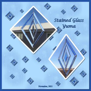
February 28, 2022 at 12:22 am #72851Day 7, wow I made it ……. I did diamonds to correspond with my stained glass. I used Lesson 6 to fill the diamonds as I thought it looked a lot like stained glass. Thank you Cassel I really enjoyed this workshop and learning different techniques and ideas from the group.
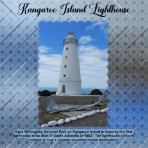
February 28, 2022 at 2:02 am #72857Day 7 – Lighthouse on Kangaroo Island. For the background I created the paper from the photo then because of the lighthouse I made a brush from a ships wheel and another from a life buoy. It didn’t quite work out how I wanted but I will work on it.
Thanks Carole for your time and the effort that goes into these workshops, and this one was was especially popular and the results achieved by everyone have been outstanding and a delight to scroll through and be inspired.
February 28, 2022 at 4:38 am #72858Randy: (#72842) Regarding your photo’s dark green background, I think the effect you’d need is the Depth of Field which is under Adjust at the top. It lets you apply a blur to the background while isolating the main figure in your photo. Or you could use the Freehand Selection tool to outline your flower and then invert the selection (Ctl-Shift-I) and use the Adjust / Brightness and Contrast tool to dim the color. Good luck!
February 28, 2022 at 5:58 am #72860Anonymous
- 335

- Enthusiast
my result for masks lesson 7
February 28, 2022 at 7:15 am #72862Randy,
I’m also not able to create the Linoleum because I haven’t the script in my list.
Carole, is there another possibility to creat the Linoleum without a/the script?
February 28, 2022 at 7:48 am #72864Anonymous
- 335

- Enthusiast
I put another opinion… for last masks lesson..
February 28, 2022 at 8:07 am #72865Christiane, the tutorial to create the lino pattern is in the video. Did you watch the whole video?
February 28, 2022 at 8:25 am #72866Sue Thomas – thank you – I will try your suggestion.
February 28, 2022 at 9:05 am #72867Sue Thomas, Thank you for the tip.
>>> I tried this but the adjustment layer applied to all layers below it, not just the picture.
As I lightened the green around the flower, my background faded out.
I tried this with brightness/contrast and also with levels in adjustments layer.
>>> I tried turning off all layers below the picture and applying the adjustment layer and it looked okay for just the picture, but then I turned on the layers below, and the same fading out of the background occurred.
>>> Were you thinking of something else?
NOTE: I combined the mask group to a single layer before trying this.
February 28, 2022 at 9:20 am #72871Ann Seeber, thank you.
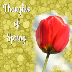
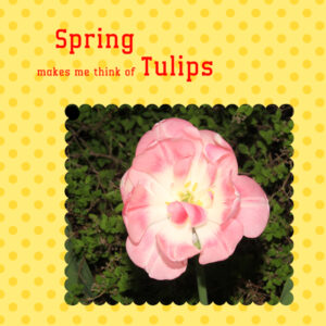
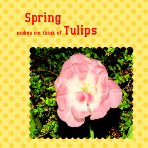
I took your suggestion related to the use of the Adjust / Brightness and Contrast tool. It did just what I wanted, actually more than I had hoped for. The leaves which appeared so dark actually seemed to glow after doing this.
What I did …
Adjust >> Brightness and Contrast >> Brightness/Contrast
I set the values as follows
Brightness 45
Contrast 70
Linear Mode – checked
Note: I did not want to blur the background.
The greenery is not from the tulip but I think it adds to the picture.
Here is my work after the adjustment.
February 28, 2022 at 9:24 am #72872Sue Thomas,
I noticed a comment by Ann Seeber, instead of an adjustment layer, she suggested using Adjust >> Brightness and Contrast. I tried and that worked.
I think the adjustment layer would have been fine if I did not have to be concerned about the oayer with the background.
Thank you. The Freehand selection was a good start.
February 28, 2022 at 9:29 am #72873Christiane (#72862),
I did not use a script to create the Linoleum background.
I just followed the instructions in the video.
As I worked through the video, I made notes so that I can go back and do this again (and again).
If you were responding to another Randy, my apologies.
February 28, 2022 at 9:31 am #72874Randy, yes the adjustment layers will effect all other layers. When I use that tool, I open a photo, which doesn’t have any other layers. What you could have done is edit the background greenery photo before adding the tulip. It was my understanding that the tulip and greenery was one photo and not a composition. I see you finally achieved the effect you were looking for, that’s good.
February 28, 2022 at 10:46 am #72876We had a great visit yesterday with Noah, my third great-nephew. His family was visiting from Texas. The tent has dinosaur scenes inside and out. My niece said that it is his favorite place to read and watch how-to LEGO videos on Youtube.
Back in my day, we had a blanket draped over two chairs so I was a bit jealous of a cool tent like that.
Carole – RE: Day 6 … did you use the linoleum background as an overlay on the cat photo too? I used a mask with a light watercolor brush. It took about 3 clicks of the brush to get enough of the picture to come through and then the opacity was lowered to bring out the texture.
Thanks for another great workshop. It was fun, interesting, and educational.
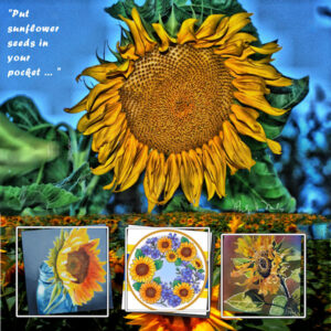
February 28, 2022 at 11:18 am #72879Here’s my last effort for Masks-Day 7. I used the Extra design this time as I’ve done polka dots, etc, last year. Here are some Sunflowers with a quote that is currently in the news using Forte font. The top photo is from THViP shot by Philip Milio, the poured watercolor on the bottom right is by my daughter, Debra Lennox. Others were found on Google Images. It’s not the season for sunflowers but they are all over the news and internet right now.
February 28, 2022 at 11:27 am #72880Christiane: I had the same problem with Linoleum. Look under Effects, Distortion Effects and there you’ll find the Displacement map. I had to hunt for it myself. Good luck!
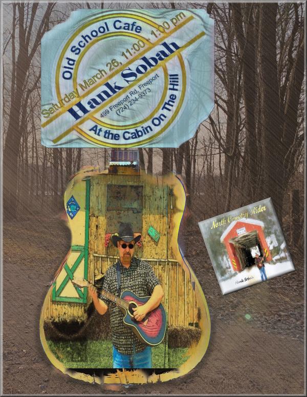
February 28, 2022 at 11:48 am #72882For my Day 7 project I chose a promotion for an upcoming job, and strayed a little in making the mask, and used slashes made from the ground of the bacground image instead of the polka-dots.
-
This reply was modified 2 years, 9 months ago by
-
AuthorPosts
- The forum ‘Showroom’ is closed to new topics and replies.


