Home of the Scrapbook Campus › Forums › Showroom › Masks Workshop 2022
Tagged: Day 2 Mask Workshop
- This topic has 562 replies, 61 voices, and was last updated 2 years, 1 month ago by
Lesley Maple.
-
AuthorPosts
-
February 25, 2022 at 7:26 pm #72597
72398 Cassel you asked what was under the title. Under Captola, I used the smart selection brush on the polka dot bag, copied it and played with it a bit, and pasted it there, I have no idea what all I did, as I was just playing around.
February 25, 2022 at 7:31 pm #72598Julia,
No problem… do you have people in Kyiv? This situation is devastating to me and I have no ties. I can only imagine how it is for those that do. It makes me cry just thinking about it and having no power to do anything about it.
Lynda
February 25, 2022 at 7:36 pm #72599Day 5 layout. Not the best creative day or layout for me. I really liked the lesson and how the masks were made. I didnt do the feathering enough, I can see it’s too hard of a line in the feathering. I thought I didn’t have room on the photo so I used 100. next time I’ll do the 200 like I should have. I used the Bokeh brush but don’t think it looks good. Titivillus has plagued me most of the day (Titivillus was a demon said to work on behalf of Belphegor, Lucifer or Satan to introduce errors into the work of scribes) and I was making so many mistakes that PSP (2022) gave me an error saying I was out of memory (how rude!) and if I didn’t put the keyboard/mouse down and back away from the computer the world would implode. Who needs that stress?
Beautiful layouts as usual from everyone. Takes the stress away and warms the heart.
February 25, 2022 at 7:39 pm #72600That carved pole is beautiful. What a great photo to select.
February 25, 2022 at 7:42 pm #72601I have no roots in Ukraine, but my parents did come from eastern europe. It’s just the overall sadness of how little the world has changed in nearly 100 years that breaks my heart.
February 25, 2022 at 7:43 pm #72602OH Julie, I feel for you(#72551) . I’m having that day too (thankfully not the vet emerg…I’ve had enough of that too!). Your layouts are always beautiful. Sometimes I find I just need to walk away for a bit. You got this, and if you don’t, someone here will have your back.
February 25, 2022 at 7:53 pm #72604I will post my latest project which was a combination from lessons 2 and 4. I reviewed lesson 3 several times and still don’t understand how I get the pattern I created from the photo to be saved as a patterned paper. I kept trying different commands, but when I opened up patterns in the materials palette the one I created does not show up. I can see the individual version but not a repeated pattern anywhere within the materials palette so I obviously am missing a step.

Anyway, the following picture demonstrates what I played around with instead. The dog Lucky is no longer among us.
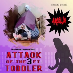
February 25, 2022 at 8:06 pm #72605Something totally off the wall. It’s a tribute to the 1958 cult sci-fi/horror classic, The Attack of the 50 ft. Woman.
My one-year-old niece wanted to explore the cats’ scratching house. She got in OK. Getting out was problematic. The cats took it in stride.
February 25, 2022 at 8:52 pm #72609Oh Gerry, that’s hilarious!
February 25, 2022 at 8:59 pm #72615Everyone is so creative! How did I spend my whole day on this?! But I learned so much! Thank you, Carole!
February 25, 2022 at 9:11 pm #72619Julia,
My heart breaks for what is going on in the world and it seems I can do nothing but protest. Pretty useless it seems. All we can do is be good to each other and while all this PaintsShop stuff seems trivial, it is a small way to be good to each other and share in humanity.
Best to you and all who share here.
Lynda
February 25, 2022 at 9:38 pm #72622Julia – prayers for you and yours and for all who are in the Ukraine.
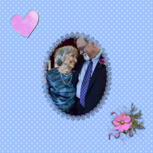
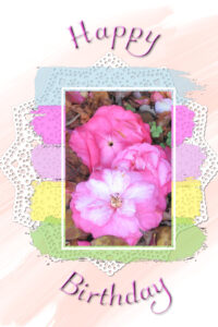
I am going to post 2 here. Carole, you said that the Camillias would make a good birthday card. I have several birthday cards that I made last year and so I changed it up for a birthday card and this is the result. Also, last year, I think it was during the Love Challenge, that Sue Thomas or one other happy PSP’er made and gave freely the oval mask with lace. As I was learning about (relearning) bringing in a mask to a layout, I remembered the oval mask and decided to do one with it. So here it is. The paper background is mine from one of the Labs, the cluster I made in one of the Travel Challenges, the heart is from a PS kit. That layout is of my son, Steve, and me at his daughter’s wedding.
February 25, 2022 at 9:45 pm #72623Well that one is just sweet! Project-3c
Oh dear, I would love to see my son, maybe this year:-)
February 25, 2022 at 10:31 pm #72625YOUR ALL THE AWESOMEST YOUR WORK
I KEEP MESSING UP Sorry caps I can see them better
February 25, 2022 at 10:35 pm #72626Here is my lesson mask 5
 February 26, 2022 at 12:42 am #72635
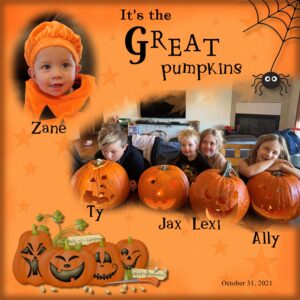
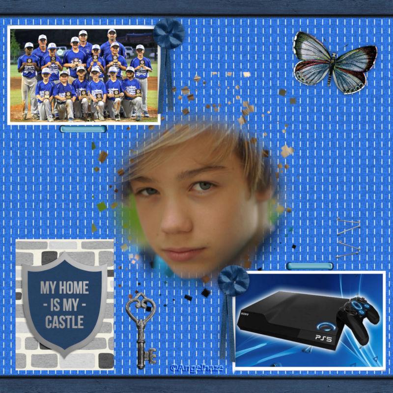
Day 5, I had a bit of trouble doing the brush around the mask. I ended up using leaves, they do not show through too well. I used CASS Script Colored Edge to darken the edge of the paper and CASS Script Emboss to emboss the stars. The pumpkins are from a purchased kit Kristmess Let’s Face It. I used several fonts and slightly rotated some letters.
February 26, 2022 at 12:44 am #72636Anita, (#72514), Mr Mooch always loves to travel, doesn’t he? (#72530) Yes, you take full advantage of the mask.
Sharla, (#72519) yes, once you get acquainted with masks, it gets easier to create them to fit your own needs, and it is more personal too.
Pirkko, (#72521) that is a great idea to blur the word SNOW to make it look like snow! (#72560) Such a relaxing picture! I could see that as a frame in a bedroom!
Marie-Claire, (#72522) ah yes, “Poncho”. Now I remember!
Marvin, (#72526) beautiful family photo. May I offer a little trick? For your text, you added a shadow. Typically, ink would not have a shadow. However, shadows can be used to emphasize. What you set is an offset that is clearly showing. If you were to set a smaller offset and more blur, then the shadow will emphasize the text without looking like the text is floating.
Ann, (#72528) definitely easier to read! (#72553) If you were to add a little shadow on that frame, it would fit well with the bevel you added.
Sherie, (#72533) that wordart is perfect for that photo.
Lynda, (#72539) the effect is stunning with all those photos, masks and frames! (#72576) Glad you are having fun. (#72545) Yes, it does take a fair amount of time to look at each project and read every post, but I believe that all the participants deserve that attention from me.
Lavada, (#72543) I have seen the Brush Variance palette in many different shapes and sizes before, and it is obviously confusing the users, just like you were!
Theresa, (#72590) you are doing well for your first. You will see; later in the lessons, you will learn exactly how to make your own masks.
Sharon, (#72547) that is a great personalized masking.
Sue, (#72549) your wordarts are always a delight to read.
Julie, (#72551) at which point of the process do you seem to get “sidetracked”? What you have posted looks like you succeeded. Post where you are stuck so we can help. (#72586) You are totally correct: I should have said “Paste as a new IMAGE”. I will have to edit the video!!! Thanks Sue for pointing out that. The shortcut would be Ctrl-Shift-V.
Connie, (#72555) having overcome all those obstacles, I can just imagine that you learned a few things to make them work. Did you use masking to get those bird “cutouts” ?
Fiona, (#72561) you can adjust the opacity in the tool settings, but there is also an option to vary the opacity in the Brush Variance palette too. Sometimes, that is another way to play with the variance.
Ellen, (#72565) that flower brush works so well with the image! I am glad you are not giving up. Masks might seem intimidating at first, but once you tame them, you will have fun.
Bill, (#72567) Are you asking about a way to remove a background like a sky or something like that? Although some techniques can involve masks, I don’t have a tutorial on that as it would be a little more advanced. You could use the Background eraser (there is an article HERE). There is also another more in-depth class HERE. On your mask, I suspect that you brushed on the wrong layer, which is why we see grey brush imprints. Is that possible? And by the way, welcome to the membership 🙂
Lois, (#72569) that page is great. The simplicity with the nicely patterned papers is a great combo.
Anne, (#72580) oh! I recognize those crochet lace borders.
Corrie, (#72582) those swirls end up creating such a delicate mask edge!
Euka, (#72583) I am glad to see a simple dot used to create a very interesting mask. If a new workspace fixed the issue, is it possible that you might have previously loaded a workspace from a previous version? This can cause “surprising” issues that don’t seem to have an explanation.
Susan, (#72599) I had never heard of Titivillus before. I guess he must be friend with some of the Campus gremlins. Your project still turned out well.
Alice, (#72604) to answer your question, how to save the pattern, there are two folds; first, any image open on your workspace can be used as a pattern as it will automatically appear in the list of patterns, on top of the list when you open the Material Properties dialog window under the Pattern tab. Second, if you want to save that pattern for future use, you can simply save the file in the Patterns folder that you can find in your Documents > Corel > PaintShop Pro > [your version] > Patterns. Then, it will be permanently accessible.
Gerry, (#72605) that is a funny project.
Joyce, (#72615) I am sorry to have incited you to have fun all day 😉
Mary, (#72622) those are beautiful cards! And you can create many different ones starting with the same template.
Louyse, (#72626) since you are adding some 3D elements on your project, you could consider adding some shadow too to match. So who is that good-looking guy in the photo?
Christine, (#72585) that is a great start with the kaleidoscope. One little step at a time.
Royanne, (#72635) maybe the opacity of the brush was lower than it should be? That could explain why they would not show as much as you wanted.
Keep it up. Your projects are better and better. And remember that if you have any problem, just ask.
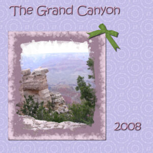
February 26, 2022 at 12:46 am #72638And this is my actual Project 3. Played with the brush on a paper layer under the mask. Enjoyed playing with the Kaleidoscope. Love working with colors. Needed something green and so the green ribbon is from a PS kit.
February 26, 2022 at 1:30 am #72646Where cani get some frames for my projects – i added borders to my project 5 and then realised it makes it into a single layer pspimage!
February 26, 2022 at 1:48 am #72647(#72636) Carole, when I was learning Calligraphy many years ago the Calligraphers would refer to Titivillus as the Patron Saint of Mistakes. I actually thought it was made up, until I looked him up. Usually it’s when you lettered something and were nearing the end (or finished) and you see you had two of the same words in a row or a spelling mistake.
February 26, 2022 at 2:27 am #72648Connie, (#72555) having overcome all those obstacles, I can just imagine that you learned a few things to make them work. Did you use masking to get those bird “cutouts” ?
Yes, Carole – I found the silhouette of a raven and turned it into a brush, then used it the same way you used the snowflakes in the lesson.
February 26, 2022 at 3:09 am #72651two attempts the love one not so good but found it beter second time around
-
This reply was modified 2 years, 10 months ago by
Liz Kershaw.
February 26, 2022 at 4:50 am #72655February 26, 2022 at 8:04 am #72661Masks Workshop Day 3: I took me a while for this one. The Mask did not turn out the way I wanted, but I finally finished it. I kept getting some small transparent areas that showed up and they were still visible after I added the background. Resizing did not help so I kept playing with it til I got tired. Any ideas where those came from? I checked all my steps and positions of the layers, and redid the steps a few times. I probably hit a wrong key at some time. By the way, do you remember the movie, Planes, Trains and Automobiles? Well, I covered 3 of them so far . Trains, Planes and the automobile (a.k.a. Cat Mobile) The pattern is from the leopard picture, part of my Jeep, trees in our backyard, and the light color is from from the driveway. Font I used is Biondi which I have in my Windows Fonts. The paw-prints I have had for years, I add different colors to them as needed. TheLeopard, well he just popped up in my graphics folder years ago and he id a keeper.
February 26, 2022 at 8:16 am #72663Corrie, I love it. It’s great
February 26, 2022 at 8:49 am #72665Lesson 6- Linoleum
I have made this before but this time around my computer could not handle resize to 3600px, so I tried to enlarge the 500px image little by little.. that didn’t work either so I had to make a seamless tile.. I came up with a couple of different backgrounds by repeating the displacement map different number of times. My favorite turned out looking like watercolor splotches. So here it is.
February 26, 2022 at 9:29 am #72669Lynda, I am not to that lesson yet.
But that is a nice background! I like it lots! I will have to try to replicate your work-around!
February 26, 2022 at 10:23 am #72670Thanks Linda,
Just follow the Linoleum instructions and repeat the Displacement map part of it until you get a result you like. I had to use seamless tiling because my computer is not complying but it seems to work. Also, I put a white layer under the linoleum creation and I decreased the opacity of the linoleum until I found something I liked.
Hope this makes your search easier,
Lynda
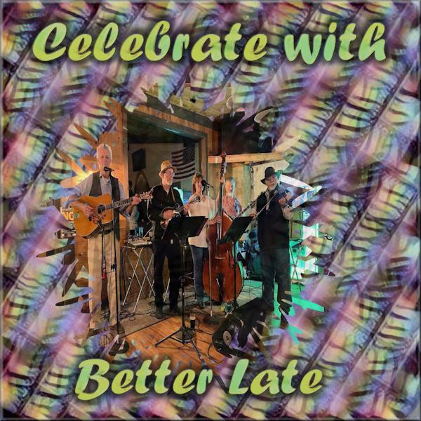
February 26, 2022 at 11:05 am #72671Got a little behind, but here is Day 5 Masks Project – Celebrate with the band…
 February 26, 2022 at 11:29 am #72672
Lynda: 72576 – beautiful use of the background plaid and love those pictures. This layout is stunning to my way of thinking!
-
This reply was modified 2 years, 10 months ago by
-
AuthorPosts
- The forum ‘Showroom’ is closed to new topics and replies.


