Home of the Scrapbook Campus › Forums › Showroom › Magazine Challenge 2021
Tagged: Magazine Challenge 2021 - Day 7
- This topic has 296 replies, 30 voices, and was last updated 3 years, 3 months ago by
Connie Collier.
-
AuthorPosts
-
August 21, 2021 at 4:35 pm #62323
When you are on the frame layer, you can floodfill it, with all layers unchecked. Otherwise all your layers will get the new chosen colour.
Hope I’m correct, always a bit afraid to give wrong advice 😉
-
This reply was modified 3 years, 4 months ago by
MoniqueN..
August 21, 2021 at 4:52 pm #62325Fiona Thanks for the comment. I can almost smell that fresh lavender. As far as changing the color of the frame I assume you just mean the narrow line of the frame. I just use the color changer tool. Just select the frame layer and activate the color changer tool selecting the color you want. Then click on the frame on the page. It should change the color for this kind of frame. There may be a better way, but it works for me.
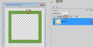
August 21, 2021 at 4:54 pm #62326With regard to changing the colour of the blue frame. Select the layer. Lock the transparency, by clicking the yellow padlock above the layers. Select either the paint bush, and brush around with your colour of choice, or flood fill. Deselect the lock transparency, before moving onto anything else.
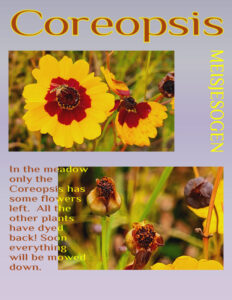
August 21, 2021 at 5:16 pm #62328I altered day 5 as Carole suggested and used uppercase and rotated the yellow word Meisjesogen. Now it is more readable.
Val thank so much you for your kind comments on all my pages!
August 21, 2021 at 5:22 pm #62330Day 6. I struggled a bit to find a photo for this page, most of my flowers are more or less in the middle of the photo. The frame I didn’t use. Again a very subtle gradient and same font with an overlapping title. No place for ads here!
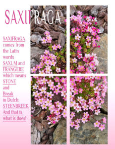
August 21, 2021 at 5:33 pm #62331Corrie, I do like the two coloured title, the white letters are a perfect match on the dark wood chips. You could have resized the masks by using the new layer group tool. To make more room on the left. I also like the gradient going from white to pink, not to clash with the pink text. As I would say, you are using your noggin’. Lol
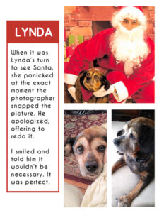
August 21, 2021 at 7:13 pm #62333Lynda was mother to River and Rudy.
August 21, 2021 at 8:32 pm #62335Fiona – there are a couple of different ways to change the color of the frame. The one I use most is I use the ‘lock’ on the layer and then fill it with the color paint I want to use. Hope that made sense. See attached picture.
August 21, 2021 at 9:26 pm #62337Gosh it has been fun perusing all the beautiful work … same templates and so many different results and I love them all. You really are a creative bunch.
This is my day 6. The blurb offers enough info without me repeating it here. I did want to keep to a consistent background colour for the magazine but with this photo the sage green was a far better blend. Thanks for takin a peek my friends. ;D
August 21, 2021 at 10:13 pm #62338Anonymous
- 335

- Enthusiast
Hi, I’m quite newbie here
Where can i find templates for this challenge?
August 21, 2021 at 10:55 pm #62339Fiona, it is good that you understand the Text tool enough to tweak the technique in order to keep the text legible. And glad that you figured out the tutorial for the four sections.
Minka, that photo is perfect for those four “panes”.
Ann S., where did you play with shadows? I don’t see that on the pages.
Val, what will you do tomorrow? It is a 7 day challenge after all! 🙂
Paul, glad to see you post your projects. If you ever encounter issues, don’t hesitate to post. You will see how supportive and helpful this community is and you will surely get a quick response (we have members in most time zones!) On some of your pages, is it possible that you squished the photos vertically to make it fit in the templates? Can you just review that? it is always better to lose a little bit on the bottom than to squish anyone. Check out this blog post about resizing without distorting.
Sue, I am always delighted to see your pages and how you tweak them with so many different techniques. The result is is always fantastic.
Anne L., that was a creative and effective way to tweak the mask. The result is stunning.
Art, rotating the template is definitely a common tweak in this challenge. And the result is great too!
Monique, that is a beautiful photo to use for that four-panes mask.
Corrie, that is an interesting treatment of the text with a mix of uppercase, lowercase and underline. And it works well.
Gerry, that magazine is definitely a trip down memory lane for you. For us, we discover a furry family of yours.
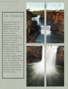
Annie, did you use a blend mode for the title of that Mitchells Falls? Personally, I find it makes it hard to read (unless it is just due to the resizing).
Pirkko, this challenge started last Monday, and the templates and tutorials are part of it. All the participants did register previously. The registration is now closed for this challenge, but if you keep an eye on this forum and your emails, we will have a Bootcamp in September, in addition to several interesting activities to celebrate the 10th anniversary of the site. Don’t hesitate to join in the games in the forum too (like the Alphabet game!).
August 22, 2021 at 4:40 am #62343Cassel: you said “Ann S., where did you play with shadows? I don’t see that on the pages.” It’s the title on this page and I did also play with the story text and it’s now in two colors.
August 22, 2021 at 5:00 am #62345Thank you Anne, Sue and Val (sorry if I haven’t caught up with all comments yet) for your tips on colour changing the frame layer. In the end I used Sue’s method with the paintbrush and the locked layer.
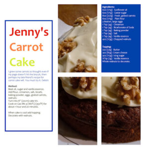
I have created another version for my Day 6 which I hope you will all like and it is following inspiration from Carole to illustrate a recipe, expanding on my theme from Garden to Kitchen.
I grew some carrots so thought even if my page doesn’t hit the biscuit, then perhaps my late friend’s recipe for carrot cake will. You must try it. Delish! If you can’t read the small text on the image download then here it is:-
Jenny’s Carrot Cake
Ingredients:
6oz (171g) Sunflower oil
6oz (171g) Caster sugar
8oz (227g) Fresh, grated carrots
6oz (171g) Plain flour
3 Beaten, large eggs
1 Tsp (4g) Cinnamon
1 Tsp (4g) Bicarbonate of Soda
1 Tsp (4g) Baking powder
1 Tsp (4g) Salt
1 Tsp (4g) Vanilla essence
4oz (113g) chopped walnuts
Method:
Beat oil, sugar and vanilla essence.
Add flour, cinnamon, salt, bicarb, baking powder, eggs, grated carrots, walnuts.
Turn into 8” (20cm) cake tin.
Cook on Gas Mk 4 (180°C) (350°F) for about 1 hour and 20 minutes.
Topping:
2oz (57g) Butter
3oz (85g) Philadelphia cream cheese
4oz (113g) Icing sugar
½Tsp (2g) Vanilla essence
Whole walnuts to decorate.
When cake is cool add topping. Decorate with walnuts.
August 22, 2021 at 6:03 am #62346I did use a blend mode Carole … burn with reduced opacity. Much nicer on the full size and resizing does diminish the effect. 😉
August 22, 2021 at 9:34 am #62358Carole – Hope you like my last page! I had it in mind from the beginning.
Fione – YUM on the carrot cake. Thanks for sharing.
Everyone – I am so amazed at how different the layouts are for each person. I really have learned so much just looking at them. Thank you all!
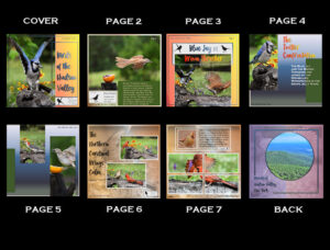
I decided to lay out my magazine. Now I have posted the double pages here… understanding that my Page 1 would be more like a table of contents and not part of this challenge. Though I am going to take this and continue with it filling in the gaps as it is easy and quick. So glad I joined this as I am always one to use embellishments and this is certainly just as wonderful and tells the story.
And I have also included my Day 7 Layout. Variation of day 3.
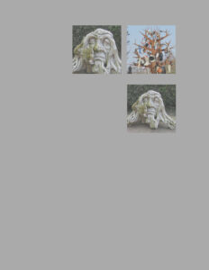
August 22, 2021 at 10:39 am #62360I think I’ve done something wrong with day 7 ……………
I made squares (and yes I duplicated whole mask layers and moved them to the spot I wanted (bit lazy 😉 )
But also on the original mask top left, my picture isn’t as bright as it should be. The funny tree on the right is also like it’s in a fog……what have I done wrong creating the mask> ( I think that must be it)
August 22, 2021 at 10:52 am #62362Everyone has done such a wonderful job. Maybe today I will get through the rest.
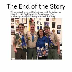
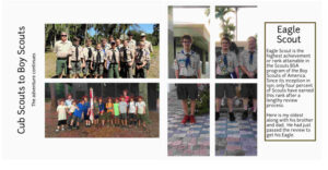
August 22, 2021 at 11:10 am #62367Val – My Dad was a Scout Leader here in Maine for many years as my brother was a Scout. I have allowed Scouts to camp in my woods from time to time to earn badges. Always makes me a little leery with campfires, etc., but we have never had any incidents. They have always been well supervised. 🙂 Loved your pages.
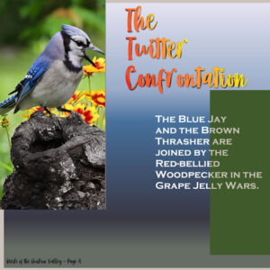
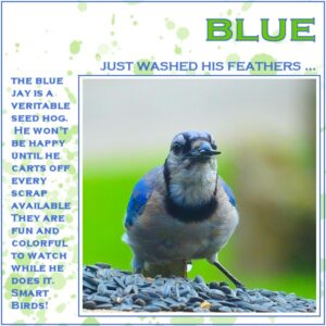
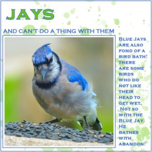
In keeping with my theme, From the Window, I tried putting two on the pages today, but I really wanted to use the birds large to see the unruly feathers. So only one to a page, but I did alter the template a bit. Not much, but enough for the lesson and to get the drift of what is done.
Back to outdoors to get ready for whatever “On-ree” is bringing to us. I think I am ready for whatever blows our way … just a few more planters to move. I laughed when I saw the weather channel spelling it that way – like we don’t know how to say it.
August 22, 2021 at 11:12 am #62370okay … just once, I would like them to go in the order I put them. LOL LOL
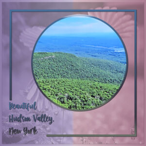
August 22, 2021 at 11:21 am #62373And here’s the back cover of my magazine (page 8) and I snagged one of the “extra” templates to do it. The background photo of a brown thrasher coming in for a landing is at opacity 30 / luminescence. The highlighted photo is overlooking our Hudson Valley region, shot from up in the Catskills. I’ve also included my “storyboard” showing all my pages.
“August 22, 2021 at 11:25 am #62374Monique, is it possible that the white used for the mask was somewhat of a light grey?
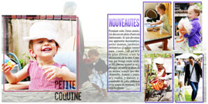
August 22, 2021 at 11:27 am #62378mouarff not enough pages to finish until the 8 years of my granddaughter … I will have to continue alone, because there er, I am only 2 years old LOL. thank you carole for everything. and here are my days 5 and 6
August 22, 2021 at 12:41 pm #62381Day 3 completed. Still using Times New Roman. Off to get Day 4 done (crossing fingers)
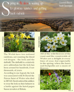
August 22, 2021 at 1:05 pm #62384This is the beach that was a favourite of ours, especially when the children were growing up, (from toddlers) we would search the Rock pools looking for crabs, shells and other goodies. It was only a 15 min drive from home. It was a little further drive from the home I grew up in. Here is my Day 7. I used the double mask from the day 5 template, and created another one, as I needed 3. I justified the text, to be in keeping with a magazine page layout. As for the sunset photo, I used the selection tool to select the sky, feather, blend mode soft light, and a little opacity. Otherwise the text wouldn’t have shown up as well.
August 22, 2021 at 1:57 pm #62394Day 4. Times New Roman; Kimeric’s A Day at the Beach.
August 22, 2021 at 2:07 pm #62395Carole, yes, iIt was grey. At first I couldn’t get the grey into white, I did something wrong, but now it works 🙂
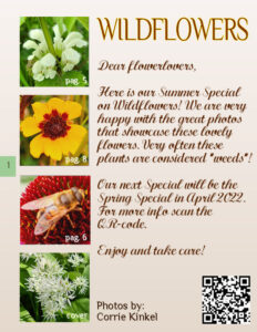
August 22, 2021 at 2:51 pm #62400Here is my day 7: the deadnettle in 2 colors. I used the template of day 5 and altered it using the tut on how to do it. I used again a gradient with the blendmode set to hardlight and a lowered opacity. I also gave it a pagenumber now all the pages are done and I can order them to my liking, which is not the order in which the were made.
I also made an introduction page and will give the other pages their number. I placed the numbers in a little green box and have that box on the right- or lefthand side of the pages. On the left of the introduction page are some little photos with a page number to make the readers curious to the rest of the contents. Maybe I’ll extent this magazine over time so I didn’t want to make the table of contents just yet. Of course a gradient and the same font + the calligraphy script font. Oh and I used one of the extra templates for this page, but I altered it (of course!!!).
I very much enjoyed this magazine challenge; it is possible to make great layouts without all the embellishments and papers of a normal scrapbook page. It was a pleasure to see all the different magazines that were made and we all learned a lot. Carole thank you so much!!!
August 22, 2021 at 2:54 pm #62401Ann I see I have to make a back cover too! Will do that one of the coming days.
August 22, 2021 at 2:58 pm #62404Day 5. Times New Roman
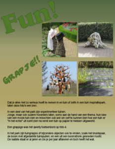
August 22, 2021 at 3:04 pm #62406Day 7
Quick translation:
You don’t have to take everything seriously in a garden or even in a garden inspiration park.
In a part of the park are experiment gardens.
Young, but also older gardeners, show, sometimes on the basis of a theme, their idea of a beautiful garden and maybe even to see what a garden looks like in
real instead of on paper.
A funny one was the qwerty garden on photo 4.In the park there are also garden ‘jokes” and special objects, like the wedding couple,the tree with old gardenstuff, a head made of a tree trunk.
The last one is standing there for years now, you see it detoriate, but it still has “something”. -
This reply was modified 3 years, 4 months ago by
-
AuthorPosts
- The forum ‘Showroom’ is closed to new topics and replies.


