Home of the Scrapbook Campus › Forums › Showroom › Magazine Challenge 2021
Tagged: Magazine Challenge 2021 - Day 7
- This topic has 296 replies, 30 voices, and was last updated 3 years, 3 months ago by
Connie Collier.
-
AuthorPosts
-
August 20, 2021 at 6:33 pm #62246
Art, beautiful pages, and so informative. My son enjoys whittling, he’s very good at it. Like you he loves working with wood. Have you ever make a Welsh love spoon?
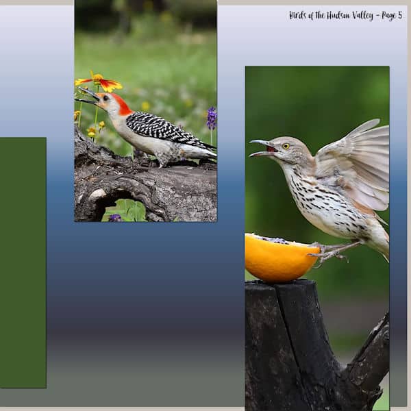
August 20, 2021 at 8:42 pm #62254Todays page number 5 after the cover. I wanted to play with the masks and this was a great opportunity for learning. The tutorial was great!
August 20, 2021 at 8:43 pm #62255I redid my day three and change my background a little. I like it a lot better. I started out with a solid background on the day 4 template, but I did not like that the background overwhelmed my design. I changed the background to a picture instead. I hope the pages work well together.
August 20, 2021 at 11:37 pm #62259Again so much beautiful work to take in … enjoyment +++, thank you.
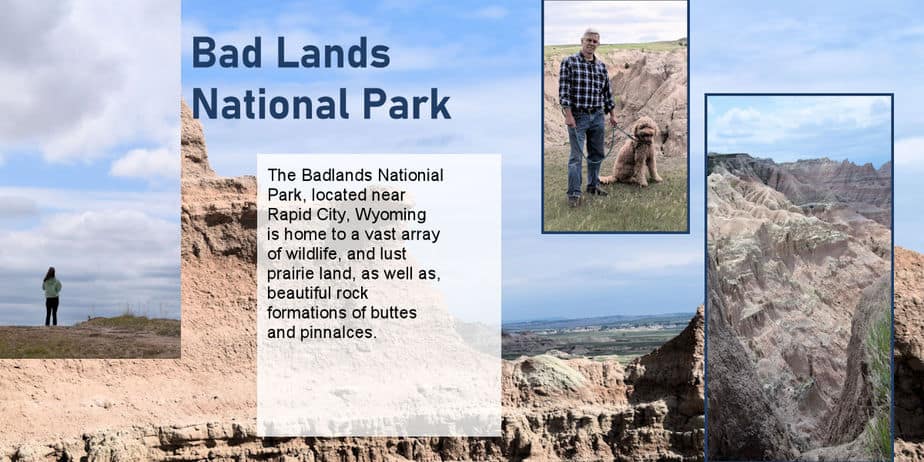
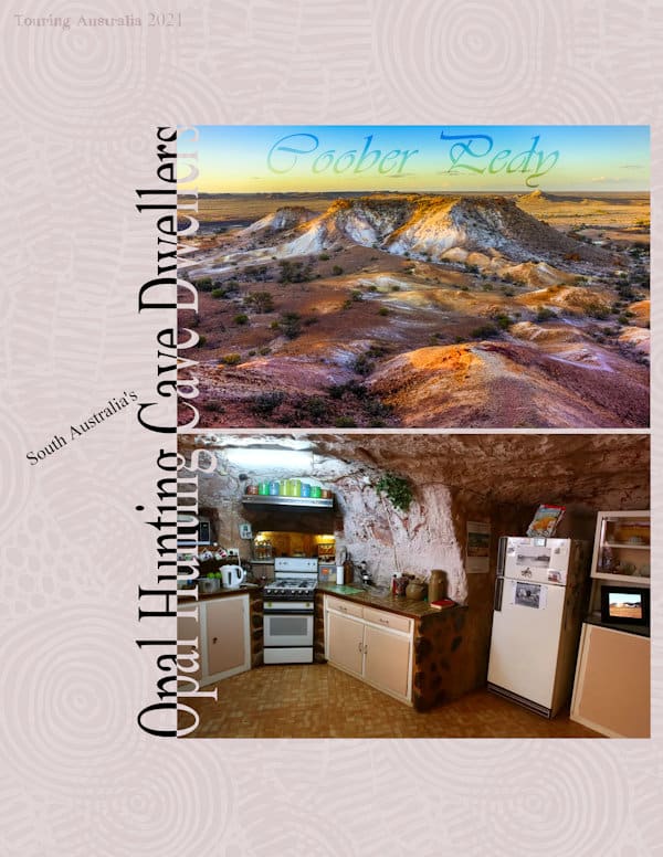
Today’s page is about a ‘different’ kind of touring experience. Possibly a lot may not enjoy as the temperatures can soar to 120F plus and that is why the residents live in caves. Yes, we do have cave dwellers here in Australia! Mining for opals began here in 1916 and Coober Pedy is known as the opal capital of the world. The name “Coober Pedy” comes from an Aboriginal term kupa-piti, which means “whitefellas’ hole” … and that it is, lol! And thanks for the tip Sue, I stretched the text quite a bit for the right effect. Thanks for takin a peek my friends. ;D
August 20, 2021 at 11:42 pm #62260Sue and Annie, maybe you have some Campus gremlins??
Annie, you are allowed to cheat like that. For future reference, if you ever have small text that is really hard to read, you can always add the text in the post itself, while we can enjoy the overall look of the page. Those photos of the Apostles, are stunning!
Ann S., I do like the two-color text but I think that what might make the black text feel better is maybe that you have a gradient that is at an angle, and the green box that would have a vertical line. I think that the two will compete with the two-color text. Just for a test, can you change the gradient to go from left to right instead of an angle? It is just an idea, and it might not make a difference, but something that is possible with PSP. Due to a certain oddity of the text in recent versions of PSP, I would suggest that you do not use an outline on the text that has some overlap (like a script font). It adds some outlined in incorrect places (and nothing you can do about it). If you want some definition for the edge, add a very faint, blurred drop shadow underneath. And no, it is not the last day. We will keep going until Sunday (and you can add more later if you want).
Nadine, you have such a fun set of pages with great story. I think you have a typo on the last line: isn’t it “digérer” instead of “digirer”?
Monique, the grey looks very nice with that photo as it feels like a continuity.
Val, you are allowed to change your mind as often as you want. Can you imagine how “stuck” we would be if those pages were made of glued papers?
Minka, I love the idea of repeating your title on multiple pages. It is tieing everything nicely.
Art, glad the suggestion helped. I find that using a stroke can be good or bad depending on the thickness of it, but also the size of the text itself. If you want/need to make the text bolder, using the same color for stroke and fill will work. If the text is small, a contrasting stroke is usually “eating” the text.
Anne L., some images will appear side by side when the filename is short. It can also depend on the side of your monitor (I think). But your solution to make one combined image is fine. You can then make it as wide as 900 pixels. Larger than that, the system will resize it anyways. If you want to “remember” what font you used, if you reopen that previous layout and double-click to edit the text, the font will automatically be selected in the Tools settings.
Hank, those wide photos are perfect for this arrangement!
Cristina, your use of the Blend mode yields a fantastic effect! I think I am going to steal your idea!
Sue, it is so much fun to visit Wales with you!
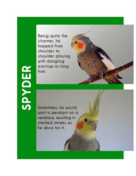
Gerry, you have done a great job adding the mask to that photo! will you add Spyder’s story on the page, somewhere?
Corrie, for your vertical text, have you considered using uppercase only? It would make each letter of the same height. Otherwise, maybe rotating the text instead of writing it vertically would make it easier to read?
Art, I would love to work on such craft, but although I have done some that would take days and weeks, Now I tend to prefer activities that give results faster, like scrapbooking, sewing, and such.
Diane, if you want your old photos to have a bit more contrast, you can use the Levels command, which you can find under Adjust > Brightness and contrast > Levels. It does not have to be a lot, but it will make them crisper.
Laurie, using a photo as a background can work fine. It is always a matter of balance. I see that you added a frame around the photos on the right to make them stand out. It is a good idea since the background photo seems to be of the same “intensity” so to speak. Another alternative would be to lower the opacity of that background layer, but it also depends if you want that background image to be a featured image like the individual ones.
August 20, 2021 at 11:49 pm #62261Another outstanding, interesting page Annie. Stretching the text makes all the difference. It would be considerably cooler in the caves. We have a basement. It’s always much cooler down there during the Summer, I don’t spend much time down there, even though it’s nicely finished. I find it like a dungeon, even though I have 3 large windows, generating lots of light, but no views. Good morning, have a great day.
August 21, 2021 at 3:35 am #62262Thanks @Cassel LOL yes I saw and already corrected on my page, but I did not want to invade the forum for a typo LOL and it is well “digest” 🙂
August 21, 2021 at 5:56 am #62263Sue it was no Wales for me but we did visit the Royal Botanic Gardens in Edinbourgh! I checked the text and the little distortion you see is indeed due to the reseizing. I noticed the hoverfly but I didn’t mention it on the page because it was all about the meadow going over. And I will take Carole’s suggestion for my vertical text and change it to uppercase.
August 21, 2021 at 9:31 am #62265I very much liked the technique that Cristina has used with the Luminance blend mode and opacity settings.
For my Day 5, for legibility reasons I put a tiny outline around the text instead of reversing out the text that overlapped the panels.
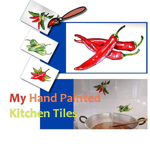
I saw Carole’s advice on the forum for one of the pages to add a drop shadow effect so I went back to my project and added thick object shadows to my paintbrush and tiles images.
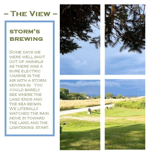
August 21, 2021 at 9:40 am #62267No animals this day … as a storm came in. Eventually, when the heaven’s let loose, we didn’t even sit out there. It was a pretty light show, but I have a healthy respect for lightening. So we moved into the middle of the house.
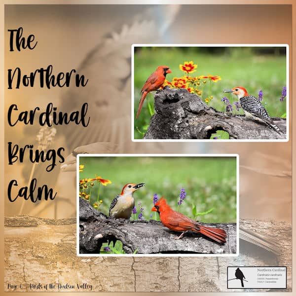
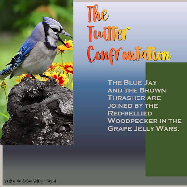
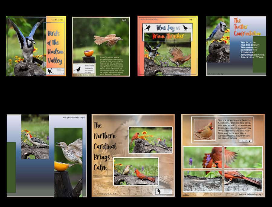
August 21, 2021 at 10:08 am #62272Finished the latest page plus did some revisions as Carole suggested (sort of 😉 ) I also liked Christina’s technique with the photo background so I redid my Cardinal page and followed through with the latest page which is a companion page. I’ll post all here now. On the page The Twitter Confrontation I got to play with shadows with the warp brush as I had them on a separate layer! Who knew! Fun!
-
This reply was modified 3 years, 4 months ago by
Ann Seeber.
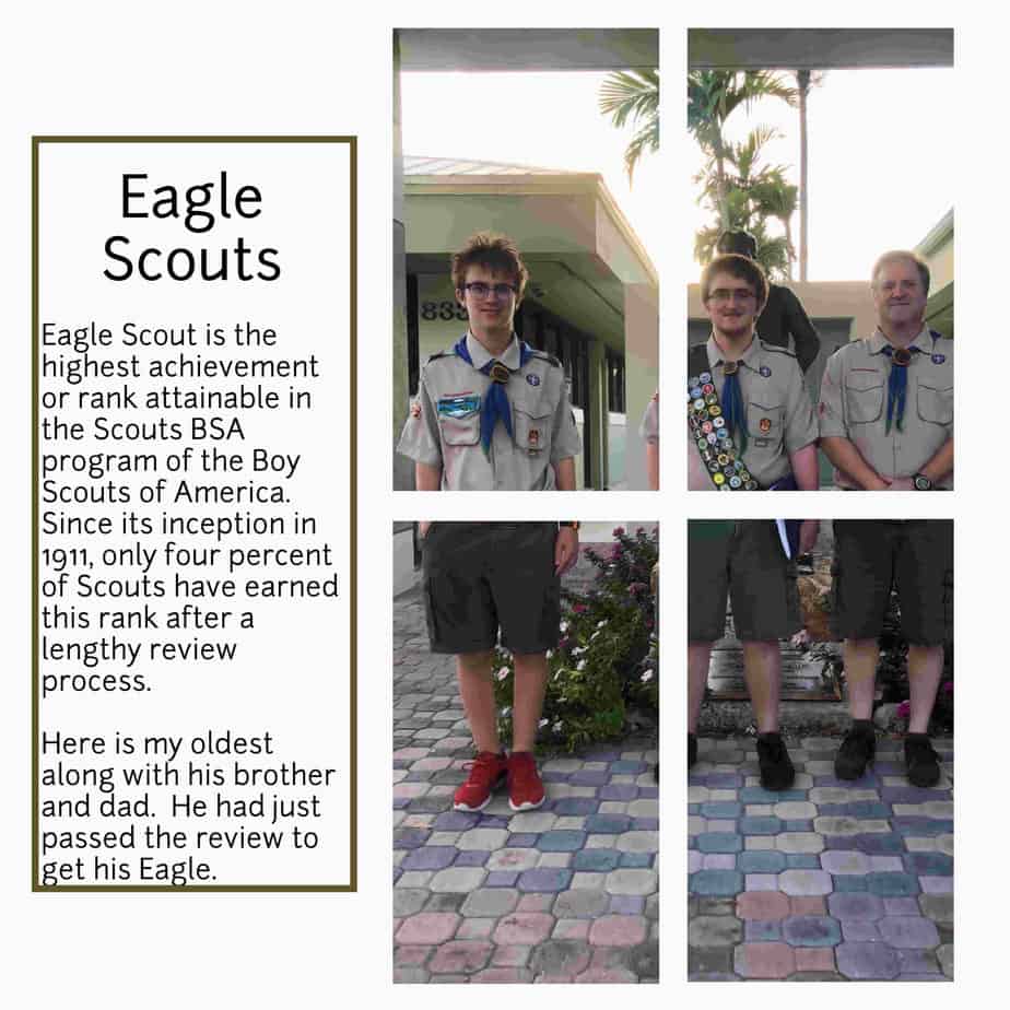
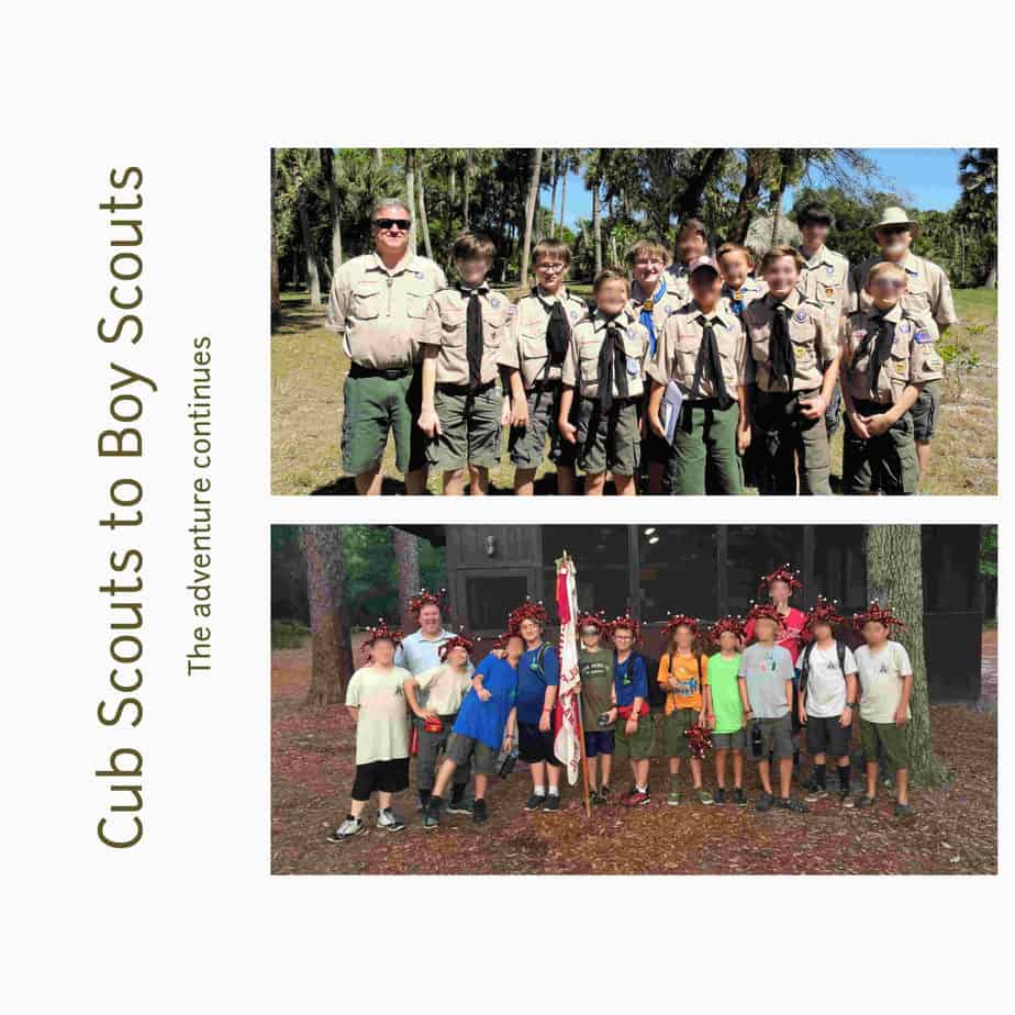
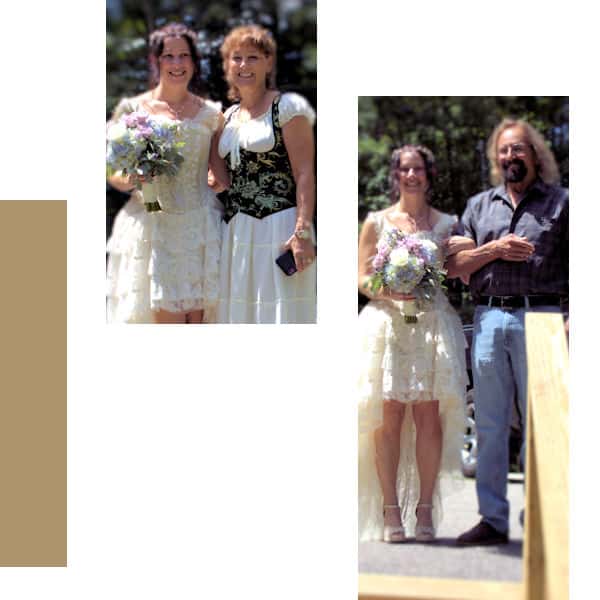
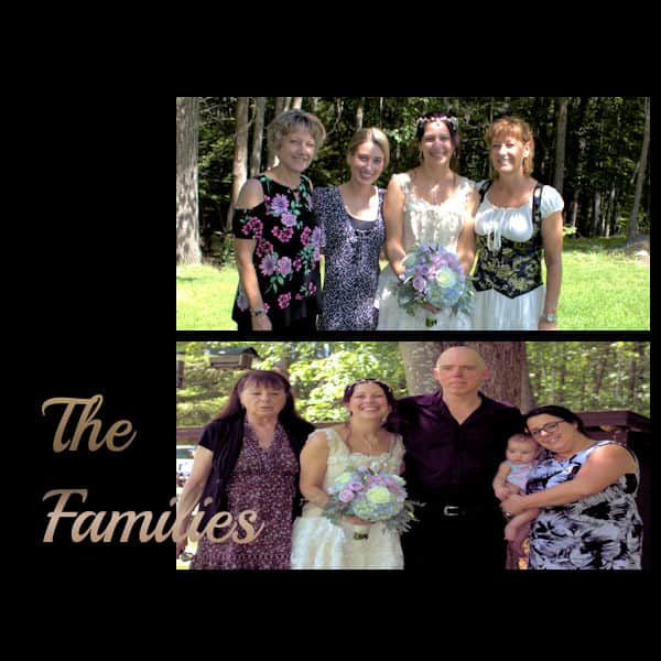
August 21, 2021 at 10:09 am #62275Pages 5 and 6. Though 6 is likely to one of the last two pages if I decide to do all 6 years the two were together with their dad in Scouts. This has been so much fun so far…
August 21, 2021 at 12:14 pm #62287I was going to reply on each person’s own post then remembered it would make a ton of posts… so instead, I put everyone in alphabetical order. Hope I got everyone as there are just so many gorgeous pages to view! Here you go:
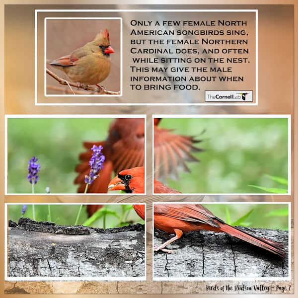
Ann S – I love the way you did the cover. Having the date range was a great idea. Thank you for writing about the Brown Thrashers. I really enjoyed your day 2 and learning more about the bird. Day 3 is a great picture and I really like how you did the title in two different colors. I like how you did the gradient across the two pages. Day 6 looks delightful! Your pages with the background of a photo really works.
Anne L – I love how you put in the surfboard. I certainly think of surfing and Hawaii together. Great day 2 with the picture of you both on the plane. I like how you did the background and the lava/flower photo. I like your day 4 with the colors and photos. Day 5 turned out really charming with the rainbow, the change in color of the fonts and the pretty background.
Annie T – Your cover is beautiful. I like how you did the title and the photo you used. Your day 2 made me long to go by the beach and put my toes in the sand. Day 3 sun set is with the lovely background just makes it stand out. Day 4 is so amazing. Day 5, I had never thought about stretching the text like that. It really works for this page you did.
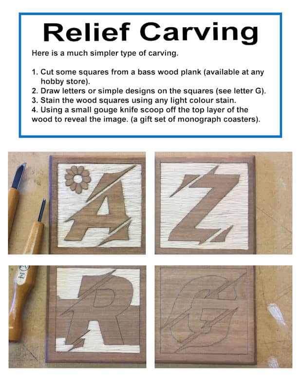
Art K – Your stand is gorgeous. And I really like how you used the wood text. Really enjoyed your day 2 with the tips & techniques. Day 3, the bear is amazing. I like how you continue using the wood text font. Day 4 skateboarder was very interesting. I like how you showed how you got from a picture to the actual wood project. You are multi-talented with the ability to carve as well. I like how you labeled the photos.
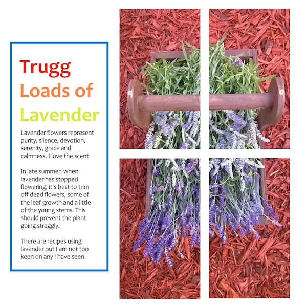
Corrie – You really made your cover flow well. I like how you did the barcode and the gradient. Your flowers are beautiful. I will have to see if it grows here in Florida as I would love to attract more bees and butterflies. Your day three is charming and I like the advertisement. Day 4 with the bees is delightful. My sister has 3 hives that she keeps, so this really hit home for me. Day 5 is pretty with the colors you used and the interesting flower.
Cristina – Your Cover was so interesting! Your treat looks yummy and the photo fits in so well for day 2. Your day 3 was a great idea with the background of the place done with low opacity. Day 4 was so unique. I like how you used the photo sections to highlight parts of a photo that went across both pages. Day 5 made me hungry. Yum!
Diane – Your cover if neat with the black and white photos. I also like how you continued with the colors for the fonts and the stories on day 2. Like your day 4 layout of the local parks as it shows not only something personal but the overall view. I really enjoyed how you laid out the photos and included the title.
Euka – I like how you did the cover with the labeling of the cover photo.
Fiona – Love how you used the colors in your title in the cover. Day 2 made me want to build a green house. I have about 15 plants out on my porch, but they don’t look as great as yours. Day 3 is yummy. I like how you did the colors for the title. Day 4 is more yummy stuff but I has to look twice to make sure that was a cat I saw! Day 5 is so much fun with the colors. I really like the hand painted tiles.
Gerry L – I like how you did the colors on your cover. And how you did redid it with the date and the quote. Day 2 made me laugh. I love your story about your cat. Day 3 with the handsome dog and the beautiful story made it special. Rudy is such a camera hound! Great photos and layout. Day 5 with Spyder is fun!
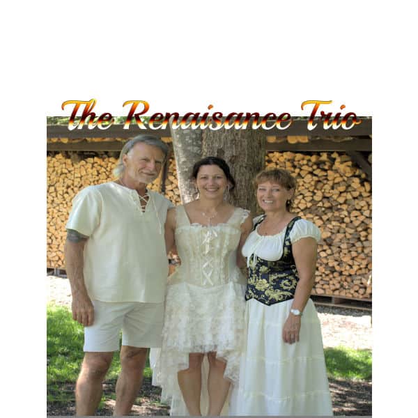
Hank – Your photo really brings it to life on your cover. The day 2 using a painting from a friend makes me smile. The colors you used for the background and font really make the painting snap in day 3. Day 4 makes me want to come out and join the crowd to listen to the music. Day 5 really show cases the whole crew making music.
Karon – I like the address label and the volume information as well as the colors and the photo. I think how you did the text in opposite corners was a neat idea. I also like the advertisement on the one page.
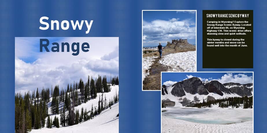
Laurie S – Wow. That looks just like an RV magazine cover. Your photo is fantastic and the dark blue you used around it made it stand out. Day 4 of Wyoming and the snow was splendid. Your redo makes so much sense and looks really good.
Lynda – I really liked how you used the gate for the The Garden and how you showed the season for the 4 Seasons. I like how you label your pots with tape and write on it. I had not thought of that. Like your day 2.
Marie-Clarie – I love the street art you choose and the way you laid out your cover. Your day 2 looks so awesome with how you did the photos of the street art. I liked how you included a link for more information as well. The way you did the ‘A tale of two foxes’ and how the colors go well with the photo is really nice.
Minka – All three of your covers are so cool. Your quote on day 2 made me laugh. Your Bit of Blue is so pretty. The heron and turkey pictures are inspiring. Mine never come out that nice. I really like your layouts. I really enjoyed the squirrel photos and how you keep ‘The View’ on every page. I like how your looking out the window looks like a window.
MoniqueN – That photo is lovely. What a great way to start the pages. Your gradient and new layout on the cover is beautiful. Day 2 makes me want to come visit you. I would love to sit in the chair and relax with a good book. Day 3 is relaxing. Thank you for the link. Thank you for the translation of day 4. I would love to see the garden. I really like how you laid it out. Day 5 showing the two seasons and the hidden chair… I really like it.
Nadine – Your colors being off the photo really made the cover pop. I really like how you did the weight, height, date, and time of the newborn. Really like how you did day three with the text up top. I like how you did some of the text on the top of the left page and then the rest on the bottom of the right page. Great idea.
Paul – Gorgeous photo and I like how you did the font for the title in the cover.
Sue T – Wow. Your cover looks like it really is a magazine cover. And the photo is beautiful. Looks like you had a wonderful trip. I like how you added a page number! Day 3 with the ad on the bottom was a good idea and really fits into the page. Day 4 shows such a beautiful trail to walk. And I would love some of those fresh blackberries! I like how you labeled the photos in day 5.
August 21, 2021 at 12:14 pm #62288Only my 2nd project, struggling to figure things out but I’ll get there.
August 21, 2021 at 12:18 pm #62290Adjustment to web color background
August 21, 2021 at 12:52 pm #62293Spyder’s Story.
Carole – Thanks for the note. It was such an obvious omission.
-
This reply was modified 3 years, 4 months ago by
Gerry Landreth.
August 21, 2021 at 1:10 pm #62295I like to see how my pages flow together. Here’s a little mock-up
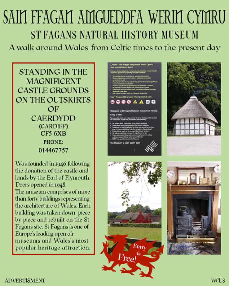
August 21, 2021 at 1:11 pm #62296Here is my day 6. Quite often you will see a whole page designated to advertising one topic. Well, that is what I have done here. As a child I used to go to St Fagans, every year on organized school trips. It really hasn’t changed that much over the years, other than there are more buildings to see. They still make welsh cakes in the bakery, to sell. My children used to go there on school trips. We would also go just for a day out. It was about a 20 minute drive from home. Admission really is FREE, it always has been. A wonderful family day out! I had to change a few things to accommodate my page size. With all of my pages, I have replicated what a typical magazine page would be like. Apparently the norm for magazines is to use no more than 3 fonts. I would say that would apply to per page, and not the whole magazine. As different pages would require different fonts, depending on the topic. All fonts, have to be easy to read, and clear. Oh yes, I also played with the kerning, to make the info in the box justified.
Cristina, the technique you used for the background has worked well on your pages. I all to frequently use that technique on many of my birds and insect projects. Selecting the subject, promote, invert, frame it, blur, blend mode, opacity and more to the background. Finally add a quote, or info.
August 21, 2021 at 1:19 pm #62298Day 3 results, since my font color blended in with the top of the photo I had to alter the copper colored gradient.
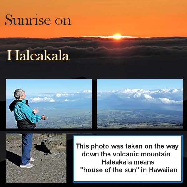
August 21, 2021 at 1:20 pm #62300I rotated the mask and eliminated the lower right section and part of the one next to it because it was just more grey rock. I then used that area for the story rectangle that I filed with white. I used the sunrise picture as my background and duplicated it and sent it to the back. I then moved that back part down to use for the bottom part of my background. I was luck it blended in O k or I would have had to do something else. We got lucky and had a beautiful sunrise and day which is not always the case. They don’t tell you that when you are booking the tour. “Isn’t every day in Hawaii supposed to be perfect?” The tour van picked us up at 2:30 AM but I am glad I didn’t try to do that drive myself because of the winding road up to the top in the dark.
August 21, 2021 at 1:32 pm #62303Cassel = Thanks to answering my question. If I want to try for two pics again I will give them short names. Thanks also for the other info.
EVERYONE ELSE – I can’t believe all the wonderful pages everyone has posted. Some of your adaptions have given me some ideas for future projects and Cassel’s suggestions to some of the problems has been a lot of help too. What a fun, interesting, and informative project this has been.August 21, 2021 at 2:17 pm #62307Val, thank you for taking the time to comment on my pages. I’m pleased that you like the layouts. I hope they will inspire you. I often create magazine covers and flyers to showcase my photos. I like to make them look realistic.
August 21, 2021 at 2:23 pm #623092 pics added
August 21, 2021 at 3:14 pm #62311Today was a challenge. I spent a lot of time trying to find a picture that would work in 4 components. With my 8.5X11 format, it required a tall thin image to fit the space. I could not find one. So I decided to turn to whole template 90 degrees to the right. Now I could use one of my carving project pictures to make a page in the theme of my Woodcraft magazine.
More great images to look at from all you talented scrapbookers. I see a few of you also rotated the template.
Ann L, your picture of Haleakala brings back some nice personal memories. Love the view.
Val, thank you so much for your detailed comments.
Ann S, good idea to put your pages in order like that. It gives a complete storyboard of your magazine.
Only one day left. I look for to seeing how everyone does their magazine wrap up.
August 21, 2021 at 3:24 pm #62313Thank you Val for your comments and interest. I am sure your plants look lovely. My parents-in-law were also both very active with the Scouts in the UK.
Clever of you Ann to make a mock up of your pages. It does help with planning. I tend to print mine out.
Rotating the mask Anne really worked with your design. I have kept to the template still with mine.
On Day 6 I had trouble at stage 9 as I could not see all 4 rectangles in one mask. I retried but it still didn’t work. However, at that stage, with the floodfill tool set to white in foreground, I clicked on each of the selections in turn and then all 4 appeared on one mask. I also found that I needed to De-Select.
I have a question.. How do you change the colour of the frames that appear as cyan in the templates please or are they just place holders for the design?
August 21, 2021 at 3:41 pm #62315Day 5, slowly getting the hang of it.
August 21, 2021 at 4:21 pm #62317Day 6
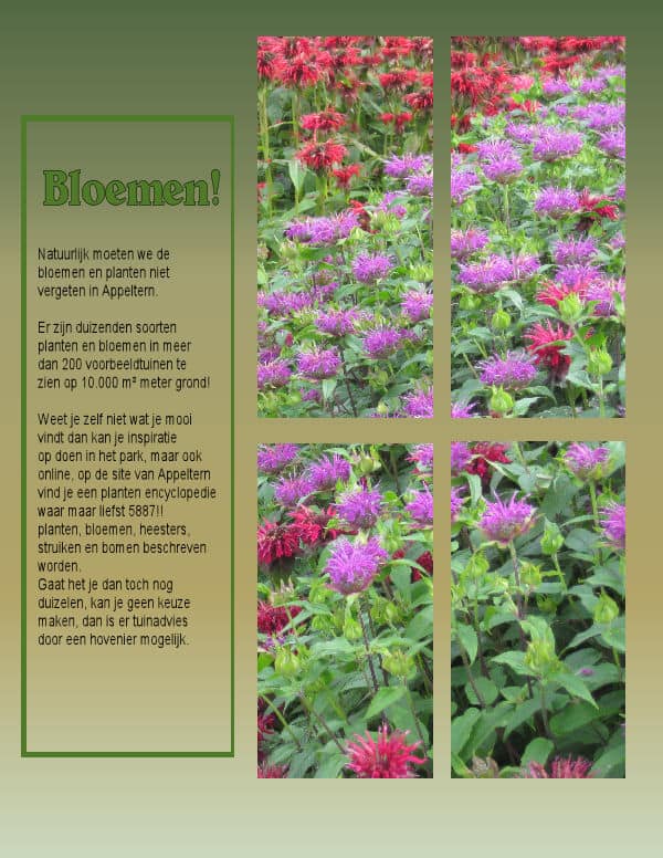
Quick translation:
Of course we shouldn’t forget the flowers in Appeltern.
There are thousands species of flowers and plants in more than 200 example gardens to have a look at on more than 10.000 m²!
Don’t you know yet what you would like, you can find inspiration in the park, but online, on Appelterns site you can find a encyclopedia where you can
read more about plants, flowers, shrubs and trees.Is this a bit too much information, you can’t make up your mind, you can hire an gardener to give you garden advice.
August 21, 2021 at 4:25 pm #62319Day 6 work is in the books, I kinda like it, simple as it is, I’ve learned quite a bit
August 21, 2021 at 4:30 pm #62320Ann, the rotation of your page works out wonderful!
August 21, 2021 at 4:32 pm #62321 -
This reply was modified 3 years, 4 months ago by
-
AuthorPosts


- The forum ‘Showroom’ is closed to new topics and replies.


