Home of the Scrapbook Campus › Forums › Showroom › Magazine Challenge 2021
Tagged: Magazine Challenge 2021 - Day 7
- This topic has 296 replies, 30 voices, and was last updated 3 years, 3 months ago by
Connie Collier.
-
AuthorPosts
-
August 19, 2021 at 10:38 pm #62172
Fiona, the addition of those colors looks great! And if you use that repeatedly (even if you need to modify some elements later on), it will really tie everything together very nicely.
Laurie, welcome to the party! It is amazing how a super “boring” black background looks so great! The blues from the second page complement the photo so well. Did you find the Text wrapping feature or did you break the lines manually?
Lynda, this will end up a very informative magazine!
Minka, it is so great that you will get a way to document all those fun animals in a cohesive album.
Hank, so simple. One point that I would tweak is to center the “Playing for Keeps”. But that is me. On the other pages, did you distort the photos? It is super important to ALWAYS use the Scale mode and NEVER use a side or a top/bottom node to resize. I am not 100% sure but I suspect you might have used those nodes.
Nadine, I agree that it is a different way to create pages with PSP, especially after all the other challenges and lessons that use a typical scrapbook look. You might end up enjoying this style too! (and it is faster too)
Karon, although it was not planned to have a table of content, it is definitely one additional page anyone can create.
Ann S., have you tried the two-color text idea? I think that it might look good to have white text on that dark green box.
Gerry, did Rudy actually wear a phantom mask or did you add that with PSP?
Sue, I am not sure what might have happened to your Text tool. That is strange, but I am glad that restarting PSP fixed it. What version are you using?
Monique, you will have ample time to tweak all your pages later. Have you tried to use a contrasting color on the green box? Like white?
Corrie, those are beautiful photos and that ad is definitely fitting in the page. Isn’t it strange how we tend to not like empty space?
Diane, are you going to print out that album once it is done? I think it would be a fantastic gift for her!
Art, you have some stroke around the small text. Have you tried without any? It might make the text a bit thicker and possibly easier to read. I find your magazine super interesting!!! You might end up publishing it!
August 19, 2021 at 10:58 pm #62173Carole, I’m using PSP 2021 Ultimate. I also emptied the temp folder before restarting PSP. It was strange, as nothing like that has ever happened before with the text tool. Perhaps I clicked, or pressed a key without realizing it. Anyway, once I reopened the program, all was fine.
August 19, 2021 at 11:24 pm #62174A delightful magazine page dear Sue. I just wanted to let you know that exactly the same thing happens to me with the text tool on occasions. I don’t bother to close down the program as I know that it will right itself in a short period of time. I was using 2021 and now use 2022 … same thing, go figure! ;D
August 19, 2021 at 11:32 pm #62178Again I wish to compliment all of you on the beautiful work you are creating. Good reading to peruse whilst enjoying my morning cuppa … thank you all. ;D
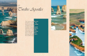
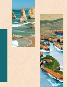
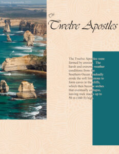
Here are my pages for days 4 A&B. Carole I have to confess to cheating a bit by resizing these pages to 600 px on the shortest side. It was impossible to read if I did it on the longest side. Thanks for takin a peek my friends. ;D
August 19, 2021 at 11:48 pm #62182Thank you for the kind compliment Annie. Your pages are terrific. Australia really is a continent of contrasts, you are doing the photos proud. Thank you for letting me know, I thought I had done something to cause the issue. Should it happen again, I’ll see if it rectifies itself first, before closing and reopening. It’s comforting to know that it must be a blip within PSP, and not of my making. I’m off to bed now, you have a most enjoyable day.
August 20, 2021 at 4:21 am #62183You are most welcome dear Sue … sleep tight. ;D
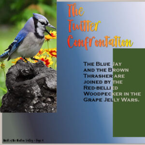
August 20, 2021 at 4:26 am #62186Cassel: You said: “Ann S., have you tried the two-color text idea? I think that it might look good to have white text on that dark green box.” So I tried it out and here’s both versions. See what you think. Personally, I like the all black text, myself.
August 20, 2021 at 5:13 am #62191Thanks @Karon Day for your message 🙂 & thanks @laurie solaas & @Diane Co for explanation and subtlety of the langage ))))
here’s my days 3&4
fonts “FrederickSans” by ©BfredDesign & TimeNewRoman by ©The Monotype CorporationAugust 20, 2021 at 6:30 am #62196Day 4 second try 😉
This is much better, white was a bit too much, but grey-ish is better then the green I had before. Changed the title and subtitle.
Isn’t it odd, one time your completly stuck and now with one suggestion from Carole, it’s a better page.
-
This reply was modified 3 years, 4 months ago by
MoniqueN.. Reason: Typo's removed
August 20, 2021 at 6:42 am #62201Day 4 is here along with … yep, a new front cover. 3rd times a charm – right?
August 20, 2021 at 7:48 am #62202I’d like to thank those for their comments on my pages, and to congratulate everyone on their pages. There are far to many to comment on individually.
Ann S, I prefer the white on the green. I wouldn’t have it overlapping on the green if it was all black. Picking a yellow from the flowers may have been my choice. It’s all down to personal preference. As long as you are happy with it, that’s the main thing.
August 20, 2021 at 8:18 am #62204Getting mine in early for the day as I have a zillion chores to do. Lovely work from every single person contributing. I applaud everyone making their own personal choices as that’s what we should all be about. Art is individual and somewhat personal. Try telling some of the absolute masters in past years that they had to follow rules … I guess that probably wouldn’t have gone over, nor would we have some of the great works we have today. I notice that more and more magazines … not necessarily the ones solely selling advertising for the dollar, but source references, etc., are using very modern thinking on their pages. I love it. Expressionism to it’s fullest. I even see scrap embellishments thrown in but even then rarely a shadow. It just doesn’t work all that well on print … depending on the paper used.
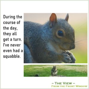
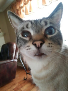
My contributions are somewhat dull this time around with pictures I took through a window. I am always amazed that many of these animals will come that close to the window, but I will admit, the window is somewhat tinted and I am not sure how much THEY CAN SEE in? They sure can see movement though and I think that scares them even more. Animals are always on guard from fast moving predators.
August 20, 2021 at 11:16 am #62205Cassel, thank you so much for the text suggestion. I went back to the instruction text and made the stroke transparent. The letters became so clear and it was indeed so much easier to read. Another lesson learned, merci.
August 20, 2021 at 11:20 am #62208Here are my day 4 pages.
August 20, 2021 at 11:38 am #62211General question. How do I get the two pages to show up next to each other here instead of one below the other? I saved them both on the same page and then cropped it to get to this image.
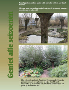
August 20, 2021 at 11:40 am #62212Day 5
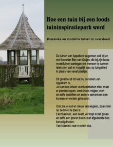
Translation:
If you’ve seen Appeltern one time, you’ve seen it all?
Well, no!
Look at the photo’s beneath, so you can see why multiple visits are recommended!Every season is different in Appeltern.The photo’s above are made on almost the same spot in March and in September.
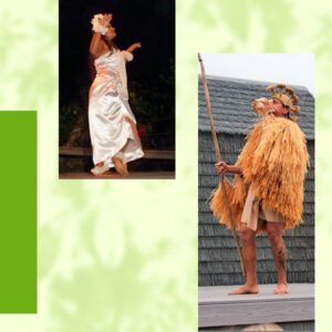
The chair on the top photo, is hidden on the left side of the picture at the bottom.August 20, 2021 at 11:57 am #62215Here is my Day 5 Magazine Challenge, Taking it to the Stage.
-
This reply was modified 3 years, 4 months ago by
Hank Sobah.
August 20, 2021 at 1:13 pm #62218Karon, thank you so much for your kind comment on my layouts. Very much appreciated. <3 …Good to see you posting your lovely work again.
I love to see everyone’s take on this challenge. So much creativity!
August 20, 2021 at 1:40 pm #62221Here is my Day 4.
I tried hard but couldn’t find any photos that would fit the mask shape… I even tried to rotate the template, but I wouldn’t say I liked it. So, this is what I came up with…
Again, I used a photo as the background, changed the blend mode to Luminance, and lowered the opacity to about 30%. Finally, to fill the spaces for the photos, I selected each photo shape from the original picture and promoted it to a new layer.
P.S. I will tweak Day 4 and do what Carole suggested to Ann, two-color text. I was in a rush to finish and post the layouts, but tomorrow I will have more time to play with PSP. 🙂
August 20, 2021 at 1:42 pm #62223August 20, 2021 at 2:12 pm #62224Sue, you mentioned you had problems creating a text.
“Carole, when I went to create the text for today’s challenge, I was unable to see the text as I was typing. Only when I clicked to accept it I could see what I had written. I closed down PSP, reopened it, and all was well all again. I’m wondering if the line spacing wasn’t anything I did, but something in PSP (Text). ”
I experience this here and there since PSP2019. Most of the time, it happens when I use a new font, but it is not something I can reproduce on demand. Anyhow, I got used to it and continue writing…
August 20, 2021 at 2:36 pm #62225Cristina, I have to say that yesterday was first time I experienced it. Using 2021. Annie, was saying it happens in 2022 as well. I’ll see if it happens again. It must be a fairly common blip in PSP. Thank you for letting me know. I love the pages you have created using the photo as a background, and highlighting interesting aspects of it. Great work.
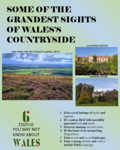
August 20, 2021 at 3:47 pm #62228I did split the mask, I also created another mask to add the larger photo. Used the guides to align the spacing evenly between them. The welsh flag is green and white with a red Welsh dragon. The italic text degraded considerably after resizing.
August 20, 2021 at 3:51 pm #62229Here is day 5. For some reason I couldn’t bet my little pea brain to figure out what I was doing wrong when I tried the way Cassel showed us to split that mask to use tow pictures. (I will try it again sometime) I finally had a brain storm and just added the two pictures I wanted in the right spot under the mask layer. and went to the mask layer, made a narrow rectangle in the middle where I wanted the break to be and flood filled it with the black. It worked at least for this simple layout. I used one of the greens from the background for the lighter part of the text. I have not been using the same font every time like what was suggested because I couldn’t remember what one I had used on one and two.
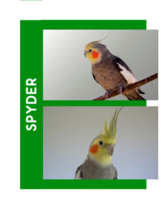
August 20, 2021 at 4:27 pm #62232Spyder always greeted guests with an enthusiastic rendition of the theme song of The Andy Griffith Show. He was quite the charmer as he hopped from shoulder to shoulder playing with dangling earrings or long hair. Sometimes, he would spot a pendant on a necklace, which resulted in startled shrieks as he dove for it.
Unfortunately, the few 40-year old pictures I have of him needed too much work to restore to be ready for this project.
Carole – Rudy’s mask was done with PSP. This is the picture I used.
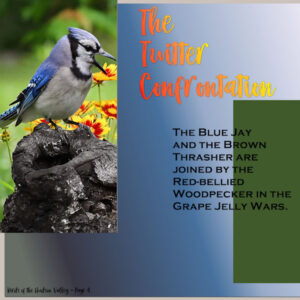
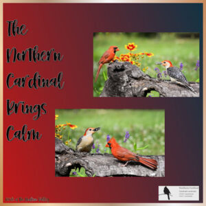
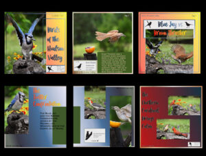
August 20, 2021 at 5:06 pm #62239Here’s the latest with the split mask as instructed. At first I couldn’t see the flood fill until I highlighted the mask layer and lo, there it was! My final bird of this series, the Northern Cardinal, who has been imbued with spiritual powers it seems. All his quotes were foretelling angels. A beautiful bird, and his “wife” is just as handsome in her greenish brown with an orange bill. Is this the final of the series or are there more pages?
I’ll upload the current page plus a display of all the pages so far.
August 20, 2021 at 5:12 pm #62240Sue I can see your love for Wales in every page and I must say I regret not having been there. We have visited England and Scotland a couple of times before my husband got ill. Live happens !!!!
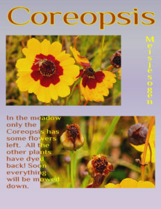
This is day 5 and I not only split the mask but repositioned it too. At first I had both photos to the right and all the text to the left but that was not a pleasing composition. The font is the same but this time with a yellow fill. Background again a vaque gradient with the blendmode set to exclusion. The yellow word “meisjesogen” is the Dutch name of this plant and means “girl’s eyes”.
August 20, 2021 at 6:13 pm #62242Corrie, it’s a great shame that you haven’t experienced Wales. You would have loved it. You would have also enjoyed the National Botanic Gardens in Wales. Situated in Carmarthenshire. About an hours drive from Cardiff Airport, along the coast. I see you have a hover fly on one of your flowers in this page. I tend to notice the insects first then the flowers. Terrific pages, every one! Well done. One thing I noticed, is the outline on the text isn’t how it should be. Check to make sure that the line style is solid. It may not unless it is due to the resizing.
August 20, 2021 at 6:17 pm #62243Very nice Ann, your pages tell an interesting bird story.
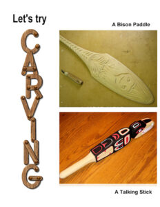
August 20, 2021 at 6:24 pm #62245For those who like working with their hands, there is always wood carving. It’s slow work so it requires endurance and a lot of patience. Some carvings can take weeks to finish especially when there are other things to do, like working on a Magazine Challenge. As you can see the Bison Paddle is not yet finished.
-
This reply was modified 3 years, 4 months ago by
-
AuthorPosts
- The forum ‘Showroom’ is closed to new topics and replies.


