Home of the Scrapbook Campus › Forums › Showroom › Magazine Challenge 2021
Tagged: Magazine Challenge 2021 - Day 7
- This topic has 296 replies, 30 voices, and was last updated 3 years, 3 months ago by
Connie Collier.
-
AuthorPosts
-
August 18, 2021 at 11:05 am #62007
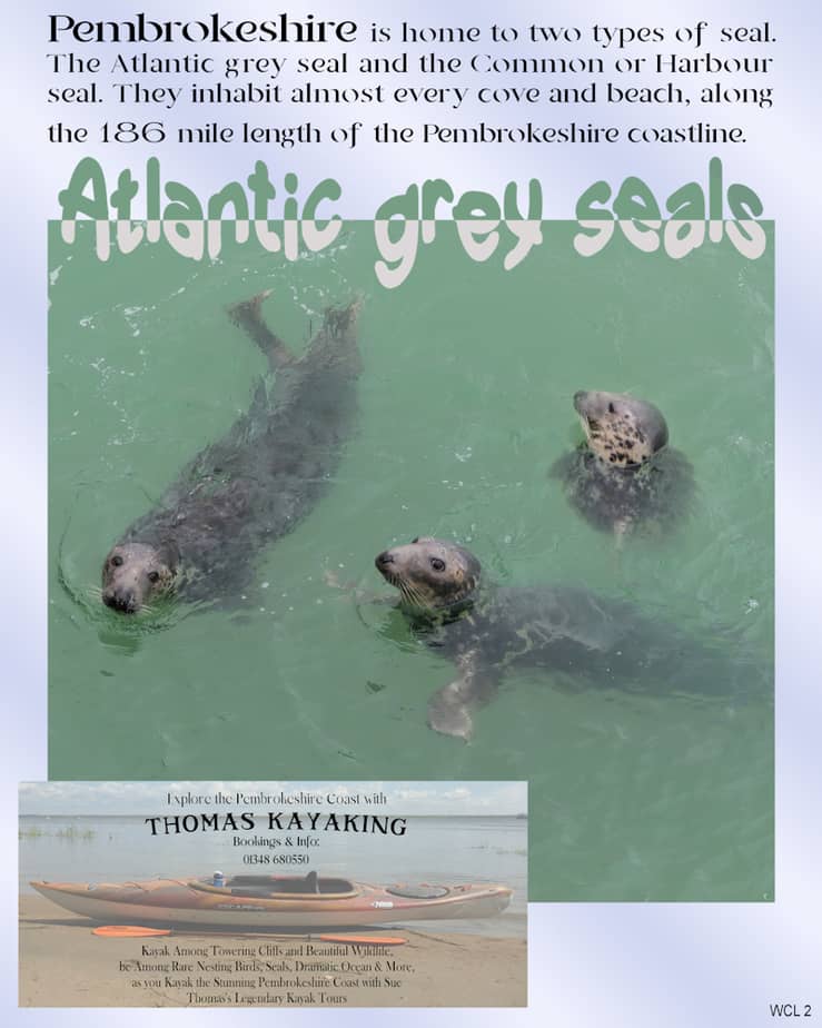
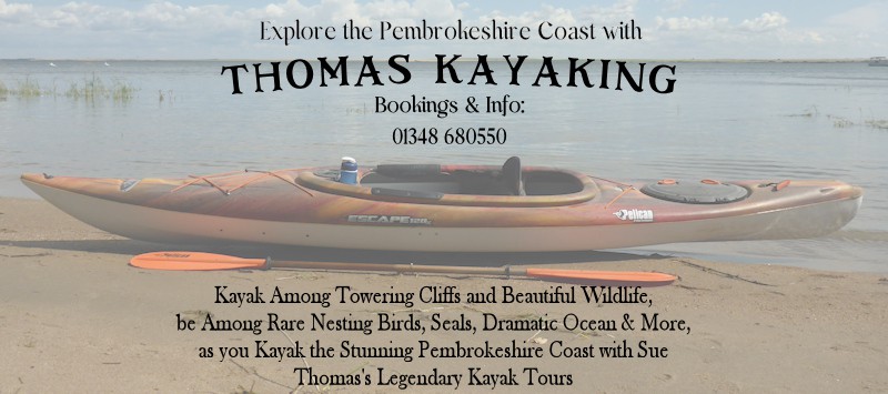
Here is my day 3. I also like the idea of a separate page for ads. I hope it isn’t going to create more work for you though Carole. I waved the text first, seeing as it’s a water photo. I also added a different style of advert using one my photos. The seal photo is also my own, as over the years I have been fortunate enough to see them. The calling of the ocean and the sea air, I love it, and miss it. It’s a fictitious advert, but one can dream!
Monique, I agree with Corrie, magazines are meant to be informative. I am enjoying the theme you chose. I would enjoy reading about Appeltern in one of your magazine pages.
August 18, 2021 at 11:15 am #62009I’ve added the advert, as it is also informative. In case you can’t read it on the magazine page. I lowered the opacity of the photo to make the text stand out more.
August 18, 2021 at 12:21 pm #62012Wow! what nice work you are all doing. Ann, your use of gradients in the title is a nice effect. Sue T, your split title is so eye catching.
I have kept my pages simple so far but very much I like the pages with some explanatory text. I think I will do some of that as well.
August 18, 2021 at 12:25 pm #62013Hi You guys, All
So Beautiful I love them all I want to be like you guys I cant follow anything 🙁 I do try but cant do it once tried the forgot challenge there so hard. I cant do 95 percent of it all going to go try for the first time to do my new button script I bought. You guys are so smart and great. Wished I could thought by now I could kind of do stuff like you guys Your work is Awesome. love you guys really
August 18, 2021 at 1:28 pm #62016Although the overlapping text wasn’t going to work with this layout, I made notes on using it in the future. It should come in very handy.
I did, however, put text on a busy background. To help make it more readable, I experimented with using a drop shadow. It didn’t take much, but it made a noticeable difference.
The idea of ads is great, adding to the authenticity of the magazine style.
August 18, 2021 at 2:07 pm #62014I do not understand anything anymore ; (3 times I put my message to give the credits of these graphics ???? and I still do not see this message !!! I try one last time: they are all fonts 🙂
alarm clock > (I just changed the time) https://www.dafont.com/fr/back-to-school-elements.font
growth chart > (uppercase L a little transformed) https://www.dafont.com/fr/toolbox.font
feather > https://www.dafont.com/fr/penmanship-feathers.font
doodles > Banitta Doodles by ©JunCreative sur le site CreativeFabricaI cross my fingers for this message to pass
August 18, 2021 at 3:49 pm #62025No adverts for me as I am sharing my finished project pages with my friend that was here and watched the birds to begin with. I do know how to make adverts as I have made them for many years in real life work … but keeping my page clean to share with her. Doesn’t take much to make an inactive friend happy so that’s what I am doing. Besides, you folks know all about the animals in my shares. I don’t need to tell you about them … now if they were Annie’s T’s beautiful and colorful birds that would be worth a story! LOL Love the different takes on one topic and always enjoyable to see where everyone goes with it. Thanks for sharing them.
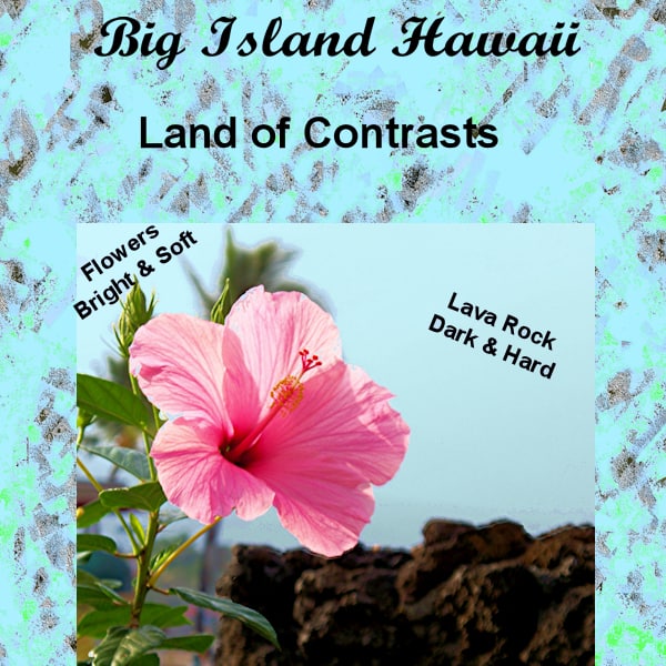
August 18, 2021 at 3:52 pm #62026Magazine challenge day 3-)First off I want to tell Cassel that she and everyone else are welcome to go on that vacation with me provided you can time travel back to when I went.) The background paper is one I created a long time ago. The photo is mine. I did enhance it and the selected the lava rock and made it even darker. I didn’t try the over lapping text, I guess I could have made the lower ones larger and overlapped them but with this background I couldn’t get them to show up like I wanted them to.
August 18, 2021 at 5:13 pm #62035Thank you Carole, I’m glad you like the theme.
Sorry I don’t write much about your beautiful pages, but it’s not easy for me to write in English, and Google helps me every time, and that’s not the same as when you really speak the language. I understand everything in English, but writing and expressing myself in English is not so easy.
So sorry for thatThis is my page for Day 3
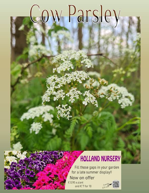
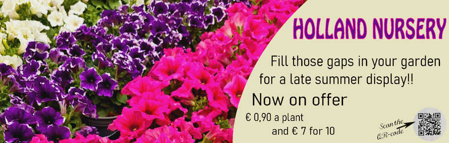
August 18, 2021 at 5:25 pm #62036My day 3 page with an ad (thank you Sue for this challenge in a challenge)! As I used a font with an outline on the other pages I wanted to continue that and therefore only decreased the brightness to about – 175% to keep the outline visable. The photo on the ad is one I took 2 weeks ago in a “real” garden centre where we often come, it has a nice coffeecorner too. I also put a QR-code on it because that is what is nowadays usual. I didn’t make the QR cube, I have no idea how to do that and haven’t found a tut for it either. Carole an idea perhaps?
There are made so many lovely magazines so far, it is a pleasure to browse here.
August 18, 2021 at 5:27 pm #62038For better visability here is my ad.
August 18, 2021 at 5:38 pm #62039Oh wow Corrie, that is a stunning page. You also did a grand job on the advert. With regard to the QR code, Carole does have a tutorial in the Creative scrap, in the campus. It’s one of her older tutorials.
August 18, 2021 at 5:46 pm #62040Art, thank you for your comment. I’ve enjoyed you pages, you are a talented man. Turning your hand to many crafts. Well done.
August 18, 2021 at 5:56 pm #62044This is so much fun. I am so glad I joined this because I get to see so many different beautiful pages. I redid my cover and here is page 3.
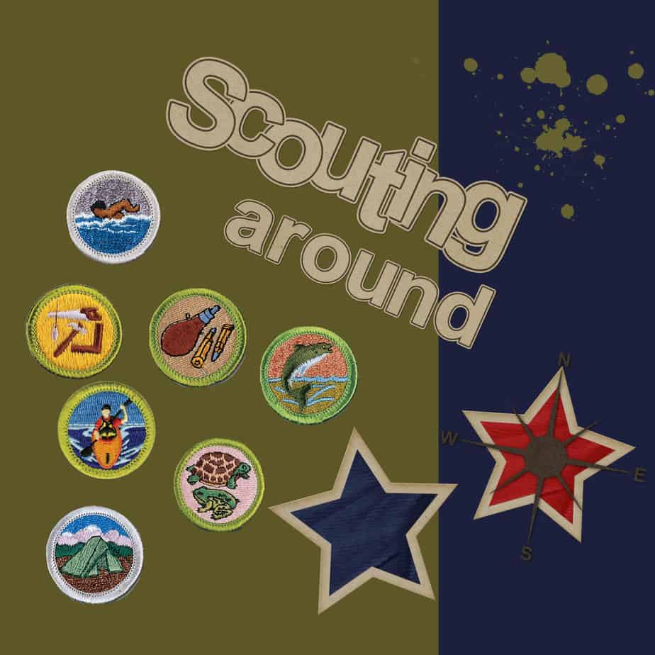
Carole – Yes the green is significant in scouts… so I took out the tree.
August 18, 2021 at 6:02 pm #62047EDIT:
As I go along with this challenge I think my pages are becoming a little better. I changed the colors in all my pages so far so they will fit together better and I like the new look.
This is page 3 much better color. The title is brighter and the text box is a soft teal.
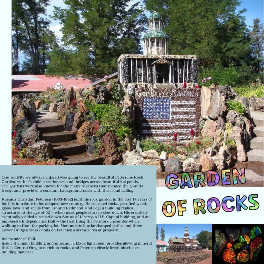
Since the photo is small I’ve decided to put the text here for those who want to read it.
*******************
One activity we always enjoyed was going to see the beautiful Petersons Rock Garden, with it’s child sized houses and bridges across beautiful koi ponds.
The gardens were also known for the many peacocks that roamed the gounds freely. and provided a constant background noise with their loud calling.Rasmus Christian Petersen (1883-1952) built his rock garden in the last 17 years of his life, in tribute to his adopted new country. He collected rocks, petrified wood, glass, lava, and shells from around Redmond, and began building replica structures at the age of 52 — when most people start to slow down. His creativity eventually yielded a scaled-down Statue of Liberty, a U.S. Capitol building, and an impressive Independence Hall — the first thing that visitors encounter when walking in from the parking lot. Monuments line landscaped paths, and three Tower Bridges cross ponds on Petersen’s seven acres of property.
Independence Hall.
Inside the main building and museum, a black light room provides glowing mineral thrills. Central Oregon is rich in rocks, and Petersen clearly loved his chosen building material.*****************
August 18, 2021 at 6:09 pm #62049Finally, got the cover done. Will be using Kimeric’s At Day at the Beach for paper and extras (if needed) and the font is Times New Roman. Went for paper size A4 as that is a standard magazine size.
August 18, 2021 at 7:31 pm #62050Cristina: Awesome magazine cover, can’t wait to open it. And I wasn’t disappointed. The photos on Day 2 and 3 are spot on and the information was entertaining to read.
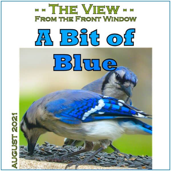
Ann: Loving the “Birds of the Hudson Valley” cover. It will be interesting to read all about them. Day 2 page is perfect. I really like how you added their scientific names as well as general information about them. Day 3 has a fantastic picture of the blue jay and brown thrasher.
Monique: The magazine cover is so gorgeous and what a lovely garden park. Both of your cover pages are lovely. The next page is so relaxing to look at. Beautiful. Day 3 is just a beautiful and I really like how you are consistantly using the gradient to tie all together.
Anne: Looks like we had something similar in mind. Great cover. Day 2 layout is wonderful. It is definitely a long trip huh? How lovely is the flower and lava rocks of the Big Island. We didn’t get a chance to go over as we were there for vow renewals for our son & dil.
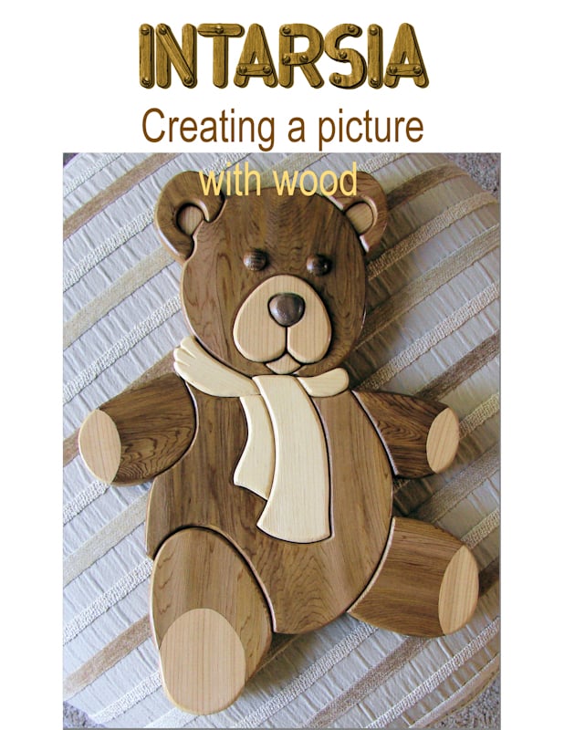
Art: Fantastic cover. Will be waiting on bated breath to read about all the projects. Next page is great. And a fantastic idea to lead in with safety tips. Liking Day 3 page. Cute and informative.
Lynda: Both covers are gorgeous. Will be looking forward to seeing more.
Fiona: Stunning cover. I am hoping that we will be seeing recipes within the magazine? You did a great job on merging the photos on your Day 2 layout. The photos are great as well. Day 3 has a fabulous photo of the broad beans. Are they as tasty as they look?
Sue: Charming cover. Looks so professional. Day 2 is so nice. I like how you included an “ad” for the Sheep Shop. The pictures are lovely and the information well worth the read. I really enjoyed reading about he Atlantic grey seals and looking at the mischevious looks upon their faces. Enjoyed the advertisement as well.
Minka: All three covers are darling. What a great title for your magazine. Oh my, what a brood of birds. Great picture and layout. The blue jays photo is breathtaking. The blues are so vibrant and I like that you used them as a gradient in the title.
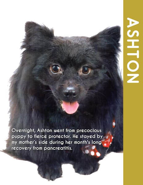
Gerry: Love the sepia look you used for your cover and the pets are adorable. Just got to your revisit. It is lovely; but both are so well done. Loved the story about River and like how you put the page together. Ashton is adorable and I loved reading about him.
Corrie: Spectacular cover. I really like the gradient you used under the title. Really makes it pop. Day 2 has an exceptionally lovely photo and very interesting information about the Eupatorium. Nicely done Day 3. Got a kick out of the ad.
Paul: Wonderful cover to the magazine. I look forward to seeing more pictures of Arizona. Great job.
Marie-Claire: Wow, that is fabulous and how lucky you live so close to such great art. Your second page layout is so vibrant and lively. I am in awe of the art you have around you and your layouts.
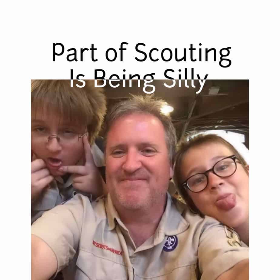
Val: You magazine is going to be full of information about scouting and I like how you used their colors in your cover. Yep the cover looks better and I just knew we were going to see more of your family scouting get togethers. Great Day 2 and really liked how you added a cutline. You just keep getting better and better. Like the addition of the badges to the cover. The boys look just like I remember them, LOL
Annie: As always you know how to make an entrance. What a fantastic cover for “Touring Australia”. Either way you do it, the covers are gorgeous. Day 2 is another stunning page with the beautiful blues.
Hank: Fantastic photo and great name for your magazine. Can’t wait to see more. And you didn’t disappoint with your next page. Great read.
Diane: Your covers and page 1 are very nice. I really enjoyed reading about your adventures. Garden of Rocks is a lovely page and the information was very interesting.
Nadine: Great cover and looking forward to reading all about your granddaughter. Day is a perfect start to the magazine.
Euka: You’re not the only one, lol. I just got my cover uploaded. I really like the look of your cover page.
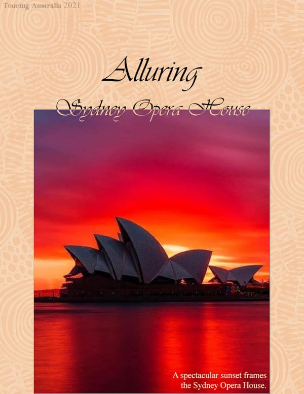
August 18, 2021 at 10:12 pm #62052Thanks to everyone who has given my work delightful comments … always appreciated my friends. This magazine I am creating ‘Touring Australia’ incorporates the most popular holiday destinations in each state of Australia (7) and, as you can imagine, by no means covers all that is in the offering. I am going from the east coast, south, west coast and finishing with the north. As Carole has indicated there will be 8 pages I am planning a summary for the 8th page … but, that may change as things do. This gorgeous photo of a sunset crowning the Sydney Opera House was a must so I hope you enjoy perusing. All fonts used are the same as the previous pages. Thanks for takin a peek my friends. ;D
August 18, 2021 at 11:20 pm #62053Annie, what a stupendous page. I love everything about it. The font is so fitting, as is the background paper. I really like the revised cover page, not that there was anything wrong with the original. The page size makes all the difference. May I make one suggestion on the opera house page? The split text, I would be inclined to stretch it vertically, before converting it to a raster. So you have more height on both on and off the photo. Giving more definition. Everyone who has participated has submitted exquisite pages. With Carole at the helm, we all have something to offer, whether it’s a tip, or knowledge to help someone out. The campus is an awesome place to be.
August 18, 2021 at 11:23 pm #62054We are definitely an active bunch of PSPers!!! Great job!
Annie, that overlay is so delicate! It really adds a nice touch. Beautiful photo of that beach. I would love to go! And that picture of the Opera house. That is stunning!
Monique, thanks for the link for us, outsiders!
Cristina, it is amazing how those simple layouts can be so interesting to look at.
Euka, naming the font on the layer is a good idea. You can also add any type of information on the Image Information. And if you can’t decide what to use for the theme, you might end up with more than one magazine!
Ann S. I see you used a tiny shadow on the text. Did it not stand out without shadows? That is definitely a great photo!
Fiona, that is typical that the display is not as crisp when resized for posting. At least, if you ever print your magazine, you will have the full-size original for it.
Sue, I am curious to know why the fourth line of text seems spaced further than the other three. That wavy title is perfect for that photo.
Art, that is a great photo to showcase. I love how those pages are not distracting us with a ton of decorations. Those photos deserve to be the stars!
Cindy, did you register? This challenge is probably the easiest of all since there is no clustering, no shadowing, no layering, etc. Give it a try.
Gerry, this is a perfect example of a drop shadow used for something other than a drop shadow. If you had not said there was one, I would not have seen it, yet you have a very legible text with it.
Nadine, it is re-added now. For anyone else who might notice their post not displaying, drop me a message: sometimes, the system is overzealous and wants to protect everyone else from potential spams, so it might catch your post in that filter.
Minka, are you considering printing that magazine? It would be great for them to have something physical to flip through! A definite conversation starter!
Anne L., try that technique on a different page.
Marie-Claire, that overlapping text technique looks great on that photo! And you did a fantastic job with those additional photos and text. It really looks like a magazine page!
Corrie, there is a tutorial in the Campus to make a QR code, and there is also a script in the store to make some. Remember that they LOOK like QR codes, but they don’t work (just like the barcodes).
Val, although magazines don’t have shadows usually, those badges might use a little bit. That overlapping text looks great on that photo.
Diane Co, even though you seem to have more text than others on that page, I think that it would be as fun to read as any magazine article. Of course, it is always smaller when posted in the forum! 🙂
Karon, is that supposed to be a ticket in the white rectangle? If so, why not make fake data that look real? Or are you going to put the actual data for your own use?
If anyone is reading this and has not yet posted, don’t be shy. These pages are very quick to create and are perfect to showcase your favorite photos.
August 18, 2021 at 11:37 pm #62057Carole, well spotted, I may not have used control A to select all the text, and missed the last line when selecting the text. To alter the spacing. I can easily amend it. I didn’t notice it. Thank you.
August 19, 2021 at 5:29 am #62064Dear Sue you are so very right. I thought it was a bit hard to see but with a little verticle tweeking it should stand out nicely. I will give it a go when I find time. Thanks dear friend, very much appreciated. <3
August 19, 2021 at 5:30 am #62065Marie-Claire, I am truly enjoying your project. That street art is stunning and to think you can walk around feeling you are right there in it! When I need to post in a “foreign” language I type in my native English and then go to Google and get it translated and then post that. What conveniences we have now!
Marie-Claire, j’apprécie vraiment votre projet. Ce street art est magnifique et penser que vous pouvez vous promener en vous sentant bien dedans ! Lorsque j’ai besoin de publier dans une langue “étrangère”, je tape mon anglais natif, puis je demande à Google de le traduire pour moi, puis de le publier. Quelles commodités nous avons maintenant!
August 19, 2021 at 9:24 am #62069I liked the creative uses for the split colour text particularly of the watery effect on Sue’s design and Val’s approach makes the text look intentionally ‘silly’. Then I got carried away looking at Art’s skill at his wooden pictures.
Carole, I hadn’t thought of recipes but that is a good idea as I have photos of some things being made in the kitchen.
August 19, 2021 at 9:31 am #62072For my Day 4 as we are using repeat colours I created a new colour palette named Magazine Challenge. I used the slider to find the colour values.
Having decided to keep the template proportions for this challenge, I didn’t want to distort my photos in order to fit the panels. Instead I used the lock layer and floodfill taught in Day 3 to change the colour of the photo layer.
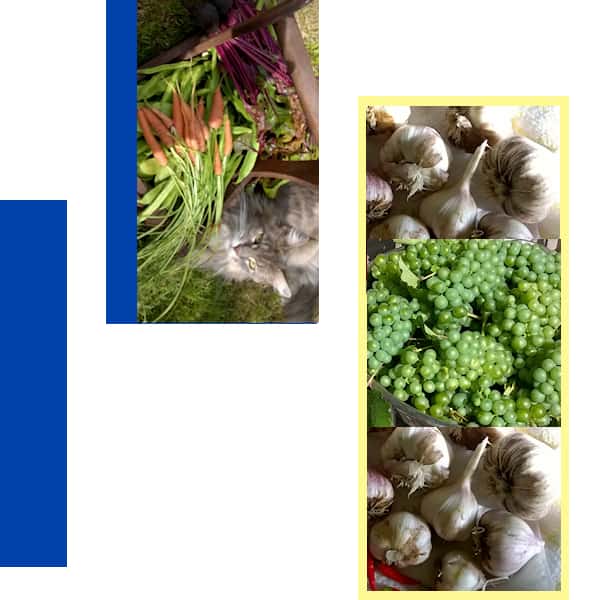
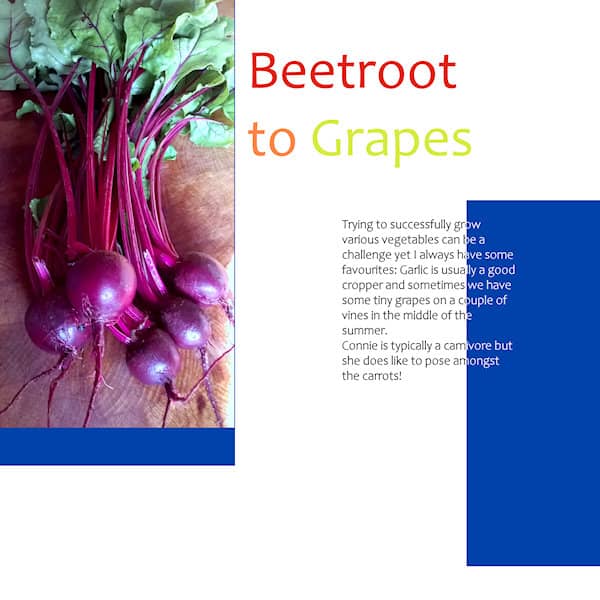
As usual Connie the cat appears in a photo!
August 19, 2021 at 10:21 am #62073Carole, Thanks for the comment. One is a barcode and the other is an address label. There is data in both of them. Just small.
August 19, 2021 at 10:26 am #62075Hi guys, I am a little late arriving at the party. I love everyone’s designs so far. Here is my magazine cover. Thanks for looking.-Laurie
August 19, 2021 at 10:26 am #62076Annie: Your photos are so stunning and I love the sky behind the opera house. So beautiful. Maybe one day I will manage a trip to Australia.
Fiona: Loving the photos of the veggies from your garden. You are definitely a master gardener. And Connie looks so at peace among the carrots.
August 19, 2021 at 11:00 am #62077Just a quick reminder for all the participants: resize your image before posting it in the forum.
Save a smaller version for here, using -600 or 600×600 in the filename, so you don’t overwrite your original.
August 19, 2021 at 11:25 am #62079Been busy with the house selling so I’m a bit late but I’ll try to keep up.
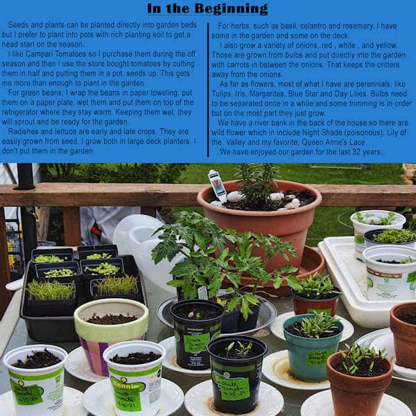
Day 2- The Garden – In the Beginning
-
AuthorPosts


- The forum ‘Showroom’ is closed to new topics and replies.


