Home of the Scrapbook Campus › Forums › Showroom › Magazine Challenge 2021
Tagged: Magazine Challenge 2021 - Day 7
- This topic has 296 replies, 30 voices, and was last updated 3 years, 3 months ago by
Connie Collier.
-
AuthorPosts
-
August 17, 2021 at 2:47 pm #61927
My Day 2 – Page 2 of Birds of the Hudson Valley. The Brown Thrasher likes his grape jelly! He has a staring eye like the grackle. If he meets the Blue Jay, things may get exciting!
My bird info comes from the Cornell Lab of Ornithology here in New York. As you can see I rotated the template to accommodate my photo that is in landscape mode rather than portrait. Using the Berlin font again but this time with Arial instead of Copperplate.
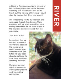
August 17, 2021 at 3:33 pm #61930Day 2 is devoted to River, my precocious cat. She loves the fireplace. Ours is gas and has a thermostat. Whenever it turns one, River runs from wherever she is. When it turns off, she starts to fuss.
August 17, 2021 at 3:35 pm #61932Magazine challenge day 2. Cassel Putting together the page didn’t take too long after I combined two photos to try to get both of us in a more or less tall picture. Next time I may just use the landscape shaped photos one over the other.
August 17, 2021 at 3:41 pm #61933Ha ha ha! Gerry, that’s really funny. I’d love to meet River who truly seems precocious. I also have a black and white Tuxie. They are lots of fun. That is such a nice layout for her story. Well done.
-
This reply was modified 3 years, 4 months ago by
Ann Seeber.
August 17, 2021 at 3:45 pm #61934Day 2, I kept more in keeping with the initial layout. I do like the 8×10 size for magazines, and flyers. On the cover I mentioned recipes, and seeing as I showcased a Welsh ewe and her lamb, I added the traditional Welsh cawl recipe. Magazine pages are packed with adverts, so I decided to showcase a Welsh love spoon, with the Welsh Dragon on it. There actually is a gift shop in Haverfordwest called the The Sheep Shop. The landscape is a photo I took several years ago of where I was raised from a baby. You can just see the chimneys of the house, the buildings are nestled amongst the trees. My parents have been long gone, but my brother still farms sheep. Craig Las means Rock Blue in English ( Blue Rock) Much of the Welsh language is spoken backwards, when translated into English. Having small hands as a child, I have drawn thousands and thousands of lambs over the years, and rolled the same amount of fleeces. Oh yes, I also added a page number. WCF is an abbreviation of the magazine title.
August 17, 2021 at 4:32 pm #61938Sue, delightful page! I’d love to visit the land of the Welsh Princes! In your recipe there is something strange to me. What is swede?
August 17, 2021 at 4:46 pm #61941Thank you Ann. There are turnips and swedes, they are both root vegetables. Swedes are more yellow than turnips and a different shape. North Americans refer to them as Rutabagas. A swede is not a turnip, although they are both root vegetables.
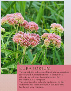
August 17, 2021 at 4:49 pm #61942Day 2 and another flower with a matching story. I kept it very simple, same font and again the colors are from the photo.
Sue I like your adver and must look into that and see what I can come up with!
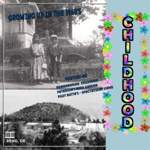
August 17, 2021 at 5:10 pm #61945UPDATE EDIT
amazing pictures and a wonderful tutorial from Carole. I am finally getting the hang of creating a more cohesive look. also my pages are starting to look more like magazine pages.
I am putting up the first 2 redone so they both look more connected.
since the name of my magazine is “Childhood” I am going for a more colorful look.
my future posts should continue to have light blue backgrounds and colorful titles with a teal color text box. I am liking the more subtle colored palette to go with the black and white photos.
since the print is small on the page I decided to include it here:
***********
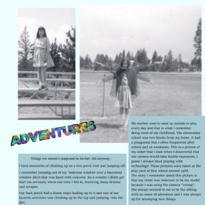
My mother used to send us outside to play every day and that is what I remember doing most of my childhood. The elementary school was two blocks from my home. It had a playgound that I often frequented after school and on weekends. This is a picture of my sister that I took when I discovered that our camera would take double exposures. I guess I always liked playing with technology! These pictures were taken at the play yard of that school around 1966.
The story I remember about this picture is that my sister was reluctant to be my model because I was using the camera “wrong”. She always seemed to me to be the sibling with no sense of adventure and I was always up for attemping new things.
___________Things we weren’t supposed to do but did anyway:
I have memories of climbing up on a low porch roof and jumping off.
I remember jumping out of my bedroom window over a basement window ditch that was lined with concrete. Its a wonder I didnt get hurt too seriously when one time I fell in, receiving many bruises and scrapes.
Our back porch had a dozen steps leading up to it and one of our favorite activities was climbing up to the top and jumping into the dirt.
-
This reply was modified 3 years, 4 months ago by
Diane Co.
August 17, 2021 at 5:13 pm #61946Beautiful page Corrie, you take beautiful flower photos. You have a good keen eye. Using an advert is another way to showcase a photo or in this case an element, which I extracted from a photo. The gift shop was aptly named for this page. As it featured the Welsh sheep. Perhaps an advert challenge could be planned for down the road. Using elements created by us, like chains, belt buckles, buttons, and hundreds more.
August 17, 2021 at 5:24 pm #61948It’s pretty cool the results are different from all 🙂
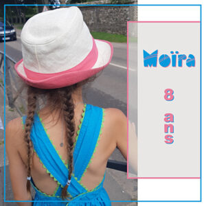
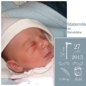
here is mine, on the theme of my granddaughter’s first 8 years.
I admit that I really like rectangular formats;) I might do another one with this format, laterDay1
August 17, 2021 at 5:24 pm #61950My day 2
August 17, 2021 at 7:16 pm #61951Cassel, Thank you for the feedback. I keep forgetting we are doing a Magazine. Thanks again!
August 17, 2021 at 7:56 pm #61954So amazed at what everyone has done. Gives me so many awesome ideas! Ok, tried to change the cover some. Still need to do some more to it. And here is the new cover as well as my first page with text.
August 17, 2021 at 10:22 pm #61961Glad to see all those layouts posted. I told you they would be quick to make!
Marie-Claire, that is such a neat subject and your page is very interesting to us, as we discover something totally new.
Hank, that page put a smile on my face. Is that you in the picture? On the second page, is the image distorted or is it done like that? If the image is larger than the area suggested, I would recommend that you resize it to match the width and leave some empty space either on top or on the bottom as to not distort the image. However, since it is a piece of art, MAYBE it is drawn like that? For the fill of the background under the text, make sure that the Fill tool is not set to Use all layers. You need to fill in the little holes in the letters.
Minka, even if only from your window, you are sharing such fun photos. And isn’t that easy to do?
Monique, I can understand that you are concerned about changing settings. However, it is with experimenting that you will learn and understand the tools better. Beautiful photo to showcase!
Art, your magazine is really giving the feel of a printed document we would find in a store! Looking forward to the next ones.
Ann S., rotating the template is definitely one creative way to use it, and the result is great.
Gerry, that is such a fun page. Are you going to tell more stories in each subsequent page? It will be so much fun!
Anne L., are we invited on the trip too? 🙂
Sue, I never thought to add advertisements to pages, but you are right: they are often in magazine pages. Maybe we can also have a whole page dedicated to ads at the end?? That is another possible twist on this challenge.
Corrie, those are beautiful flowers, and you are correct, simplicity is just what we are looking for in this challenge.
Diane, stories are always important in scrapbooking, whether we tell them in photos only or in text too. And why not learn PSP at the same time? That is great! And remember that as you save the projects in .pspimage format, you will have many opportunities to tweak them and change your mind multiple times!
Nadine, I really love the idea of a photo from behind. It makes me want to know more about this person. That is a great choice for a cover. Where did you get those “icons” for page 2? They are great ideas!
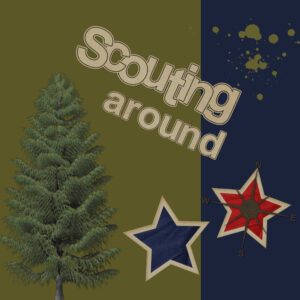
Val, do you have a reason to use a dark green on your page? Is that meaningful of something? Personally (unless it is specific colors for something), I would have used a lighter version, so that the tree would stand out more.
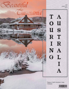
August 17, 2021 at 11:43 pm #61966Well I decided to revise my cover page and make it a magazine size … 2550 pixels wide x 3300 pixels in height. Following in the footsteps of Corrie, Sue, and Gerry and added a little extra in the sky with the font Vivaldi … tip came from Sue. The overlay on the mauve background paper is aboriginal art. Thanks for takin a peek my friends.
P.S. Again such beautiful work by all and helpful tips coming from everywhere, what a Campus!
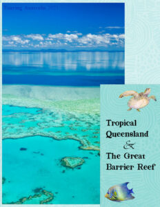
August 18, 2021 at 1:04 am #61968Day 2. My home state Queensland with the Great Barrier Reef just a skipping stone from our shore. I stayed with the same fonts and background overlay just changing up the colour to suit the photo. Thanks for takin a peek my friends. ;D
August 18, 2021 at 7:10 am #61971I’m always amazed how the same theme can give such different results, wonderful projects!!
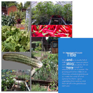
August 18, 2021 at 7:31 am #61973Well I have made a right muck up of my Day 1 so will have to go back and redo it. Firstly thank you Lynda and Sue for assisting with the multi image merging. I managed to have images outside of the ‘Photo’ layer as well as separate layers inside but with your help I think I have got that right.
The grey background is not to my liking but I don’t want white as a bit of a background helps. Being a bit afraid of making changes to the template I have not yet changed it. How can this be done?
Then when I entered my text I cannot get rid of the headings ‘Title and story here’ so clearly I have done something wrong there. I tried to change the layer to a raster as suggested but when I activated the text tool a new vector layer appeared for my Title text.
I have noticed an annoying thing that where I had the abbreviated word ‘don’t’ at the end of a line, the wrap feature saw the apostrophe as a space and broke up the word. In the end I changed ‘don’t’ to ‘do not’.
August 18, 2021 at 7:47 am #61974Fiona, to answer your questions:
- for the grey background, it is just a placeholder. Look in the Layers palette and simply hide that layer and it will disappear
- the layer for the title and story is also a placeholder. When you add your text, it adds its own layer and it is normal. Again, just find that layer in the Layers palette and hide it
- the issue with the Text wrapping is a known limitation. I guess PSP can’t spell correctly!
-
This reply was modified 3 years, 4 months ago by
Cassel.
August 18, 2021 at 7:52 am #61975Hi Carole, I think your answers given to Monique were for me (Fiona) as I am the one who has got in the mess! Thank you loads though. I have amended the text issue and starting to understand it a bit better now.
August 18, 2021 at 8:43 am #61979Day 3
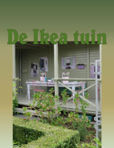
This is my favourite garden in Appeltern. If you would like to have look what Appeltern is, check their site: http://www.appeltern.nl
-
This reply was modified 3 years, 4 months ago by
MoniqueN..
August 18, 2021 at 8:49 am #61982Beautiful the new layouts posted. So much inspiration!
August 18, 2021 at 8:53 am #61985Here are my Day 2 and 3 layouts.
For day 3, I used a photo as the background, changed the blend mode to luminance, and the opacity to around 35.
Font: Bauhaus Std Medium
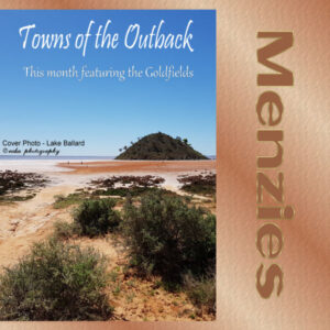
August 18, 2021 at 8:57 am #61986Hi – Sorry to be running behind – that is one of the problems of being a procrastinator and not being able to decide on what/where/who to showcase. I decided on the Goldfields of West Aust. Lake Ballard is a huge salt lake and is home to the largest outdoor art gallery in the world with 51 steel statues spread out over 7 sq km.
Annie might visit me in her travels around Australia!
An amazing lot of creativity is being displayed in the magazines, there is so much talent here and the suggestions/tips are always appreciated.
One thing I like to do when working with fonts is to rename the font layer with the font name and size I used.
August 18, 2021 at 9:22 am #61988So many wonderful pages, each one a source of inspiration. I’m also enjoying the visual trip around the world from the comfort my chair. Well done ladies and gentlemen!
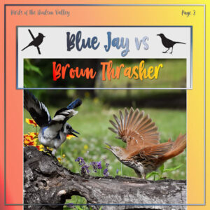
August 18, 2021 at 9:47 am #61997Here’s my Day 3 – Page 3. I told you there’d be trouble with these two! 😉
Same font (Berlin Kitchen) as the cover but used two different gradients this time and kept with the style of the cover by adding a light shadow.
Edit: I added the bird silhouettes to the top of the page and now it looks finished to me!
-
This reply was modified 3 years, 4 months ago by
Ann Seeber.
August 18, 2021 at 10:08 am #61999Monique, I like your theme, we have visited Appeltern too. You give their website in your comments, but as this challenge is to make a magazine why don’t you include that info on one of your pages?
August 18, 2021 at 10:11 am #62000Carole I like your suggestion to do a sepate page with ads as that is done in lots of magazines!
August 18, 2021 at 10:30 am #62005Day 3. I have caught up and here is my design for page 3.
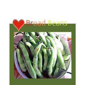
The heart layer (from Pixelscrapper) I duplicated so that the bottom part of the heart appeared on top of the green and the top part of the heart was on the other layer that covered the white.
My photo of beans I used Effects\plugins\pic to paint ‘watercolour’ and then bumped up the colour a bit with Adjust\Colour\fade correction.
On the print out of the file the lettering shows up fine but this miniature jpg not so well.
-
This reply was modified 3 years, 4 months ago by
-
AuthorPosts
- The forum ‘Showroom’ is closed to new topics and replies.


