Home of the Scrapbook Campus › Forums › Showroom › Magazine Challenge 2021
Tagged: Magazine Challenge 2021 - Day 7
- This topic has 296 replies, 30 voices, and was last updated 3 years, 3 months ago by
Connie Collier.
-
AuthorPosts
-
August 16, 2021 at 1:17 pm #61835
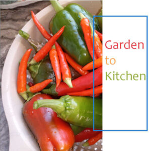
Hi everyone and thank you Carole for an interesting challenge. I have not done one of these before so am getting prepared. My subject will be Garden to Kitchen as I have lots of photos of my garden and of the produce. Might be a lot of photos of marrows though!
August 16, 2021 at 1:54 pm #61838Hi everyone,
Love all the interesting ideas that are showing up already. it is always great to get ideas from your work.
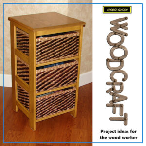
Cassell, thanks for the ‘custom wood text’ you gave out a while ago. My theme on this challenge is an excellent place to use it.
The baskets here are store bought, but the stand was built in my shop. It now gives easy access to our gloves, hats and scarves.
August 16, 2021 at 2:07 pm #61841I originally wanted to do 4 Seasons but couldn’t think of one photo to depict the title. Then I decided to do the garden so here are two. Maybe I’ll find something to cover all the seasons later if not I’ll go with the garden.
-
This reply was modified 3 years, 4 months ago by
Lynda DiGregor.
August 16, 2021 at 2:53 pm #61844Here’s my Day 1 cover and like Lynda have focused on the garden. My cover photo is of peppers that I have grown and then visited the kitchen.
The font I have used is called Candara and I have used the dropper tool to select colours selected from the photo for use on the text.
To have more than one photo as Lynda has done, do you just keep adding to that photo layer?
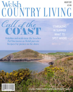
August 16, 2021 at 2:57 pm #61847I see there are already lots of lovely pages posted, well done! Some of you will already know that I will use a magazine cover layout to showcase my insects, mammals and landscape photos. I got a bit carried away with this layout I’m afraid. I will keep to the layouts for the next pages. I thought I’d showcase some photos I take when I go home, of my beautiful homeland, Wales. I’ll share my little tip with you. When I select a photo for a cover, I choose one which has a relevantly plain area like the sky in this photo, to use for the text. That way, the photo isn’t obstructed to much by the text. After all, it is the photo that I’m showcasing. Wales is renowned for it’s outstanding coastlines, and it’s marine habitat.
August 16, 2021 at 3:04 pm #61850Fiona, not to the main photo layer because it’s a mask. You can either merge the mask group, or click the top layer of the mask, and then paste as a new layer your image. Because they will be on their own layer, you can move them around and resize them to your liking.
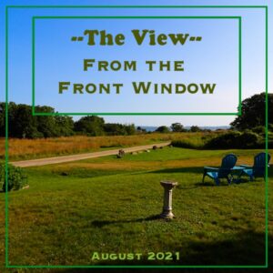
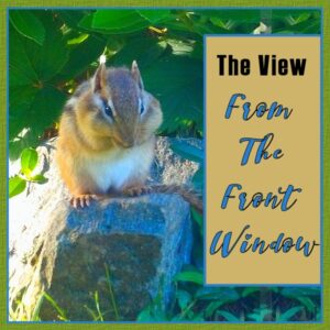
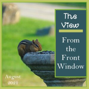
August 16, 2021 at 3:13 pm #61854Hello everyone! I recently had company for a few weeks that required oxygen 24/7 and not much movement … so I kept her entertained with the view from the front window. My pictures will be the wildlife we lured in … with food, seeds and water. We ended up with all the little’s (rodents) … birds … bigger birds … and toward the end, unfortunately, birds of prey. So that’s what I will be using as we go along. Same view … taken through the window … but different animals. You will see, too, we had a little fun with them along the way. The animals are very clever! Kept this first one pretty simple — made a few because of the simplicity … so sending them all.
August 16, 2021 at 3:58 pm #61864Art, Fiona, Linda, Sue, Minka: Your magazine covers are delightful! I’m getting so many ideas. I hope we do this more often!
August 16, 2021 at 4:22 pm #61867It is always a pleasure to see everyone’s work. The participants are a diverse bunch with interesting perspectives and ideas.
This week is devoted to my furry and feathered friends. All have unique and often quirky personalities.
The picture is from Pixabay and the font is Odin Rounded from DaFont.com.
August 16, 2021 at 5:01 pm #61870What a very nice and very different “magazines” are to be seen here! Wow, I like them all.
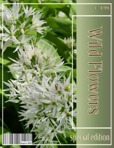
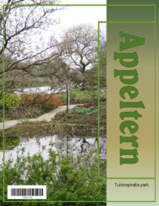
I have used a 8,5×11 format because I find that more a magazine instead of a scrapbook layout. A gradient under the title and I added a barcode; the colors I took from my photo and the font is Philosopher with an outline to gave it a little more body.
Looking forward to tomorrow.
August 16, 2021 at 5:05 pm #61872My first everything kind of sort of, thanks for your help.
August 16, 2021 at 5:12 pm #61875Hello everyone, what a beautiful magazine pages are already here.
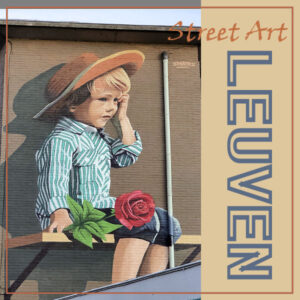
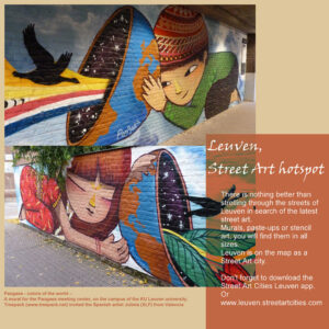
For me this is the first time to create such pages, here is the first. The city of Leuven (Belgium) where I live is a city rich in street art. The photo I used for the cover can be seen Not far from my house.August 16, 2021 at 6:03 pm #61877So many beautiful covers! Still playing with mine but this is the latest…
August 16, 2021 at 9:07 pm #61883Ann, you have created a delightful magazine cover my friend and I am looking forward to viewing the rest of your pages as we go along. ;D
August 16, 2021 at 9:12 pm #61884OMGosh! I thought there were only a couple of participants to respond to but on second glance there are far more than that so I will just make one comment for all … Splendid work my friends, a joy to peruse. ;D
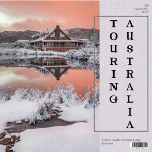
August 17, 2021 at 2:58 am #61888Well I decided to stick with the 3600×3600 format … not that you see a lot of ‘square’ magazines but why not be different. I have sourced some beautiful photos of Australian holiday destinations so I thought I would go with touring Australia. I liked the idea of a bar code so thanks to Cristina, Sue and Corrie for putting that idea into my head. Fonts used are Magazine 2 and Times New Roman. Thanks for takin a peek my friends. ;D
August 17, 2021 at 4:24 am #61890MoniqueN and Ann, thank you very much for commenting on my layout.
I am in awe! Look at all those wonderful and unique magazine covers… This challenge has started at a high level.
There are already too many to mention individually, so…
Congratulations, …. ! (read your name here) 🙂
August 17, 2021 at 8:01 am #61894Corie’s use of the 8.5 X 11 layout inspired me to revisit my original cover.
August 17, 2021 at 8:33 am #61895Very nice Gerry, I always use 8×10 for my magazine size.
August 17, 2021 at 8:41 am #61896As you can all see, you don’t need to be exact in using the template. I kept the outer “frame” and didn’t use the smaller one. Also, remember that Page 1 is not necessarily finished. You are likely to come back to it later in the challenge (or even after!).
Cristina, I can see that you added more elements like the barcode and the text elements. I am sure others will finish with that too.
Ann S., the idea of a gradient is great with that photo. I know I have been very picky about shadows, but in this case, it is probably not necessary. Did you try the same thing without shadows?
Monique, since your text is mostly one main word, have you tried rotating it on its side? Not saying it is better, but just curious if you tried.
Anne L., what an interesting way to use a narrow vertical area to write your word!
Art, unlike for other pages, since you used that particular alphabet, you are probably going to consider adding shadows to those letters. Typically, in a magazine, titles would not have shadows, but those letters have an automatic idea of thickness that has to come with shadows. But only add that to the letters! I am looking forward to your other projects!!!
Lynda, in the end, you might want to keep both pages! You will just have more pages to your magazine! I love how you rotated the template for the “Garden” page.
Fiona, it is great to see those three colors in the title. It really matches well with the photo!
Sue, good tip for adding text on an image!
Minka, with so many options, you might transform some of those pages into different ones (different placement, different text) for the inside of the magazine!
Gerry, using a “negative” for the text is very interesting! Looking forward to your furry and feathered friends. And yes, if you prefer a different format, why not? It is a personal choice and might also depend if you want to print it later on.
Corrie, that will be interesting to see a magazine in a different format. Looking forward to that!
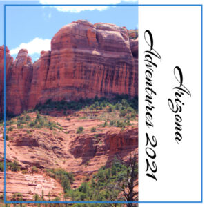
Paul, welcome to the Campus. This is a great start for this challenge. I have never been to Arizona (not been to the US much at all). Remember that all the pages are saved in .pspimage format, and you are likely to add more details or change things around later. That is expected!
Marie-Claire, I think your page is likely the first magazine page about street art. Very interesting.
Val, do you have a particular theme in mind so far? Like I mentioned for Art, above, if you use rope for the frame, you will likely have to add a shadow. If you use just colors (like in a magazine), you will be able to skip the shadows completely. Either way, make sure you are consistent with the following pages!
Annie, I am also delightfully surprised to see that many participants. It is still strange for me, to think of August as a winter month! 🙂
If you have not posted yet, don’t be shy. We all love to see everyone’s projects and they always inspire others in one way or another.
August 17, 2021 at 9:55 am #61897Hi Carole, the only text I added was the title and Special Edition…Everything else was part of the photo I took inside the store, where those traditional fish cakes were being sold.
August 17, 2021 at 10:05 am #61899Carole, in lmost everything I make with paintshop my dog is the center of attention, so I thought I could be more innovative, and opt for something different.
After the cover here is the second page
Later in the challenge I hope to update the cover.to everyone,
It’s so nice to see all those beautiful layouts and different ideas, I’m looking forward to see your next pageAugust 17, 2021 at 10:15 am #61900Gerry I like this one better; it is more a magazine to me and I can see it as a leaflet or poster too.
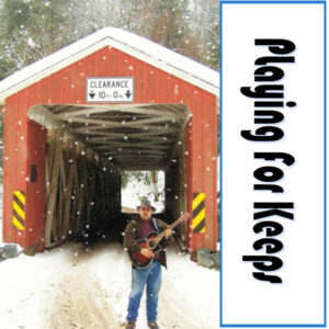
August 17, 2021 at 10:42 am #61903Here is my day 1 project. My magazine will be about playing acoustic music – picking for keeps. I went with the small frame, and adjusted the size
-
This reply was modified 3 years, 4 months ago by
Hank Sobah.
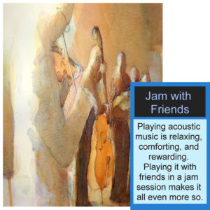
August 17, 2021 at 11:12 am #61907Here is my Day 2 Magazine Challenge. Using a painting from my friend Robert Yonke (The Bluegrass Painter), I’ve gone with a theme of playing music with friends.
-
This reply was modified 3 years, 4 months ago by
Hank Sobah.
August 17, 2021 at 11:13 am #61909Kept mine simple again … I had purchased a new camera and so I was learning how to use that as well. Some shots came out better than others, but that’s all about learning, right? No fanciness to this one. The font was just Copperplate Gothic.
August 17, 2021 at 11:37 am #61914Had another go and changed the size, added a barcode and a gradient. Font is belwe Bd 🙂
Am I the only one who is a bit “scared” to alter settings like UN check the lock aspect ratio for example? I’m always afraid I don’t remember how it was before altering, especially when you start another project 🙂
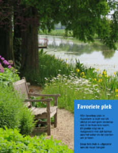
August 17, 2021 at 12:29 pm #61916Translation:
My favourite spot
My favourite spot in Appeltern (the name of the showgarden) must be this spot and a spot further on which I call the Ikea garden. This spot looks and is soothing with the bench near the water and the plants surrounding you.
This picture I printed and it’s on a wall.
Belwe is the font I used.
August 17, 2021 at 12:37 pm #61919Hi Fiona,
To answer your question, I put each photo on a separate layer, arranged them to my liking, and then merged them down until all the photos were on one layer. You could also hide all the layers that you DON’T want to merge and then use “merge visible to a new layer”. That way you can keep all the photos on their own layer and still have a merged copy.
Hope that was helpful
BTW nice to meet another vegetable gardener 🙂
Lynda
-
This reply was modified 3 years, 4 months ago by
Lynda DiGregor.
August 17, 2021 at 2:13 pm #61922Carole, thanks for the tip about the shadows on my text in the cover. I tried it and it looks so much better.
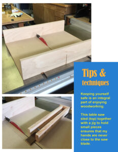
Before starting on any projects, I thought that a safety tip would be a good way to lead into my new magazine.
I also like the looks of an 8.5 x 11 format that many of you used, so I tried it here.
-
This reply was modified 3 years, 4 months ago by
-
AuthorPosts
- The forum ‘Showroom’ is closed to new topics and replies.


