Home of the Scrapbook Campus › Forums › Showroom › Love Story Challenge
Tagged: Love story challenge - Day 7
- This topic has 292 replies, 32 voices, and was last updated 5 years, 9 months ago by
Vicki.
-
AuthorPosts
-
February 24, 2018 at 5:53 pm #17628
Day 7 – I was able to do the background, but when added to the picture it appeared like the picture was sitting on top. Ha! I ended up making the background barely visible and it looks somewhat better. I’ll have to keep practicing the text, I just couldn’t get it quite right. My text has the sculpture effect, but that’s all. This is a picture I took at my home. I’m passionate about saving the pollinating bees. Cassel, I want to thank you so much for all that I have learned! I’ve been using Corel starting way back to Photo Paint 8 and never learned about layers and masks. This was fun and educational. Everyone’s pages are all so awesome!
February 24, 2018 at 6:27 pm #17629Oh, rats, another problem…
When I switch between the dropper and the brush, the brush retains the color last used. Not sure how to change that option. It’s done that for a long time, but I never was switching back and forth so it wasn’t too big of an annoyance.Teri
February 24, 2018 at 6:33 pm #17630@ Teri, your Dropper tool probably does not have the correct setting. Check to make sure it TAKES the actual color, typically the setting is to UNcheck the “active layer only” in the Dropper tool setting. Check that.
February 24, 2018 at 6:57 pm #17633I’ve done some screen shots. The first shows that I had my dropper settings right, but for the second one, all I had done is use the b key and you can see the color is not the pick I had selected
February 24, 2018 at 7:01 pm #17634@ Teri, when you activate the Dropper tool, you will “see” the color, but you still have to click to select it. While it is the Dropper, if you click what color do you get in the Material palette?
February 24, 2018 at 7:08 pm #17635Yes, Carole, I had done that “for real”, but for the screen shot I hadn’t. I just did it again with the same results. The brush has a memory that I don’t want! :-/
February 24, 2018 at 7:12 pm #17636@ Teri, let me check a few things on my end. I’ll be back.
February 24, 2018 at 7:19 pm #17637@ Teri, do you mean that when you click with the Dropper tool, the dark red swatch turns to pink. And then, when you use the Brush, it reverts to dark red? or does it always stay Dark red?
February 24, 2018 at 7:25 pm #17639With eye dropper, it does change to the pink. As soon as I click B, it reverts to yesterday’s dark red.
February 24, 2018 at 7:42 pm #17640@ Teri, I think this needs a bit further troubleshooting. Could you drop me an email using the yellow Need help? on the right of this page?
February 24, 2018 at 8:03 pm #17642February 24, 2018 at 9:16 pm #17643Very nicely done everyone!
February 25, 2018 at 4:43 am #17644Cassel, I used “hearts brushes.abr” that I downloaded a long time ago. It doesn’t have the name of the site/designer, and back then I was not adding this information if they were not in the file, what I do now. This set contains hearts and florals and I used a combination of both. It could have been from Fuzzimo.com / DeviantArt /Brusheezy or All-free-download, but I am not sure.
February 25, 2018 at 4:47 am #17645Beautiful new layouts!
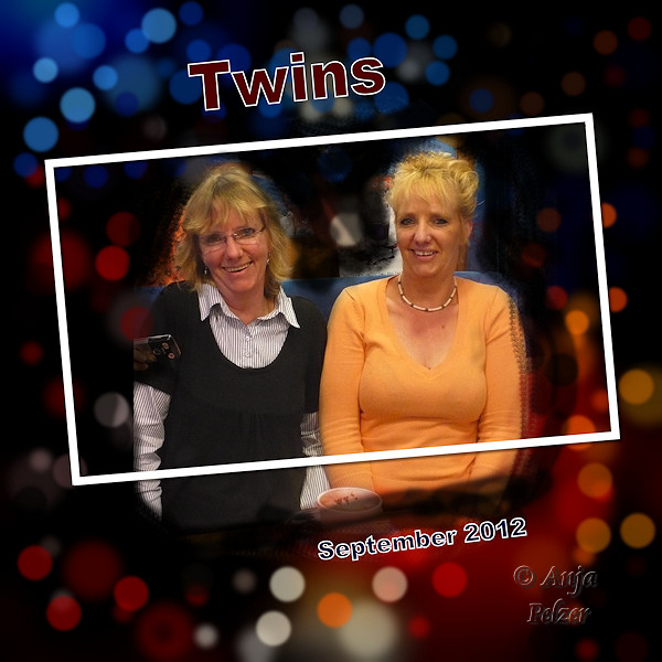
I am still working on Day 6 but so far I didn’t like how the photo is blending with the black bokeh background… it doesn’t blend naturally like some pages here and Cassel’s example. I have to practice more 🙂
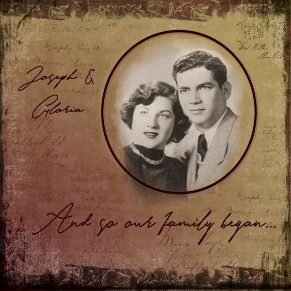
February 25, 2018 at 7:59 am #17648Here’s my Day 4. Mom and Dad at their engagement party circa 1948.
February 25, 2018 at 8:20 am #17649Cristina Hanlon I didn’t use a black background for my bokeh. I used one that complimented my photo. Maybe try that?
February 25, 2018 at 1:17 pm #17653Christina Hamlin, I believe it’s the placement of your solid color layer. It needs to be above the photo you’re taking your dots from. Use the little eyeball to make it visible or hidden..
February 25, 2018 at 2:04 pm #17655Aus, thank you for the tip! I think I am not choosing the right photo for a black bokeh background, besides “struggling” with the technique. 😀 And by the way, I love your layouts.
Teri, I thank you for the tip! I will take both into consideration and see if I can come up with something my Day 6 layout. And you also have great layouts. 🙂
February 25, 2018 at 4:16 pm #17665Cristina, you don’t have to have a black background, or even a very dark coloured one. Instead of doing a few layers of different sized bokeh, change the Brush variance pallet settings. After you have altered the brightness and contrast, and added a blur, also selected a colour with the dropper tool. For example. Jitter to around 100, colour blend 100, size 2, fade rate 100, impressions per step around 5. Brush setting: size varies, opacity 45 step 18 you’ll get different sizes with the colour. Add a new layer to do a different colour. Once done, blur again if need be.
February 25, 2018 at 6:00 pm #17672I pop in every day to look at all the pages that have been posted and all the new ones that have been added… everyone’s pages are beautiful ! and a joy to view them…. well done everyone!
Dawn.
February 25, 2018 at 10:41 pm #17676Carole,
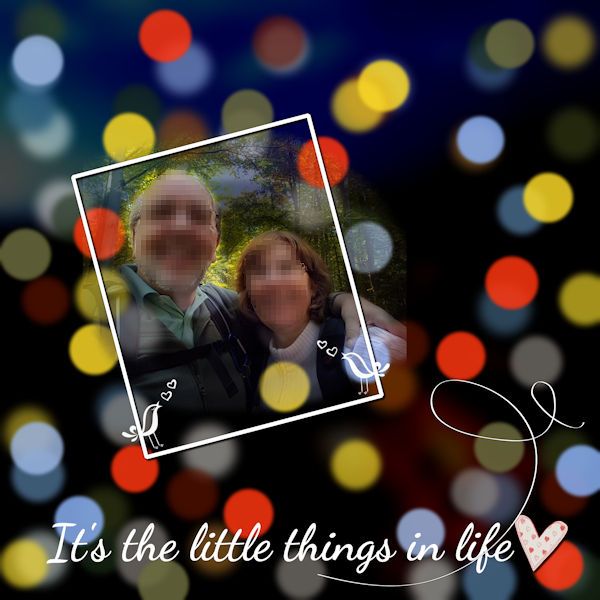
Thank you for the extra help. I don’t think I would ever have solved that problem!I’ve had a lot of fun learning how to make my own papers and masks so I can make pages like this one! Course, it helps to have such a great subject! My paper was made from the photo on the right.
February 25, 2018 at 11:10 pm #17677@ Teri, I am just happy that it was such a simple fix.
For anyone wondering, Teri had issues where selecting a color with the Dropper tool was not kept when the Brush tool was activated, which meant she could not create that Bokeh effect as in the tutorial. It turned out that a little check box in the Material palette labelled “All tools” needed to be CHECKED when the Brush tool was active but had accidentally been UNchecked. Simple fix to a strange issue. This could happen with any version of PSP, so if you ever have some odd color selection issue, check if that box is checked or not.
February 26, 2018 at 3:22 am #17678Hi Sue, thanks for the tip! This is a very interesting way of creating the bokeh effect using the Brush Variance. Before watching some time ago Cassel’s webinar using this tool I had no idea that it existed. 🙂
I copied your comment and will also try this way. This is the great thing about the Forum, I learn a lot from all you.
February 26, 2018 at 5:11 am #17682Finally, I have Day 6. Although I had several attempts before this one it was fun to play with this effect, and I thank everyone who gave me suggestions. I do appreciate <3 and will try them later.
February 26, 2018 at 8:52 am #17686Day 5. I had to brush on a couple of the snowflakes. The picture of the arctic fox was too small and I kept running into the edges. The photo is from Unsplash. I made the background with the kaleidoscope effect from a watercolor illustration I had. And the font is Flower Child by Skyla Design.
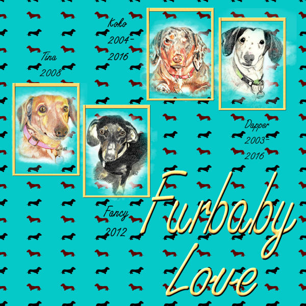
February 26, 2018 at 9:33 pm #17688Finally finished my last challenge! Took quite awhile. I knew I was going to use our Doxies, so I wanted a paper to go with them. It took me awhile to do the font as well. Too bad that life (dishes, going to the feed store, feeding out livestock, shoveling snow) has to get in the way of what I want to do! 🙂 Glad I am retired!! The pictures of our “kids” are drawings that my husband has done. You can see his work on Facebook @Cleaveland Indians Online. I may be prejudged, but I think he’s pretty good!
I have enjoyed seeing everyone’s creations! Very fun and there is so much talent out there!
Teri
February 27, 2018 at 1:04 am #17692Finally got my last three pages finished.
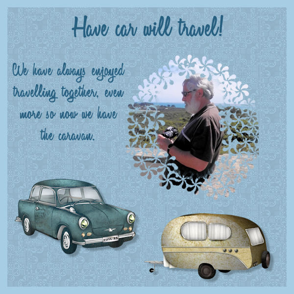
Day 5 was fun, I used an overlay to get the background paper (Cassel’s blog) and a flower brush on the mask. The car & caravan are freebies from Manu Designs. The RUSL25 number plate on the car is a personalised plate I bought for Russell for Christmas in 1993 to celebrate the 25th Anniversary of the day we met, I nearly changed it to 50 in 2008 but didn’t. It is great fun having total strangers calling him by name after looking at the car!
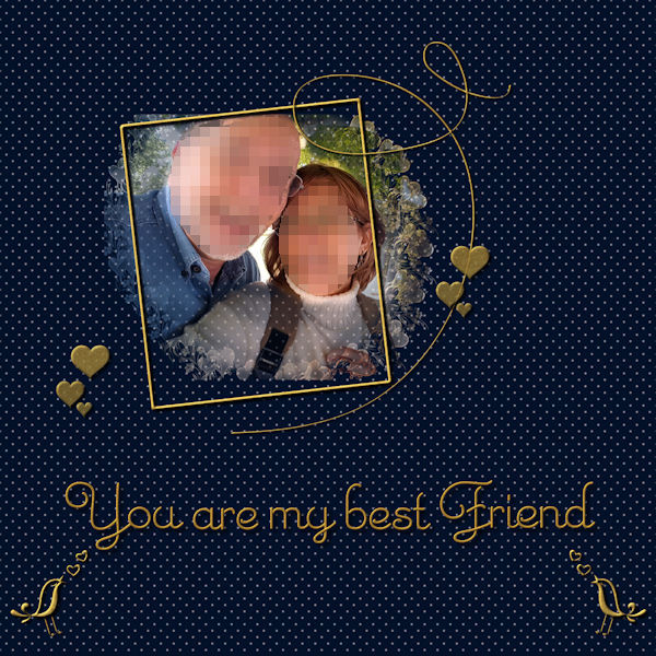
Day 6 took me a bit longer. I used the photo of us by the helicopter for the bokeh, which I found fairly easy to do. I have also done it just using the Brush Variance pallet and not separate layers, which was easy as well. I had most problems trying to decide what colour background to use, still not sure about the blue.
For Day 7 I did the polkadot background as per the tutorial, gave the dots a bevel and a bit of a blur, then used Cassel’s Corner Punch brush to highlight the corners. I also used the same frame as before, just changed the colour to match. I had most trouble doing the text. I had a tutorial for wire text using SuperBlade Pro and tried that but it wasn’t very nice, so went back to using the sculpture effect. I wanted silver and that wasn’t too easy to find a texture, I ended up using felt. The font is Saginaw, which wasn’t as spread out as Love Notes.
Thank you Cassel for setting us this challenge, it has been really good taking part and seeing what everyone has done. Some of the tutorials I had already done (Diamond Member) but it still a bit of a challenge to do them again, and there were new things to learn as well. Everyone who has taken part has done some really nice pages, and I have also come to know people a bit more personally through seeing the things they love.
Looking forward to the next challenge!
February 27, 2018 at 4:04 am #17697This is my Day 7. About the Wire Text… In order to make it easier for me, I create an image of 3000px and wrote the text. From it, I created separate images with one word each. This way each image only had a few promoted selection layers and not dozens like when I tried it for the first time. My text had lots of amendments to be made. 🙂 After it was done, I added all images to just one file. I used the Emily Regular Font.
Like always, it is so much fun to participate in the challenges. I love them! I learn a lot and have a reason to do something with my photos. Thank you, Cassel.
February 27, 2018 at 7:11 pm #17711Wonderful work ladies. I check in periodically to see what has been posted, same techniques used, yet every paper is unique. I always learn something new. Cristina, you can always change the impression per step to 1, so you have more control of where you want each bokeh to be positioned. You’ll still get the different sized bokeh, which gives perspective, and with the opacity low, I like the overlapping, where you see the colour of the one underneath seeping through when they overlap, apart from the different sizes which also gives perspective. I know that this a Christmas card, I make them throughout the winter months, in readiness for next Xmas, using last years photos. Saying that I took this photo of a Snowy Owl last weekend when I was out doing a bird count. I made my own mask, used the wire text tutorial for the greeting, used a picture frame for the torn paper, image, picture frame, coloured and used a sandstone texture, for the right side border, selection tool, material palette, gold pattern with dither 20pct texture. My wire text isn’t as defined as what Carole did in her tutorial. So I’m a bit disappointed with that. Plenty of time to do it again. I can always add a few elements closer to next Xmas.
February 27, 2018 at 7:39 pm #17712@ Sue Thomas
Love the card! Could you just add a shadow to the text to make it stand out more? -
AuthorPosts


- The forum ‘Showroom’ is closed to new topics and replies.


