Home of the Scrapbook Campus › Forums › Showroom › Love Story Challenge
Tagged: Love story challenge - Day 7
- This topic has 292 replies, 32 voices, and was last updated 5 years, 9 months ago by
Vicki.
-
AuthorPosts
-
February 21, 2018 at 9:13 pm #17552
@cassel
I see to have a problem with sizing of my patterns. I thought I watched carefully for both the plaid and the kalioscope but I think they are so small they hardly appear at all. I even tried to put a solid background behind the kaleidoscope but it’s still too faint. Aarrgghh!!
Teri
February 21, 2018 at 9:17 pm #17553@ Teri, the size of the tile depends on the size of the starting image you have and how big a selection you make. If you have a tile that is too small to your liking, maybe you just started with a piece of image that was too small. Since it is a kaleidoscope effect, you can easily enlarge your tile first, and then apply the effect. The design will not need to have a sharp starting image. Or, you can also try to use a larger scale in the Material Properties window when you select your tile. Give this a try.
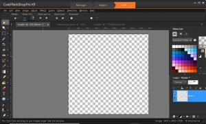
February 21, 2018 at 9:21 pm #17554Suggestions on the size And resolution? I do size my transparent “paper” at 3600×3600 and 300.
Thank you
Teri
February 21, 2018 at 9:43 pm #17555@ Teri, yes, typically, a scrapbook layout will be created at 3600×3600 pixels with a 300 ppi resolution. However, the resolution in itself means nothing until you print it. So if you are to keep your layouts on your computer, or in a digital frame, and never print, you can set it to anything, but just in case you might want to print it later, it is always a good way to set it to 300 ppi (you can set it by default, in File > Preferences > General Program Preferences under the Units tab. For your tile, you can create one at 100 pixels (which will be small but can also be considered subtle) or 300 pixels (which would be average) or 600 (which is starting to feel a bit big), however, you can always adjust the scale when you chose that tile as a pattern.
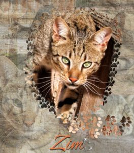
February 22, 2018 at 1:40 am #17557Day 5 – This was a fun challenge. I ended up scrapping my first try and minimizing the amount of the paw brush strokes used. I know the bkg is a bit busy, but I’m happy with it. This is ZIM, a Savannah, who had been abandoned and wandered into my yard one day. I located the previous owner, but they didn’t want him as he is quite the handful and he does not like other cats. Savannah’s are worth a lot of money and while I was trying to find him a new ‘free and forever home’, he was stolen from me. After a long investigation and 54 heart breaking days, gratefully the police and animal control located and returned him back to me. He was in bad shape. Today, ZIM is now living on 60 acres outside of Lake Tahoe, California. He is loving life as an indoor and outdoor cat and his new family adores him. I love and miss him so much, but so grateful that he’s loved, healthy, safe and living the life that he deserves. I’m now an advocate for people to do their research before adopting exotic animals. (OK Cassel, let’s see if adding a bunch of text and changing the size of the pic a bit helps it to post. 🙂 Fingers crossed, thank you for your help!)
February 22, 2018 at 7:21 am #17563Still on Day 2 of the challenge, hope to catch up soon!
I wasn’t really feeling the rectangle so got rid of it on my page 🙂
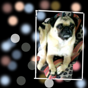
February 22, 2018 at 11:38 am #17567This is my try at the Bokeh effect.
Not sure I did it correctly, but did the best I could.
February 22, 2018 at 12:27 pm #17569@ Leslie, you applied the technique very well. I might just suggest to add more blur to the one layer that seems “sharper” than the others. For the rest of the light spots, they are… spot on!
@ Rizzi, you are the creator so it is quite ok to change the template to suit your photo, and your own preferences.
@ Cheryl, sometimes, a busy background goes well with the feel you want to give to your project. There is usually no right or wrong way to do it. Handsome animal, by the way!
@ Jennifer, I do hope you continue to play and explore PSP too!
@ Marie-Claire, that polkadot pattern makes a statement without being overwhelming. I see you picked the blue from the photo. That is a great way to make the paper match the image and make it cohesive.
@ Cristina, it is so interesting how your page looks very different, yet you still started with the same template! That is the beauty of knowing how to use the program and the supplies you have; you can always change anything you want.
@ Teri, I am glad to see that you can still use those elements you have gathered over the years. It is a great thing to have a varied stash of supplies. And by the way, the Pick tool tends to be… picky in the last couple of versions of PSP. The mode tends to change randomly on you so it is nothing you do that changes it, it does it on its own.
February 22, 2018 at 12:33 pm #17570Thanks, Cassel
I had to put the pix on the top of the Bokeh effect. Thanks for the good tip.
February 22, 2018 at 2:54 pm #17573Thank you, Cassel. I have to say that since I found your site almost two years ago, I have learned a LOT with you.
This is my Day 4 page… The elements are the same I have been using… “Escale Amoureuse Partie 2” from Day 1 freebie.
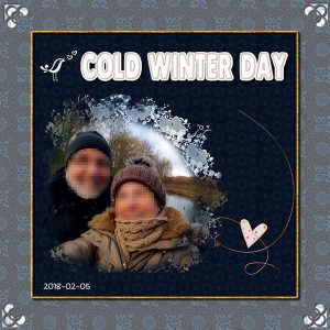
I like the effect of using the brush around the photo.
The font is ChalkDust. I used Cassel’s DateStamp #5 Script.
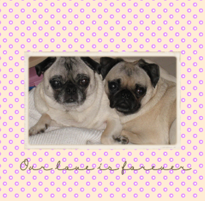
February 22, 2018 at 5:30 pm #17575Was I supposed to use a mask on Day 7?
I did mine without one. It was really cool to make the polkadots.
The pix is of my 2 pugs, Tiger the Terrible and CSI Grissom. Tiger went to Rainbow Bridge last May, and he will be forever missed.
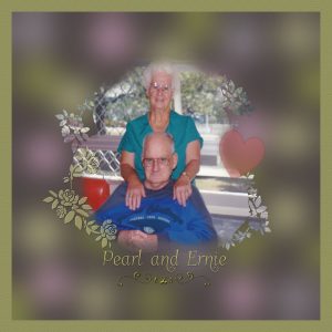
February 22, 2018 at 6:08 pm #17577my Day 6…… quite some time after Jack passed away Ernie came into Mum’s life and they were married. He was also a very dear man. Mum never married again after Ernie passed away but she had us to keep her company right up until she passed away at 98 years old. I felt I needed a softer Bokeh effect for this photo so that is what I did.
February 22, 2018 at 6:17 pm #17579I used the same bokeh I created before but changed the photo. The original photo was too small. I simply used a different photo…much larger photo. I like it better than the first one.
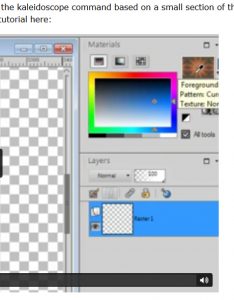
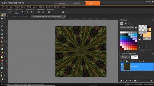
February 22, 2018 at 6:25 pm #17584@cassel Carole, I definitely have a problem. I went back to the tutorial. In it you can see the pattern i the swatch box. In my screen shots, the swatch doesn’t show. It appears transparent. I checked the image and made sure it did not have any transparent layers. Something in my settings must not be right or I am missing a step. You can see the image I am using for the pattern swatch.
Guess I need to solve this problem before I can work on any more challenges. 🙁
Thanks for the help.
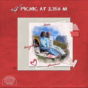
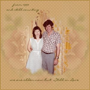
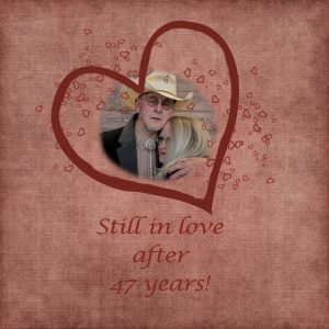
February 22, 2018 at 6:42 pm #17586Day 7….. this photo was taken in 1982 and this year we will celebrate our 46th Wedding Anniversary.
to everyone who has participated in this challenge so far, it has been a pleasure to come and view your beautiful work … and to Carole (Cassel) Thank you so much for all the time and effort you give to putting up all the challenges here in the campus.. I know I appreciate it very much and I enjoy participating in them.
best wishes to everyone,
Dawn.
February 22, 2018 at 6:46 pm #17587@ Teri, from the screen capture that you have posted (and that is a great idea), I can see that the second “box” underneath the swatch is activated and that is the Texture. It looks like the swatch is not really transparent, but has a dotted texture. Just click on that second box to deactivate it, and you should see your pattern in full.
February 22, 2018 at 7:04 pm #17588YEAH!!That was it!
I appreciate your patience!
Teri
February 22, 2018 at 7:55 pm #17590Day 6. This effect was interesting and fun to learn. I’ll have to keep practicing, but this is my best attempt so far. The picture is of my daughter and her husband. I love everyone’s pictures that they are making!
February 23, 2018 at 1:36 am #17597Here are my Day 3 and 4 pages, still trying to catch up. Day 3 shows the two of us after Russell won his Championship (I had been his caddy) and the individual shots of each of us with our trophies. The background kaleidoscope pattern was from a small square I picked under the verandah and then the layer was reduced in opacity to make it more subtle. The two individual photos were quite different in colour so I used the sepia toning to match the background and make them look the same.
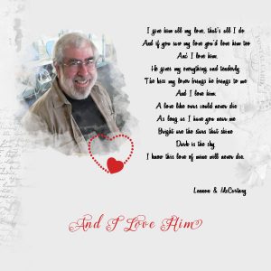
Day 4 was fun trying to make my own mask. I used the background from Day 1 which I thought was interesting without being overpowering, and the words of the Beatle’s song said everything I wanted to say.
I have been using Springer font on the pages, until Day 4 when I used Variane Script for the song and Maphylla for the red words. The heart was from Escale Amoureuse.
Now on to the others.
February 23, 2018 at 5:25 am #17598Lovely layouts everyone.
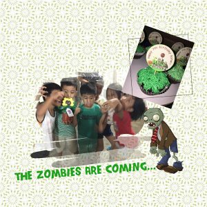
February 23, 2018 at 6:19 am #17601Yay, am on Day 3. This one’s got photos from my son’s PVZ themed birthday party 🙂
February 23, 2018 at 8:00 am #17602I give big kudos to all. I love seeing all the imaginative layouts.
And @ Cassel~~Thank you so much for all your work. It has been a blast. I have learned so much. I have had such trouble with masks, but will now use them and know what I am doing. It was so great to get immediate feedback.
February 23, 2018 at 2:23 pm #17604Here is Day 5… Again I had fun creating papers with kaleidoscope effect. I loved creating my first mask, but I made a few before I had one that I liked.
I used Cassel’s CornerPunches-B Brushes and for the title the StitchedEdges2 Script.
February 23, 2018 at 7:21 pm #17606Here is my day 1. Yes I am behind but am working on them.
February 23, 2018 at 8:26 pm #17608Not sure I like this but onward I go.
February 23, 2018 at 9:09 pm #17610Challenge 5
I couldn’t find a heart cut out so I used a brush and added color instead. I made my frame. I used pre-designed papers to save time. My original thought was to use two papers, a darker one underneath, but couldn’t figure out how to place the layers to do that with the mask. I rather like the end result even if it isn’t quite what I planned. 🙂February 23, 2018 at 9:42 pm #17612Day 3 complete.
February 24, 2018 at 4:06 pm #17623February 24, 2018 at 5:14 pm #17625February 24, 2018 at 5:48 pm #17627@ Vickie, on your Day 3 layout, is it possible that you have used the mask before making it a negative image? It looks like it is hiding part of the photo instead of showing it, especially in the center. For the Day 2, I wonder if you also placed the photo on top of the mask so it is still showing as a dark area around the photo. Another tip: when using those types of masks with faint or blurred edges, you can often get away with enlarging your photo much more as the viewer kind of expects that this effect will affect the photo quality, so if enlarging the photo gives a blurriness to it, it will look intentional, and we can still have a look and enjoy that pretty photo!
@ Teri, what effect did you want to achieve with the heart as a mask? Did you want to show the picture inside the heart or just have the heart show part of the image where it is currently red?
@ Cristina, what brush did you use for that last mask? It looks like a combination of several brushes. Is that right?
@ Rizzi, that zombie party looks like fun!
@ Marlene, you will end up with a nice album with those pages!
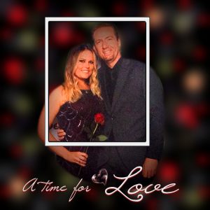
@ Cheryl, that Bokeh gives such a magical and romantic look to your page!!! Using a black background always seems to bring out the colors of the photo!
@ Dawn, the choice of color for your background paper just matches perfectly with the age of the photo! Good choice! Also, a softer Bokeh was a good adjustment to the technique for feel of the layout about Ernie.
@ Bonnie, using the black background for the Bokeh is a great choice. I wonder if the background of the photo was also black or if you just managed to focus on the faces with the mask to the point of completely removing the photo background. Either way, it turned out fantastic.
@ Leslie, although you could have used a mask for Day 7, it is ok not to. Now you have the techniques you can use, but you don’t have to use them all, all the time either!
Although many of you have already gone through all 7 days of the challenge, some are still working through the tutorials. All the work posted here is fantastic. For those who have completed the 7 days, you will get an email about a survey. Make sure you fill it, so it will help me create more challenges in the future!
-
AuthorPosts
- The forum ‘Showroom’ is closed to new topics and replies.


