Home of the Scrapbook Campus › Forums › Showroom › Love Story Challenge 2021
- This topic has 342 replies, 31 voices, and was last updated 2 years, 9 months ago by
Cassel.
-
AuthorPosts
-
February 13, 2021 at 7:17 pm #53187
Sue, this is a delightful page. What happy little sunflowers. I appreciate how, as a society, we have forged ahead with the use of colours. When I was an early teenager and just beginning to sew my own clothes there were certain colours that were taboo to use together … blue and green should never be seen! I never really understood that because Mother Earth in her green finery meets Father Sky in his glorious blue. Anyway my friend, your page certainly gives lie to that old adage. ;D
P.S. Thanks very much for your tip about the use of brushes for masks. I had not thought to reduce opacity and hardness etcetera. Much appreciated my friend. <3February 13, 2021 at 7:20 pm #53188Corrie, you have done this iconic flower proud my friend. A very sweet page, well done my friend. 😀
February 13, 2021 at 7:23 pm #53189Barbara I like you pages a lot and I find it quirky and inspirational that you have chosen a dress for the overall theme. Well done Hon for thinking outside the box. 😀
February 13, 2021 at 7:31 pm #53190Cristina, this page is so cute my friend. What an adorable photo. Simplicity at it’s best Hon.
February 13, 2021 at 7:41 pm #53191Thanks very much Laurie, very pleased you liked it my friend. I was a bit worried when I started as the photo was particularly dark but eventually I was able to tone it down. 😉
February 13, 2021 at 7:44 pm #53192Lynda, this is a fantastic page. Black and White is one of my favourite colour combinations and the addition of a little red really makes it tick. Love it my friend and that plaid is something else! ;D
February 13, 2021 at 7:51 pm #53193Ah! A Cinque Terre holiday … a place I have ever wished to visit and even though Vernazza is the most popular choice for tourists my heart goes to Manarola, don’t know why. A lovely and colourful page Minka, well done. ;D
February 13, 2021 at 7:55 pm #53194Such beautiful works! I am sooo behind! Very busy yesterday and most of today. I have started day 5 and hope to finish tonight. Having a hard time with the brushes as masks part…I don’t seem to have any that fit my subject. I’ll have to look for some.
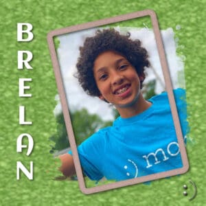
February 13, 2021 at 9:40 pm #53199Brelan, 12.75-years old, is the oldest of my great-nieces/nephews. The countdown to a full-fledged teenager is well underway.
Font: Aclonica. Smile doodle: Pixelscrapper – Janet Kemp. Frame: Pixelscrapper – Jessica Dunn. Mask: Pixescrapper – Melo
Carole: The distortion technique is cool. I’m trying to figure out how one “accidentally” discovers such a thing, but I guess that is why it is an accident. A happy one.
As always, it is a pleasure to scroll through the posts to admire the projects, enjoy the stories, and learn from the questions.
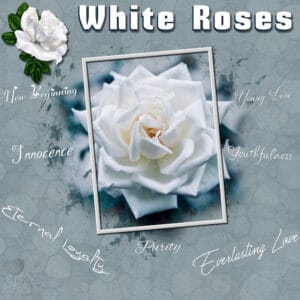
February 13, 2021 at 9:40 pm #53200Day 6. Lots of different fonts used here and I have lost track of them … sorry! The words are all the things that a white rose stands for. Photo courtesy of Unsplash. Thanks for takin a peek my friends. ;D
February 13, 2021 at 10:12 pm #53201Annie, what a gorgeous page you created. With many loving centiments.
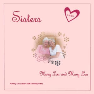
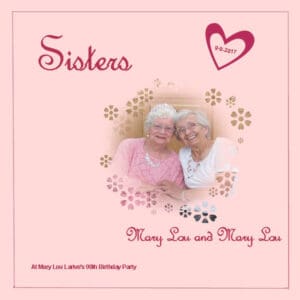
February 13, 2021 at 11:29 pm #53245Day 5. I decided to pick the picture of my sister-in-law who is also named Mary Lou. Earlier today I had almost finished it and then DELETED IT. Accidently of course. So I had to go back and re-create it. The circle mask went better this time and only has the flower brush used. I found the font (comes with PSP) called French Script MT. The other font used is Arial. Still like to put dates inside elements! Tried a tube, but it made the page too busy. Used the paint brush to make the inside frame. Had fun doing this. Again, another way to create a mask.
February 14, 2021 at 12:41 am #53281February 14, 2021 at 1:59 am #53284Shirley, those old photos are so interesting to tell stories!
Linda, as long as you keep the pspimage version of your page, you can tweak it later, add a photo, an element, more text, etc. You can load the watercolor brushes later on, and you will have them later for other projects.
Annie, some shapes will give better results than others, plus different settings for them. With a little experimenting, you will find out what works and what does not, and what you like and don’t. The technique is there to personalize.
Mary, that kaleidoscope paper is so subtle, I had to look twice. And yes, it is a good idea to keep the tiles you like because you are unlikely to recreate them again! The watercolor brush gave a great effect to showcase that RV. When you use a fuzzy edge mask, you can often allow yourself to enlarge the photo so maybe you can make your photo of Mary Lou a bit larger?
Gabriella, two layouts in one day, you are really working hard! That is a beautiful dog you had. That is a great way to showcase how much you loved him. The heart brush used for the mask is lovely. Is that one from Corel or one you did yourself?
Mireille, intéressant que tu aies utilisé un deuxième masque sur ton projet sur la graduation de Myriam.
Anne S., I can imagine it is hard to find a brush that goes with a camel! You could use a round or a square brush to make the mask a bit geometric, or even a brush with only an outline of a circle or square or heart. Experimentation! How did you get the color of the linoleum?
Sue, your linoleum pattern is great and subtle. What color did you use for such a subtle effect?
Gerry, Maggie has such a sweet smile! It is definitely a great photo to showcase. The “accident” was probably when I wanted to use that distortion effect with a different “distortion map” but since it shows the image itself as default, it must have been when I noticed the effect.
Alica, that unevenness really does look like a blanket. It is a good choice to have kept it. I am not sure why your settings yielded a 4 pixels thick image instead of 1. Strange.
Corrie, that brush shape is perfect for that flower!
Barbara, the challenge is not ment to turn in “assignments”. The idea is to give you more ideas, techniques that you can use, even if your end project turns out different than mine. The idea of loading masks is great when you have them on your computer, however, I find that those masks will always cover the whole page, so it is a different approach when you want the mask only smaller or covering a specific area, or even if you want to add more than one. But it is definitely another option in some instances.
Cristina, what brush did you use for the Snapshot page? It almost looks like you used one of the corner punches. Or was it a “frame” you made?
Lynda, that black and white plaid looks great! And the pink linoleum really complements that pink flower.
Minka, although you might not be fond of the background paper, you chose the perfect color for your page. I find it quite fitting.
Jennifer, the color you chose for the linoleum paper is very “antique” and matches the photo very well. Be careful, that technique is addictive!
Donna, I agree that adding that green is perfect with the blue. And adds great interest to the overall page. I hope you have a chance to make another set for Philip too.
Wanda, have you tried adding heart shape brush strokes? The pastel linoleum is great with Hannah’s photo.
Ann L., looking through photos is definitely part of the scrapbooking experience too! 🙂
February 14, 2021 at 2:49 am #53286Thanks dear Sue, always appreciated my friend. <3
February 14, 2021 at 2:55 am #53288Finally finished 5, although I think I did the leaf brush wrong, ha ha. Clay and Cody were my best loves…they passed one year apart almost to the day in 2009 and 2010. Cody at the ripe old age of 15, he was a rescue dog and he had the sweetest spirit. Clay, we raised from a 6 week old pup passed the following year at the age of 12. I miss them.
February 14, 2021 at 5:08 am #53291Carole/Cassel: My linoleum background color came from the foam on the waves x 12 repeats! 🙂
Wonderful work everyone. Amazing what I can learn looking at your work. I think all our designs have taken a giant leap upward in quality with this intense week of masks!
Happy Valentine’s Day!
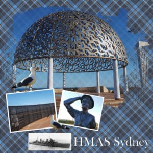
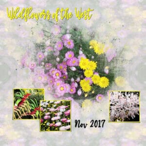
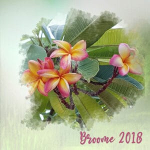
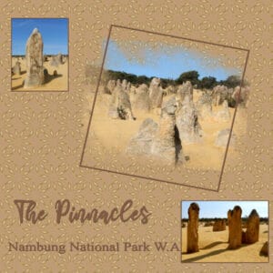
February 14, 2021 at 8:00 am #53295Hi – I am a very late starter to this challenge and I have just been through the postings and all the pages are amazing and so varied. A real delight to see. I have used masks a lot but not like these, I especially like how they mask a smaller select area and especially using a brush to mask. The ‘mama’ font I downloaded from Day 1 doesn’t have the glyphs for me, I may have to check if I downloaded the right one. My photos are from one of my West Australian trips along the coast, I love that part of the country and unfortunately with covid border closures I have not been able to spend any time there this past 12 months. These pages were a bit rushed as I have tried to catch up, I will be able to go back and ‘tidy’ them up later.
Day 2 shows a memorial to the HMAS Sydney in Geraldton WA. This ship was sunk off the West Aust coast in 1941 by a German warship disguised as a Dutch merchant ship. The whole 645 young Australians were killed. The dome pictured here is made up of 645 seagulls – one for each life lost. The wreck was only located in 2008. The granite wall has each persons name engraved and the lady is a bronze statue called “The Woman Waiting”.
February 14, 2021 at 8:02 am #53299I lost the shadow on the right picture and my text is a bit blurry (on my computer it looks ok though……) but number one is “born” 😀
Is there a way to go back to the point where I masked the 3rd photo even after you’ve saved it as a PSP file?
Loved all the projects I saw in this thread 🙂
February 14, 2021 at 8:12 am #53301The kaleidoscope paper made some interesting patterns, choosing one was hard!. The Pinnacles are natural limestone structures, dating back 25,000-30,000 years! They are fascinating to walk among, some are quite tall over 3 metres. I do like using a brush to mask. I will be using this technique a bit. I did use a watercolour brush but it was a brush I already had. The paper for the flower was one I had.
February 14, 2021 at 8:36 am #53302Carole, I did use a corner punches brush. The set is called Ornamental Butterflies-2 by mohaafterdark.deviantart.com. They don’t have a good quality, but as I lowered the opacity a lot, it didn’t matter. The butterflies I used for Day 3 are from the same set. I really had to look for it as my brush folders are NOT very well organized. : )
February 14, 2021 at 8:56 am #53304And here is my Day 5.
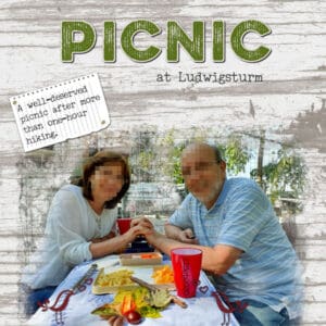
In this photo, we were sitting in front of a very nice old tower, and usually, we would be able to go to the top and have a nice view of the city… But since last year, this is not allowed anymore because it is impossible to keep social distance going up… Also, it is being renovated, and now the tower is surrounded by scaffolding… So, using the mask was perfect for hiding it.
Mary Solaas said she likes to add the date on something… so I decided to do the same and added the date on the cup… I have a special pen for that ; )
Credits:
Eminkus Pixel Scrapper: background paper “PS BT Feb2019 eminkus Paper09”
KAagard: Alpha “Great Outdoors)
Cassel: cass-Notebook-LoosePage2 freebie
February 14, 2021 at 9:10 am #53305Annie, thank you! <3
February 14, 2021 at 9:39 am #53307Carole, I did and this is the result. The problem was that the original photo was so large and we were just a small part of it. So, using PSP2021 and AI, I cropped us out and enlarged the crop. Took out the original and inserted the crop. Then I enlarged the photo and the mask and it does look so much better. This is the result.
February 14, 2021 at 9:49 am #53309Everyone is doing an amazing job! Great to see each and every page.
February 14, 2021 at 10:16 am #53311Tremendous creativity going on , I’m pleased to see so many participants posting their pages. Such a varied selection of topics too, using photos from some of the highest mountains flowers birds, animals to a new born babies. They are all of great inspiration to us all. Carole, for my lino paper, I used a very light pastel blue. On a new layer I flood filled with an even lighter blue (almost white), and lowered the opacity on the lino paper, added a blur to finish it off. The blur tones down the edges on the shapes. I can create this pattern with my eyes closed. I can then use other tools to create a completely different unique background paper, more in keeping with my style.
February 14, 2021 at 10:22 am #53313I have watched your last video, I didn’t know about using the pick tool to move the mask, without having to merge the group first. I always do what you said, duplicate the mask, (hide one) and merge the other to move it around. I always make a copy, so that I can go back at anytime to edit it.
February 14, 2021 at 12:38 pm #53319Happy Valentine’s Day everyone!
in two days of absence, lots of new layouts were added! Bravo to all of you! It’s so beautiful!
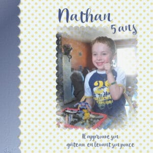
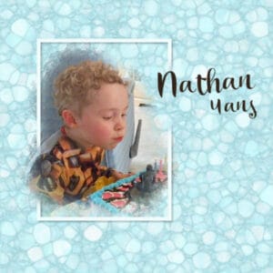
Carole, yes it was a superposition, I forgot to write it down. There were too many people around Nathan that I had to hide 😉
Here are my days 6 and 7. I loved the linoleum paper. For the 7, I added a second mask (which I made) on the one in the lesson. I also made the left border with the first mask. Thank you Carole for this beautiful LoveStory. I wonder every February if I participate and believe me I do not regret it. What a great way to remind us of what you teach us.
Nathan will be 15 on May 17th
Text on day 7: He approves his cake with his thumb
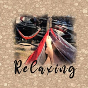
February 14, 2021 at 1:08 pm #53327Day 6- I didn’t know that you could create so many awesome backgrounds with PSP. Thanks, Carole for teaching us. I wanted to think a little outside of the box with this one about what love is. Relaxing and spending time with others, or even some much needed me-time shows love.
-
This reply was modified 3 years, 10 months ago by
laurie solaas.
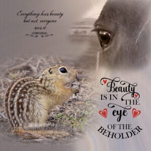
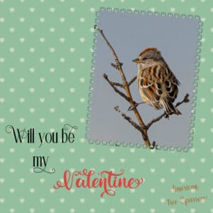
February 14, 2021 at 1:13 pm #53331Day 7. I did an extra one using the technique shown in the video. Although I knew how to do it. I had forgot how to keep the hearts on the background paper straight, and then it came to me. I hadn’t done it for a while, it was good to do it. I had to delve deep to get that bit of info to the front of my brain. I used one of your heart fonts to create the frame. I should have used the mitred corner script, but I didn’t, as now I can see that the corners are a bit off. I had already chose the photos I was going to use in day 7. Focusing on eyes. I created 2 masks. One of my resident ground squirrels, and Nell. I used the blend mode on her, as she is a bright chestnust, and to bright for the LO. I did ask the tree sparrow to be my Valentine, but he few off before I could finish the sentence. :-). Thank you ever so much Caorle for yet another superb challenge. As always I learn something new.
-
This reply was modified 3 years, 10 months ago by
-
AuthorPosts
- The forum ‘Showroom’ is closed to new topics and replies.


