Home of the Scrapbook Campus › Forums › Showroom › Love Story Challenge 2021
- This topic has 342 replies, 31 voices, and was last updated 2 years, 9 months ago by
Cassel.
-
AuthorPosts
-
February 9, 2021 at 4:33 pm #52746
And here is my day one, also very minimalistic. I go this whole challenge with my love for the mountains combined with my love of photografy. I have a lot of photo’s on this subject and it costs me a lot of time to select the ones I want to use.
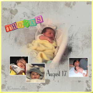
February 9, 2021 at 4:49 pm #52750This image is my first attempt at Love, Day 1. It has pictures of my grandson, Thomas. The block name “Thomas” was created by me some time ago using another program for a birthday card. The background was from the kit, but I darkened it use curves(I was trying to make it yellow, but didn’t succeed). So instead, I added a yellow border. I’m a terrible grandmother and couldn’t remember the year he was born, so I just put the date.
-
This reply was modified 3 years, 10 months ago by
Donna Sillia.
February 9, 2021 at 6:25 pm #52765Thanks dear Sue, always appreciated and you are very welcome. I have often wondered why the tropics seem to have an excess of colourful birds. Every country has beautiful colourful birds but the tropics seem to have an abundance of them. There must be a reason for this … I think I had better Google! 😀
February 9, 2021 at 6:33 pm #52776Wow Corrie this page is simple and beautiful! The colour combination of blue and cream is divine and the photos are beautiful. Well done my friend … first lesson conquered!
February 9, 2021 at 6:37 pm #52782Always very much appreciated Lynda, thank you. ;D
February 9, 2021 at 6:42 pm #52783A lovely page Cristina. I love that you used the hessian background … rustic and beautiful, well done my friend. 😀
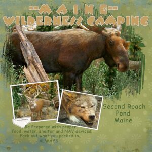
February 9, 2021 at 6:55 pm #52785Years ago, my husband and I along with another couple and ALL OUR KIDS would go wilderness camping in Maine. It was all paper mill land and we could only drive in so far and from there we had to park and hike. One of our favorite spots was Second Roach Pond. We carted everything in – and everything out. Folks with the smallest hands had the lightest loads – but they still had to help. We saw wildlife galore. The mornings and evenings were to die for. The bird calls were awesome and so was the fishing. Now these pictures are what we would have seen … but they aren’t really there. These pictures are all of stuffed animals on display at the awesome Cabella’s store in Scarborough, Maine. A display of monumental proportions! Almost like being there. Too bad the animals aren’t. 🙁
February 9, 2021 at 7:50 pm #52787Here is my Love Story day 2 picture. Love comes in all sizes. How about a whole group of islands. The state of Hawaii. Photos are mine. After I made the plaid I reduced the opacity so it didn’t overpower the rest of the picture.
February 9, 2021 at 8:00 pm #52788Ann: I have a special place in my heart for vultures. In Miami, I worked downtown, surrounded by high rises. Every year at the same time, the turkey vultures would return to circle around the top of the buildings.
One morning, a co-worker squealed with delight. “Christmas is coming. The turkey vultures are here!”
Some areas mark the change of seasons by the weather. In Miami, there is a different kind of signal of change.
-
This reply was modified 3 years, 10 months ago by
Gerry Landreth.
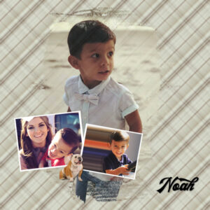
February 9, 2021 at 8:14 pm #52789Day 2 – Noah.
Noah turned three in December but has already started announcing that he will soon be four. Since he lives in Texas (we are in Alabama), we don’t get to see him more than once or twice a year.
The plaid effect is a great tool. I tried several versions before realizing that I could either keep going or cook dinner. Mother was getting hungry, so the latter won out.
Bull Dog element – Pixabay; Font – The Rollingstone
-
This reply was modified 3 years, 10 months ago by
Gerry Landreth. Reason: Forgot to upload image
February 9, 2021 at 8:14 pm #52791My day 2
February 9, 2021 at 9:35 pm #52795Lovely work Everyone. I am a bit late with my Day 1. Photos were not good quality but they are old. I used a kit created by a friend of mine.
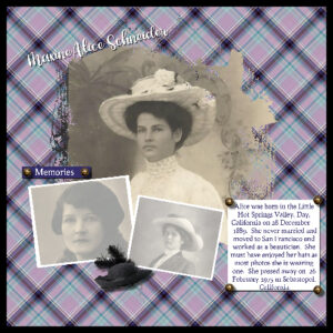
February 9, 2021 at 10:11 pm #52797Day 2 Aunt Alice-
Embellishments from ADB Designs Coming to America kit. Love the birds, everyone is doing such a great job!
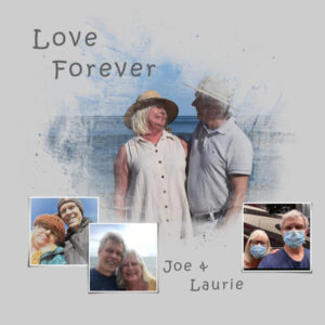
February 9, 2021 at 10:15 pm #52799This was my first time using Masks and one of the first times I have used Paint Shop Pro. Thanks for teaching me. -Laurie
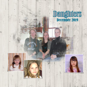
February 9, 2021 at 11:00 pm #52802I don’t have any new babies to showcase. But I did find some old photos of my girls when they were smaller. These ‘challenges’ do challenge me. I have not used masks before, so I learned a good bit this evening.
After 2020, it is good to think of masks in an entirely different light 🙂
February 9, 2021 at 11:36 pm #52803Anne L, it would be cool if you could share what it is that you learned. It would emphasize some lessons! Will you focus all the pages on your mother? (I just assume this is your mother). For your Day 2, the idea of reducing the opacity is a good one. That is a good way to tone down something that would otherwise overpower the project.
Gerry, I love that font! I think Amelia will certainly put more smiles on your face in these challenging times. The plaid technique is definitely addictive. And if you want to REALLY be addicted, there is a script in the store that can make a bunch of plaids in one run!
Annie, those birds look so loving. Perfect for a LOVE theme!
Susan, you did a good job of layering: the wordart is perfectly placed, under the photos!
Ann S., glad to hear that the “issue” is fixed. A grey mask might have its place in some situations, especially when the masks have fuzzy edges, so you can keep that idea for other projects too. That plaid is obviously, perfectly matching the photo!
Cristina, those birds on the window frame are so perfectly placed. I had to look twice to realize they were not part of the photo!
Sue, those corner swirls are super interesting!
Jnet, yes, those pages showcase my grandson, but it was not a photo of him that was used in the Master Class on Sunday.
Corrie, looking forward to see all those mountain photos. I see you changed the color of the small photo frames. That is a great tweak.
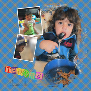
Donna, another lovely baby layout (I think we might have a baby party!). Getting yellow as a colorized element is typically quite challenging. The best way I found would be using Blend modes, so you might have to experiment a bit. I love how you rotated the template for Day 2. That would an easy way to reuse the same supplies to create something different.
Minka, if I had not read your post, I would have thought those animals WERE alive! If I may offer a little suggestion, I would encourage you to move the bottom text a tiny bit as it is overlapping the tag, which would not be realistic (or you can move the tag too).
Wanda, when photos are “lower quality”, it is a great opportunity to use masks especially if they are not completely black/white. That way, the photo is not expected to be as “sharp”. Or also, using them in smaller format is another way to get around the issue.
Jennifer, old photos are always a favorite when using “artsy” masks like that.
Laurie, welcome to the Campus. If you are new to using PaintShop Pro, you are doing a fantastic job. Somehow, I suspect you might be getting some coaching on the side 😉 Looking forward to your other pages. Remember, if you are ever stuck, just post in the forum. I read every single post. And someone else might even be faster than me to reply if needed.
Linda, glad that you are discovering a new tool altogether. On the larger photo, is it possible that you might have resized it sideways? It might be an optical illusion, but that is the impression I get.
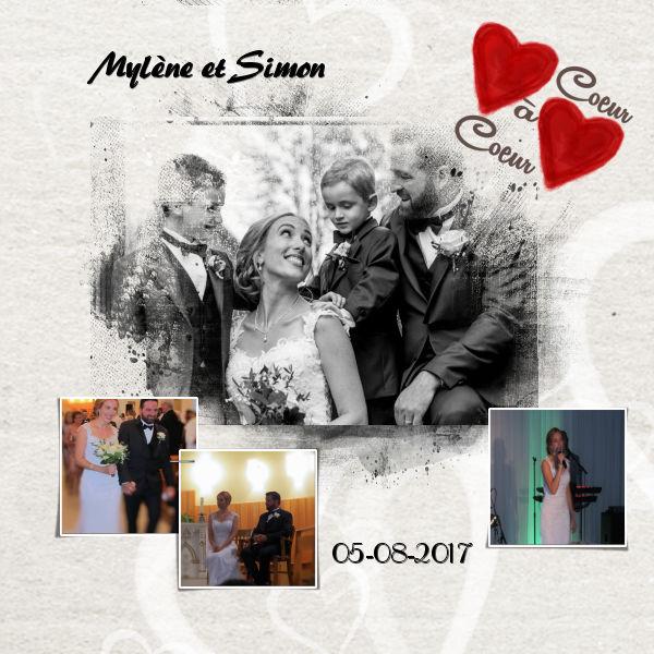
February 10, 2021 at 12:11 am #52804Voici mon premier projet. Ma nièce et son mari.
 February 10, 2021 at 3:54 am #52806
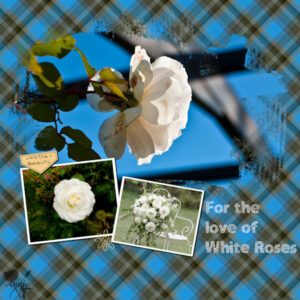
Hi Campus Friends. This is my day 2. Not my usual style but I did have fun playing and I decided to keep it very simple … and, yes, I do love white roses. The photos are from Unsplash. Thanks for takin a peek! ;D
February 10, 2021 at 3:56 am #52807I was going to comment individually but there are too many delightful posts so let me just say … lovely work everyone, I do so enjoy perusing whilst having my morning coffee, thank you. ;D
February 10, 2021 at 8:10 am #52812Here’s my day 2. I used my own flower and text.
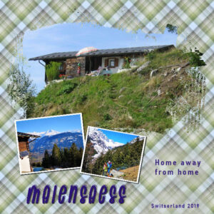
February 10, 2021 at 12:23 pm #52814And here is my day 3. Again a mountain scene. This one is about the mountain cabin, called Maiensaess, that the inlaws of my daughter own. You can only get there by foot with all your belongings and lots of fresh food in a backpack! Minka that must appeal to you. Over the years I have been there a lot of times; it’s a lovely place and so quite with very dark skies, no lightpollution. The only way to get bigger supplies up is by helicopter.
February 10, 2021 at 12:26 pm #52816Thank you so much, Carole and Annie. : )
Here is Day 2.
Credits:
lady-DCS-template November 2019, and I tweaked it a bit.
KAagard (Kristin Aagard) Great Outdoors kit – paper pattern 1 — Border Stitch Jul17CCM
Fonts: The Quiet Nite and Typewriter
Cassel: I used the Alpha-Maker sample again but added the plaid pattern. I liked this Alpha script so much that I will have to visit Cassel’s Store.
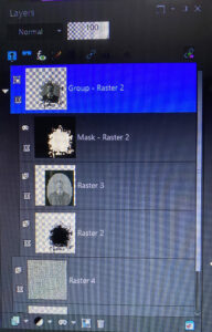
February 10, 2021 at 12:45 pm #52819Cassel, Help! What am I doing wrong? This challenge is the first I have used either masks or templates. for some reason the black part of the mask is really faint and not showing up well. I tried adjusting the contrast and the the transparency is at 100…..thanks in advance!
February 10, 2021 at 12:56 pm #52821finally found photos I wanted to use for Day 2. These are photos of my sisters and me at different stages of life. I used one of my cloud photos for the background and stuck pretty much to the Day 2 template.
Beautiful job done by all . The babies are adorable.
-
This reply was modified 3 years, 10 months ago by
Lynda DiGregor.
February 10, 2021 at 1:04 pm #52823Many new pages have appeared since my posting yesterday especially since I was still thinking of myself in the first page when I posted. I won’t post for all new pages but I want to say that you all did a great job! The subjects are varied and some remind me of things that I have had or that I have experienced.
Thank you Carole for your word, I liked redoing the kaleidoscope paper tutorial. It is very well explained and made me understand how to adjust the corners
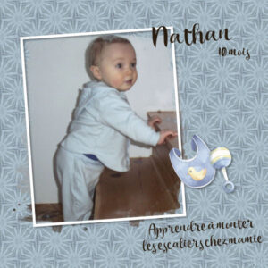
Here is my day 3 always with my grandson Nathan
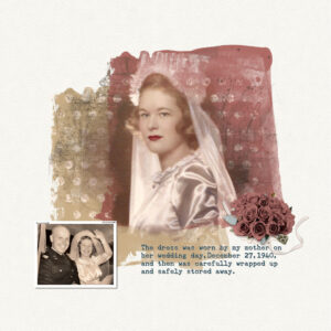
February 10, 2021 at 1:38 pm #52827This is my third time participating in the Love Story Challenge which means I’ve been doing digital scrapbooking for two years now–time has passed so quickly. And my skills have improved. I remember the first year was so hard for me because everything was so new. I’ve gotten more comfortable with my PSP so I can do more now.
The overall idea behind my pages for this year is “it’s all about the dress” and it has to do with my mother’s wedding dress. I’m uploading a title page and the day 1 challenge.
-
This reply was modified 3 years, 10 months ago by
Barbara Hall.
February 10, 2021 at 1:52 pm #52831Hi guys.. HELP! I sent a message to Carole but she may be working. I’m doing Day 3 with one large photo with the mask but there doesn’t seem to be the white frame that shows on Carole’s and Jnet’s design. How do I do a white frame with the mask? Thanks for any advice!
February 10, 2021 at 2:00 pm #52832I didn’t get the email for Day 3.
Of course I just did Day 1 last night, but eventually I will need the Day 3 video and instructions!
February 10, 2021 at 2:10 pm #52834Here is my day 3. I did use the mask provided , but edited it to my liking by using a heart brush. I added Tess’s name to the frame, used the lifted corner script, the word art, hearts and the apple are all fonts, I used the selection tool in the font tool bar to delete a heart shape from the apple.
Far to many to congratulate on awesome pages created, it’s always a pleasure to scroll through.
February 10, 2021 at 2:12 pm #52835Ann the white frame isn’t part of the mask, you create the frame yourself, there are several ways to do it. Try using either the selection tool, or rectangle shape. Use the one you usually use to create frames.
-
This reply was modified 3 years, 10 months ago by
-
AuthorPosts
- The forum ‘Showroom’ is closed to new topics and replies.


