Home of the Scrapbook Campus › Forums › Showroom › Love Story Challenge 2019
Tagged: Love Story
- This topic has 195 replies, 26 voices, and was last updated 5 years, 10 months ago by
Sue Thomas.
-
AuthorPosts
-
February 12, 2019 at 11:33 pm #25746
Terrific result on both Dee347.
February 12, 2019 at 11:34 pm #25747Love your results shutterpixi, well done. <3
February 12, 2019 at 11:36 pm #25748Nicely done redradar and it looks as though it was a fun event! <3
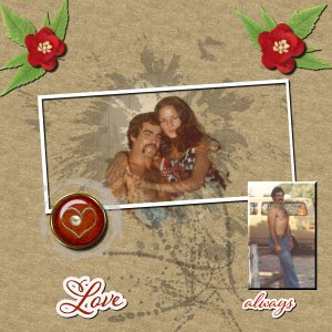
February 13, 2019 at 12:13 am #25751February 13, 2019 at 12:24 am #25753I am still a day behind. Just finished Day 2 Project Love Story Challenge. From my parents love to my own. I am going to have a problem with Day 3 Project as I could not down load the template. I am sorry to say I cannot speak or read French and could not figure out how to down load Day 3’s template. I may just look at what others have done and try to create one from scratch.
February 13, 2019 at 4:51 am #25761Such beautiful results Jnet, well done my friend. <3
February 13, 2019 at 4:53 am #25762Delightful results Sharon, well done. <3
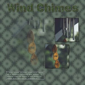
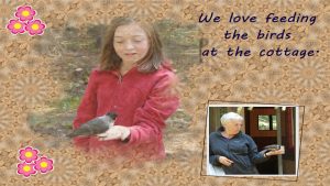
February 13, 2019 at 4:59 am #25764Hi Scrapbook Campers. These templates are such a delight to use, thanks Cassel. The photo I have used here is another from Unsplash by Suresh Kumar and I felt it suited the theme very well. I used an alpha I had created for the title just to add another dimension. The background paper is the kaleidoscope effect but I did seamlessly tile it. Thanks for takin a peek.
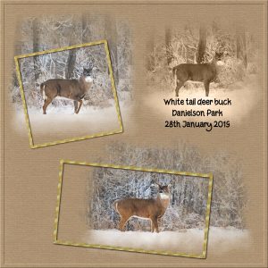
February 13, 2019 at 8:41 am #25771@Sue: In my photography class, the first thing my teacher would ask as one of our pictures came up on the screen was, “What does this person want us to look at?” So that’s my question to you: what do you want me to look at, the herd or mother and calf? If it’s the mother/calf, you’ve succeeded, because that’s what my eye is drawn toward immediately, both because of where it’s placed and because the colors are more saturated than anything else on the page. According to my teacher, the right vertical line on the rule of thirds grid is the strongest axis on which to place an object because people have a tendency to look, not at the center of a picture, but to the right of center–where the mother and calf are.
If you wanted me to look at the herd first, then maybe the page should be recomposed. What if you lifted the herd up a bit so it lies in the middle of the top horizontal axis and then place mother/calf on the left vertical axis? And, instead of cropping the mother/calf with the grass taking up so much of the lower portion of the picture, why not crop the image and bring mother/calf down a bit and then place the frame under the herd’s frame instead of over it? I’m still going to look at them, but my eye will go to the herd first and then drop down.
Now, after all of that, I think it’s important for me to say that I believe what we create is uniquely our own and, if we’re at peace with what we’ve made, then it doesn’t matter what someone else thinks.
That’s enough–
Barbara
February 13, 2019 at 9:23 am #25774@Sue My original post seems to have disappeared into the ether. So I’ll do it again.
In my photography class, the first question the teacher would ask when one of our pictures appeared on the screen was, “What does the person want us to look at?” So that’s my question to you: do you want me to look at the herd or the mother and calf? If it’s the mother and calf, you’ve succeeded–first, because of where the picture’s placed and, second, because the colors are more saturated than those on the rest of the page. According to my teacher, the right vertical axis of the rule of thirds grid–where mother and calf are–is supposedly the axis people have a tendency to look at first. And that’s right where my eye went.
If you wanted the herd to be the main focus, maybe you could recompose the page. What if you lifted the herd up just a bit so it lies in the middle of the top horizontal axis? Then, how about shifting mother and calf to the left vertical axis? And, instead of cropping them so that grass fills much of the frame, why not drop them down a little and place their frame under, instead of over, the herd?
Enough of my ideas, and it’s important to note that they’re mine, not yours. I believe that what we create is uniquely ours and, if we’re at peace or feel good with what we’ve made, that’s all that matters.
Barbara
February 13, 2019 at 9:40 am #25775@Dee 347 As I was looking at the newest submissions, my eye stopped at your day 2 page–I was attracted to the sheer simplicity of it. The photo was the hero of the page and there was nothing to distract me from that. I also really liked your day 3 page. Both the elements you chose and the way you arranged them added to the overall “beachy” ambiance of picture without distracting from the picture itself.
Barbara
February 13, 2019 at 9:57 am #25776@shutterpixi Using that really strong plaid to frame your loggerhead shrike was a great idea. It not only adds interest, it also forces my eye to move to the center of page where the shrike is.
Barbara Hall
February 13, 2019 at 11:15 am #25778Annie Tobin and Barbara Hall — Thank you both for your kind words!
February 13, 2019 at 12:21 pm #25784@Sharon, that is why I put the images on the page to show you where to click, even if you don’t understand what is written.
February 13, 2019 at 1:02 pm #25798Day 4. Although, I did make this page a few nights ago. The background paper is one I made quite some time ago using one of Carole’s tutorials. Corduroy I believe. The layout is in keeping with the challenge. Masks and frames. I made the masks myself.
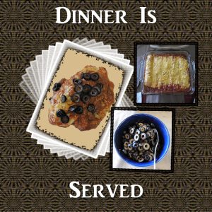
February 13, 2019 at 4:00 pm #25800I forgot to mention that I also love to cook. Day 3 is a sampling of that. I used part of the template that I downloaded, but the mask on the left didn’t work well for this subject. So, I changed out that mask for another.
— Linda
February 13, 2019 at 4:41 pm #25802I’m a little late, but here is day 1. Learning already. Thanks Cassel!. Everyone’s work looks awesome. So glad to see familiar names. @Sue-am so enjoying another round of your photography and scrapbook pages. @Barbara Hall-I too live in South Louisiana. Happy Mardi Gras!
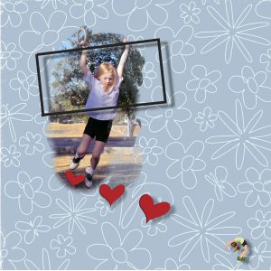
February 13, 2019 at 5:32 pm #25804Well, this turned out to be a lot harder than it should have been. For some reason, my 2019 version of PSP didn’t want to let me paint over the raster to make a mask. The paint brush would only remove a small amount of the layer at a time and I ended up with a situation akin to trying to remove a product sticker from a piece of plasticware. I kept virtually scrubbing and only bits of the layer would come up. And then the program kept shutting down. I finally gave up and opened my 2018 version of PSP and had no trouble at all. This isn’t the first problem I’ve had with the newer version–it also won’t accept plug-ins. I’ve been in contact by email with Corel and have received instructions via email to fix that. But the fix didn’t work. It’s frustrating because all communication has been via email and there’s a day or so lag between me doing what I’ve been instructed to do, sending info to my assigned technician saying it didn’t work, then waiting a day or so until he responds. Anyway . . . has anyone else had problems PSP 2019?
So, this is my day 4 page. All of the pictures I’ve been using are of my granddaughter at a younger age. I decided to put up-to-date pictures of her in the process of doing flips on the corner of each page (I went back and added them to my other pages). Then I also decided to forgo words on each page until later.
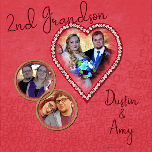
February 13, 2019 at 8:19 pm #25812Day 4: I’ve never had to work so hard! Computer and software problems. Ugh! Oh, had two teeth filled today which didn’t help.
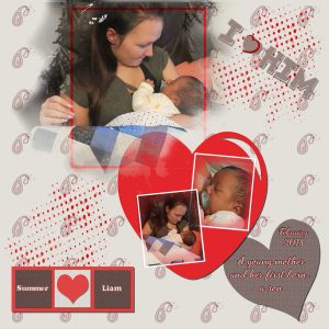
Anyway, finally finished the on for today. This is my oldest daughter’s youngest. She is six years older than our youngest so there’s a space between the kids. Our adopted son was killed in a car wreck at 21 (1997) and he never gave us any grand kids.
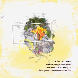
February 13, 2019 at 8:56 pm #25814Day 4: The subject I chose for today’s is a beautiful but invasive flower, the American Lotus. Creating my own mask using the watercolor brushes that were part of the download allowed me to tailor the mask perfectly for this photo. I used a textured background, then added noise to it. I used Graphics Plus – Cross Shadow plugin on the frame.
Linda
February 13, 2019 at 9:59 pm #25818I had fun with the kaleidoscope pattern maker. Still struggling a bit with the template to mask conversion.
February 13, 2019 at 11:27 pm #25821Love your work Sue, job well done Hun. <3
February 13, 2019 at 11:29 pm #25822Mmmm. Now that looks delicious shutterpixi … any leftovers? Lovely, tasty work my friend. <3
February 13, 2019 at 11:31 pm #25823Aww, really sweet Rhonda, nice work Hun. <3
February 13, 2019 at 11:33 pm #25824Beautiful work shutterpixi. I love the plugin Graphics Plus and especially the cross shadow effect. <3
February 13, 2019 at 11:35 pm #25825Lovely work Art, well done. <3
February 13, 2019 at 11:42 pm #25827Hello Scrapbook Campers. Thanks for the tut Cassel and you are right, it is addictive, 🙂 Photo used was by Annie Spratt from Unsplash. I made a simple square frame copied it as a new image, applied Cassel’s script -scribbles- to it and re-inserted it into the page. I love the scribbles effect. Thanks for takin a peek.
February 14, 2019 at 12:22 am #25829My third project is complete. Still one behind. Everyone’s projects look so amazing. I am really enjoying this experience.
February 14, 2019 at 12:32 am #25830Lovely job Sharon, very pretty. <3
February 14, 2019 at 12:34 am #25832Annie, I didn’t know about Cassel’s script “Scribbles” — that’s a really great effect! I’ll have to put that script on my wish list — thanks!
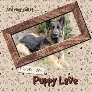
This tutorial on making your own mask is so useful. When it came to making a frame, I blanked out on how to make a simple white frame so went to Cassel’s element creation page for frames and found instructions on how to make a rustic wooden one instead. Once I had finished my page and checked out everyone else’s creative efforts, I realized just how easy it would have been to make that simple white frame, and the page probably would have looked better with it too. Oh well, I couldn’t waste the wooden frame I worked so hard on so left it in the project anyway.
The background paper pattern is from Pixelscrapper’s Paper Templates #18 Dog Overlay. The paper tag is also from their Puppy Dog Mini Kit. The font is “Gunter Hund” (Good Dog), a free font from DaFont.com.
-
AuthorPosts
- The forum ‘Showroom’ is closed to new topics and replies.


