Home of the Scrapbook Campus › Forums › Showroom › Love Story Challenge 2019
Tagged: Love Story
- This topic has 195 replies, 26 voices, and was last updated 5 years, 10 months ago by
Sue Thomas.
-
AuthorPosts
-
February 11, 2019 at 12:47 pm #25663
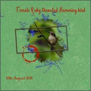
Barbara, thank you for your kind comment on my page. It’s always a shock to the system when the temps change so dramatically after a hot summer, but we get used to it and with clothing to withstand such cold temps, I’m able to get out and about. I alter the camera setting indoors before going outside. I have a remote shutter control, which has quite a long cable. Using a monopod, I can hold the camera comfortably with a mitten on, while the other is tucked inside my -40c overalls to take the shot with the remote shutter. I unzip the overalls enough to slip my hand in with the shutter. So my one hand is only exposed for a matter of seconds at a time. All the projects posted are really lovely. Well done everyone! Today I went with this photo. I’m already dreaming of summer. The only shot I have ever taken of a Humming bird with it’s tongue out. For the background I used a plain colour, and added an overlay, then played with the blend modes to get the desired effect. For the background border I selected all, effects, 3D effect, buttonize. I also moved the blue splatter below the mask, to show more of the photo.
February 11, 2019 at 2:54 pm #25666Day 2 led me off in a lot of different directions. I needed to rotate the mask to fit my photo – I tried using it in the original position, but I didn’t care for the result. So I started over, which meant I got to practice the mask creation twice 🙂 and I did it without consulting yesterday’s instructions both times! (Five more times, and I’ll consider it truly learned!)
I duplicated one of the brush layers and played around with rotating them to keep my photo clear. I deleted the circle brush layer as well.
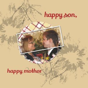
Then it was time to try my hand at creating the plaid using colors from the photo. For some reason, the lines I pasted into the 200 X 10 image wouldn’t stay straight, so I re-watched the lesson, and noticed that Carole’s line size was longer than the size of the image. I made that change, and it did help a lot.
I didn’t want the whole page to be plaid, so I created the circle, and then had to figure out how to mask the plaid behind the photo so it didn’t show through. More practice! I think I’d like to add some texture to the background paper. The solid color flood-fill doesn’t please me, but that’s a project for another day.
February 11, 2019 at 2:58 pm #25668@Sue, I guess I need to learn about blend modes and overlays next. I really like your background paper – it makes the lovely little hummingbird shine.
February 11, 2019 at 3:12 pm #25669Thank you Alicia for you lovely comment. Your page is lovely Alicia! To add a subtle texture to your background paper go to effects, texture effects, effects. There you’ll find quite a few that comes with PSP. Choose a texture, and play with the shine, size and depth to get the desired effect that you want. With the blend mode place a photo, or any layer that you like above the background layer and go to the blend mode tool, which is below the colour palette. It’s always on normal, but click on it, and it will reveal a large selection of options. Overlay papers are usually black/ grey and white patterns. That’s the best I can do in describing it to you. Hope you could follow what I wrote.
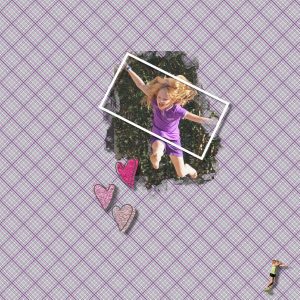
February 11, 2019 at 5:54 pm #25674Well, I learned a lot today . . . making plaid paper is ridiculously easy–who knew? In the process of playing with plaids I learned a useful image command I didn’t know–free rotate. I’ve struggled with ribbons when they load in one direction and I want them to go in another. I’ve been doing all the turning with the pick tool–never again!
I’m almost embarrassed to admit that this is my fourth version of this challenge. I could probably make plaids in my sleep, I’ve done so many! This is it, though. No more re-do’s on this one. (Well, maybe one more from at template I got at loulou. I left the words-in French–on it so I’d know where to put my own narrative.) I’m leaving words off until I finish day 7 so that I can compose a coherent narrative for the series. I’m not sure what my granddaughter is doing in the bottom corner.
That’s it for today–
Barbara
February 11, 2019 at 8:34 pm #25679Well, I’m behind LOL! Here is day 1. I ran into a lot of problems and got really frustrated 🙁
February 11, 2019 at 8:37 pm #25681Day 2
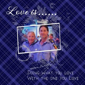
I am not sure about the background being as dark as it is…….made my plaid and then put a navyblue behind it.
I didn’t like it with a light background.I duplicated one of the brushes and expanded it to go behind the mask group and then adjusted the brightness/contrast so it showed up better.
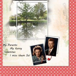
This is hubby and I at the presentation dinner for the Fire Service after the Australian Firefighter Games when they were held here.
And the text says it all.February 11, 2019 at 8:55 pm #25683I didn’t try making a plaid background today. I was busy trying to fully understand the process of making a mask from the template. After several tries and some experimentation I think I have got it.
As I mentioned in an earlier post, I like working in 19 by 9 format. I was so easy to convert the template. And now when I send it to the parties involved they will cover the whole screen.
February 11, 2019 at 11:10 pm #25688Re: Challenge tutorials
Will I still have access to the tutorials once the challenge ends? If not, how can I save them? I’d like to think that I’ll remember how to do everything, but I know that’s unrealistic.
Barbara
February 11, 2019 at 11:16 pm #25689@Barbara. yes, you will keep access to the tutorial. These are the same as last year, so they have already lasted that long! 🙂
February 11, 2019 at 11:59 pm #25691This template made me think of a good friend of ours who is crazy in love with tea (must be the mug ring layer). I had fun with the plaid paper but it still looked a little bare so I also added gold heart scatter and elements from Pixelscrapper’s English Breakfast and Sisters Always Mini Kits.
February 12, 2019 at 2:01 am #25696The day one challenge took me 2 days to get it done. I had family obligations and commitments that took up most of my Sunday. I also did get a bit confused at first in the instructions but finally figured it out. I have submitted a copy of my first project. I decided to keep it simple as it is getting late and I am tired. But it was a good learning experience.
February 12, 2019 at 3:14 am #25698Hi All!! I am a day behind as usual. I saw some really nice pages!! Keep up the good work everyone.
I had great difficulties with the mask. I changed the picture in the mask and it worked out better.I hope tomorrow goes better!!HaHa!!
February 12, 2019 at 3:58 am #25700Congrats to Susan, Aus, Sue, Alicia, Barbara, AngelStarr5, Art, redradar, Sharon and darlenek for the beautiful job you have all put into your scrapbook pages for the love-story-challenge to date, well done!
February 12, 2019 at 4:03 am #25701Thanks Annie.
Yes everyone is doing a wonderful job……telling tales of love.I’m LOVING this challenge
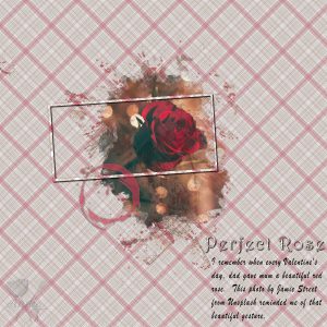
February 12, 2019 at 4:06 am #25703Hi Scrapbook Campers. This is my result for the day 2 love-story-challenge. Photo used was by Jamie Street from Unsplash. Love the mask effect but I did need to follow the instructions from day 1 again, these old brain cells ain’t what they used to be, lol! Thanks for takin a peek.
P.S. Cassel did ask what was thought of the simplicity of this page and I must say that I am impressed. Often times simplicity says it better, 🙂
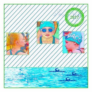
February 12, 2019 at 4:35 am #25705To Cassel: Thank you! With only two days of tutorials, I was able to take a template I downloaded from the loulou site, make four masks (for the water and the three head shots) AND add the striped background paper. I’ve used the texture part of the color palette, but not the pattern part until yesterday when we made plaid paper. I was amazed and delighted to find out that I can open any paper I want in my work space and it will appear in the pattern part. All I have to do is choose it and then “pour” the design onto the background layer. More digital magic!
I was really happy to find out that I can use templates in PaintShopPro. I’ve grouped the pictures I’ve taken of my grandchildren over the past eight years by subject, e.g. swimming or riding bikes, and then I have put them in chronological order–I think it’s fun to watch them doing the same thing at different ages. I want to make each grouping into cohesive scrapbook pages and that’s where I’ve run into trouble–the cohesive part. I veer all over the place in my designs. I think using templates and sticking to a limited number of papers and embellishments–and a consistent font–will help me reach my goal.
About the kind of weird-looking pictures: When the photos I take aren’t up to par, I sometimes play with scripts to see what effects I can get. These were done with a comic script I had loaded into one of my earlier versions of PaintShopPro.
Barbara
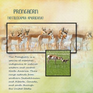
February 12, 2019 at 2:24 pm #25717Here’s my day 3 of the challenge. We really are trapped in a deep freeze. Again -30c, with 15km winds, making it feel like -40 and colder. At least the sun is shining, and there is a lot of heat in the sun. Out of the wind the horses bodies are toasty hot to the touch. Early in January I came across a small herd of about 20 Antelope, feeding in a stubble field. The smaller photo is of a female with her new born fawn, which was born in the horses field. They have their young in mid June. I used colours from the two photos to create the background paper, and made my own mask. I wanted some of the stubble to subtlety show through the background paper. I used watercolour brushes to make the background paper. Warp brush, noise tool. A lot of blur, and two other layers with matching colours, opacity and blend mode. Also a texture.
February 12, 2019 at 4:18 pm #25722@Sue: I love-love-love the top picture of the pronghorn herd–and the color palette you used is perfect. The paper is beautiful. I know this forum is more a show-and-tell rather than a show and have others evaluate your work. That being said, I recently took a photography class and our photos were displayed on a screen for the whole class to look at and critique. That was invaluable because it helped me know what I was doing well and also gave me ideas about how I could improve on what I’d done. I’m really impressed by your page though I also see a couple of things I might change. I don’t know if you’re interested in that kind of feedback, so I won’t give it unless invited.
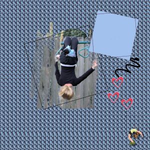
Today’s assignment: Making masks is getting easier and easier. The kaleidoscope instructions weren’t quite detailed enough for me at the beginning. I made the selection and copied it with control c and then I was supposed to paste it as a new image but the directions didn’t tell or show me how to do that. I had to go to help.corel to find out what to do. I made the design really small which adds a kind of knitted texture to it. I didn’t do it for that reason-I was just trying to lessen the “busyness” of the design-but I like the way it turned out.
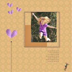
In case anyone’s interested, the theme of my pages is what my never-still granddaughter loves to do…e.g.,jump, hang upside down, climb, jump, flip.
February 12, 2019 at 5:16 pm #25723Constructive criticism is always gratefully received. It’s how we learn and improve Barbara. I’m not really a scrapbooker, I use my photos in greeting cards, and calendars, to be printed and given to family and friends at home, the rest are sent via email. By all means tell me what you’d change, you have me intrigued now.
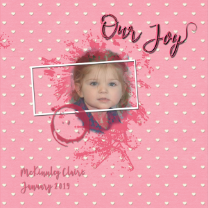
February 12, 2019 at 5:48 pm #25726Day 2 of Love Story 2019 is our darling McKi. My font is Belattrix2 with a Respective Swash added at the end. I used a paper from SyrenaE. Hoping to keep all the layouts in a love theme using Valentine related item.
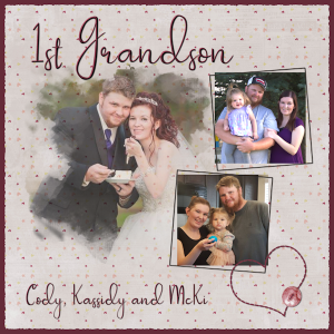
February 12, 2019 at 5:51 pm #25728Day 3: Our oldest grandson Cody and his family. The paper is by Cytisia Coeursmaman’s and I used Passionate font. I took a heart that I had in my file and added the button. I decided to distress the edges of the paper used Carole’s distressed edge script.
February 12, 2019 at 6:05 pm #25730February 12, 2019 at 6:06 pm #25732February 12, 2019 at 9:06 pm #25736I’m not a scrapbooker, but I love PSP. As you can probably guess from my screenname, I also love photography. I particularly like taking photos of wildlife, birds, flowers/grasses/trees, insects, landscapes, sunrises and sunsets.
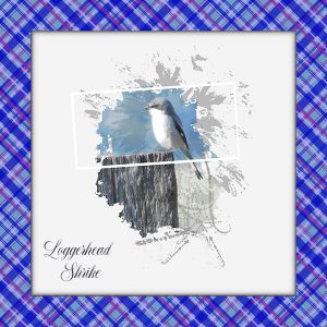
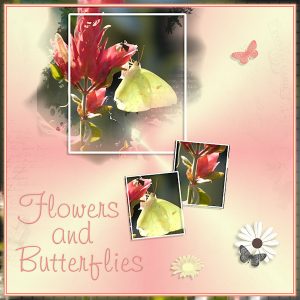
Here are my Day 1 and Day 2 images. On the Day 1 image, I used one of my photos of a yellow butterfly on a shrimp plant. I used some brushes to create the other butterflies and one daisy, using Hue and Saturation to change the butterfly colors. The daisy with the black center is from the provided materials. On the Day 2 image, I used one of my photos of a Loggerhead Shrike and decided to remove some elements of the mask. I opted to use the plaid I made for a border instead of a background. I applied drop shadows and buttonized the image inside the border.
February 12, 2019 at 10:45 pm #25739I’m really enjoying seeing everyone’s creations and have gotten some good ideas from them on how to improve my work. Thanks everyone!
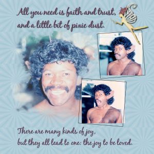
When I saw Carole’s Day 3 page with Bob in jester costume, I was totally inspired! Our friend Phil wore a jester costume similar to his which I had gotten for him to attend the Renaissance Faire with our family. So many people like to play at being royalty, but it takes a very special man to wear a jester costume. I must have spent half the day looking for a photo of that but unfortunately to no avail.
What I did find was my friend dressed as a fairy for a Halloween party, so I went with that instead. I found two fairy quotes, the “pixie dust” one from Peter Pan, and the “joy to be loved” quote from The NeverEnding Story. Both fit my friend very well, and the second quote ties in with the Love Story theme.
I’ve had a lot of fun playing around in the past with the Kaleidoscope tutorial through the Diamond membership. This time I had to tone down the effect somewhat to put the focus on the photos, otherwise the page looked too busy. I found the wooden fairy in Pixelscrapper’s Enchanted elements kit. Thanks for looking!
February 12, 2019 at 11:26 pm #25742Wow Sue, this is really lovely and natural, well done. <3
February 12, 2019 at 11:29 pm #25743Job well done Barbara, I love it. <3
February 12, 2019 at 11:30 pm #25744Very pretty Teri, nice work. <3
February 12, 2019 at 11:31 pm #25745Another lovely result Teri. <3
-
AuthorPosts
- The forum ‘Showroom’ is closed to new topics and replies.


