Home of the Scrapbook Campus › Forums › Challenges › June Tut/Tech Challenge
- This topic has 14 replies, 6 voices, and was last updated 7 years, 5 months ago by
Cristina.
-
AuthorPosts
-
June 24, 2017 at 12:00 pm #13620

The Campus is the perfect place to learn more about photo editing, various techniques, or PSP in general.
This challenge will give you an opportunity to practice some of those techniques or use some tools.
This month’s Tut/Tech Challenge is the Text on Path. This technique is fairly simple, and once you know how to attach the text to any path, you open up a whole world of options to add your text. You can read the tutorial HERE.
What will you create? Show us below. We want to be inspired.
June 25, 2017 at 5:17 pm #13631June 25, 2017 at 9:11 pm #13643Anja your page is lovely. Thanks for showing us.
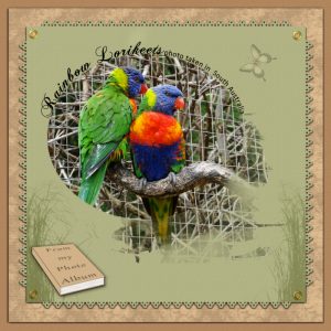
Here is my page for this challenge. The Text on Path effect done on the bird photo and green page edge (this done with Cassel’s Font edges). Album book was done with Cassel’s Preview Book script. The Mask on photo was a freebie I was able to get.
best wishes to everyone,
Dawn.
June 26, 2017 at 2:50 am #13656Anja and Dawn, both lovely layouts using gorgeous subjects.
Sheila x
June 27, 2017 at 4:15 am #13659Anja and Dawn, nice layouts, colors, and photos. Great work!
Dawn, I love the page edge and the preview book. I knew neither the font nor the script… I will add to my wish list 😉
I haven’t done anything yet to this challenge… Let’s see if I can come up with something.
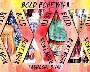
June 28, 2017 at 4:48 am #13664I just read your campus update and by coincidence, I used the Text on Path technique today for my gaming group daily theme. Again, pay no attention to “Fabulous Divas.” That is simply the group’s name.
I couldn’t get the exact result I wanted and I ran out of time. I wanted to make the word “BOLD” more centered over it’s part of the path. I put “BOLD BOHEMIAN” on one path and I realize now I probably should have created separate paths for each word. I used the space bar to move “Bohemian” to where I wanted it to go. However, when I tried to do the same with “Bold,” it didn’t work. I put my cursor at the beginning of the text, but when I spaced, only the second word would move. Can anyone give me any hints besides using two different paths?
June 28, 2017 at 4:50 am #13665Anja and AprilDawn, I love your projects. I wish there was an option to “like” your posts.
June 28, 2017 at 9:52 am #13677micfin, I like your layout very much … so colorful and creative. Great work!
And about your doubt, right now I can only think of creating the text in two layers, one for each word. Maybe others have a better idea.
June 28, 2017 at 9:59 am #13680Here is my contribution for this challenge. For the papers, I used a free icon from Wikipedia and ran the Cassel’s Embossed Script. Also used Cassel’s Corners Punched A brush. For the photo, I used one of the Distressed Edges freebies and ran the Split-Photo script. As I had 4 pieces of the photo and I only wanted 2, I merged them, and after that, I ran the Lifted Photo script.
For the papers, I used a free icon from Wikipedia and ran the cass-Embossed Script. Also used cass-Corners-PunchesA Brush. For the photo, I used one of the Distressed Edges freebies and ran the cass-Split-Photo script. As I had 4 pieces of the photo and I only wanted 2, I merged them, and after that, I ran the cass-LiftedPhoto script.
At the end, I added this cute cass-StripCluster-SpringThing1.
June 28, 2017 at 12:48 pm #13681your layouts are really wonderful and with so different effects
love them all
thank you all for your nice comments
June 28, 2017 at 10:59 pm #13694Cristina, Anja, mcfin and Sheila, thank you all for taking the time to leave a comment on my page for this challenge. it is great we can be an encouragement to one another in this way.
mcfin…. like Cristina, I also think your page is very colourful and creative . isn’t it wonderful to see the different ideas that we all have. well done!
Cristina.. love your page,…… the corner punches and the text on path look great..
best wishes everyone,
Dawn.
June 29, 2017 at 4:04 pm #13696Dawn, thank you for your comment. 🙂 Like you said, it is an encouragement to one another.
It is the first time I am using the corner punches, although I have had the brushes for some time. I’ve seen you using it and always loved the effect.
July 2, 2017 at 2:20 am #13743Thanks for the kind words, ladies, and the suggestions.
Cristina, your page is beautiful. I’m going to have to look into the corner punches and the lifted photo script. They look very cool.
I’m learning so much from everyone. Thank you for describing the different methods and tools you used on your projects.
July 2, 2017 at 6:06 am #13746So I couldn’t resist…I bought all three corner punch brush sets and the lifted photo script. I started playing with them and what I did fit right into my group’s daily theme for Sunday. Risking redundancy, I thank you all.
July 2, 2017 at 11:14 am #13749micfin, thanks for your kind comment! One of the good things here is the Campus is that we learn a lot from each other.
-
AuthorPosts
- The forum ‘Challenges’ is closed to new topics and replies.


