Home of the Scrapbook Campus › Forums › Challenges › June Tut/Tech Challenge – Vignette
Tagged: Vignette
- This topic has 12 replies, 6 voices, and was last updated 6 years, 5 months ago by
Michele.
-
AuthorPosts
-
June 23, 2018 at 11:06 am #19595

The Campus is the perfect place to learn more about photo editing, various techniques, or PSP in general.
This challenge will give you an opportunity to practice some of those techniques or use some tools.
This month’s Tut/Tech Challenge is to the Vignette effect from PSP. Use one of the default preset or create your own. Put the focus on the subject of your photo, or simulate an old picture. Be creative.
HERE is a tutorial to help you out.
Why not show us the before and after? It is always inspiring to know how one starts with an “ordinary” image and creates a masterpiece using PSP and a few clicks.
June 25, 2018 at 9:06 am #19673When I first watched this tutorial, I thought it was awesome to be able to add a vignette effect to a selection. (Now I realize you can add any effect to a selection.) I took a pic I had previously downloaded from a wallpaper site and played with it. I liked the idea of a light vignette for this pic. Added a few poinsettias from a tube, lowered the opacity of them, and created a simple frame. I didn’t want the font to overshadow that sweet face. Oddly enough the name of it is Summery. 🙂
I can’t wait to see what the other campus members come up with.
~ Michele
June 25, 2018 at 5:23 pm #19703well done Michele! love the effect you have achieved. such a pretty photo to have used for this technique and adding the flower tube was a great idea.
Dawn.
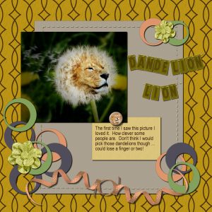
June 26, 2018 at 8:38 am #19748Completed this lesson for Basic Scrap Course 1 – Module 5. The main photo got the Vignette treatment. I really liked the result. Never used Vignette before but now that I am familiar with it I may be using it a lot more.
June 27, 2018 at 7:25 am #19785Great job, Annie. That dandeLION is wonderful.
~ Michele
June 27, 2018 at 6:21 pm #19788Perfect Vignette effect for this photo Michele, love it, You Go Girl! <3
June 27, 2018 at 6:26 pm #19789Thanks Michele. Do you think he is a dandelion or a Dandy Lion? LOL! Interesting effect Vignette. I agree with the lighter touch for your Christmas Chick and I had to go darker for the lion otherwise I lost the wind blown effect of the dandelion. Definitely makes you think about what you are trying to achieve. <3
June 29, 2018 at 1:10 pm #19846Michele, you achieved a very nice vignette effect and created a lovely layout. Well done.
Annie, your DandeLion is awesome 😀
I am so behind with the challenges. I just finished one layout today and let’s see what else I can do.
June 29, 2018 at 5:42 pm #19848Thanks dear Cristina, always appreciated my friend. <3
June 29, 2018 at 8:12 pm #19850Annie, your dandelion vignette was such a creative idea. it looks great… well done!
Dawn.
June 30, 2018 at 8:01 am #19854Thanks, Cristina. 🙂
~ Michele
July 3, 2018 at 4:25 pm #19955Hello everybody! I needed a quick birthday wish for my brother this past weekend. He drives heavy equipment, and this is what I came up with. I started with a stock photo….adjusted brightness/contrast…. applied vignette & lowered opacity….added text. Very quick and he loved it! Enjoy! Nancy
July 4, 2018 at 5:56 am #19961Great job, Nancy! I’ll bet your brother loved it.
~ Michele
-
AuthorPosts
- The forum ‘Challenges’ is closed to new topics and replies.


