Home of the Scrapbook Campus › Forums › Challenges › June Theme Challenge – CONTINENTS
- This topic has 25 replies, 7 voices, and was last updated 3 years, 6 months ago by
Annie Tobin.
-
AuthorPosts
-
June 1, 2021 at 7:48 am #58733

If you have visited, worked or studied in a different continent, do you have something to show? Or maybe you have some ancestors coming from a different continent? Show us any project you can have related to different (or your own) continents.
Let’s go!
June 1, 2021 at 11:59 pm #58760Well here is a little bit of information about the floral emblems for the nation of Australia and for her states. If anything is unclear just holler and I will be glad to provide any information. Fonts used are CNN, Claudia and Segoe Script. The photos of the flowers for Victoria and Tasmania are a little unclear so I will provide some photos of them in a separate post. Thanks for taking a peek my friends. ;D
June 2, 2021 at 8:00 pm #58790Annie, what an outstanding page to pay tribute to your beautiful country. The arrows are a great idea. I love arrows, the eye automatically follows their direction. Like everything about your country the flowers are no different, they are vibrantly colourful. I notice that you used a lilac watercolour brush bleed on the background paper. Perfect, it matches the Orchid. It’s little things like that I notice and love.
June 2, 2021 at 9:37 pm #58798Thanks very much Sue, means a lot to me getting positive comments from yourself. The page is a little disappointing in that some of the words on the arrows are illegible … even for me and I know the flowers, lol! In hindsight I should have used a different font … ah well, always room for improvement dear friend. 🙂
June 3, 2021 at 12:31 am #58805Ok … revision done! I changed the CNN font to Comic Sans and all white … much easier on the eyes. Our little island state of Tasmania the font is black as is that of Western Australia … for obvious reasons. Thanks for takin a peek. ;D
June 3, 2021 at 4:08 am #58807Annie, what a beautiful layout! I agree, with the new font and color, it’s easier to read.
It happens to me often that only after posting a layout here that I see things that don’t seem right… No matter how long I have looked at it. : )
June 3, 2021 at 7:28 am #58809Annie, I must admit I didn’t have a problem reading the text in the arrows, saying that the revised version is more clear.
June 3, 2021 at 11:06 pm #58819Thanks dear Cristina and Sue … as always your comments are fondly regarded. Hugs to you both. ;D
June 4, 2021 at 12:02 pm #58824This was just a quick project to show one of the papers and world map that are included in today’s. Creative fabrica Daily Gifts.
June 4, 2021 at 8:07 pm #58836LOL! It is lovely Anne and I am wondering if there is actually anyone who has seen the WHOLE world … I like your ambition my friend. ;D
June 5, 2021 at 12:02 am #58838Another for the challenge. 10 facts about Australia that you may not know. It is a strange little continent … being the smallest of the 7 continents and we Aussies are very proud of her. The font used for the text is Scriptys. Thanks for takin a peek my friends. ;D
June 5, 2021 at 4:03 pm #58839Wow, Annie, great to see all your Australien info and it is so colorful!!! You have done your beloved country well!
June 5, 2021 at 5:57 pm #58841Thanks dear Corrie, always appreciated my friend. It is made easy for me as Australia is the smallest continent and a relatively new discovery for all intents and purposes. It will be harder for those like yourself who lives in the Netherlands and your continent is Europe! Fifty-two countries (including the Vatican City) squished into one continent … hell’s bells, I wouldn’t know where to start! We may in the not too distant future have 8 continents on the earth, below is an excerpt from Wikipedia …
The case for Zealandia being a continent in its own right was argued by Nick Mortimer and Hamish Campbell in their 2017 book, entitled Zealandia: Our continent revealed, citing geological and ecological evidence to support the proposal.
In 2017, a team of eleven geologists from New Zealand, New Caledonia, and Australia concluded that Zealandia fulfills all the requirements to be considered a submerged continent, rather than a microcontinent or continental fragment. This verdict was widely covered by news media.Who knows Corrie, we may even see that acknowledgement in our lifetime! Can ya tell I love GEOGRAPHY, lol! Looking forward to seeing your contribution to this theme Corrie as I love your work dear friend. ;D
June 6, 2021 at 4:05 pm #58845Thanks Annie, I’m working on it but I haven’t come up with a good idea yet, there are so many possibilities! I remember to have read or seen on the telly about this new continent, but those things take ages.
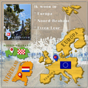
June 9, 2021 at 5:44 pm #58915Well after long and hard thinking I have come up with this LO. As Annie said it is difficult making something of Europe. I have quite a bit traveled around but it isn’t easy to show all of that in this setting. So I decided on something else and show where I live on this continent of mine. And instead of my usual flowers I used flaggs. The background is made by a paper of the globe combined with a photo and using a blend mode and opacity.
I’m happy that the alphabet game is way easier!
June 9, 2021 at 6:32 pm #58924I think this is very clever Corrie. I love your background paper and the cityscape overlay suits perfectly. What blend mode did you use to achieve that effect my friend? An inspirational page dear Corrie, well done. 😉
June 10, 2021 at 3:03 pm #58944Hi Annie I’m glad you liked it because I wasn’t too sure myself. I was a bit out of my comfortzone. The blend mode I found by just trying them all. I first had a backgroundpaper with a worldglobe that I found on Pixelscrapper, but it was too obvious. So I lowered the opacity (white layer underneath of course). Then it needed something else and I did an overlay with a photo of our old marketsquare, that photo had a blue sky and lots of paving at the bottom. It still wasn’t what I wanted and I played around with the blend modes and luminance or dark light and a very low opacity about 30% gave this result. It made the sky and the paving disappear, a rather fun effect.
June 10, 2021 at 3:50 pm #58946Sorry Annie, the blend mode was difference (I checked, should have done that before!) with 61% opacity. The above mentioned I used at first and later changed it to this one.
June 10, 2021 at 6:57 pm #58950Dear Corrie, I thought it might be either difference or exclusion. They are blend modes that I use very rarely but there are times when nothing else gives quite the same result. This really did turn out wonderfully my friend and thanks very much for sharing the information. <3 😀
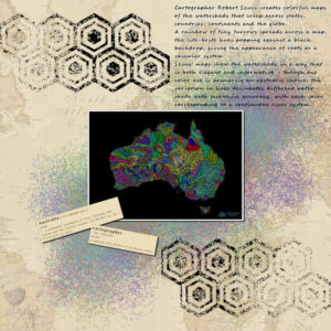
June 11, 2021 at 2:47 am #58954Decided to do this one for the theme following the lessons in Lab11M5. The grungy background behind the photo was made by using the grungy brush as a paint brush instead of as an eraser! Thanks for takin a peek my friends. 😀
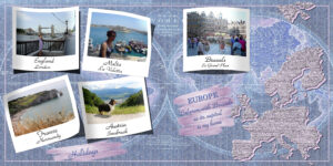
June 18, 2021 at 5:34 pm #59190After much thought I came to this. I used Carole’s script lifted photos for the photos.
June 18, 2021 at 7:53 pm #59194Very lovely Marie-Claire. The lifted photo script draws the attention to the photos and I love the clever use of the art media tool to draw attention to the title etcetera. Inspires me, thank you. ;D
June 18, 2021 at 11:56 pm #59217Another for the Continents theme. Antartica is the least known continent so I thought I could provide a very basic knowledge regards her. Font used is Commercial script, speech bubbles are freebies from Cassel, photo and sketch are freebies on the web, masks and alpha from PixelScrappers. Thanks for takin a peek my friends. ;D
June 19, 2021 at 4:07 am #59219Marie-Claire: That is one of the most effective uses of pale pastel colors that I have ever seen. The lifted photos stand out and are perfect for that design. You inspire me! How lucky to live in Belgium, home of one of my favorite TV shows on PBS: Professor T. 😉
Annie: How interesting you make geography. Antarctica is unfortunately in the news more lately as it shows signs of melting faster than usual due to global warming. Is a rainforest far behind for its distant future? Your design is very effective and, as usual, commands my attention! Good work, my friend. 🙂
-
This reply was modified 3 years, 6 months ago by
Ann Seeber.
June 19, 2021 at 5:13 am #59221Annie, very nice and informative and truly in your own unique style, love it my friend!
Marie-Claire, very cleverly done!
June 19, 2021 at 6:24 pm #59246Ann and Corrie, thank you very much for your lovely comments on my work, always appreciated my friends. ;D
-
This reply was modified 3 years, 6 months ago by
-
AuthorPosts
- The forum ‘Challenges’ is closed to new topics and replies.


