Home of the Scrapbook Campus › Forums › Challenges › July Master Class Challenge
- This topic has 20 replies, 7 voices, and was last updated 7 years, 4 months ago by
AprilDawn.
-
AuthorPosts
-
July 3, 2017 at 11:45 am #13763
Although the edited video is not yet available, those who were able to attend the live class (or the replay) might be inspired to create something of their own. I would LOVE to see what you will come up. It would be even interesting to see the “before” and the “after” image. It is always amazing to see how a very ordinary (and often boring) photo can be turned into something magical.
Here are those I used for the class.
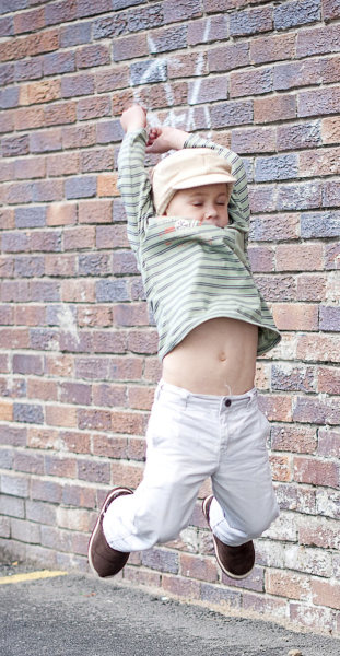
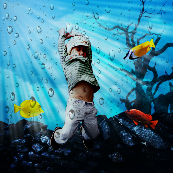
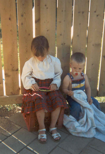
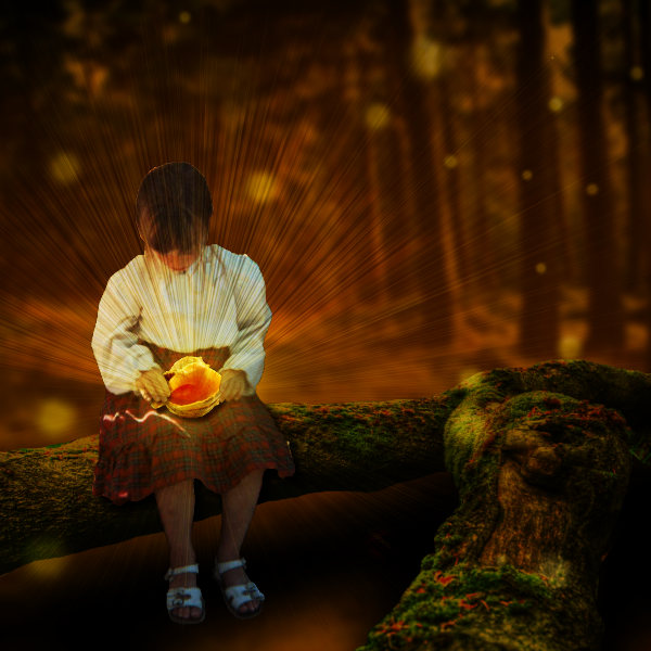
Show us yours.
If you need extra images (like the rocks, the clouds, etc.) here are some links to help out:
July 4, 2017 at 11:50 pm #13782I was happy to be able to attend the class, it very interested and I learned a lot of neat techniques. I am going to try to put something together! 🙂
July 9, 2017 at 4:31 am #13874I really loved this class. I haven’t done anything yet, but I will try it sometime later.
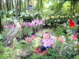
July 10, 2017 at 2:09 am #13910The class was really good, sorry I couldn’t attend live but the video was great. It was not so easy however to come up with a page, I had a few ideas but finding photos and backgrounds that were suitable was quite hard. Anyway this is my attempt. I used a photo of a friend’s baby, and other photos of our visit to Singapore: the orchid garden and bird park. I did a bit of cloning to get the plants round the Emma, and used the feathered circle technique for the glow behind her. After a bit of trial and error I settled on the Luminance (Legacy) blend mode. I wanted to highlight the birds a bit but using the same technique didn’t look that good, neither did going for sun rays, so in the end I used the layer properties and added a small outer glow. The quality of the reduced jpeg was not as good as I would have liked but hopefully you get the idea.
July 11, 2017 at 5:43 am #13920Marlene, very nice page. I love to see all the different ideas for this challenge.
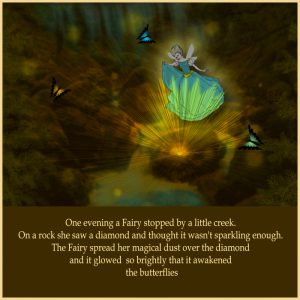
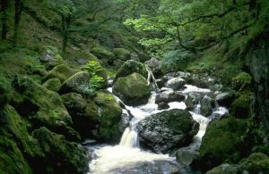
Here is my contribution to this challenge. I used a photo I had in my collection as a base for the project.. then found a clipart fairy I had in the folder as well, so from there it began. I followed Cassel’s video on how to do sunrays etc. but I added another glow for the fairy using layer styles outer glow. the butterflies I made long ago in a software called PhotoImpact using a tutorial. they have a fantasy look about them and they fitted the project theme. I made up a little story to put on the page.. this is my first attempt to do something like this.. it is not perfect. but you got to start somewhere. hope it comes up ok on screen. I have included the photo I started with in the upload
Best wishes to everyone,
Dawn.
July 12, 2017 at 2:36 am #13930That is lovely Dawn, the story makes all the difference.
July 12, 2017 at 6:06 pm #13934Marlene, Thank you for taking the time to leave me a comment on my project. I hesitated posting it because it was so different a style of project for me to try. Even though I know it is not perfect, I enjoyed Cassel’s class so much I thought I would let my imagination go and try something fun with this Fantasy World technique.
Dawn.
July 13, 2017 at 4:10 am #13936Marlene, Dawn, very good pages and ideas for this challenge!
Dawn, coming up with a story helps a lot to do this challenge… great idea. I love the butterfly you created.
Like Marlene, I am struggling to come up with an idea, story for the challenge… Yesterday I started to collect some forest photos from Pixabay… I don’t know what yet, but I will for sure do something.
Have a nice day, ladies 🙂
July 13, 2017 at 8:02 am #13938Hello Cristina, thank you for leaving me a comment on my project. I appreciate it very much. … it took me a few days also to put something together for this challenge….. the butterfly was done in another programme like I mentioned in my post. but I am going to try and create another version of it in PSP.
best of wishes,
Dawn.
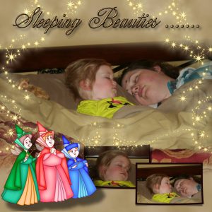
July 13, 2017 at 12:25 pm #13942Thanks for the inspiration, AGAIN. I love all of your work and please continue to post it really is great to see all the creative ideas. I had this picture of our daughter sleeping with our granddaughter after an exhausting morning. I did not know how to scrapbook it. Then I applied the fantasy idea. It is simple but I really like the results. I just matched to background color to the color of the sheets added airbrush effect with cass-AirbrushedPaper. Only 2 colors the color of the sheets and a bit darker color. The main picture I just cut out the narrow strip of the headboard and part of the blankets. Then I blended it by using the eraser low hardness and low opacity, on the top and bottom so it would blend into the paper. I added some sparkle, and layer style with a small outer glow. Added the text, I chose a script type text added a bevel. Then I bought the Sleeping Beauty Flora, Fuana and Merryweather PNG file. I can not remember where I bought it from I do lots of searches for Disney characters. I applied a drop shadow to try to make it appear they are floating. I need some extra work on that. The page seemed a bit bare so I added the two smaller photos to the bottom left and made narrow frames and added a bevel.
July 13, 2017 at 6:25 pm #13948Royanne your page is really nice, great idea and the extra photos work well.
July 13, 2017 at 8:02 pm #13953Royanne, you chose a great title for your photos and the way you have put it all together for this technique is great.. another wonderful page for the family album.
Dawn.
July 14, 2017 at 6:57 am #13955Royanne, I love your page! Beginning with the photo of the two exhausted ladies. The use of the 3 Sleeping Beauty element is a great choice, together with the sparkle. I also like the idea of using the same photo in a different way. Nice font.
3 great pages shown here, each one in its own way. Congrats, ladies!
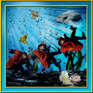
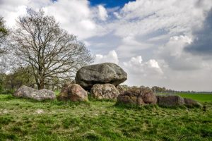
July 16, 2017 at 12:57 pm #14001My goal for this challenge was less to be creative but more to try to replicate the techniques I saw in the video. So, don’t be surprised with the similarity with Cassel’s example. But I have to say I had fun doing it.
July 16, 2017 at 7:26 pm #14007Cristina, you have done great work for this technique and the photo you chose to start with suited your end result.. you have achieved both styles that Cassel demonstrated in the video. I had fun doing this technique to. the “Close Encounter” is a terrific title and both of your projects a very creative. like them very much.
Dawn.
July 16, 2017 at 10:09 pm #14009Well done Cristina, the photos for the sea page work really well and I love the Close Encounter idea as well.
July 17, 2017 at 6:42 am #14018Dawn, Marlene, thank you so much for your lovely comments… I really appreciate 🙂
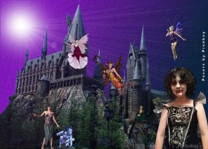
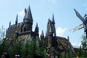
July 28, 2017 at 4:49 pm #14206Here’s my go at this. I used an image of the Hogworts theme at Universal in Florida and an extracted image of a photo of my grand daughter before she turned into a moody teenager!! and some free poser images from Pixabay. I also extracted the Hogworts building and added a gradient background. I then added the sunburst filter from the Effects manu. TFL.
Sheila x
August 1, 2017 at 11:46 am #14282Sheila, very nice page. It is amazing the transformation of a photo with these techniques. Nice work!
August 2, 2017 at 6:00 pm #14290Thank you Christina, it was good fun to do.
Sheila x
August 2, 2017 at 6:32 pm #14291Hello Sheila, you have done a nice page, your sky colour is really lovely with your sunburst … and I agree, this technique was fun to do.
Dawn.
-
AuthorPosts
- The forum ‘Challenges’ is closed to new topics and replies.


