Home of the Scrapbook Campus › Forums › Challenges › July Challenge – Pick an idea
Tagged: cardboard
- This topic has 27 replies, 7 voices, and was last updated 5 years, 4 months ago by
Annie Tobin.
-
AuthorPosts
-
July 5, 2019 at 8:43 pm #31049

When creating graphics projects, we are always inspired by things we see, whether it is in the same area, or from totally different sources.
In this challenge, I will be posting one graphics project and you get to pick an idea from it and create your own. In the scrapbooking world, some people will use this type of inspiration and try to replicate a project, as closely as possible. That is ok if that is what you want, but I prefer to offer you an array of options where you can pick at least ONE idea and run with it. Is it a color combination? Is it a particular element? Is it a special effect you want to try? Is it an arrangement that you never thought of? It does not matter.
Here is your inspiration:
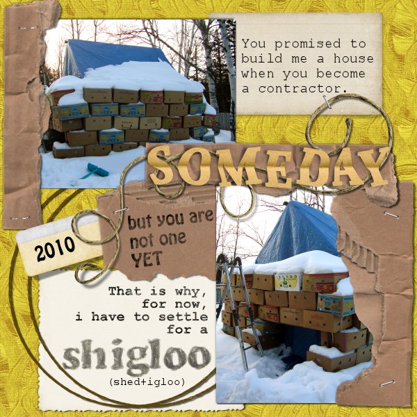
And once you post your project, tell us what particular element inspired you that you incorporated into yours.
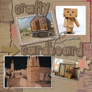
July 12, 2019 at 4:40 am #31295Hello Scrapbook Campers. I love cardboard so that is what came to me when I viewed the graphic offered by Cassel for inspiration. Unsplash delivered a couple of photos, the square man and the city buildings. I stumbled across the cubby photo on a craft ideas website and the cabin is exactly that … a cabin, and it is called the Wikkelhouse and it uses cardboard as the main building material … go figure! The paper, frames, alpha, and elements are all from Pixel Scrapper. Thanks for takin a peek.
July 12, 2019 at 7:06 am #31299Fantastic approach of the cardboard theme, Annie 🙂
July 12, 2019 at 8:07 am #31302Great job, Annie!
July 12, 2019 at 9:40 am #31309Annie, the whole layout is great! It has many details: stitching, staples, torn pieces, etc. I love the square man.
July 12, 2019 at 10:14 am #31313Libera, Michele, and Cristina, thank you very much for your lovely comments, greatly appreciated my friends. <3
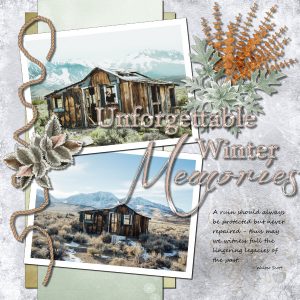
July 13, 2019 at 12:39 am #31329This one didn’t quite turn out as intended … the idea went awry somewhere! Not to worry, will give me an excuse to have another go. I saved this page as shabby lodgings but the lovely scrapkit I used (DSB-collab-WhenFallMeetsWinter) was too elegant for the photos, so I think that is where I lost it! The photos are from Unsplash and were taken by different photographers, top – Dane Deaner, and bottom – Ben Cliff, however both are of the same ruined cabin on Mammoth Lakes, United States. The layout was inspired by one from noreimerreason. My sole contribution was the rope which was a cass tube, but … I did manipulate it with the mouse, lol! Thanks for takin a peek.
July 13, 2019 at 3:09 am #31333Lovely pages Annie !…. i think your shabby lodgings winter memories page turned out great… for my eye the photos work well with all your elements…. well done!
best wishes,
Dawn.
July 13, 2019 at 5:02 am #31335Annie, I agree with Dawn, also for my eyes the photos work well with the kit… The colors match perfectly, and the page turned out great! You are on a roll, and each layout is lovelier than the other!
July 13, 2019 at 6:56 am #31341Annie, I agree with Dawn and Christina. Be sure we wait for your next work …
July 13, 2019 at 8:47 am #31342Annie, sometimes our best projects are ones that went awry. I love this page. Your idea of finding and featuring pics of the same cabin by two different photogs was brilliant! I’ll have to try that one of these day.
~ Michele
July 13, 2019 at 7:47 pm #31357Dawn, Cristina, Libera, and Michele, thank you so much for your lovely comments on my work. You always gee me up to do bigger and better things, 🙂 <3
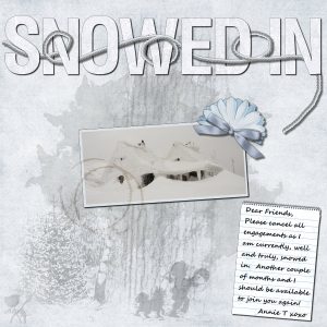
July 14, 2019 at 1:25 am #31367Hello again Scrapbook Campers. This time I was inspired to go for a winter theme. The photo is of a house covered in snow from a blizzard and was taken by Biegun Wschodni from Unsplash. Scrapkit used was “True Blue” by Clarey. Alpha by Marisa Lerin, coffee stain stamp by Brooke Gazarek, and snow baby template by Jessica Dunn, all from Pixel Scrappers. The rope I created from a picture tube by Cass and I also used the weaving technique provided by Cass’ Master Class – Title Work. Brushes used are by a-dozi and eraserx. The tree stamp on the lower left is from a kit “Inked” by G and T Designs … beautiful work. Thanks for takin a peek.
July 14, 2019 at 7:48 am #31370Hello Annie, very nice page… love the softness of colour with the pop of colour in the blue element. you have convinced me to go and look at my Masterclass video on Title Work.. I was going to do the tutorials from it ages ago but haven’t yet got to it…. love the weaving effect of the rope in the title.. it is a joy to view your creative work Annie!…. well done.
best wishes,
Dawn.
July 14, 2019 at 9:13 am #31373Love everything about it, Annie. I am amazed how you can take so many elements from different resources and put it all together like that.
~ Michele
July 14, 2019 at 10:12 am #31382Annie, so many elements and techniques and the end result is great… I like very much how you used the interlacing technique… It made the title pop up.
Are you sure you cannot join us in time? 😀
July 14, 2019 at 10:48 am #31389Annie, what a chance for us that you are snowed in …LOL!! This makes you most creative and us really happy to see the various results of your “productivity”.
July 15, 2019 at 5:35 pm #31446Dawn, Cristina, Michele, and Libera, thank you so much again dear ladies for your encouraging comments, always appreciated my friends. <3
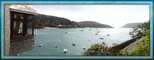
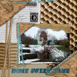
July 23, 2019 at 7:39 am #32033I have always loved my photos of Salcombe but could never get a good shot of all of it so this took 3 photos thank you carole xx
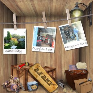
July 28, 2019 at 12:46 pm #32657The Blue tarpauline tent reminded me of a picture I had of my husbands overflow dept, he had so many sheds, one for every type for all work he did, building, carpentry, saw shed, paint and turning The poor cars got kicked out the garage to make room for more tools and machinery, although he did store the sit on mower in the overflow area, so we nick named it shed city. It was an excerise in perspective, but I coldnt change the items on the floor to match the room shape, Perhaps a lesson in that would be great carole. Thank you
July 28, 2019 at 12:55 pm #32658Trish, are all the elements on the floor as separate layers?
July 28, 2019 at 7:54 pm #32709this one was inspired by the cardboard
July 28, 2019 at 11:50 pm #32743Nice work Trish, I like it! <3
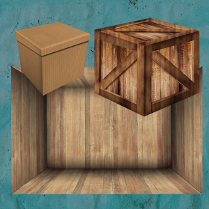
July 29, 2019 at 3:39 am #32744Yes Carol everything is on its own layer except the tools, they seem to want to be on a layer with someone else, I have to keep going back and undoing to remember to open a vector for each tool, which was annoying even putting 2 on one layer meant I couldnt enlarge them and kept them where I wanted them, then the tool I wanted wouldnt come up the next klk, I am not a fan of those tubes with a mixture on them , hard to get what you want. I land up taken the tube apart in the end, but that was the first time I had used that one yesterday. so the persceptive had been a challenge which I failed at, and the tube was frustrating. I had to do another picture to get over it I think. Oh tell a lie I did merge the photos on the frames to stop them moving.
Thank you Annie
July 30, 2019 at 7:39 am #32830Carol these are the images I tried to bring into perspective, what should I have done please. xx
July 30, 2019 at 3:22 pm #32849First, you need to understand the visual representation of perspective: it means that lines that are parallel in real life will appear as gradually tapering toward each other. One perfect example is the room on your picture:
- the top and bottom of the walls would be parallel in real life, correct? Well in this image, it is tapering the further it goes.
- the floor would have parallel edges on the left and the right in real life. In the image, the edges are getting closer together as they are further from the viewer.
This means that you have to look at objects in the same way. If you look carefully, the box on the left already has a perspective on it: the square top is not really showing as a square because it is tapering. Same with the height of the box, from the front “corner” to the back ones. So that one would not need any tweaking.
For the box on the right, you can see that the tapering is much much less. It is still there, but just a tiny bit.
The challenge, in this case, is not the perspective per se, but the angle of view. For the left box, the angle of view is from more above than with the right box, while the box on the right is seen from “not soo high”. Basically, it means that those two boxes would be hard to fit in a single collage to be consistent together.
I think it would be difficult to adjust one box (mostly the left one) to match the right one and the room because of that angle of view.
I think this might require a whole class to explain 🙂
July 30, 2019 at 8:09 pm #32867thank you Carole, and yes please a class would be good, might need a webinier, so complicated. I did realise what you said about the 2 different angle of the boxes, and the small box was easy to get more in shape, sort of, but the big box that I thought I could see what was needed, just went more out of shape with ever move, perhaps that was becaue of what you said about looking down on it., where it sat fine if I wanted it in the middle of the room. So yes please a lesson x
The tin box was equally a different angle again, as was the sign. so I had given myself a challenge with that one.
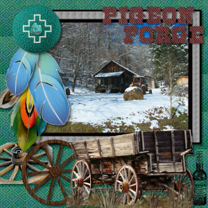
I found this green button which reminded me of this photo I took, love taking pic of old barn, and there is a lot of interesting ones around the smoky mountains, my favourite place on earth.
July 30, 2019 at 11:02 pm #32868Trish, this is a great page, I love it my friend. <3
-
AuthorPosts
- The forum ‘Challenges’ is closed to new topics and replies.


