Home of the Scrapbook Campus › Forums › Challenges › January FREEBIE Challenge – 2022
Tagged: january-freebie-challenge-2022
- This topic has 18 replies, 11 voices, and was last updated 2 years, 11 months ago by
Mary Solaas.
-
AuthorPosts
-
January 8, 2022 at 1:09 am #69403

Freebies are great resources that you can find in many places to build a library of elements, graphics, and tools. Since they are free, they are available to all.
This week, grab this fun freebie from the store blog that you can use to showcase or summarize your year 2021. With 12 photos, you can illustrate something from every month, or just find 12 photos of one event or activity that you did in 2021. Maybe it will be 12 photos of your garden, 12 photos of your knitting projects, 12 photos of birds you observed in your backyard.
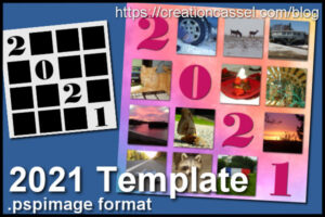
Grab it HERE.
What will you showcase?
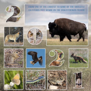
January 8, 2022 at 6:09 pm #69679Over the years I have been fortunate enough to trail ride the vast Grasslands National park, which consists of the east and west block, totalling 350 sq miles of open prairie. The east block is more rugged, with awesome natural beauty, the bad lands.
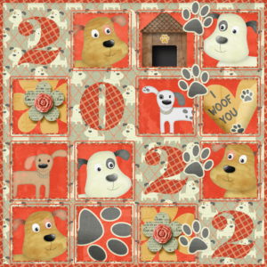
January 8, 2022 at 9:44 pm #696852021 didn’t really lend itself to too many exciting travels for me other than getting home and back here to Florida again. Still not anxious to travel too far – so no great pictures. I just had fun with it and made a Valentine for the dog. 🙂 Cute scrap from Digital Scrapbook.
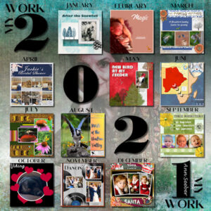
January 9, 2022 at 3:02 pm #69690I did mine as a gallery of my work in 2021. The background photo is of me back in 1996 or so, treated to an opacity of 40 and a hard light effect.
January 9, 2022 at 10:01 pm #69699I love these “year in review” templates, Carole! Thank you! I think I could create at least one more of 2021…probably will do that before too long. Can you believe it? No pickleball in this one.
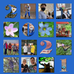
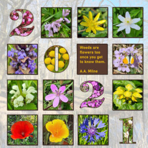
January 10, 2022 at 6:37 pm #69734Here is my take on the freebie for the year 2021. For 2020 I used photos from the series I took on flowers growing in the gardens in my neighbourhood during many walks. This year again sadly no traveling for me, so I took photos of the wild flowers I saw on my walks. I refrained from putting all the names on the page, I think that would make it way to cluttered.
January 10, 2022 at 8:35 pm #69735Beautiful Corrie
Each posting is unique and beautiful. Different takes on 2021.
January 11, 2022 at 11:22 am #69745Love these..everyone came up with beautiful and creative ideas.
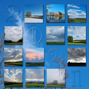
January 12, 2022 at 1:50 pm #69791Since I only stayed in my same environment for the year 2021, and only took pictures during the walks with my dog, I always have pictures of the same environment and usually of my dog. But, I also like to take pictures of the different skies. Since I no longer live in the countryside, that has also become difficult, but I try it anyway, I regret that I often miss the sunrise and sunset.
So I used pictures of the skies I tookJanuary 13, 2022 at 8:05 am #69807Thank you Carole for the template. I can’t believe how quickly others have got their ideas up onto the forum. So clever.
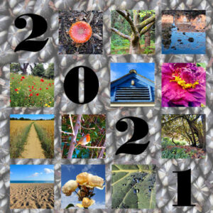
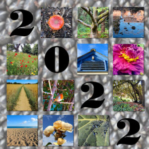
I have pinched Ann’s idea of showcasing work from last year and have used photos I took that to produce a calendar for this year. The background is a close up of a sunflower seed head and like Ann, have reduced the opacity to set off the photo squares.
Some techniques I could try, having seen your examples is, like Minka, changing the year text to 2022. I hadn’t realised that was possible but maybe I have that font installed. I like the way Corrie, Sue and Bonnie for example have used the text as a mask to show a photo beneath. I could try that if I used a plain background perhaps.
January 13, 2022 at 10:52 am #69808That’s a really interesting background, Fiona. Your photos are lovely. Have you tried using a little bit of a drop shadow on your elements? It might make them stand out more. The font that was used looks like Bodoni which should be a system font. Keep experimenting and have fun with it. 🙂
January 13, 2022 at 11:26 am #69809I agree with Michele Fiona, it’s a lovely page. The shadows would make a huge difference. Perhaps try some blur on the background paper too. If you don’t have, or know the font used, in this case all you need to do is duplicate one the number 2 layers, delete or hide the number 1, and replace it with the duplicated 2.
January 13, 2022 at 11:29 am #69810All the pages created using this template are unique, and outstanding.
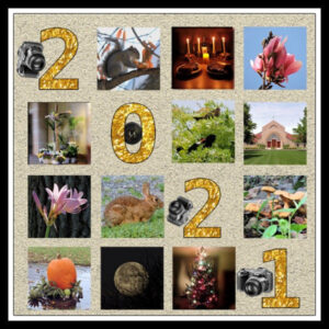
January 15, 2022 at 1:14 pm #69863All the photos are mine, one from each month. I added a few images of the camera used.
January 16, 2022 at 1:44 pm #69905Thank you Michelle and Sue. Given a bit of spare time this week I will try your suggestions. Yes, the background is a tad busy yet it needed something with a bit of interest I thought, rather than plain. Let’s see how it goes! Glad you like my piccies. I love flowers and I loved Corrie’s wild flower photos too.
January 16, 2022 at 3:08 pm #69913Fiona – that was interesting using the seed head for the background.
Anne Lamp – love your layout, too. Interesting to take a picture of your camera and use it in the layout. Looks kind of like mine – Canon EOS Rebel T7i.
Really enjoyed each of the layouts – unique ideas from everyone.
January 18, 2022 at 1:00 pm #70029My goodness what a difference your suggestions made! Looks better in PSP than on the JPGs though. I don’t know whether I made more work for myself or not in the way I managed to add the drop shadows to each of the photos to make them stand out from the background. My problem was the square photo displayed is a crop from the much larger image beneath the mask. So for each square photo I made a selection of it and promoted the selection to a new layer. Moved that layer to above the mask group that it came from then added a ‘paper’ type drop shadow. A bit laborious so I suspect there was an easier way.
The background blur idea worked from Adjust, ‘Average’ blur setting with a blur filter of 27. Anything less on that photo didn’t make enough of a difference.
To make the date 2022, I did as you suggested Sue and only deleted the old figure ‘1’ after I had repositioned the duplicated ‘2’.
Thank you all for your comments.
January 19, 2022 at 5:21 am #70077Way to go, Fiona!
January 19, 2022 at 11:01 am #70082I do shadows on masked photos by first being satisfied with the mask group, then merging the group. After you merge the group you can move the group around on your layout with the pick tool, but you can also add borders, add shadows, etc. because you are treating it as the photo itself in that size (however, after the merge you can use the pick tool to resize it also).
Love the layout after blurring the background. You are doing great!
-
AuthorPosts
- The forum ‘Challenges’ is closed to new topics and replies.


