Home of the Scrapbook Campus › Forums › Showroom › Greeting Card Workshop (2022)
Tagged: Workshop Card 6
- This topic has 337 replies, 49 voices, and was last updated 2 years ago by
Chris Schults.
-
AuthorPosts
-
November 19, 2022 at 12:57 am #86965
Here ya go, here is mine. I cheated….I started keeping track of where this stuff is located. That way I can look it up in the future when I can’t remember the exact directions, LOL!
Card 1 – resizing using the top, bottom, left and right. I knew it was to be used how you used it, but I never saw the potential until Card 1. The exact instructions instead of me floundering around helped, too.
Reminder, the right-click paint can dropper.
Reminder, duplicating the font and turning the bottom one into a raster with shadow.What I didn’t understand: why don’t you use “open as copy” script for all these instead of opening and closing so many?
Card 2 – the 25 px stripe x 4 from the little 100 px square box.
Card 3 – the amazing Diamond pattern. That is my favorite!
I also liked how the border was interrupted by the flower line…and the flower line went outside the border. I had never thought of that before.
Plus, I love that font, especially the letter W, and now I have it! (Thanks to Trish and Sharon)Card 4 – I didn’t know the corner cutters went on the edge/to the edge of the paper and the corner cutter brushes went just inside the corner. (And I know those words aren’t right, but hopefully people know what I mean.)
Card 5 – the BIGGIE is that I finally understand why you are so enamored with Groups with the stork. All this time I’ve been using the link layers command, but I can see now that what I really needed was Groups. (I always figured out of sight out of mind, and I’d forget, but I don’t forget.) I also like how the stork is just a wee bit out of the circle.
Now, what I learned from the other posters is just as long a list, I might add. People do a little name dropping on places where they acquired images or filters, or whatever, so I picked up some really good stuff and new ideas. So a big shout out to the other classmates who had such amazing ideas for cards.
This is an excellent class! We need those little Christmas package To: From: . cards…do those have a name? You could print maybe 9 or 12 large ones on a single sheet of paper and save a bunch of money! (That’s what my White Elephant cards were…they go on a package designated for no one in particular in a white elephant gift exchange. It occurred to me after I posted it and looked at it with all the other cards that people from other countries might not know what it was.)
November 19, 2022 at 1:56 am #86967November 19, 2022 at 2:45 am #86968Card #4.
A little humour of my pipe-dream wish list of lenses. My new camera is begging for them. okay, maybe it’s just me begging for them.
Treated myself to the Heart Corner Punches. So cool! I see what Sue means, they are addictive and look very nice on a layout. Font is Bronela (Creative Fabrica) and the lenses I took off the google search and extracted them. I’m glad to have learned how to edit the selection from previous workshops/masterclasses. Making the heart ribbon was neat.
 November 19, 2022 at 6:19 am #86970
Greeting Card Workshop Lesson 5
Picture frame by Marisa Lerin – Digital Scrapbook. Shanley font by Creative Fabrica.
 November 19, 2022 at 8:49 am #86971
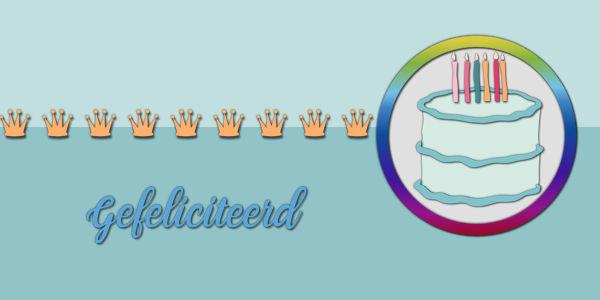
Day 5 Oh, shadows! I’m always hesitating and not easily satisfied 🙂
 November 19, 2022 at 9:06 am #86974
Susan, those corner and border punches make for an exquisite touch to any project. I have all of them. I used a Xmas corner punch in the label below.
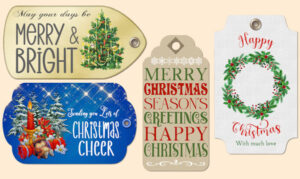
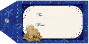
Suzy, I think you are referring to tags. which you attach to wrapped gifts. There are a few tutorials on how to create them, in the creative scrap. You can print them, using business card sheets. 10 to a sheet . I use them in projects. Here are some Xmas ones. You can have an image on the front, and to and from on the back, or add to and from on a decorated front. Here are some examples. I submitted these as freebies for year’s the Xmas countdown.
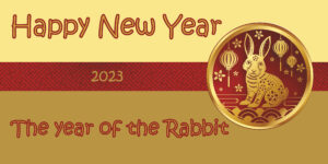
November 19, 2022 at 9:27 am #86976Card 5. A happy new year card (Chinese). I’ve taken bits from an image on vecteezy http://www.vecteezy.com/free-vector/chinese-new-year-2023
November 19, 2022 at 10:39 am #86978LOL Carole;
(#86885), these cards remind me of a game on the Sesame Street show “One of these things just doesn’t belong” to find the one different image in a set of four.I did not have 4 different colour cupcakes so added the Macaron, I guess I could have added two different Macaron’s and two cupcakes! Did not think of that at the time! lol
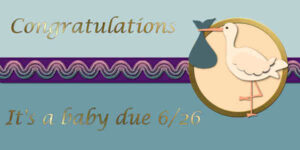
November 19, 2022 at 11:32 am #86980Here’s Card #5 – The baby is due June 26. We don’t know the gender yet. I followed Carole’s video and made my own ribbon by adding blinds texture to the template’s strip and the putting the embroidery on top of that. My font is Lucida Calligraphy.
November 19, 2022 at 11:32 am #86981Oh, yeah, tags. LOL! I was thinking they had a special name when I wrote that! Yes, and template for those utilizing a full sheet of paper (cardstock) would be great, but it occurred to me that only about half of us think 8.5” x 11” is a common size. ?
Those are really nice tags. The blue one has sooo much beautiful detail – it would take me a couple hours to make it! And another couple to think it up…..the teeny tiny sleighs and stars are just so perfect!
And Sharla, you wouldn’t believe how many friends of mine celebrate Chinese New Year when they have no Chinese – or even Asian- ancestry at all! That circular rabbit element is gorgeous, and once again, a gorgeous gold color and shine. I really need to learn that!
November 19, 2022 at 11:37 am #86982Carole (#86964 )
I don’t have a secret source ?
and my apologies, I often forget to tell where the elements I used come from, that’s because I usually upload my works very late (here in Belgium).
The apples come from a kit, and can be downloaded for free at : lady22.eklablog.com/couleurs-d-automne-a112496888.Unfortunately I don’t remember where the Christmas trees come from, it’s also a free bundle that I downloaded, but there is no file where I can see where it comes from.
I think it comes from the design bundles site, and it was once offered for free. I googled the file name but couldn’t find anything.November 19, 2022 at 12:51 pm #86997Lots of great designs in here
November 19, 2022 at 2:43 pm #87001Day 6. I decided to go with a thank you card.
November 19, 2022 at 2:49 pm #87003November 19, 2022 at 3:11 pm #87004Thank you, Carole. I probably won’t use that as a Christmas card this year, though I do love that picture and is a special memory 🙂
I found the other cupcake from Card #2 at DigitalScrapbook.com along with the other one. I have been a member of that site for years and keep forgetting to use it as a resource! 🙂
November 19, 2022 at 3:15 pm #87005For anyone wanting the font Holiday Meladine from Card #3, it is available at SoFontsy.com and is on sale for $1
Holiday Meladine – Script Font
Carole, hope it is ok to post that here!
November 19, 2022 at 3:43 pm #87006Card 4
Selected the color from the tongue of the dog
cass-RasterToMask script to put the photo of my dog Poncho
cass-CornerPunchesD
Font : Styll Love (Creative Fabrica)
 November 19, 2022 at 4:28 pm #87010
I like it!
November 19, 2022 at 4:39 pm #87011Louyse, thank you !
November 19, 2022 at 5:35 pm #87012Here is my result for Card 5.
Font Used: Viner Hand ITC and scrap supplies were obtained from Digital Scrapbook with almost all of them coming from a kit called Baby’s First Christmas.
 November 19, 2022 at 5:36 pm #87014
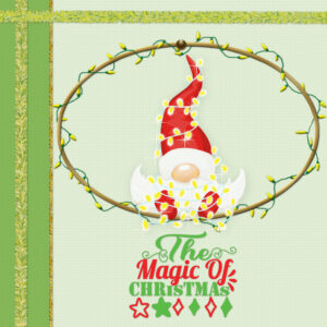
My card number 6. Image and word art from Creative Fabrica and fairy lights tube from Cassel. TFL
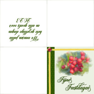
November 19, 2022 at 6:35 pm #87016Day 6 and another christmas card. I followed the tutorial as far as the recoloring of the paper and the straightening of the ribbon (that was a new one for me). In stead of the oval I made a watercolor of my photo of the redberries with the watercolor script. The font is Michalina by Creative Fabrica if I’m not mistaken. I probably won’t print in this format, but just as a double card, or use only the front for email or wattsapp.
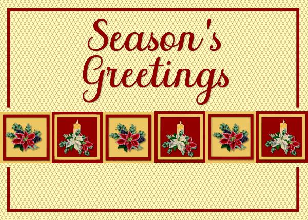
November 19, 2022 at 6:35 pm #87017Card 3- I have had these elements for a year now and thought this layout would be perfect them. I really like the background design a lot. The font that I used is call Sophia. Thanks, Carole, for all that you do in helping members on our journey…..
 November 19, 2022 at 6:59 pm #87018
Lois Duckworth your card #5 is so sweet it really melts my heart!
November 19, 2022 at 7:17 pm #87019Card 5. Sticking with the “camera” theme. A herculean effort this summer to sell all my silversmithing supplies and tools so I could purchase this camera and lens adapters (the lenses I want are as much as the body or more, like I say, it’s a pipe dream for those). I’m calling that the “pregnancy” for the “birth” (purchase) of my new camera.
Sue, those tags are fabulous, I would never have thought to use them in that way. I had a few of the punches but never really used them, except once this summer. I am glad we used them in the workshop. I also want them all. Hoping for a Black Friday Sale! (hint hint).
Carole, I have a question. I used the “blinds” texture on the white strip and ended up lowering the opacity because when I left it the way I liked it, the letters floated on the top and didnt sink into the blind contours. It was a PNG transparent file that I did the 45 degree angle like in the last card. Is there a way to make the word look like it was printed on the blinds texture.
I loved learning about the grouping. That’s a big time saver. Suzy, your post on what you’ve learned was so good to read. So smart to jot things down right away. I always think I’ll do it later then I dont and I scramble to find where the instructions for a technique is.
 November 19, 2022 at 7:28 pm #87020
Forgot to add:
Sharla, loved your New Years card, elements and colors are perfect.
Carole: that background paper in card 3 (HO HO HO) is from the Kit called “Seth” and it’s in with the elements “kit” not the solids. It’s by Rachel Martin at DigitalScrapbook.com. There is 3 colors; Red (more like Magenta-Red), Blue, Yellow. they are very pretty, I pasted mine in at full size so I could choose the area I wanted to show. Which brings up a question with printing:
When designing a card for email we can have our papers or elements coming past the canvas edges, but with printing would we need to go and select what’s sticking over and delete them. Would a printer “see” that and want to print it?
November 19, 2022 at 7:33 pm #87022Greeting Card Workshop-6
November 19, 2022 at 8:09 pm #87023Susan #87020 – When I worked in advertising and design many years ago, everything that was printed on a commercial press, had a 1/8″ bleed added to the paste-up board. So if something was going to be 8″ x 10″, the paste-up board would have 1/8″ on each side, so the image area would be 8 1/4″ x 10 1/4″, with a trim of 8″ x 10″. The reason for the bleed is that they can’t be certain the machine will always trim on the trim line, so you add 1/8″ so the color will extend off the edge if the cut is off a bit. If I am printing something at home, and trimming it by hand, I don’t add that 1/8″ bleed because I can be more precise when I am hand trimming it. If you are having it printed with a commercial printer and they are going to have to trim it to size, they will probably want you to have the 1/8″ bleed. But I would really ask the printer! Today they can print photos that are borderless, and even my home printer does a pretty good job of borderless 4×6 prints, that are printed on 4×6 paper and not trimmed.
I hope that helps, and I hope I did not make more confusion!
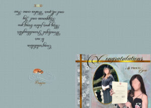
November 19, 2022 at 9:29 pm #87025Losing Track thinks this is day 6, unfortunately, I had to blot out my Granddaughter’s beautiful face, but it’s still on my original.
After spending a couple of hours making this, I pressed shift /enter by mistake and it completely disappeared and I had to restart, does anyone know where this would have gone too and is it recoverable xx
Don’t know what Fonts I used on this, there are a few, I usually just write what I need , highlight it and run down the text file till it changes to something I likeNovember 19, 2022 at 9:48 pm #87026I’m sorry Trish, I don’t know where it goes. I *think* the clipboard empties when you restart and everything goes *pouf*.
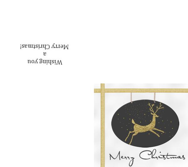
Here is mine. I hate it. I thought it looked like a for sale sign with that ribbon crossed at the top – and added the chains but didn’t bother centering them because the whole thing is awful.
What I learned — Note to self: Use a straight ribbon if you’re worried about it. That warp brush was horrible.
Question: why didn’t she smooth or feather that oval (photo) selection? And why isn’t it pixilated?
Promote selection to a layer. (Never did this before)
Using the Hue map (which I had never done before)
Warp brush to straighten ribbon (which I will leave to the experts)
Spacing and directions on 1/4 fold or 4-fold card with text inside. (which I shall remember)
-
AuthorPosts
- The forum ‘Showroom’ is closed to new topics and replies.


