Home of the Scrapbook Campus › Forums › Showroom › Greeting Card Workshop (2022)
Tagged: Workshop Card 6
- This topic has 337 replies, 49 voices, and was last updated 2 years ago by
Chris Schults.
-
AuthorPosts
-
November 18, 2022 at 10:51 am #86885
Just catching up on lessons, lesson 2 cards
November 18, 2022 at 10:52 am #86886November 18, 2022 at 11:44 am #86887Lyn, I also have catching up to do.
This is card 2 November 18, 2022 at 12:00 pm #86889
I had a stressful day yesterday. Made a trip to the city. I only go about twice a year, and that’s twice to many. But it’s a necessity, to stock up on things I can’t get locally.
Carole’s corner punch. My own globes. How many of you remember that Christmas masterclass?
November 18, 2022 at 12:50 pm #86890As I browse through all the cards submitted. There are far to many to comment on individually. I’m amazed by the creativity, and quality of each one. Well done, ladies and gentlemen!
For many of us it’s like going back to nursey school, back to the basics. It’s actually a great course in revision. As I use tools without thinking, it’s become second nature to me.
November 18, 2022 at 1:57 pm #86892Card #4-Jack Skellington (and his little dog) from A Nightmare Before Christmas say Happy Holidays from someone’s front lawn in inflatable decorations. The font is Horror Story (of course!) the garland is a Picture Tube, the strings of lights are from the decoration set. The frame is a PSP Frame. Backgrounds are a gold gradient under one called Rocket. I used my eraser tool to get the punches to reveal the gold layer underneath. Enjoy!
 November 18, 2022 at 2:42 pm #86898
I am very behind, only just now getting to post Day 1. I am LOVING everyone’s cards – so different and unique in their own right ♥♥♥
This is a picture of my husband and daughter from February 2014
 November 18, 2022 at 2:51 pm #86899
Marie-Clare, That is such a darling card!!! The text, the graphics and the execution – just darling!
Sue, You are right, but I comment on the two or three above mine. And your text is amazing. I want to learn how to do that C – actually I know how to do it, I want the ability to see the opportunity. To have the design ability to do it. To even think of doing it. Sometimes I look at a blank canvas and cannot think of what to do for the title.
Ann your gold is amazing –very pretty and realistic, I’m going to look for Rocket? gradient? Horror Story and the corner punches really came out nice looking with lots of detail.
And here is mine to give credence to my comment to Sue about title work. There was just no where to put it!
 November 18, 2022 at 3:00 pm #86902
If you like the selection you made, but want to move it a bit, how did you do that again? So you haven’t got to make a new selection?
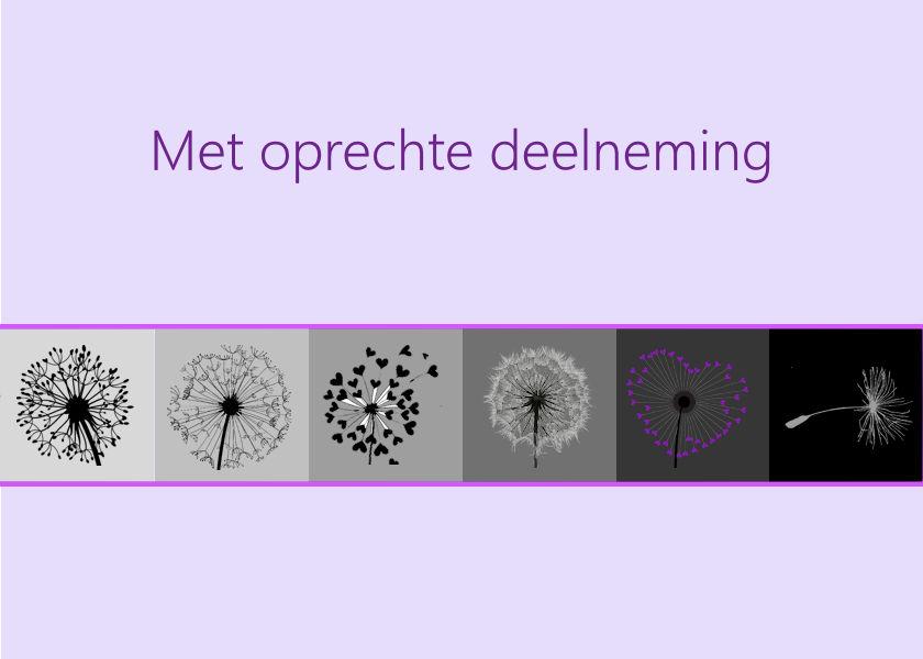
Malgun gothic is the font, the dandelions I found here: http://www.pngegg.com/
 November 18, 2022 at 3:03 pm #86903
I like your cards very much!
November 18, 2022 at 3:04 pm #86904Very romantic card, Trish! Like it!
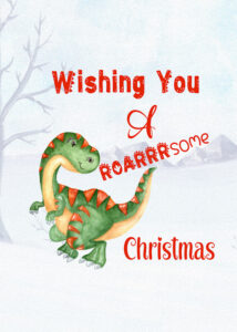
November 18, 2022 at 3:29 pm #86912Day 5. Twice now I haven’t followed the template. This is a 5×7 card. I modified the inside of my granddaughter’s half fold card. Both of them are into dinos, and not just dino cartoons. While I was home, I bought them a book on dinos. By the time I had left, they could pronounce and identify 6 different species of dino. More than what their parents can do. Lol
Thank you Suzy. There are several masterclasses, and in the creative scrap, on text. There’s word art, subway art, create a word tree, and many, many more. For inspiration, scroll through the campus, viewing the previews, perhaps something will grab your attention for the project you are working on. Just a thought.
November 18, 2022 at 4:16 pm #86913Suzy, thank you for your nice comment.
All the cards are so beautiful, way too hard for me to comment on.
November 18, 2022 at 4:19 pm #86914Day 3
 November 18, 2022 at 4:24 pm #86915November 18, 2022 at 4:57 pm #86917
Monique, stunning Day 3 card! Moving the selection is right click and hold (in the selection) and move where you want it….I think.
Marie-Claire, love those apples and the colors you chose on your Day 3.
Everyone has such inspiring work. This workshop has taught me many more techniques that I wondered how to do (or if I did them I took the long way to get the result).
November 18, 2022 at 6:14 pm #86920Card for Day 2 I didn’t deviate much from Carole’s tutorial, but I plan to go back and do a Christmas themed card.
Again, I’m loving all the creativity here!
 November 18, 2022 at 6:50 pm #86924
Day 5 completed
Well done everyone there are so many lovely and different cards on here xx
Ive enjoyed making these cards, but its hard work keep resizing elements everytime with these templates being smaller than I usually work on-
This reply was modified 2 years, 1 month ago by
trish williams. Reason: resized image
November 18, 2022 at 6:53 pm #86929Hello, here is my Greeting Card Workshop-5
November 18, 2022 at 7:02 pm #86930I wanted to use one of my pictures of my son and grandson(who is now 15), but I also wanted to learn what Carole was going to instuct us on using the stork. The background is a gradient, the font is Baby Olivia with a gold stroke. The ribbon was created from a Janet Kemp paper from Digital Scrapbook. I added scallops to the selection and then created a pattern that I used for my frame. My cards are printed on half fold card paper, size 8.5 by 11 that is scored for folding . I have a card template that I converted to PSP that has a line denoting where the fold will be. It works very well with my printer.
BTW, I am so happy to be a new Diamond member!
November 18, 2022 at 7:15 pm #86932No babies or opportunities for baby cards so this time I did a Happy New Year card, always handy to have when you forg0t to send some one a christmas card! Last year I made some photos from the fireworks. I don’t have a layered template for this occasion so I do without, but the tutorial about it will come in handy on another moment.
November 18, 2022 at 7:49 pm #86940Day 5 I liked those little storks so I decided to have two. A girl and a boy for twins.
November 18, 2022 at 7:49 pm #86941Here is my 1st 3 cards. I am bit late with my cards, but I have been unwell, and probably not followed the rules correctly. I always heard that shingles was cruel, but had no idea it would be this painful and believe me I am in week 3 and there is no let up of pain. Getting a Tia, and a Uti in the midst of it all hasn’t helped either. However have managed to get some finished I am posting the 1st 3 here today and I must say that even though the cards are very simple looking, there are some good techniques I have learnt. I had some issues with the first card, I couldn’t get the paint in, but I went on to the 2nd card and it worked. I think maybe I had a small selection open on the work and it was stopping the action as I know it can.
November 18, 2022 at 8:46 pm #86952Looks like I was getting out of school early and didn’t finish my project. Here is the o 3 card completed.
November 18, 2022 at 8:53 pm #86953Looks like I was getting out of school early and didn’t finish my project. Here is the o 3 card completed.
Such an abundance of beautiful cards. Lovely to see Trish back again, I love your work Trish, and what a lot of newbies bringing some lovely work.
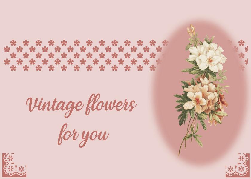
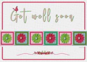
November 18, 2022 at 9:09 pm #86955My card number 5. Made it a Get well one. The flower image is one i did earlier in the year. It was a Doverpub free image that I made the background transparent with the Cybia plugin Alphaworks before applying the colouring and shading using many, many layers. Thank goodness for Carole’s Script for grouping. Anyway, I thought I would use it for this card. The font is called Gladista. TFL
November 18, 2022 at 10:07 pm #86958Only Card 2 for me–enjoying seeing all the different things we are coming up with!
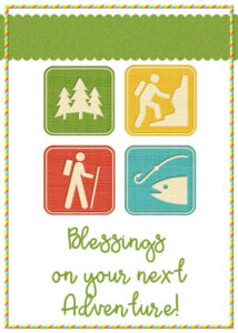
In the past year, I have had several of my doctors move–one stopped practicing, one moved out of state, and one is a mystery. If I had the opportunity to send them cards, it would be something like this….Blessings on the new adventure. And I sure do miss them all!
A few card making tips–If I am planning to print a card on my home printer, I try to avoid areas of solid color-someone mentioned that earlier. I also add old fashioned crop marks on the corners and I mark the fold line and score it lightly with the end of a burnisher. Paper and card stock has grain, even if you can’t see it, a score line makes it fold easier. Often I will find the envelope I plan to mail it in first, and design the card to fit the envelope. It is upsetting to print several cards and then realize I don’t have, or can’t get the right size envelope!
November 18, 2022 at 10:11 pm #86960I will say, I am sad that the Pre-Black Friday event is overlapping this workshop!
There are not enough hours in a day 😉
Thanks Carole, there is lots to learn in these few days.
November 18, 2022 at 10:57 pm #86963Lovely results. I love seeing the various results.
Here is my result for day 4. Still running a day late.
 November 18, 2022 at 11:26 pm #86964
Susan (#86852), I love that watercolor effect in the background!
Anita (#86871), have you noticed the shading on the blue flowers? It looks like the light source is at the bottom right. Did you rotate it? If not, try to rotate them by 180 degrees to have the shading consistent with the other flowers.
Sharla (#86874), very traditional, but also very nice.
Sheila (#86877), those are cute bees!!! Interesting to see corner punches from other sources! (#86955), that embossed background gives such a delicate effect.
Monique (#86880), that welcome baby card is lovely. Those images are cute! (#86902) To move a selection, simply right-click inside the selection and that will grab it.
Lyn (#86885), these cards remind me of a game on the Sesame Street show “One of these things just doesn’t belong” to find the one different image in a set of four.
Kasany (#86886), are the hearts separate? Since they are the same color, if they are on separate layer, consider adjusting the brightness just a tiny bit, just enough to make them slightly different shades of red.
Marie-Claire (#86887), those trees are making me smile for sure. Where did you get them? (#86914), those apples are also great. You must have a secret source as your images are so cute and unique.
Sue (#86889), yes, that was PaintShop Christmas 4. We saw many snowglobes in the forum that year! (#86912), I love it when a card is particularly customized to the recipient, in the theme, the color, or something else.
Ann (#86892), that is a very original take on the theme, and very effective!
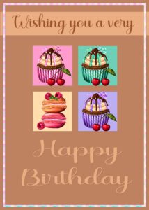
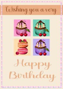
Sharon (#86898), it is lovely to see a family photo on a card. Will you be using it this year? (#86920) great result. I see you found a different cupcake to use.
Suzy (#86899), if you really need to have a title/text, there is always a way to do it. Maybe sideways? Maybe add a mat underneath? That little charm is great!
Trish (#86924), that is such a great idea to use the card for an invitation.
Louyse (#86929), you might want to have a peek at the shadows on the yellow flowers: they are inconsistent with all the other shadows. If the shadows are on separate layers, you can replace them. If not, you might be able to rotate them by 90 degrees.
Donna (#86930), great idea to use the stork AND the photo. And welcome as a DIAMOND member. I am glad you are already enjoying yourself!
Corrie (#86932), that is a great idea. We have obviously seen a lot of Christmas cards, but not many for New Year!
Anne (#86940), now who will receive that card? You might be able to ‘scare’ someone with that!
Shirley (#86941), you are catching up very well despite all your challenges. I hope you recover soon so your mind will be more at ease to enjoy the hobby.
Linda (#86958), that is such an interesting take for a card! And thank you for the tip. I guess I am a little lazy and I simply make sure that the background of the card is not pure white, so I have something to follow when I cut the edge! I am sorry that the pre-Black Friday event is overlapping. But it will be going until Monday night and the workshop will finish on Sunday morning.
Lois (#86963), you are catching up very nicely. Such a cute gnome!
Some of you might have noticed that now, when you click on the thumbnails of some images embedded into the posts, a large image pops up. I have partially fixed the issue that caused the images to NOT display in full size. Yay!!!
With this workshop so well received, I often read comments about “learning something new”, or “loving this new technique”. How about you tell us what is that “something new” you learned or re-learned. I bet everyone picks up something different from each tutorial!
-
This reply was modified 2 years, 1 month ago by
-
AuthorPosts
- The forum ‘Showroom’ is closed to new topics and replies.


