Home of the Scrapbook Campus › Forums › Showroom › Greeting Card Workshop (2022)
Tagged: Workshop Card 6
- This topic has 337 replies, 49 voices, and was last updated 2 years ago by
Chris Schults.
-
AuthorPosts
-
November 15, 2022 at 7:56 pm #86559
This is my Greeting Card 2 posting. Modified it slightly.
 November 15, 2022 at 8:39 pm #86561
Wow…it always amazes me how we come up with such a variety of creations from the same template!Beautiful creations, Everyone.
I stayed right with Carole this time. This was a super fun lesson. Thank you, Carole!
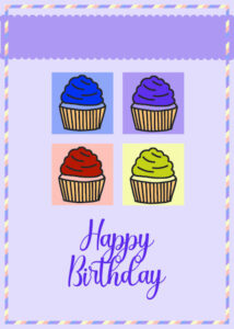
A friend of mine loves purple…guess this card is for him. I may even go back and do more purple!
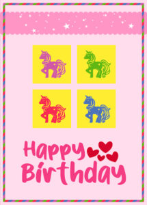
November 15, 2022 at 9:39 pm #86564All of the elements are from Creative Fabrica. My niece is a big fan of unicorns.
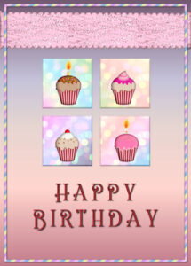
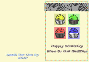
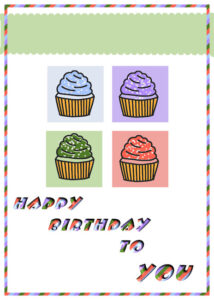
November 15, 2022 at 10:02 pm #86570Cupcakes are from Chantahlia.com. Square and ribbon backgrounds are from background papers that I have downloaded(I wish I had kept a note of where). Font is Flamingo Shadow. I can’t resist bevel and shadow. All the bevels were made using layer styles. The card background is a gradient. I also made the candles and flame.
-
This reply was modified 2 years, 1 month ago by
Donna Sillia.
November 15, 2022 at 10:07 pm #86573Day2. I’m afraid I didn’t stick rigidly to the template. I used a brush on the top ribbon. I omit the border around the page. I used one of Carole’s corner punches. I use them a lot, as I love them. They are so versatile. Created a simple frame around the main photo. My own photo and word art.
 November 15, 2022 at 10:18 pm #86575
In this one I used a different corner punch, edited the border, to create an embossed like frame on the background paper. I had to narrow the frame to match the corner punches.

-
This reply was modified 2 years, 1 month ago by
Cassel.
November 15, 2022 at 10:22 pm #86576Not sure why the image wasn’t displayed. Not that it matters, as you can click on the link to open it.
November 15, 2022 at 10:43 pm #86578Here in the USA, the next holiday will be Thanksgiving. So for Card 1, I used a Thanksgiving/Fall theme.
All of the papers and elements came from Pixel Scrapper. The font for ‘blessings’ is called Baby Heart.
November 15, 2022 at 11:42 pm #86580Bill (#86487), that looks just like a postcard! And yes, on Lesson 2, you get the tutorial to create a “back”.
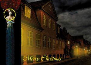
Susan (#86488), very unusual colors for a Christmas card, but definitely effective. I hope you have a great printer OR you send ecards with that much black! (#86489), that is a wonderful photo you took. Definitely worth using in a card for everyone to see!
Anita (#86494), beautiful card. I think you will have some happy recipients!
John (#86500), great start if this is a first project for you. May I suggest you try black shadows instead of white shadows? Although white is ok, give a try to black ones as it will add to the realism.
Sue (#86522), it is a fun detail that you have used for the word Greetings. I was hoping for a way to automatically add images from the gallery to the forum (and vice versa), but it is not possible. I wish! (#86573), you are ahead with Easter! The corner punches is part of an upcoming tutorial 😉
Kasany (#86528), considering that the image is fairly light, you might want to consider adding a shadow layer, even if it is not a “realistic” shadow, it would make your text stand out, a bit like in this article.
James (#86529), great choice of image! This is just the first of many cards, I hope! (#86559), you are more than allowed to modify the templates and NOT follow the tutorials to the letter! It is even encouraged! That is a good idea to include the photo of the birthday girl.
Dianne (#86531), you have a very good point about printing. Thank you for your insight. If you want to use the templates given, you can always work only on a front cover and use them as ecards!
Trish (#86540), it is a cute idea to add something other than just a solid color to the back.
Louyse (#86543), this is such a cute birthday card! good work.
Lois (#86547), welcome to the workshop. Nice card to get you started. Looking forward to the next ones.
Lyn (#86551), that is a perfect timing to create several cards for those recipients.
Sheila (#86553), a simple yet very elegant card!
Anne (#86556), it almost looks like an ice cream cone!
Corrie (#86558), great to see a card that is a different theme than mine.
Bonnie (#86561), once you follow the tutorial closely, I am sure you will fly on your own quickly!
Gerry (#86564), that is the best way to customize a card to the recipient’s preferences and interests.
Donna (#86570), that gradient is very effective. I like those different cupcakes.
Linda (#86578), that is a perfect theme for the week. I had not even thought about it (our Thanksgiving in Canada was in October)
As mentioned in the thread, it is amazing to see how varied the projects are, even though they started with the same template! Keep them coming.
November 16, 2022 at 12:31 am #86584Oh, shoot! I missed Carole! I wanted her to see my keylines from the Q&A Session!!!
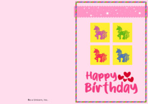
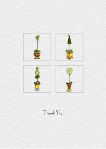
Here is my Day 2. I made it into a thank you card. Although I *did* make a border, it didn’t fit with my vision, and likewise the thicker ribbon border, so I eliminated both. My idea on this is to maybe make it a quarter fold card (thanks for the name for that, Susan Ewart!) So I left some room to allow for the smaller size.
November 16, 2022 at 1:00 am #86586Finally finished Day 2. I did learn a lot today. I should have used the complimentary colour wheels but it is not too bad. Also, I need to figure out how to colour the ribbon with colours to match the muffins.
November 16, 2022 at 2:57 am #86587Wow, such outstanding cards! Great job, Everyone!
I am not going to be able to post any cards… I haven’t started yet… We’ll have family next month, after almost three years, but before that, we will travel… So I’ll have to hurry to have everything finished before we do. This means Christmas decorations and so. But before, I will enjoy what everybody is creating.
November 16, 2022 at 4:24 am #86604Cristina a pity that you cann’t join in, but here are sometimes more pressing matters than scrapping. Wish you happy travels and a fantastic family gathering for christmas!!!
November 16, 2022 at 6:43 am #86607Loving what everyone is producing – such creativity. Wonderful!
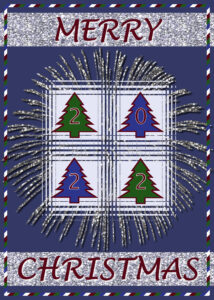
Here’s my day 2 card – I’ve stuck with Christmas as my theme.
November 16, 2022 at 7:44 am #86612Corrie, thank you so much, I really appreciate it! <3
November 16, 2022 at 8:11 am #86613Ooooo, love that effect Sharla. Like a firework blast.
Sue, love the cross-stitch effect on page 1. I’m sure the girls loved them.
November 16, 2022 at 9:18 am #86618I thought I placed already my cards from Day 1.
But I can not find them.
So a next try.
I think the best one is with the candle left.
November 16, 2022 at 9:23 am #86619Yes Suzy I can remember that folding printed on a dot matrix printer
The image left upper must be upside down and the text in the right down quarter.
There are still tutorials and you tube stuff How to make such cards 🙂
November 16, 2022 at 9:38 am #86574Thank you Carole for your note and well done for the cards seen so far. all different and very pretty. I used your template with it placed sideways.
https://scrapbookcampus.com/gallery/index.php?/image/515-carte2jpg/
November 16, 2022 at 9:54 am #86623Suzy #86448 I like what you did with the scallops 🙂
Corrie #86469 Love the light blue in your card, the latern hs a bit of a Anton Pieck feel 🙂
Susan #86469 What a different kind of christmas card, but I love it!
I enjoyed looking at all the different cards, but commenting on every card is a bit too much work. Love them! 🙂
Mine will be posted soon I hope 🙂 Not just started 😉
November 16, 2022 at 10:18 am #86630Here is my Day 2 Card: A birthday card for my daughter. I used the colors from the flowers and the kaleidoscope effect to create the design for the top strip. The font for Happy Birthday is Banana Pancakes; the font for Debbie is Wide Latin. I also create a back but didn’t post it here. I’m probably going to send this to Debbie on her birthday, Dec 28th, as an eCard, anyway.
 November 16, 2022 at 10:20 am #86631
So first a tryout for Day 3
Used some other flowers and text.
Texture effect on background Fine leather.
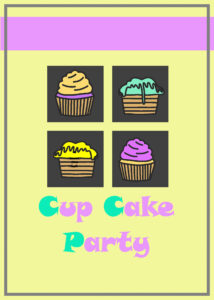
November 16, 2022 at 10:22 am #86633And a Cup Cake Party Day 2
Colour for the cook part I used is #dcb16b
Just a lot of fun to do.
-
This reply was modified 2 years, 1 month ago by
Chris Schults.
November 16, 2022 at 10:25 am #86634Oh Sharla never tought to use this template also for christmas, but very good idea and beatiful card.
November 16, 2022 at 10:30 am #86636Very nice card Ann Seeber Specially the idea for the top strip. Love that.
November 16, 2022 at 12:03 pm #86643My second card.
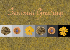
November 16, 2022 at 12:20 pm #86645My day 2 project. I need cards for all seasons so that is the reason for the colors. I thought these were good for the four seasons.
November 16, 2022 at 12:21 pm #86646Card number two. I followed the layout and really enjoyed the exercise. Remembering all the shortcut commands is another story. My cheat sheet was hiding. I liked the part about making the back. I did do a back but showing the front here. Cupcake is from the tutorial (Digital Scrapbook.com) and Font is Adam Melda. I like the template and lots of ideas to fill the boxes.
 November 16, 2022 at 12:38 pm #86647
Wow! unbelievable cards from everyone. Ideas I would never have thought of. It’s so enjoyable to log on and see what’s new. Like Monique, I’d to comment on all of them.
Chris, I love your darker cards (#86618) and thanks for going to darker side with me. I was thinking of going with black cardstock and envelope this year (I would have to print and affix the print though, more work but would look cool).
Monique, thank you so much, my heart is singing from the highest mountain right now (I live close to the Rocky Mountains, so they mighty high).
Carole, I did use that darker (low key) image in a Christmas card in the past. But as a photo print on glossy for a crisp feel, that I attached the folded cardstock. If I do print the card I’d have to go to a outsources printer, unless I had my dream Epson printer ($$$$), then I would use a coated stock that handles blacks well.
November 16, 2022 at 1:53 pm #86653A lot of work has already been done here, so many beautiful cards!
I just started the workshop today. So this is card 1.

-
This reply was modified 2 years, 1 month ago by
-
AuthorPosts
- The forum ‘Showroom’ is closed to new topics and replies.


