Home of the Scrapbook Campus › Forums › Showroom › Greeting Card Workshop (2022)
Tagged: Workshop Card 6
- This topic has 337 replies, 49 voices, and was last updated 2 years ago by
Chris Schults.
-
AuthorPosts
-
November 14, 2022 at 8:30 pm #86473
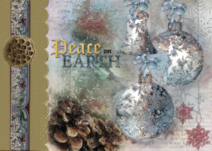
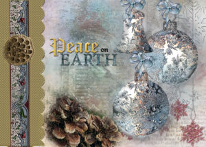
Here’s my go, enjoyed making this card, mixture of elemments from creative fabric, my stock, marisa, and osprey.
November 14, 2022 at 8:40 pm #86474Carole how do straighten a ribbon that goes offline I tried by rotating but that just rotated everything. trying to rotate with the archor on the element just makings it worse , my mouse doesnt response to minute moves and the up and down buttons dont help I tried the alighn tool under objects, not shore what they do, but they didnt align anything, perhaps you can explain what they are for please x Thank you
November 14, 2022 at 8:50 pm #86477I found it, I wasnt unchecking the box, slap wrist xx
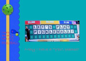
November 14, 2022 at 9:48 pm #86479I had not planned to do a card like this but when I saw this photo on FaceBook, I couldn’t resist. If I add, place, date and time it could be an invitation to play pickleball.
November 14, 2022 at 11:46 pm #86485I am very happy to see everyone posting, and I hope to see even more posts.
Welcome to our regulars: Susan E, Corrie, Ann, Bonnie, Marie-Claire, Donna S, Sue, Anita, Cristina, Michele, Jnet, Linda, Sharla, Kasany, Trish, Susan C, Dawn, Suzy, Monique, Nancy, Deana, Harmony, Lynda, Cindy H, Nana, Lyn, Hank, Louyse, Mary, Leslie, Gerry.
A special welcome to new posters: Donna, Roni, Cindy S, John.
Jnet (#86435), beautiful photo. Yes, we will be getting snow soon enough!
Hank (#86443), I see you turned the rectangle template to a square card. That is great example of customization.
Sharla (#86445), such a delicate card. Good work.
Suzy (#86448), nice idea to use the striped paper. It makes it pop!
Louyse (#86451), such fun elements used to decorate your card.
Ann (#86455), although my brain is uneasy to see shadows on the “other side”, it certainly makes total sense with the photo you are showcasing.
Mary (#86458), I am glad to see that you are creating a different card than the theme I used. Each card will have a different theme in the tutorials, so we should also see a wide variety of cards in the next few days.
Leslie (#86462), such a clever idea! A card can be turned into a business card or an ID tag. Let us know how the event goes!
Cindy (#86463), great!!! You are doing so well with your PSP and your projects.
Gerry (#86465), Creative Fabrica certainly has a lot of cute designs to choose from! And it is nicely showcased.
Donna (#86467) that gradient paper definitely helps showcase those other decorations. Great work.
Corrie (#86469), another great example of customization. The same template can be flipped to get something that looks different.
Dawn (#86471), that is a beautiful image. And I am happy to see this template used for a different theme than the Christmas card that I used.
Trish (#86473), did you blend in multiple images or what the picture like that? It looks great.
Bonnie (#86479), I have a feeling one of your pickleball friends will get a surprise card in the near future!
Keep them coming. Don’t be shy.
Remember that you can add your projects in the gallery too. The gallery will become a central location to browse and get inspired.
November 15, 2022 at 12:52 am #86487And here we go for Day One of the greeting cards. I hope we get to foldable ones with a Front, Back and Inside.
November 15, 2022 at 12:54 am #86488Card 1 5×7 size. Font used is Amnestia Normal (Creative Fabrica). Photo is mine.
 November 15, 2022 at 12:57 am #86489
Card 1 4×6 size. Used the same font as tutorial – Hestia Austine (Creative Fabrica), snowflake by Sheila Reid (DigitalScrapbook.com) and photo is mine. really enjoyed the tutorial.
Not sure how to upload two images from the gallery into one post so I’m doing two. Now I get to go look at all the cool cards!
 November 15, 2022 at 4:34 am #86494
Here is my Card 1 and I picked Christmas as the theme.. The font is Bianca Romantic from Creative Fabrica, the element is from Marisa Lerin at Digital Scrapbooking. I reduced the opacity on the picture to 81 and used the tip from Carol about the leader option in the text tool menu. That really helped with the line spacing. Thank you Carole. This was a lot of fun to do. I enjoy looking at the beautiful cards here. You are all so talented.
November 15, 2022 at 5:11 am #86500This is my first complete project since joining and half heartedly doing the workbooks, I mostly use PSP for enhancing and fixing old worn out photos starting from 1927 until this year of over 7,000 photos. I’ve been working on these for ten years or more.
I did want to do more with PSP and so started these classes to help me improve in all aspects of the program, which, by the way I started using from the very first version back in the ’70’s when the original company (Jasc, I think) created it and have stuck with it.
-
This reply was modified 2 years, 1 month ago by
John Zippro.
November 15, 2022 at 5:14 am #86503Beautiful job!
November 15, 2022 at 6:14 am #86519My goodness, I just LOVE, LOVE, LOVE all the cards. It’s wonderful how there are so many different interpretations.
November 15, 2022 at 8:23 am #86522 A simple , no fuss card, used Carole’s gimp tube, and waved it. Text slightly rotated, after adding text on a curve. I replaced the border, with one of my own. Extracted the bird, placed it on a plain background, added snowflakes, and snow, to finish I added some noise to the border, and the background paper.
I uploaded my first page yesterday in the gallery, in the appropriate section. I assumed it would be automatically added to the forum, it would seem not.
There isn’t anything to add to Michele’s comment
November 15, 2022 at 8:26 am #86523You’d swear I’m a newbie in the campus, but I’m not. I’m baffled on how to add a page directly onto forum. Displaying a much larger image.
November 15, 2022 at 8:53 am #86524Sue: Well, this Gallery thingy is new for all of us! LOL Here’s Carole’s instructions for posting an image from the Gallery into the Forum. I keep it handy myself as it’s not a habit yet.
November 15, 2022 at 9:31 am #86525Thanks Ann. I know I was away for quite some time, but many changes. All for the better I may add.
November 15, 2022 at 9:51 am #86528Photo ( background of the card) taken by Jacek, fonts Christmas Blessings
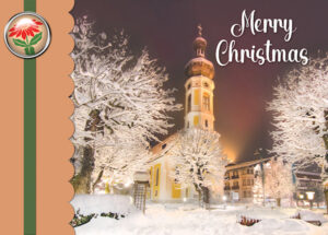
November 15, 2022 at 10:05 am #86529My first greeting card. Winter scene from Pixabay.
 November 15, 2022 at 10:49 am #86531
This is a great class. I’m not going to be posting much but I wanted to mention two things that help me. I don’t have a great printer so I avoid have blocks of solid colors. I can’t afford a new printer so I adjust to what I have and it works well enough but it does mean sometimes have to accept a white background, which I’m fine with. But I suggest looking at your card and judging if your printer is providing the quality is good enough for your color scheme. I cannot, for example, print in large areas of black because I end up with streaking. I don’t care for my day-to-day prints, but I want celebration cards to look a little nicer. I buy card stock that is scored down the center so I don’t have to worry about figuring out where the middle fold goes. I’m lazy that way. Some of the stock has a slight blush of color or texture would keeps it from looking too stark.
One thing I do on my cards (and I do very few these days) is I add a little graphic and indicate the year and occasion, or the date, because sometimes people keep the card and like that added touch. As I said, I don’t do many cards or graphics these days so it’s more something I did in the past than I do now.
Thank you for all the good information. I forget some of these “tricks” to make ribbons, scallops, etc. so I am happy to see how you create the effect.
-
This reply was modified 2 years, 1 month ago by
Dianne. Reason: Correction
November 15, 2022 at 11:20 am #86533This is a second post of Greeting Card 1. Images are mostly from Pixabay. Great class. Iam learning a lot.
 November 15, 2022 at 11:34 am #86534
I am so happy the Beautiful Lady said my name 🙂 ty I am feeling more confidant its all the tweaks and stuff
you have to figure out. Loving this Plus I got Called.
When I was little Ild run and turn on the tv and that Teacher never seen me though her Mirror
I LOVE THIS PLACE AND EVERYONE.
November 15, 2022 at 11:59 am #86537LOL, Cindy! That’s how I feel too!
Dianne, I wanted to comment on your printer observation – and thank you for reminding me! I have had many, many printers in my time, and I haven’t had a one that printed blocks of color well reliably. And your little graphic is adorable and a special fillip.
All, I am so impressed – you have outdone yourselves and it shows! I would be happy to mail out any of these cards!
November 15, 2022 at 1:09 pm #86540What is the Gallery how do we get to it please Carole
Thank you you for your comment, there is 2 background pages blended in one, then there are 21 elements on different layers , one being the scalloped edge from the original template all layers blended , some layers are duplicated like the bows which are on 3 layers. xxNovember 15, 2022 at 1:15 pm #86541November 15, 2022 at 1:15 pm #86543November 15, 2022 at 3:07 pm #86547Well I registered and am saying hello to everyone. Fabulous results todate.
Here is my result for Day 1. A little behind schedule.
Lois
-
This reply was modified 2 years, 1 month ago by
Lois Duckworth.
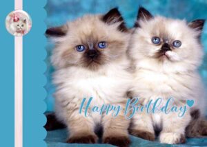
November 15, 2022 at 4:22 pm #86551As I have several birthdays over December/January I thought I would do a Birthday Card
November 15, 2022 at 4:34 pm #86553My day 1 card. Background image by Monika viaPixabay, Font called ChristmasWishCalligraphy ? by whom. Stars by myself. Ribbon from free bundle and coloured by me. TFL
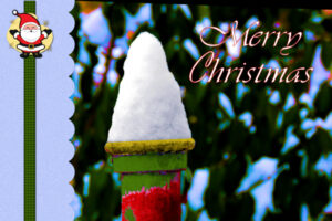
November 15, 2022 at 5:28 pm #86556Day 1 The photo was from a 6″ snowfall a couple of days ago. This was snow on top of a fence post, then I shopped it to give it the Christmas colors.
November 15, 2022 at 6:55 pm #86558Great entries by all, it is a pleasure to browse through them!
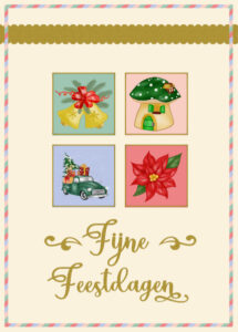
Here is my day 2 and I stick to christmas cards, although I can imagine the little squares filled with flowers for a birthday card and I will certainly make some too. As I don’t have enough winterphotos with snow I decided to use christmas elements from my stash and gave the squares a very small border to let them stand out a bit better. The font is Christmas Holland, very appropriate as my text is in Dutch. I made the back as well, but Carole said to upload just the front.
-
This reply was modified 2 years, 1 month ago by
-
AuthorPosts
- The forum ‘Showroom’ is closed to new topics and replies.


