Home of the Scrapbook Campus › Forums › Challenges › February Theme Challenge – BOOKS
Tagged: Books
- This topic has 27 replies, 6 voices, and was last updated 5 years, 10 months ago by
Annie Tobin.
-
AuthorPosts
-
February 1, 2019 at 7:58 am #25430
Did you set a New Year resolution to read more books? Did you get or give books as Christmas presents? Are you a bookworm? Do you have an extensive library of books (paper or digital)?
Create a layout about your reading adventures or someone else’s.
February 9, 2019 at 1:54 pm #25551Bonjour, en espérant que cela va fonctionner
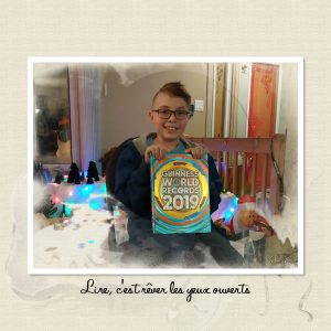
Mon petit-fils qui adore lire
https://scrapbookcampus.com/wp-content/uploads/2019/02/001-1.jpg
Masque de Corelle appliqué plusieurs fois dans des directions différentes ~ Overlay AASPN
February 9, 2019 at 1:55 pm #25552Bonjour Carole, j’ai inséré le lien tel que demandé et il est visible.
Qu’est-ce que je dois placer pour voir seulement l’image?
February 9, 2019 at 3:36 pm #25554@Jnet, tu n’as pas besoin de mettre le lien DANS le message. L’image s’affiche correctement quand tu cliques sur Upload Images.
February 9, 2019 at 7:00 pm #25569Merci Carole, j’espère m’en rappeler au prochain envoi
February 10, 2019 at 12:16 am #25575Lovely work Jnet, simple and very effective with your photo as the show piece. <3
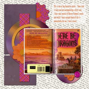
February 10, 2019 at 12:25 am #25577Hello Scrapbook Campers. I am an avid book reader and for this one decided to use the scanned cover of one of my favourite novels as the main “photo”. I used a layout template by Marisa Lerin and the background paper was from PixelScrapper. I created the elements from my own papers as I went along to suit both the template and the book cover colours. Thanks for takin a peek.
February 10, 2019 at 9:45 am #25582Jnet, it looks like it was a wonderful holiday at your house!
Very clever idea, Annie. Love the colors
~ Michele
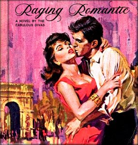
February 10, 2019 at 9:54 am #25584Coincidentally, I made this last week for my gaming group. With my usual short time limit, I found this pic on Google and thought I would try to make it look like a romance novel. Don’t know how successful I was, but I had fun trying. 🙂
~ Michele
February 10, 2019 at 11:02 am #25585Superbe Annie et Michele!
Merci pour ma page
February 10, 2019 at 7:09 pm #25615Thanks Michele and Jnet, I appreciate your comments. Michele I am amazed at how quickly you can whip something up … takes me days, LOL! Don’t think my brain cells are working as they used to!
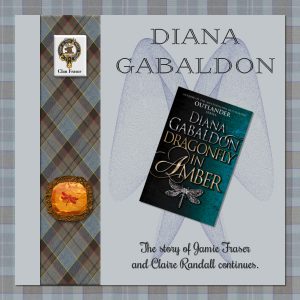
February 11, 2019 at 1:25 am #25648This is a combination of Theme of the Month and Masterclass – there was a question during the masterclass about putting something IN the gem and this reminded me of the second book in the Outlander series by Diana Gabaldon – Dragonfly in Amber. So I followed the instructions to get the amber gem, and put a clip art picture of a dragonfly I had in between a couple of the layers, played around with layer styles until I found something I liked. The outside of the amber was made using the sculpture effect.
The tartan is Fraser tartan from online, as well as the Fraser logo. I added a blue layer underneath the background one and used the exclusion style to get the nice blue. Like Annie I was able to scan my copy of the book. The picture behind the book was made using Sinedots II plugin from Dragonfly and the preset is actually called Dragonfly as well, nifty eh?
Micfin I love your cover, you did a really good job of making it look like a Mills & Boon romance novel. Jnet I am having great fun trying to remember my schoolgirl French reading your postings.
February 11, 2019 at 1:48 am #25649I love the overall effect you have achieved for this page Marlene, beautiful work, well done my friend. <3
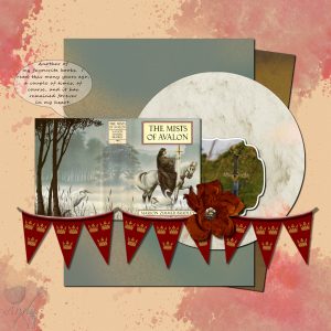
February 11, 2019 at 2:00 am #25651Hi again Scrapbook Campers. Another book I dearly love is “The Mists of Avalon” by Marion Zimmer Bradley. Again I used the cover as a “photo”. The layout is from a template I put together after viewing some sketches by Rochelle Spears. The photo of the Arthurian sword is by Ricardo Cruz from Unsplash. The brown silk flower is by BCS and the Arthurian banner was made by myself (with a lot of help from Cassel’s tut). All papers used are my own creation … ditto the bracketed comment.
February 11, 2019 at 5:15 am #25657Jnet, Annie, Michele, and Marlene, lovely layouts. I like to pay attention to the details and there are so many to look … You are all very creative… Great work!
February 11, 2019 at 5:31 am #25659Annie, like you I am always amazed how Michele can come up with a new layout every day… It also takes days for me to finish one, and ever after I had posted in the Forum I will go back to it and tweak a little bit (or a lot!) more! 🙂
February 11, 2019 at 6:10 am #25660Oh I am so glad to hear that dear Cristina. I am a tweaker too! Always worried it will not be good enough. I have worked with PSP for 13yrs, wouldn’t you think I should have enough confidence by now, LOL! <3
February 11, 2019 at 7:55 am #25661Marlene, isn’t it fun when you can combine two current techniques for one cohesive page? You did a great job.
Annie, you were very successful in giving your layout a wonderful Arthurian feel. The banner is awesome!
Thanks so much for your kind words, ladies. It’s amazing what you can do when you have a deadline. Then there are the many nights where I just say, “Good enough. It will only be on view for one day.” <3 🙂 <3
~ Michele
February 11, 2019 at 7:51 pm #25677Love your page Annie, I too enjoyed the book and I think the banner works really well. The backgrounds suit the theme really nicely, you could almost image the mists coming off the page.
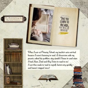
February 11, 2019 at 9:09 pm #25685I was going to tell the story of how I came to be an avid reader, then decided to make a page about it instead! The kit I used was Grandmother’s Reading Room from Studio Manu, and the photo by Annie Spratt on Unsplash – The Lord of the Rings is one of my all time favourite series of books. The bookplate font was DSP Tiffany A from Digital Scrapbooking place and I decided to use my maiden name, the other font is Rochester.
February 12, 2019 at 11:21 pm #25741Hi Marlene, thanks for your lovely comment on my page. I too am an avid fan of the Lord of the Ring series, read all the books and watched all of the movies, plus, of course, The Hobbit. Love your page, it is well laid out and very effective, like your style! <3
February 14, 2019 at 3:15 am #25837Hello again Scrapbook Campers. Put this layout together after perusing some made by noreimereason (borrowing ideas)! Papers used are from PixelScrappers and were created by different designers there. Photo is by Zohre Nemati from Unsplash. The cluster element was in my tubes folder and just has a string of numbers to identify it. I used Cassel’s Squiggles script for the frame. Thanks for takin a peek.
February 16, 2019 at 12:23 pm #26024Very nice layouts, ladies!
Annie, like you, I love to read in bed as during the day I don’t have the time… I usually read two books at a time, and which one I am going to read on a specific day depends on how I am feeling… There are days that all I want is a light reading book. 🙂
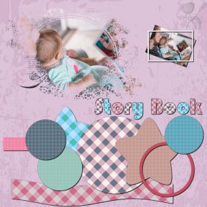
February 18, 2019 at 2:02 am #26112Hello Scrapbook Campers. Here is another for the theme challenge “books”. The photo I used is by picsea from Unsplash. The mask was not my creation this time, it is one of many beautiful paper masks from PixelScrapper. The papers are my own creation from SC paper tuts. The nine paper filled elements at the bottom were generated from Cassel’s script – ClusterTemplateMaker2 and the title was made using the tut “punched” from Intermediate – Creative Scrap – Paper Use. Layout kind of fell together, 🙂 Thanks for takin a peek.
February 19, 2019 at 1:31 pm #26163Hi Annie, another lovely layout… I don’t usually use masks but I love the effect… I have to remember to use them more often… Good idea to have different papers pattern for the cluster, nice colors… I love the way you made the alpha! Hugs, my friend! <3
February 19, 2019 at 7:15 pm #26165Thanks dear Cristina. There is so much to learn in the Campus that I tend to get a bit lost … I think I will head back to the LAB, 🙂 <3
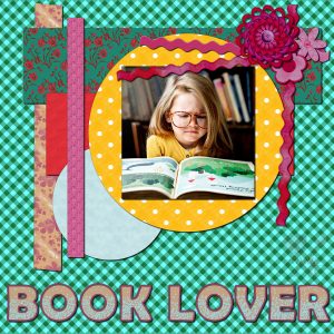
February 22, 2019 at 5:24 am #26222Hello Scrapbook Campers. One more for the book theme. Photo was from freepix. Alpha was made following Cassel’s Filled Cutout tutorial. Papers and Layout were made as I went along. All papers consist of two layers, solid colour with a texture on the bottom layer and a patterned top layer with opacity and blend mode adjustments to suit. I had made a 6 colour swatch to follow as this always seems best when I am doing my own thing. The cluster was made using cass-clustermaker. Thanks for takin a peek.
February 22, 2019 at 8:45 am #26229Last one for this month’s book theme … I’m all booked out, 🙂 Photo is from freepix. Papers and layout developed as I played. Cluster I made using cass-clustermaker. Font used was Lucida Sans Unicode and then I subjected it to cass-Squiggles … funky result which I am very pleased with. Thanks for takin a peek.
-
AuthorPosts
- The forum ‘Challenges’ is closed to new topics and replies.


