Home of the Scrapbook Campus › Forums › Challenges › February COLOR Challenge – Tarnished Trumpet
- This topic has 27 replies, 13 voices, and was last updated 3 years, 9 months ago by
Cristina.
-
AuthorPosts
-
February 13, 2021 at 11:18 am #53118
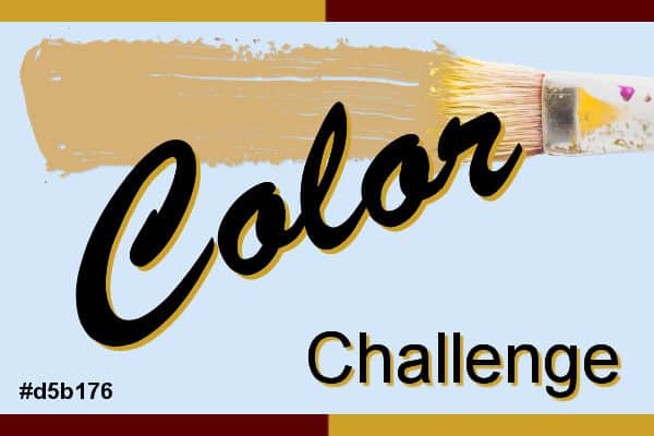
Did you know that Sherwin-Williams promote a new color every month? Of course, they are in the paint business, so it makes sense, but at the same time, it can be a great resource for colors and color palettes, so I thought that we can use some of their suggestions to use in our projects.
This month, their color is called Tarnished Trumpet. It is a beige/brown color so it can be quite neutral, and allows you to combine many other colors. Of course, you can also add some variations on that color (lighter, darker, muted, brighter). You can find the color and the hex code on the preview above.
Here are other colors suggested to go along with it.

What will you do?
February 14, 2021 at 3:50 pm #53352Template by Miss Fish, Newsletter Freebie, 2-21, word art from Creative Fabrica.
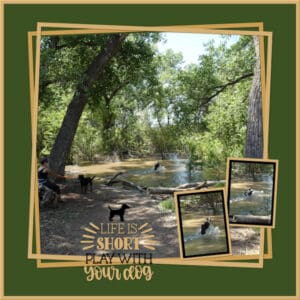
After my competitions were completed in the National Senior Games (2018) I visited local parks and hiked. This park is along the Rio Grande which had recently flooded. This area was part of the flood waters and away from the swift current of a very high river. I don’t know this lady or her dogs. They were having tons of fun.I was really struggling with this layout until I found this challenge. After that it came together easily.
February 14, 2021 at 4:13 pm #53357Love it Bonnie.
February 14, 2021 at 5:38 pm #53376Some people lead from the front … some people lead from the back, too … helping the stragglers along. Then there are ones in the middle lending encouragement to keep the pace. Such is life. Perfect mask to illustrate. Except they are not people, but Mother Nature tends to us all.
February 14, 2021 at 10:37 pm #53391Ooooo, I like this, Minka!
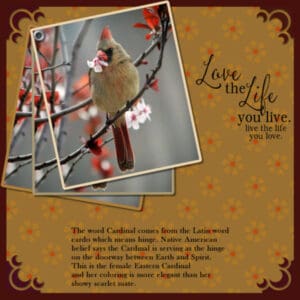
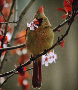
February 15, 2021 at 3:44 pm #53425Here’s my take on Tarnished Trumpet colors. I made the background by using the brush in a flower shape and then filling the center of the flower with a color from the flowers in the photo. I then applied soft light. The corners are also brushes which did not want to cooperate. They would not stay the same size, so I ended up with each corner on a separate layer so I could use the pick tool on them. I then added an under-layer in the same color as the corners and pulled in the original background to leave a border. The photo is from the Hudson Valley in Pictures. The word art was in my stash and the little mythology about the Cardinal I found using Google.
February 15, 2021 at 9:20 pm #53451Bonnie, Minka and Ann – lovely pages. Ann thanks for the hint on using brush in the corner and an underlayment in the same color to give a border to the whole page. Also loved your paper.
Minka, that is a really lovely page.
Bonnie, love the colors you used and the double frame with 2 small pics in frames.
February 17, 2021 at 2:06 am #53489Bonnie, Minka, and Ann, lovely pages ladies … enjoyed perusing and learning, thank you. ;D
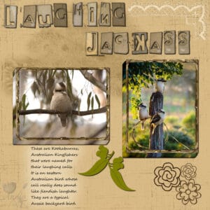
February 17, 2021 at 2:13 am #53491Here is one for the colour challenge. The Kookaburra (nicknamed Laughing Jackass) is a fairly typical backyard kingfisher in eastern Australia. They do have a rather wicked laugh which is an early morning wake up call for a lot of us. Photos courtesy Australian Geographic. I didn’t put a shadow on the lacy corner because it just looked yuk! Alpha is from Pixel Market. Thanks for takin a peek my friends. 😉
February 17, 2021 at 3:26 am #53492Lovely pages, ladies.
February 17, 2021 at 5:39 am #53494Bonnie, Minka, Ann, and Annie, wonderful layouts!
February 17, 2021 at 9:16 pm #53500Thanks dear Cristina and Michele, always appreciated my friends. 😀
February 19, 2021 at 8:48 am #53515For this challenge – color Tarnished Trumpet, I went back to my photos from a few years ago. My favorite photo model is my dog Poncho, as you will have noticed :-). This photo was taken in 2016.
February 19, 2021 at 10:00 am #53518What a beautiful dog, Marie-Claire! I take it your design uses a photo from when he was a puppy. That color works very well.
February 19, 2021 at 10:10 am #53519Another simplistic attempt at the tarnished trumpet colors … I kind of like them. Very earthy.
February 19, 2021 at 10:11 am #53521Oops. Got away from me before I added the pic! I hope it’s not an indicator of how the day will go! LOL
February 19, 2021 at 8:03 pm #53528A beautiful page Marie-Claire. Poncho is a beautiful dog and you are obviously very proud of him. His colouring favours this challenge so lovely choice my friend. 😉
February 19, 2021 at 8:05 pm #53529Simple, lovely and suits the theme perfectly … well done Minka, a delight to peruse. 😉
February 20, 2021 at 1:47 pm #53541Thank you Ann and Annie, I am indeed proud of my dog and I love him so much. We are always together. I can see that I am not the only one who loves nature. All those beautiful pages with birds! I’m not much of a scrapbooker, but I like to use psp to do something with my photos and show them off in a way other than uploading them as is.
Bonnie, I really like the layout and word art, the photo and colors fit very well.
Well thought out Minka. The map goes well with the colors and the rope around picture
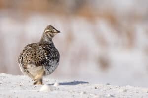
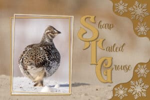
February 20, 2021 at 3:23 pm #53548Here’s my quickie February colour challenge. Stitching on the capital letters, Carole’s snowflake corner punches. Promoted the grouse to a new layer, created 2 frames, overlayed the background of the photo, blend mode, added a texture. Photo taken last week, when it was 40 below with brilliant sunshine, not that you’d think it was that cold looking at the photo. These colours are my favourite earth tones.
Lovely pages produced. I noticed that at least one challenge colour is also in the images used. Same goes for my grouse photo. I’ve also included the original photo for comparison.
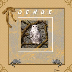
February 21, 2021 at 5:48 pm #53611For this page I used the photo of Sue Thomas which we could download a while ago. It took me some time to deside what to do with it. I wanted to find a place for the owl to sit on and on my walks I was on the lookout for a suitable tree. The Tarnished Trumpet colors fit nicely I think. I made a polkadot background, but gave the dots a blur. Font is Brush King, 2 simple frames, Cassel’s cornerpunches and the floppy bow and 2 mice for the owl to feed on. I used blend modes one the tree photo because I took it on a fine sunny day with a intense blue sky, not something you associate with an owl.
February 21, 2021 at 6:43 pm #53612My, what a superb job you did using the owl, the extraction, tree branches, the coloring all absolute perfection. Well done Corrie. You’ve certainly done this female G H Owl justice. Love the addition of the mice, that’s a really nice touch.
-
This reply was modified 3 years, 10 months ago by
Sue Thomas.
February 21, 2021 at 8:39 pm #53625You have done justice to the beautiful photo Corrie, well done my friend, excellent page. 😉
February 24, 2021 at 1:57 pm #53861Hello everyone,
I played a bit with an effect I tested with a script for light effects a while ago. I did a quick work with the month color and added a mandala. It differs totally from the beautiful works that all of you presented.
I would have added which script it was, but unfortunately I forgot it and didn’t write it down. What a pity …
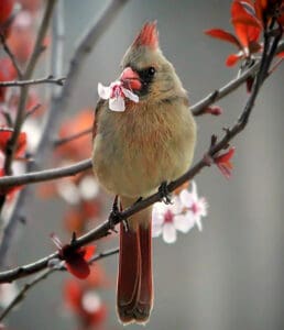
February 24, 2021 at 3:41 pm #53875Here is my female cardinal from my previous design for the color challenge but I’ve applied the free script called Dark Tones 3 that Corel is offering this week. It adds dramatic shadows and lighting; I kinda like it. Here are both photos: before and after.
February 25, 2021 at 7:54 pm #53914Wow! What beautiful creations. You folks are true inspirations.
I received this template and like it immediately. As I began to work with it, I decided the photos were too small for my liking but I completed it anyway. I used the Tarnished Trumpet color pallet. I debated journaling but decided not to journal.
February 25, 2021 at 7:55 pm #53918Same template…the designer created it to be used both ways. Again, colors from the Tarnished Trumpet color pallet.
March 2, 2021 at 5:53 am #54093Late, but I have finished something for this challenge.
Basically, I just had to add the photos… I used the template “Messy-Pockets-Captured-4” by Lynn Grieveson (Lilypad); The shadows were also included, and I didn’t change them.
The background is from her Newsletter “Welcome Kit,” and I just added a layer on top of it with one of the colors suggested… added some texture, and played with the Blend Mode.
Word Art fonts: Slashback Swashes – RioSquad – Romantic
-
This reply was modified 3 years, 10 months ago by
-
AuthorPosts
- The forum ‘Challenges’ is closed to new topics and replies.


