Home of the Scrapbook Campus › Forums › Showroom › Double Take Challenge 2019
- This topic has 142 replies, 16 voices, and was last updated 5 years, 3 months ago by
Lynda DiGregor.
-
AuthorPosts
-
August 27, 2019 at 4:11 am #33707
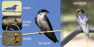
Day two of the challenge. For the background I used a sky photo which I took, played with the opacity, and kaleidoscope. Mirror, so that the two background paged matched. I did the same with the second page of photos., to achieve a sort of pyramid effect.
August 27, 2019 at 10:01 am #33712August 27, 2019 at 10:36 am #33715Sue and Shutterpixi, how inspiring birds can be :-)!! Amazing realization of DTC, I really like the way you placed your beautiful pictures, and it is an interesting course in ornithology as well. The transformation of the ladybird is exciting.
The technique applied for the word bird is great, Sue. I would like to see it “bigger” :-).
Which font did you use for the red cardinal, Shutterpixi? Although the font is small, it is very easy to read on the second side.August 27, 2019 at 10:40 am #33716Successful first try, David, congratulations :-)! Good to hear that you solved your problems.
August 27, 2019 at 12:56 pm #33724Thanks, Carole and Libera!
Libera – The font I used for all my text on Day 1 was Calligraph421 BT. I applied a bevel to it and, for the big header text, I also applied a drop shadow. The smaller informational text needed more definition beyond what the bevel provided, so I duplicated the raster layer and changed the blend mode to Hard Light.
Libera – I really like your Day 1! Very pretty garden images and such good photography!
Sue – It’s hard to beat your last year’s work, but you look like you are off to a great start on doing that!
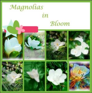
David – Glad you were able to get the problem resolved. Good job on the magnolias! They are such beautiful and fragrant flowers!
August 27, 2019 at 2:09 pm #33725Libera, thank you for you lovely comment. You are going to have to wait a few days, to see the bird word much, much bigger. 🙂 I have plans for it.
Shutterpixi, thank you for your encouraging comment. I have a high standard to maintain, phew! I hope I can deliver. 🙂
Dave, really good job on your magnolia page. Keep up the good work.
August 27, 2019 at 3:54 pm #33730Thanks for liking, Shutterpixi and for the font info. I can’t find this font in 2018, so admit you found it elsewhere.
I will wait, Sue, and I bet you can deliver, I’m sure 🙂 🙂
August 27, 2019 at 4:03 pm #33732Libera – I’m not sure where I originally got the font, but I searched online and found it is available for free here: https://best-font.com/fonts/download-calligraphic-421-bt-font.html
August 27, 2019 at 4:14 pm #33734Hey, that was quick, shutterpixi, thanks a lot! It is interesting for me, because I am testing many fonts which are well suited as legible small fonts, especially for our works here in the forum. 🙂
August 27, 2019 at 4:16 pm #33735You are welcome, Libera!
August 27, 2019 at 5:07 pm #33738Hi, everyone. I’ll be using pictures from a spring trip to Florida for this challenge. The more I learn about scrapping with PSP, the more I want to learn. (I’ve put a Diamond Membership on my Christmas wish list!)
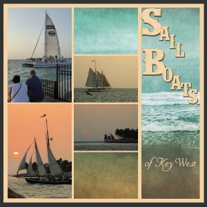
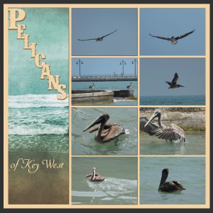
My Day One pages feature some sights from Key West. I didn’t have enough vertical pictures, so I rotated the pages. The seashore paper is from a kit by Digicats called “Travelling Abroad,” and the letters are from the Let It Shine alphabet kit by JSS.
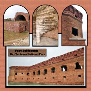
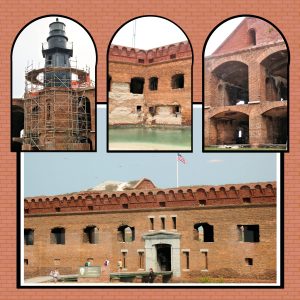
August 27, 2019 at 7:10 pm #33744And Day 2: Dry Tortugas National Park, Fort Jefferson. I used the arch shape from the fort’s construction to inspire my photo shapes. I applied the “duplicate and change the brightness” routine to create the shaped mats around each photo by just resizing the black shape to slightly bigger than the photos. I’m pretty happy with the results. I made the background paper (and the tag) by using the PSP brick texture blended with a basic background color.
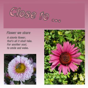
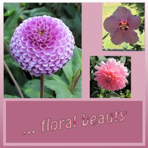
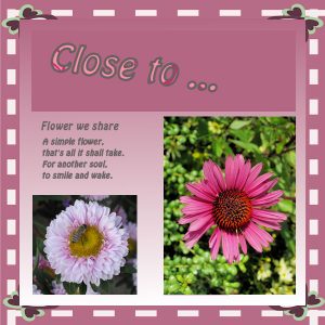
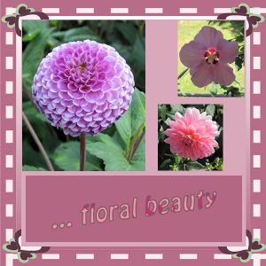
August 27, 2019 at 8:52 pm #33747Not Day 2 but still Day 1, another alternative in pink based on Carole’s tip concerning my green layout.
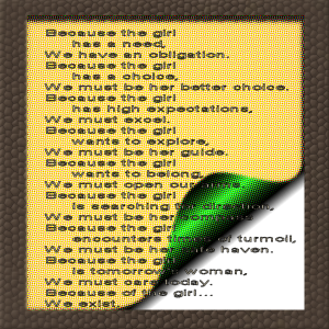
I seized the opportunity to add other flower photos of mine, matching more with the pink gradient. For the little poem I chose the Hobo font again, hoping it is easy to read by clicking on the picture.August 27, 2019 at 9:01 pm #33751The same frame (called “butterfly” in PSP) as in the green layout.
August 27, 2019 at 9:20 pm #33752Beautiful layouts Alicia, it makes you want to sail, well balanced and placed pictures. The font, pelicans and sail boat is matching well with the landscape.
Clever idea to use the brick texture and the arch shapes to illustrate the forttress :-)!
August 27, 2019 at 9:39 pm #33753A big thank you to all who commented on my day 1 double page, it is always appreciated my friends. And, congratulations to all for the beautiful work on your pages, very inspirational let me assure you. I was going to comment for individual participants but I would be here all day, ;D
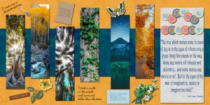
August 28, 2019 at 4:33 am #33757Hi Scrapbook Campers. For day 2 of the challenge I used some elements out of kits from Pixel Scrapper “Back to Nature” & “Many Thanks”. All the photos are from Unsplash. The background papers were made by myself following tutorials by Cassel. Thanks for takin a peek!
August 28, 2019 at 6:31 am #33758Hi, I have registered, but not able to start the double take yet as I have had a busy week.
I recently cremated my laptop and just received my new one after a 3 month break. I was ready to start tonight, and I have done another whoopsee, not a bad one but I don’t know how to get out of it so will need to get some help tomorrow.
I would like to tell what happened to my old laptop because it was such a freak accident I would not like it to happen to you. I prepared to charge my tablet and my usual multi power connection plug was full so I chose to charge it through my laptop, I made the connection and walked away, when I returned and removed the connection alarm bells rang big time and my usb ports were deemed unusable and it would not even accept my mouse dongle.Three techs were unable to correct the fault. Long story short the big boy experts decided I had overpowered the mother board. Fortunately my insurance helped out. It was the first time I had charged in this way.
August 28, 2019 at 6:33 am #33760This is day 3 of the double take challenge.
August 28, 2019 at 8:30 am #33763Thanks Shirley for your informations, always new experiences with hardware. Good luck for you!
Annie, thumbs up again for your picture/color/element composition and thanks for the nice poem.
Sue, what a quick “delivery”, I won my bet. 🙂 Very beautiful bird pictures again.
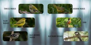
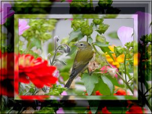
August 28, 2019 at 10:31 am #33788August 28, 2019 at 10:48 am #33793Playing around with some of last year’s photos. Seeing as I’ve gone through them to select what I need for the challenge. Adjustment layers, effects, 3D effects, chisel. Inner bevel, and paste into selection. Using the selection tool. Tennessee Warbler.
August 28, 2019 at 11:26 am #33796Sue, that is a great way to create your own background for that Day 2 project. It is so easy to use just about any image (good or bad) and play with the effects in PSP to create something totally new! For the Day 3 project, did you use a mask on the edge of the right image? It is a fun edge.
David, success!! Those little elements on the left, are placeholders. I know I didn’t put much emphasis on those in the tutorial. Since they are separate layers, you can remove them or replace them by some other decorative elements if you want, as they are typically not meant to stay as-is (although sometimes, they are fun to have, and you can just change the color and add a shadow to make them “match” your project. Keep it up!
Alicia, those boats and pelicans pages are great. I like how you rotated the template to make something unique and very pleasing to the eye. For your Day 2, that is really impressive!!! It is such a great idea to get the inspiration from the arch and translate that into the shape of the photos. Great work!
Libera, that font is great to read. I use that sometimes too, when I have some text to add. I think you are having fun creating your own templates!
Annie, great photos and great layout. I think that the journaling is a little bit hard to read. Maybe it was just a little squished sideways? I think we should notify Unsplash of all the great layouts you make to showcase their photos!!!
Shirley, sorry to hear about your computer! Don’t worry if you start late. It is not a contest or a speed challenge. Start when you are ready.
Marisia, that is an interesting page on the left. It looks like some photos were a bit distorted though. You might want to have a look at this tutorial. For the right side, with the text, it is hard to read that text. Maybe you could try to have the text on an area where the paper is not flipped, or even flip a smaller section of the page.
August 28, 2019 at 11:35 am #33797Everyone’s work is so good and interesting! I’m enjoying them all and love seeing the inspirations, which makes for such a wide variety of results!
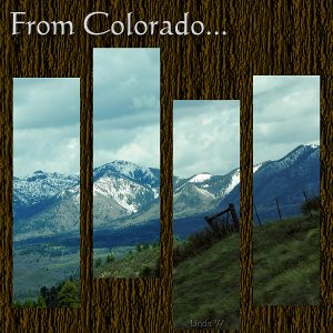
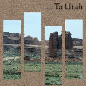
August 28, 2019 at 11:50 am #33800A few years back, we took a driving trip that went from Texas to Utah, and of course, I got lots of photos! For Day 2 of this Challenge, I picked two of the states we drove through, Colorado and Utah, and decided I would show the change of scenery that we got to enjoy. Because the landscapes and climates were so very different, I changed the backgrounds to reflect that dynamic. I also kept the masks on both pages the same to provide more continuity. The font is the same as what I used on Day 1.
August 28, 2019 at 12:11 pm #33801Thank you Carole. It’s hard to beleive that I started out with a photo of blue sky with some white clouds. I use the effects tools a lot. I clicked and clicked on the random button, in the Kaleidoscope, until I found what I was looking for. I agree those tools in PSP create some truly unique background papers. I used the mirror tool too, so that they would fit perfectly in the centre. I used a brush, I tried to use one of your lace tubes, but the magic wand wouldn’t pick up every detail, so I used a brush I had. It’s a photoshop brush, from https://myphotoshopbrushes.com/brushes/. I made a mask out of it. I find that brushes or masks make a subtle divide. Perhaps you could make some lace brushes for the store. I’d buy them. x
August 28, 2019 at 12:19 pm #33804Everyone’s work is outstanding, and extremely interesting, so many different techniques used too. I feel after looking at the pages and reading the postings, I’ve completed a trip around the world in 80 seconds. Well done one and all, I love everything you have done.
August 28, 2019 at 12:45 pm #33813I’m really enjoying everyone’s layouts. Shutterpixi, I especially like the way you featured the landscapes of Colorado and Utah; I’m going to scraplift that layout for sure!
I’m really glad to see that everyone else takes photos of birds and flowers – seems we all seek beauty in nature.
Shirley, thank you for sharing your painful experience as a cautionary tale. I hope you had everything safely backed up. I’m doing another back up today, after reading your story. 🙂
August 28, 2019 at 9:25 pm #33828LOL! Thanks Cassel, I did squish it a bit too much … wish someone could do that to me! <3
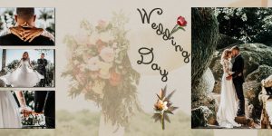
August 28, 2019 at 10:01 pm #33830Hi Scrapbook Campers. Again I must say that there is some beautiful and clever work being presented here so… congratulations to all! This is my day 3. All photos from Unsplash and all by the same photographer, Vitor Pinto, except for the background photo which was taken by Samantha Gades. Thanks to Unsplash for the beautiful photography I source … I have very few photographs of my own you see 🙁 Font used is a freebie, Xiomara and the two elements I have had forever… Thanks for takin a peek!
-
AuthorPosts
- The forum ‘Showroom’ is closed to new topics and replies.


