Home of the Scrapbook Campus › Forums › Showroom › DIAMOND Scrap Challenge – April 2019
- This topic has 136 replies, 29 voices, and was last updated 5 years, 7 months ago by
Shannon Cooper.
-
AuthorPosts
-
April 16, 2019 at 8:04 pm #27863
Good result Michele. I hear what you are saying though … just a tad addictive, lol! <3
April 16, 2019 at 9:28 pm #27868Here is my complete project through Day 3.
April 16, 2019 at 10:12 pm #27869Alicia, did you keep the tile with a transparent background? If so, if it is filling the page on its own layer you might simply want to change the color of the lines to something darker so it will contrast more? If you still have the tile with the vector lines, you can also increase the thickness of the lines. See if that helps.
April 16, 2019 at 10:21 pm #27870Alicia Garbelman – A simple thing you can do is duplicate the pattern layer. That should intensify it some. Then play with the blend modes on the duplicate layer and see if one gets you a result that is a little more bold. If you find something you like, you can then merge down to get the two layers combined and you’ll be back to just one layer. Hope this helps.
April 16, 2019 at 10:23 pm #27871Sorry, Cassel! We must have been typing around the same time, so I didn’t see your response.
April 16, 2019 at 11:51 pm #27875Day 1, my tile.
April 17, 2019 at 4:55 am #27877Hi Everyone. My result to date. thanks for takin a peek. Great results everyone!
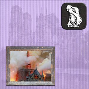
April 17, 2019 at 6:15 am #27880Well am exhausted – Blue Screen of Death to content with but my laptop was very ladylike and well behaved & we restored pre last windows update. Have done the paper for 4th different time. Still not happy with how it is all hanging together with the greys which I like the fire looks too bright. Button was a lot of noise and trying out every other thing I could. Am really impressed with all the different interpretations and am learning so much and getting ideas for all of you too. Thanks Cassell and everybody.
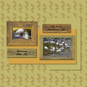
April 17, 2019 at 9:21 am #27882paint chip wood and placards
April 17, 2019 at 9:27 am #27883Marie McGrath
I think your fire is very dramatic looking which in this case should be. It also looks like the fire is reflecting off the frame. I like it. I also like your background. What did you use for it.
Lynda DiGregor
April 17, 2019 at 10:17 am #27885Here’s my Day 2 with Day 3 added to it. The painted wood didn’t work for my project so I did it a little differently. I don’t know where this challenge is leading us, but I’ll happily follow.
~ Michele
April 17, 2019 at 12:39 pm #27887April 17, 2019 at 9:29 pm #27892Here’s my Day 4 progress! I really had fun with this. Jnet I love yours! I wanted to do a painted wood but I couldn’t figure out how to do it. I need to watch the tutorial again.
April 17, 2019 at 9:40 pm #27896I am getting started a bit late this week. Seems like things kept coming up.
Here are 3 different colors of the same paper I made. This was fun..endless possibilities. I made mine smaller (1000×1000) because I Plan to use these for tagging and only need no more than 700×700.
Thank you Cassel for expanding our horizons.
April 17, 2019 at 9:42 pm #27898I love your work Sharon! Well done
April 17, 2019 at 10:22 pm #27900Day 4:
With my short memory, I had to set up each of the letters at the same time and with each step, I’d listen to the instructions and then I went in and did that step to each letter.
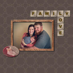
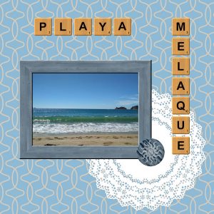
I don’t like the little Tucker tag. Could get the paint right on itApril 18, 2019 at 10:24 am #27904Day 4 with wood tiles added and a different background color. I saved the first wood tile after adding the letter but before adding the outer bevel, and used that as a starting point for all subsequent tiles to reduce the amount of rework (I left the previous letter in place but lowered the opacity of that layer to help in placement of each new letter, then deleted the previous letter layer).
April 18, 2019 at 1:45 pm #27906Day 5:
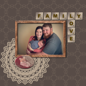
I tried to duplicate the design in the paper as much as I could. I also tried to “match” the doily color to my palette.
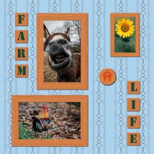
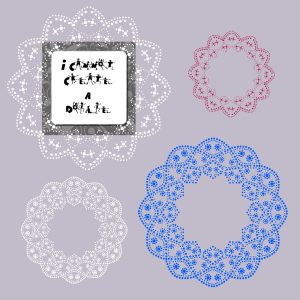
April 18, 2019 at 9:47 pm #27912Teri your doily looks fantastic! I didn’t have much luck with the doily test. I could create the pattern but I got lost in the layers and selections. I did manage to create a lacy looking circle. I tried twice but I’m no closer than I was. My mule and rooster said they didn’t mind so it’s not a total loss. Here’s an example of what I did create.
April 19, 2019 at 12:20 am #27915J’ai aimé faire la dentelle. Certains points chevauchaient d’autres (ceux sur les lignes). Peux-tu me dire Carole, ce qu’il faut faire pour qu’il n’y ait pas de chevauchement. J’ai aussi aimé faire les lettres. Je me suis aperçue trop tard que mon chiffre pour les points étaient trop bas.
April 19, 2019 at 12:23 am #27916<span style=”vertical-align: inherit;”><span style=”vertical-align: inherit;”>Carole, j’ai perdu des mots dans mon message … ce qu’il faut faire …… trop tard que mes chiffres étaient trop bas</span></span>
Pourquoi je perds des mots lorsque je clique sur soumettre?
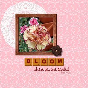
April 19, 2019 at 5:38 am #27919My day 4 and 5. I changed the background colour using a blend mode. The font is by 2peas-champagne and the sentiment by Stella Payton. TFL.
Sheila x
April 19, 2019 at 5:57 am #27920Hi Everyone,
You all are making amazing and creative layouts! It is very inspiring… I am working on my page and will try to upload it today.
April 19, 2019 at 9:26 am #27922I had another look at your result tonight Sharon and I have to say I really like it. I give you 10 out of 10! <3
April 19, 2019 at 9:29 am #27924Hello Scrapbook Campers. This is my result so far. This doily would not be applicable for other work but it fits the bill here so I am happy enough with that. Thanks for takin a peek. Great work coming through, keep up the good work campers! <3
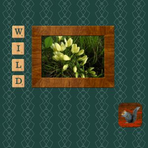
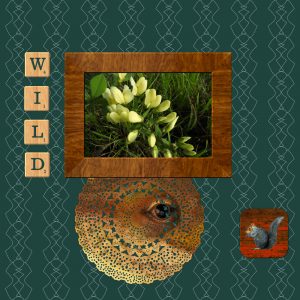
April 19, 2019 at 10:10 am #27927Day 5 – I made a doily, but it didn’t really fit with my “Wild” theme, so I flood filled it with a pattern of a lizard (close-up) from a picture I took of one on our porch. Not sure if the doily will stay in my challenge image, but included it for now. I’ve also shown what my doily looks like without the lizard.
Enjoy seeing everyone’s posts!
April 19, 2019 at 10:50 am #27928Deana, with those three versions, you can see how versatile a single tile can be! You can change the scale, change the color, even change the angle!
Teri, if you want the picture of Tucker to be “painted” on, you can use that layer instead of a paint layer so that once you have created the “scratches” (in black and white), you can delete parts of that picture. Of course, you need to make sure not to remove too much.
Sharon, is it possible you forgot to invert the selection to create your doily? It looks like you kept the holes instead of the paper. Very nice design though. Use those holes and add a paper.
Jnet, il faut éviter de toucher la ligne de démarcation pour que les trous ne se chevauchent pas. Si tu touches la ligne, il faut que ce soit bien centré et avec une forme symmétrique (comme un cercle). (Et aucune idée pourquoi des mots se perdent; peux-tu juste éditer le post quand tu remarques cela?)
Translation: in order to avoid any overlapping of the designs in the doilies, you have to make sure you don’t touch the lines when you create the design. If you need or want to touch the line, it has to be with a symmetrical shape (like a circle) and perfectly centered on it.
Shutterpixi, maybe the initial doily could be colorized in a green tint to blend in too? If it is a solid color, the details will show up more than with a pattern.
April 19, 2019 at 12:03 pm #27929Hi Cassel! Nice to be with y’all again! I know I may have registered late, but I am missing the first day’s email. The lesson looks interesting from checking out the forum. If it’s not too much trouble could you send that email to me again? I would appreciate it.
April 19, 2019 at 12:06 pm #27931Rhonda, you will get the links to all the days in the last email as a summary, so don’t worry, it will be tomorrow!
April 19, 2019 at 1:01 pm #27938 -
AuthorPosts
- The forum ‘Showroom’ is closed to new topics and replies.


