Home of the Scrapbook Campus › Forums › Showroom › Calendar Workshop 2023
Tagged: Calendar-Cover-2023-scaled
- This topic has 278 replies, 30 voices, and was last updated 2 years, 1 month ago by
Anita Wyatt.
-
AuthorPosts
-
September 26, 2022 at 6:06 pm #83719
Lynda: Yes, I like the looks of this new one. Good job!
September 26, 2022 at 10:17 pm #83722Susan I like your calendar, it is very good one for people who love brocante – shabby chic. The colors are softer then I mostly use. But give me an idea for one to make for my mother in law.
-
This reply was modified 2 years, 2 months ago by
Chris Schults.
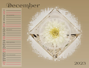
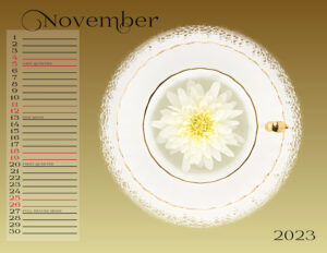
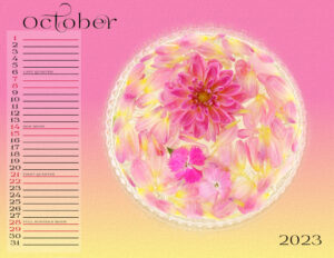
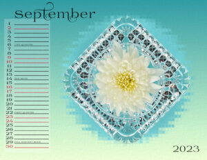
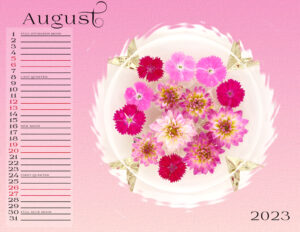
September 27, 2022 at 12:53 am #83737Here is my calendar. I added some of the moon phases because I love the moon. Chris, for sure this is soft than I would normally use too. I tend to like the darker shades, it’s a surprise to me how it turned out. I let the flowers tell me which direction to go. The best thing is I managed to keep them alive long enough to have flowers to shoot. I have a black thumb.
 My-Calendar-12-2023-WIP-600-1
 My-Calendar-11-2023-WIP-600-1
 My-Calendar-10-2023-WIP-600-1
 My-Calendar-09-2023-WIP-600-1
 My-Calendar-08-2023-WIP-600-1
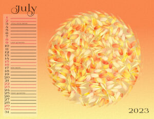 My-Calendar-07-2023-WIP-600-1
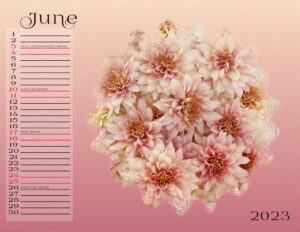 My-Calendar-06-2023-WIP-600-1
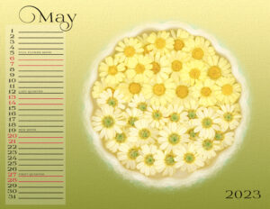 My-Calendar-05-2023-WIP-600-1
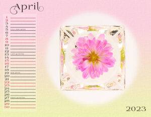 My-Calendar-04-2023-WIP-600-1
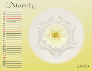 My-Calendar-03-2023-WIP-600-1
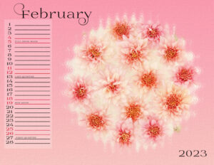 My-Calendar-02-2023-WIP-600-1
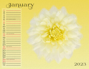 My-Calendar-01-2023-WIP-600
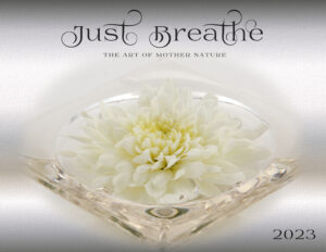 My-Calendar-00-Cover-2023-WIP-600
September 27, 2022 at 7:30 am #83742
My-Calendar-00-Cover-2023-WIP-600
September 27, 2022 at 7:30 am #83742I am so blown away by everybody’s calendars.
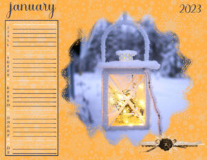
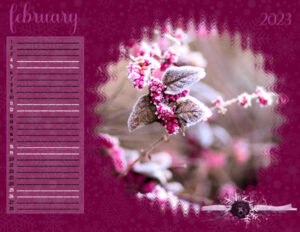
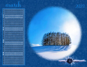
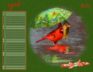
I’m way behind (partly due to my ocd), but here’s what I have so far. January and February pics are from Unsplash and I probably googled the other two a long time ago when I wasn’t adding the source to my file names. I don’t think you’ll be able to see details at this size unless you click on the pics, but when you do, the lines will look like dashes. So glad I didn’t notice that before I posted them or I would still be ocd’ing. LOL
September 27, 2022 at 8:20 am #83745Michelle those are beautiful. I got dashes too, and yes, it drove me crazy. I had tried to use the same font as my numbers and it would not produce a solid line. I kept the solid line as Arial and used the “leading” to line it all up (using the font I had choosen). Thankfully it worked. Seeing everyone’s calendars makes me want to make more with different subjects.
September 27, 2022 at 9:14 am #83746Michele: Those are beautiful! And the April cardinals made me laugh! Why are you getting dashes? When I wanted to extend my lines, I just duplicated the Lines layer and slid it carefully to the right and then just did a Merge Down.
September 27, 2022 at 10:25 am #83747Thanks, Susan. I left the lines Arial, too. My calendar is not a particular theme; I’m just choosing pics for the month’s weather.
Ann, thank you, I found the cardinals when I was making a page for Fab Divas with the April Showers theme years ago. The dashes are only showing on the 600 pixel size, but not on the regular page.
I hope to get the entire calendar done…last year’s only made it to January. LOL
September 27, 2022 at 11:20 am #83748Michele: Mysterious dashes. I don’t show any at all, even in 600 px size. Did they come that way on your templates?
September 27, 2022 at 11:20 am #83749Mary Solaas (#83662) , thank you, Nice of you to say that about my dog. I would do all projects with pictures of my dog, but I think I’m exaggerating, so I sometimes force myself to choose a different subject.
I used to do that with pictures of my daughter when she was little, now she is 42 years old, and I have no grandchildren. So my dog has all the attention.September 27, 2022 at 1:17 pm #83753Michele – I definitely understand the OCD – I’m a victim of it too. My daughter is convinced – I couldn’t stop “playing” with PSP even while we were on vacation!
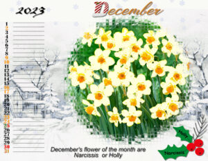
September 27, 2022 at 2:01 pm #83759I decided to just share my “finished” December page. The background snowy buildings etc was adapted from a page I got from digitalscrapbook.com ” ps_jessica-dunn_232273_winter-solstice-winter-house-4×4-journal-card_pu” The Narcissus flowers are from CreativeFabrica. The Snowlfakes is a Cass picture tube and I changed the color to a light blue so they would show up on the white background. 2023 font is blackaddar itc, the D in december is from Cass ElphAlpha and I used the mesh warp to angle it. the rest of December font is Bigtime.
September 27, 2022 at 2:14 pm #83760I just want to say I have viewed each and every one of these pages and it is amazing how diverse and beautiful they are. This workshop has been very helpful (Thanks Cassel) and it and so many of the shared pages have inspired me to try some new ideas, some for these pages and some for future endeavors.
September 27, 2022 at 4:20 pm #83762Susan,(#83424), nice to meet a honorary Scott 🙂
Marie-Claire,(#83440) all the birds fit so wonderfully in the mask, love it!Just wanted to say I’m always surprised how one theme or lay-out end up with so many, beautiful projects, it’s joy to see them all.
Had a very busy week/weekend, so I’m still working on my calender.
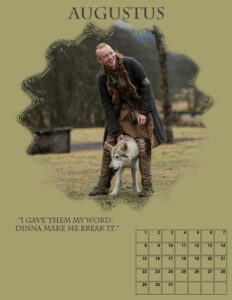
The Outlander one will be with the round masks, the other for my granddaughter will be made of the template of last year, changing the dates of course.
The rectangle layout fits the pictures I want to use better. 🙂September 27, 2022 at 4:21 pm #83763Lynda, That is more what I had in mind and maybe I would bring the opacity of the backgound photo a bit lower and make the photo a bit larger so it covers more of the page. But this is just what I would do and you are the designer of the calendar. Sorry for my late answer, but I have so much going on at the monent that I only check in here once a day to see what everybody is doing. I’m slowly starting to work a little bit on my calendar but I can only do one hour at the time and then I have to get up and walk a bit around otherwise my hip/leg is going stiff.
September 28, 2022 at 1:36 am #83790Here is my day 5 of the 2023 Calendar. I am a bit behind as I have been very busy at work. But I will be getting the calendar done one day at a time and having fun with it.
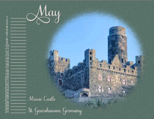
I used a picture of the Mouse Castle which is located near the Cat Castle. Font is Samantha Upright and the texture in the background is gravel. I used a light color for the font to make it stand out more. I tried to use the picture with Gausian Blur as some of you have done, but mine did not come as beautiful as yours, so I used a textured background.
Burg Maus (Fortress Mouse) resides on a mountain spur overlooking the Rhine River. Originally called St. Peterseck and later Burg Deuernburg (Thurnberg), the castle came to be known as Burg Maus due to the cat and mouse rivalry between the Church and the powerful counts of Katzenelnbogen who owned nearby Katz Castle (Burg Neukatzenelnbogen).
September 28, 2022 at 5:28 am #83791Ann, I used the original lines from the template provided by Cass and used the pick tool set to scale to widen them. Within PSP and when posted on FB at full size and reduced size, the lines are solid. It was only when I posted the reduced size here that they look like dashes so it’s no big deal.
Oh, Mary, we are OCD sisters. I had to use guides to make sure each page had the elements in the same places. Sometimes OCD comes in handy; other times it can be a pain in the butt! lol
September 28, 2022 at 7:27 am #83793I made a whole calendar /all pages/, I present FEBRUARY. Fine work with it. I know a little bit more about my old PSP9:)
September 28, 2022 at 8:39 am #83794Yikes, Michele and Mary. I have caught your OCD. My pages were FULL of guidelines. It sure made it easier when the object snapped to the guideline too.
September 28, 2022 at 6:32 pm #83801September 28, 2022 at 6:35 pm #83802Carole (#83663) I had a good time trying to find a different technique for the backgrounds each time
, and thank you for this workshop.
September 28, 2022 at 6:39 pm #83803All the calendars are so beautiful, if I had to choose, I wouldn’t know which one ?
September 29, 2022 at 12:25 am #83804Marie-Claire, absolutely beautiful. I love your backgrounds. What an inspiration. I agree with you. I’d want one of everyone’s calendars. Hopefully we can view them in the gallery throughout the year.
September 29, 2022 at 4:41 am #83805LOL, Susan. 😀
September 29, 2022 at 8:57 am #83808Still working on my calender 🙂 What’s the best way to align the calenderbox and the month? For the month I used align horizontal and that’s ok, but from the top? How do I align each months “name” the same way?
Same for the calender date box, how do I align them so that each month has the same box alignment?
See the months in progress, hope you understand what I mean 🙂
September 29, 2022 at 8:59 am #83809Marie-Claire, same here,love them all and all so different!
September 29, 2022 at 9:02 am #83810Monique, place guides along the lines of the boxes, add all the dates one by one, making sure they are all separate objects but all inside a single vector layer, and then, once you have put all the dates for that month, remove/deactivate the guides and move the dates INSIDE the boxes. They will all be perfectly aligned.
September 29, 2022 at 9:02 am #83811Anne,(#83759) At first I thought the templates are a bit to busy to fill it with a photo background but your december project is wonderful!
September 29, 2022 at 9:15 am #83812Carole, and the box itself? I don’t know if you can see it, but they are not on the same spot on the page 🙂 Also with the guides maybe?
September 29, 2022 at 9:23 am #83813I think I found it :X and Y position, was looking for it, just found it, 🙂
September 29, 2022 at 9:50 am #83814Yes, if you put guides at the same spot for each calendar, you can then align the boxes in the same way.
-
This reply was modified 2 years, 2 months ago by
-
AuthorPosts
- The forum ‘Showroom’ is closed to new topics and replies.


