Home of the Scrapbook Campus › Forums › Showroom › Calendar Workshop 2023
Tagged: Calendar-Cover-2023-scaled
- This topic has 278 replies, 30 voices, and was last updated 2 years, 1 month ago by
Anita Wyatt.
-
AuthorPosts
-
September 25, 2022 at 10:53 am #83556
Nice work Harmony
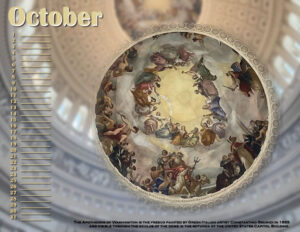
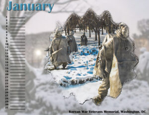
September 25, 2022 at 11:05 am #83561Chris: Those pages are very nice. You have the same ideas that I have; using a photo as a background. I discovered in my October and January calendar pages, that the center image in the group stands out better if I take the background and apply Blur/Gaussian Blur. Here are how mine look now that I did that.
September 25, 2022 at 1:31 pm #83589Calendar cover.. Thanks for the font change/placement tip
September 25, 2022 at 1:50 pm #83592Finally completed but not sure I am happy with the final cover as it’s very busy. Have learned a lot in the process though and I could always go back and remove items.
Thank you all for the tip and the designs you have shared. Recently useful has been Ann’s use of Blur/Gaussian Blur for the enlarged background. It is effective and keeps the theme of the image relevant. I also thought Gerry’s use of Carole’s Script ‘Bleed JPG’ looks useful.
September 25, 2022 at 3:18 pm #83593OMG! these are amazing! I didn’t sign up …who wants a paper calendar? But I made a huge mistake because you’re doing all kinds of super-cool things! Really, they just look great!
Corrie, so glad you were able to stop in the forum and say hi! Amazing, really, so good job!
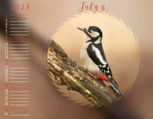
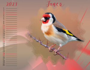
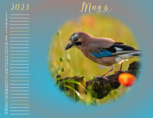
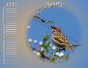
September 25, 2022 at 4:50 pm #83607Carole (#83470) Thank you! and yes the theme is birds, it’s not my dog for once ?
The continuation of my calendar.
All photos come from http://www.hdwallpapers.in
for the backgrounds I sometimes have
– made a gradient myself from the colors from the photo,
– some with a texture as Carole explained,
– some without texture,
– sometimes it is the photo itself as background, with gausian blur and above it 1 or 2 layers of color from the photo and a blending.
– For 1 background I used a mask with a color from the photo.I think I’m going to leave the pages that way because I think it’s going to get too busy otherwise.
I will be adding birthdays from family and friends to use the calendar as a birthday calendar and desktop background.
-
This reply was modified 2 years, 2 months ago by
Marie-Claire.
September 25, 2022 at 5:44 pm #83613September 25, 2022 at 7:48 pm #83630Anonymous
- 335

- Enthusiast
here is my Monthly Calendar for year 2023
This was very very instructive indeed 🙂 – Thanks CaroleSeptember 25, 2022 at 8:07 pm #83645Here is my completed calendar.. Loved this Thanks Carole
September 25, 2022 at 8:13 pm #83646Pirkko,
Love all your photos of children. Great job on your calendar . I’m sure your family will love it.
Lynda
September 25, 2022 at 11:17 pm #83662Have to comment:
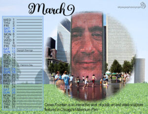
Lynda – always enjoy your pics and layouts; I remember the tower with the changing photos in Chicago.
Pirkko – I too like your children – particularly liked September.
Harmony – I’ve enjoyed your calendar pages.
Marie-Claire – you used birds this time and they are great (but I miss your dog)
Ann Seeber – I really like your choice of a theme; and of course you are always spot on with your pics and displays.
Gerry – love your photos and thanks for the note on Mixbook.
Chris, April, Fiona, Anne, and all of the rest who have joined this workshop and posted – beautiful work and I know you had much fun. It’s been great going through all these pages and seeing the different themes and techniques used.September 25, 2022 at 11:22 pm #83663AprilDawn (#83518), one nice thing about creating a desktop with these calendar pages is that you can put the extra space anywhere, depending on your preference. Some will want everything on one side, or on three sides like you did.
Anita (#83520), that is a wonderful font. I think I’ll have to go grab it! It is so elegant.
Ann (#83523), I see what you mean with the bevel. What happens is that the mask was not 100% white in the center and there likely were some stray pixels. To “fix” this, brush with white on the center of the mask. Those stray pixels created “holes” in your image and the bevel will just accentuate it if you leave them there. Once you brush the mask with white, and merge the group, you should be able to add the bevel as you wish. (#83524) That would have been a reasonable assumption (the lines wrapped inside a shape) but they were not made that way. If I had, not everyone would have been able to open the templates.
Chris (#83530), I had to look twice to realize that the house was not on the same “layer” as the background. The trees around blend in so well!
Harmony (#83551), those ribbons in the corner make your pages so elegant! And a great place to add details.
Lynda (#83589), you should send a copy to the Chevrolet company 😉
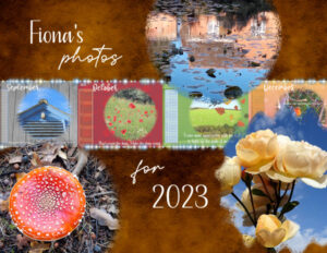
Fiona (#83592), yes, that is the beauty of digital projects; you can always go back and change things.
Suzy (#83593), as a DIAMOND member, this Workshop is available to you anytime. I have added it to the list of workshops.
Marie-Claire (#83607), glad to see that you used different techniques for your background. That means more tools at your disposal!
Pirkko (#83630), wow, you just waited to show everything at once. Beautiful calendar!
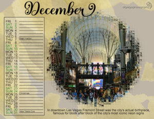
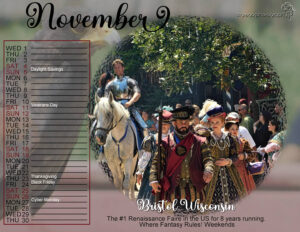
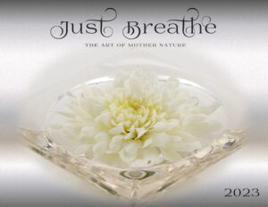
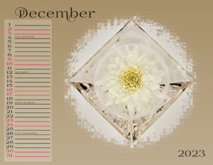
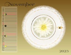
September 26, 2022 at 12:57 am #83668November, December and the Cover finally complete. I wanted to add some of the moon phases. I tested two styles, one with icons and one with words. I think the icons are too distracting. Not sure if I’ll do the moon phases or not.
Ann, your November has such depth. Everyone has done a fabulous job. I love seeing the calendars in their entirety.
Suzy, I learned from Ann; take all the workshops because there is so much to learn that you didn’t expect, or didnt know you would learn. Eg. Copy Special was a new one for me. Carole, if I do adjustment layers on a photo, is this a good place to use the Copy Special to the layout so I can leave the layered PSP edited photo as is.
I made a mask (thanks to the Masks workshop) for the cover as I wanted it to look similar to the interior and it’s also the first layout in the workshop where I used an existing PSP gradient. And, with this Calendar my flat-lay-flower-phase-photo-project (say that 5 times fast) has come to an end. I really enjoyed this workshop, thank you Carole.
September 26, 2022 at 2:57 am #83672Anonymous
- 335

- Enthusiast
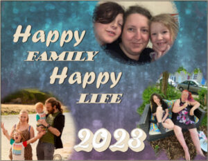
Here is the Cover for Calendar 2023
September 26, 2022 at 8:44 am #83677Carole, to answer your question in post #83414. I used your boxes (copied them) for the dates but removed the numbers in the right one.
Hope I wil have more time to work on the calender this week. I browsed the forum a bit and love all the different calenders 🙂
Corrie, I hope you will be “on your feet” painless soon, take care!
September 26, 2022 at 9:40 am #83679I decided to add our Chevy truck and Sanibel 5th wheel to the mix. Not sure I like it. Maybe to busy but it does explain the title. I’ll think about it. Any help would be appreciated.
Again this has been a really great workshop and everyone has done such a fantastic job.
September 26, 2022 at 10:12 am #83693Lynda: If I wanted to add that truck to that layout, I think I’d “ghost” it behind the title. Maybe I’d even blow it up really large and use it as an overlay with the background. If you reduce the opacity, you’d still see the truck, but it wouldn’t be obtrusive. Just my thoughts.
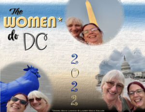
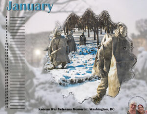
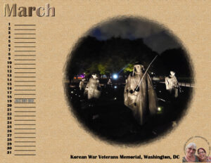
Here’s my complete calendar-all 13 pages! I did a cover but didn’t use 2023 because I left the months as a perpetual without the days of the week and my daughters’ trip happened in 2022.
The cover uses the selfies they included in the photo batch. I tried the word art title and applied a little inner bevel or a shadow. The background is a gradient I edited from Corel’s White Sand and added the Plaster texture. I couldn’t do Inner Bevel on the masks as it left a line at the edge that looked out of place, so I skipped it this time.
 00-COVER-2023-CALENDAR
 01-JANUARY-2023-CALENDAR__forum
 02-FEBRUARY-2023-CALENDAR_-forum
 03-MARCH-2023-CALENDAR_forum
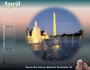 04-APRIL-2023-CALENDAR_forum
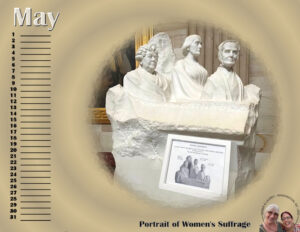 05-MAY-2023-CALENDAR_forum
 06-JUNE-2023-CALENDAR_forum
 07-JULY-2023-CALENDAR_forum
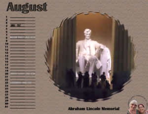 08-AUGUST-2023-CALENDAR_forum
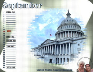 09-SEPTEMBER-2023-CALENDAR_forum
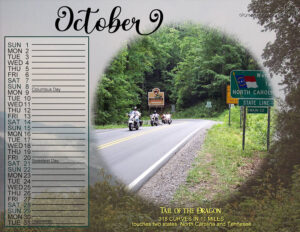
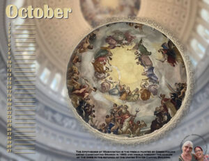 10-OCTOBER-2023-CALENDAR_forum
 11-NOVEMBER-2023-CALENDAR_forum
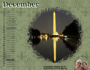 12-DECEMBER-2023-CALENDAR_forum
September 26, 2022 at 10:42 am #83696
12-DECEMBER-2023-CALENDAR_forum
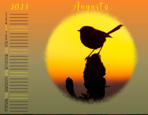
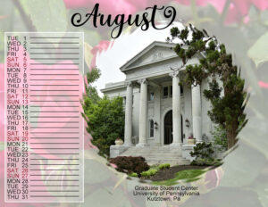
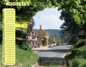
September 26, 2022 at 10:42 am #83696My idea for august. The center pic is an own photo made in the cotswolds, place called Burford. The background, also cotswolds is from pixabay. As the sign too.
September 26, 2022 at 10:44 am #83697Susan Ewart: Wow, your cover is gorgeous! Your title makes me think of when I quit smoking (many moons ago) and I had to power through nicotine cravings. In fact, some of your crystal looks like an ashtray to me (probably not, just how my mind works!) 😉
September 26, 2022 at 2:01 pm #83699Thank you so much Ann. It means a lot to me. Your’s (and everyone’s) calendars are breathtaking. The photos in yours are really beautiful, and of course the abstract ones really hit home with me. I’m learning so many design ideas, eg. Look at Chris’s (#83696), I would not have thought of that. Like a perfect peep hole into Cotswold.
You are correct; some are ashtrays, who knew they were also beautiful and not just utilitarian. Some are oven dishes and a bunch are candle holders. All found at the thrift store. That’s photography on a budget. Next year I’ll have a better idea of what kind of flowers I want to use and get lots of them. There never seemed to be enough in bloom at the same time. The Calendar Workshop is perfect for making a cohesive set of pieces. It’s always a surprise and delight when I look at all 13 pieces together. I love this workshop.
September 26, 2022 at 2:31 pm #83701Thanks Ann, I’ll try that
Lynda
September 26, 2022 at 2:40 pm #83704September 26, 2022 at 3:18 pm #83705Lynda: I prefer the one with the smaller truck. Alternatively, you could tighten up the word art going up and left and enlarge the truck a little bit in the center. See how that looks. The other one looks too crowded to me. Which do you prefer?
September 26, 2022 at 4:19 pm #83706I’m loving all the different calendars!!! I’m not doing much at the moment qua scrapping. I just managed to put the photos I want to use inside the templates. I’m still very tired so it’s off to bed early for me, my brain just shutes down in the evenings. I know I have to be patient and so far it all goes to plan!
Lynda I see your problem with the cover. On both I find it a bit to busy; have you considered to use only 2 masks and put you chevy on the bottom right side of the layout and use one of the photos as a suttle background? Just another idea.
September 26, 2022 at 4:33 pm #83708How about this?
September 26, 2022 at 4:33 pm #83709Thanks Corrie,
I’ll try that too
September 26, 2022 at 4:42 pm #83710Your all so Awesome
I got stuck I cant wait till I can do stuff like you all
thank you Carole for helping me today, with my pallets or toolbars its way better now.
September 26, 2022 at 4:46 pm #83712Corrie,
Is this what you had in mind?
I changed it again 😉
-
This reply was modified 2 years, 2 months ago by
Lynda DiGregor.
-
This reply was modified 2 years, 2 months ago by
Lynda DiGregor.
September 26, 2022 at 4:49 pm #83713Lynda: Still too busy for me. Sticking with that layout, though, I’d reduce the size of the WordArt and leave the truck in the center, maybe up a little higher and a bit smaller. Try Corrie’s idea. The beauty of digital is changes are easy peasy. 😉
September 26, 2022 at 4:52 pm #83716Ann ,
How about this one.. changed the word “see” to blue because the background is much lighter.
Love that you two are giving me feedback. Thanks
-
This reply was modified 2 years, 2 months ago by
-
AuthorPosts
- The forum ‘Showroom’ is closed to new topics and replies.


