Home of the Scrapbook Campus › Forums › Showroom › Calendar Workshop 2023
Tagged: Calendar-Cover-2023-scaled
- This topic has 278 replies, 30 voices, and was last updated 2 years, 1 month ago by
Anita Wyatt.
-
AuthorPosts
-
September 22, 2022 at 5:27 am #83348
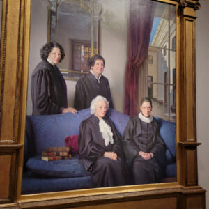
Carole said: “(#83317) Have you considered straightening the painting image? Based on the mirror in the back seems obviously angled.”
I’m showing you the original photo I had to work with. What you see in my calendar is the best I could do with the angles, never mind fitting it in the mask!
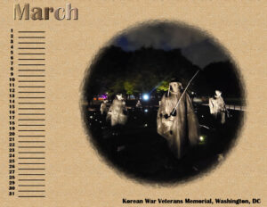
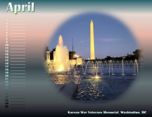
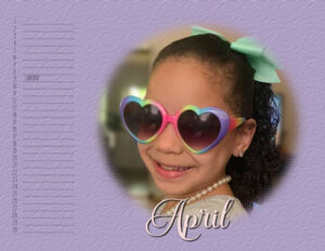
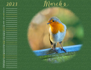
September 22, 2022 at 7:52 am #83356I think I’m finished with March & April, unless I add some more text. My March background is a double layer from the Textures tool. I made an interesting discovery, the Sculpture texture has tons of pattern choices and some are my own plaids, etc! I used the pale Elegant texture overlaid with the Cracked Plaster and then multiplied. My April background is a gradient called Calm Skies and Water. I used the gradient Cougar for all the text and applied an inner bevel to the month.
September 22, 2022 at 10:01 am #83359So many interesting calendars and so many different approaches.
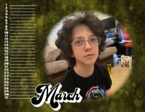
I have gone with more blocky fonts and one that has an extrusion option for the titles. My backgrounds are all the same image but some versions are colorised and some have the HSL tool used on them. Here is my Maarch so far. My theme is family
September 22, 2022 at 10:02 am #83360Oei I registered and just downloaded Day 4 the pages and the video’s.
Do not have enough time these days, so I will later looking at the vid’s
September 22, 2022 at 11:41 am #83361Dawn, I think I missed your post, but hope you will be able to participate and your health will be better soon. 🙂
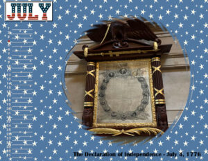
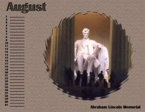
September 22, 2022 at 1:41 pm #83364Here is July and August, finished. I got patriotic with July, since Laurey gave me a photo of the Declaration of Independence which was signed July 4, 1776. I used the USA split font so you can use 2 colors. I placed a mat behind it as the background is busy. I tried to add an Outer Bevel to the Photo/Mask Group, and it came out well, I think. August is Abraham Lincoln’s memorial, photo shot at night and from a distance so it was quite grainy. I tried to improve it and think it looks a lot better now. The background is a texture called Letters, which I found appropriate for Lincoln who was known as an effective orator. We had to memorize one of his speeches when I was in high school, “Fourscore and seven years ago …” 😉
September 22, 2022 at 8:37 pm #83372Hello Cristina, Fiona, Susan and Monique… Thank you so much for your kind well wishes for my health.
Still working on my calendars but had not settled on what I wanted to do with them until today . Every one has done lovely work on their calendars and it is has been good to view them.
best wishes to everyone.
Dawn.
September 22, 2022 at 9:01 pm #83374I love you all’s work 🙂
September 22, 2022 at 9:10 pm #83376I had a bit of a light bulb moment on what to do with the calendars as usually we have calendars with boxes for writing events . .. so decided to see how they would look as a background calendar for my computer desktop . finished the calendar placed it on a 1920×1080 pixel page so it would leave room around for desktop icons etc. tested it out and it looked good and my hubby was so keen on the idea he wants to have them also… image below is how it will look on computer hope it is not to blurry as of course had to reduce the size
Dawn.
September 22, 2022 at 10:11 pm #83381More work in progress.
Dawn – Using the layout as the desktop background is a great idea. After such a difficult period, I’m glad that you joined this workshop.
Carole – “do you have enough people with birthdays in each month?” There are a couple of months where there are no birthdays and a couple of others that have multiples. For the former, I’ll use a group shot of the great-grandkids for one and a group photo of the “older” members of the family for the other. The audience for the calendar is my mother, who is dealing with dementia. I did the same for last year’s calendar, and the visual helped her more than I would have thought.
September 22, 2022 at 10:12 pm #83383I have not posted yet because I am slow! and I have not had much time to focus on this project!
But I think I am like Monique, I am not sure about the style, so maybe I got stalled there.
I added the year, because I WILL FORGET in a year or 2. I write things on my calendar, in some ways they become a journal of sorts. As a genealogist, I keep my old calendars because they bring back memories. Hopefully good memories 🙂
This is what I have begun for the first template-
-
This reply was modified 2 years, 3 months ago by
Linda J Walker.
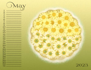
September 22, 2022 at 10:59 pm #83387May and June. I’m getting an idea of a style now. Gradient background with texture effects. I tried many versions of the texture from the materials palette. I like that it’s on a different layer, but I didn’t like the texture it made. I do like the texture from Effects>Texture Effects>Texture better. I wish it was on it’s own layer. I think I’ll duplicate the gradient background and put the effect on one, that way I can decide if I want the texture or not. I added the year smaller in the opposite corner. I will likely change the Prida 02 Calt font. Believe it or not most of the glyphs are just typing it out, without using a character map. I had to go and look in the glyphs for normal letters and it’s a super unorganized glylph section.
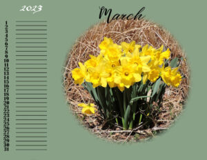
September 22, 2022 at 11:56 pm #83390March calendar My theme is Flower of the month that I googled. March is Daffodil and since I have hundredes of photos I have taken over the years (I live daffodils) I used one of mine. The text for the month and also for the days is Bigtime. Font for the M in March is Angellica Merona. Font for the year is blackadder itc. I haven’t done any shadows yet, I thought I would leave that until I was done in case I wanted to change something.
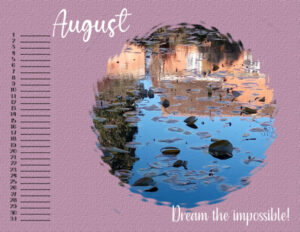
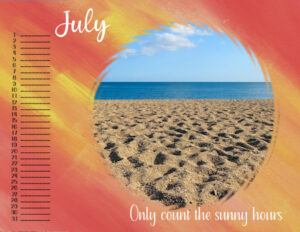
September 23, 2022 at 1:19 am #83403July and August. Prida 02 Calt is the font for the month and year, days are Prida Em Cooper. Gradient with Texture from Effects.
Really love seeing how everyone lays out their calendars. Stuff I had not though of and really like eg. where you place the month, year etc). Beautiful and interesting photo’s and the textures I’m seeing are so interesting.
April, that’s a great idea for the desktop.
Linda your texture, color and photo are fabulous
Ann, I’m enjoying your Washington layouts, you are making me an armchair traveler. Wish I could see it in person!
I wish I could comment on everyone, they are all so enjoyable to look at. With every visit to the forum I see something I want to try.
I also like the challenge of making the photo’s fit the mask, it’s exercising my creativity and problem solving abilities.
September 23, 2022 at 1:20 am #83404Ann, I love this photo.
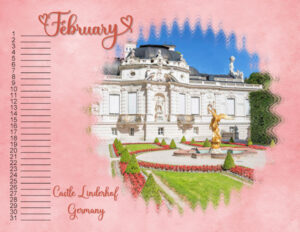
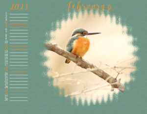
September 23, 2022 at 1:29 am #83406Here is my day 2 February Calendar showcasing Castle Linderhof. It is situated in southwest Bavaria near the village of Ettal. This glamorous royal castle is 15 km from the Bavarian town of Oberammergau. It is the smallest of the three palaces built by King Ludwig II of Bavaria and the only one which he lived to see completed. It was also his favorite castle. Last time I toured it was in 1986 and I loved it. My January Calendar page shows Ludwig’s Neuschwanstein castle. Thank you Carole for inspiring all of us.
September 23, 2022 at 3:15 am #83408Gerry Thank you for your kind comments. ….. it is wonderful you do Calendars for your Mother. My 98 year old Mum had Dementia before she passed away and I personally know how visuals via cards and calendars can be a great help for their memory. she never forgot who we were right to the end.
Still more lovely work since I was here earlier… a joy to view them I still go back to the beginning of this thread to look at them all again.
below is my February Desktop Calendar … when it gets closer to the new year i will add birthdays to the calendar.
Dawn
September 23, 2022 at 5:04 am #83410Gerry: Using the birthday calendar as a visual for your mother is an inspired idea. I made ID sheets for my husband in his final year so he could tell which grandchild was on duty while I went out for errands, etc. The calendar templates this year don’t have the days of the week so I view them as Perpetual Calendars that can be used any year. Perhaps I’ll add the family birthdays. You’ve got my creative juices flowing! 😉
April/Dawn: I’m so glad to see you back and hope you are now feeling well. I keep a 1300 x 950 template with a black background which is the same as my monitor, for my ongoing projects here. I use a .jpg of it as my desktop background at all times. I do use my Big Cat Calendars as fill-ins when I don’t have a current project. Are those Lorikeets in your calendar? My granddaughter’s zoo has a flock that visitors can interact with and feed. They have gorgeous colors!
September 23, 2022 at 6:44 am #83414Still experimenting 🙂 I will keep the template vertical, but would like quotes from the series and a Scottish related picture/embelishment also, so I have rotated the boxes vertical (have to put numbers in it) I won’t use the calenders to write on, just as decoration but a bit hesitating about the vertical box lay out 🙂
September 23, 2022 at 6:47 am #83415When we got the first templates, I thought how will you make the pages look nice with the round masks, but now I see all those calender pages I’m amazed how wonderful it looks! It’s a joy to see all of the pages 🙂
September 23, 2022 at 6:51 am #83416Susan, you’re bouquets look almost as advertisements fo bridal bouquets, love them! (Love flowers)
September 23, 2022 at 8:22 am #83421I changed the dates’ font to ‘Tasteful Sandwich’ and used for my quotes also. The letter spacing in the new font was a bit close for some figures so I used kerning to space them out a bit so they appear to align better.
Thank you Susan and Lynda for liking my layouts. I think the circular framework for the photos is more impactful sometimes than the original rectangular format. Credit there due to Carole’s design. I like the way Lynda has used a photo background that draws you in to the main circular photo. Susan’s fresh colours and symmetrical, geometric feel to the images just look so good in a circle. Well worth considering these ideas for future projects.
September 23, 2022 at 11:59 am #83423I love to see what everybody is doing. Great work, Everyone!
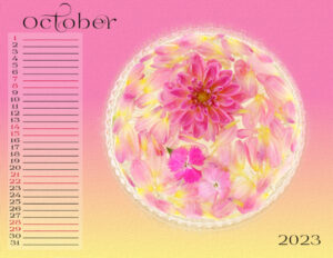
Here is my page for October.
Background paper: Lilypad – Pink Reptile Designs – Basically Kraft-pp09
Font: Soffia Slant
For the holiday date, I used Layer Styles>Outer Glow
September 23, 2022 at 12:07 pm #83424Monique and Fiona, thank you for the kind words. My heart is singing right now. Joining the campus has renewed my love of photography, for that I am truly grateful. (I just sold all my silversmithing tools/supplies so I could buy a new camera…I might sell my older, well-worn husband to get the lens I want ?).
Monique, my dad’s side of the family is Scottish. Although I am adopted I consider myself an honorary Scott. Most people have a hard time saying Ewart (my last name), which sounds like U-ert, we get called EE-wart? . So we used to say, “it’s like “Stewart, without the St., because we aint no Saints….).
Cristina, great layouts and what a great idea with the outer glow.
-
This reply was modified 2 years, 3 months ago by
Susan Ewart.
September 23, 2022 at 12:27 pm #83428The tips we have learned in this tutorial must be worth remembering and like Cristina I found the tip to hold the ctrl key to toggle between the dropper and the floodfill tool, is a good one.
I was also interested by Carole prompting PSP by using the swatch toggle arrows in order for the colour swatch to register. I had found this by accident (probably frustrated) but now I know that I don’t have a bug!
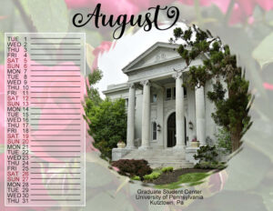
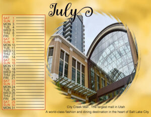
September 23, 2022 at 2:40 pm #83432Didn’t get a chance to do July and August so here they are with the Sept/Oct lesson
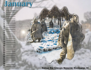
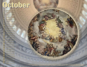
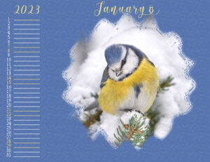
September 23, 2022 at 4:24 pm #83436I did some editing on the January calendar and also finished October but September is taking longer. Who knows? Maybe later today.
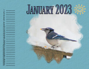
All these photos were taken by my daughters in DC last week except for January that I got from the memorial’s website as I felt I needed snow.
In case you can’t read the text in October in this reduced version, here it is:
The Apotheosis of Washington is the fresco painted by Greek-Italian artist Constantino Brumidi in 1865 and visible through the oculus of the dome in the rotunda of the United States Capitol Building.
September 23, 2022 at 4:50 pm #83440Hello! It’s a bit busy this week and next week, and I got behind as usual. Today I was able to work on my calendar, and I want to show what I’m doing.
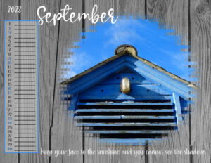
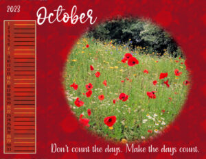
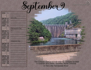
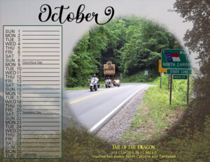
You have already uploaded many beautiful calendar pages !September 23, 2022 at 5:10 pm #83452September and October- I used a few photos of a family get together/motorcycle ride in Tennessee and North Carolina.
My husband and I left the rest of the family at a cabin we rented on Douglas Lake and rode the Dragon.
The Cheoah Dam can be seen from the Tail of the Dragon and the other photo is a few motorcyclists on the road. Tail of the Dragon is a must for motorcycling. Not only does it take skill but it is beautiful.
I do like Carole’s bounding box and the color changes on the weekend days and dates.
-
This reply was modified 2 years, 3 months ago by
Lynda DiGregor. Reason: fix a mistake
September 23, 2022 at 5:14 pm #83455September and October. I wasnt planning on the using the September image because of the black reflection in the glass but after seeing the template I changed my mind. I tried so many different colors for the weekends. White disappeared in some and I wanted it to be readable. Chose a red version. I liked the selection, flood fill, reduce opacity. I didn’t like the frame so on one (Sept) I feather the edge. That was a hard one to do and found how by accident. I know we did it in a tutorial some time ago, but I couldn’t remember. I think though, I like the straight edges of box in October.
Wow, such stunning layouts today. I like reading about Washington, DC Ann. And, Carole, when I watch the video, I use full screen and holy wow, it’s tack sharp on the 21″ screen.
-
This reply was modified 2 years, 3 months ago by
-
AuthorPosts
- The forum ‘Showroom’ is closed to new topics and replies.


