Home of the Scrapbook Campus › Forums › Showroom › Calendar Challenge 2016
- This topic has 42 replies, 9 voices, and was last updated 8 years ago by
eileen deliot.
-
AuthorPosts
-
November 26, 2016 at 1:31 pm #11555
Have you joined the Calendar Challenge 2016?
Show us the pages you have made so far. We would love to see how creative you are and how different each page will be.
November 27, 2016 at 5:02 am #11567Here are my first two pages. Not sure if I’ll keep them as January and February yet, might change them when I have all 12 pages.
 November 27, 2016 at 10:57 am #11573
Wendy, those are beautiful! You went the longer route and used the templates instead of the quick pages. Great job!
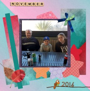
November 27, 2016 at 6:08 pm #11589Ok being a novice, I used the template supplied, but used some of my own textures and some collected embelishments. I used this page for November 2016 as a reminder of my son and my grandkids visit because I don’t get to see them as much as I would like.
Having fun doing these though and have nearly finished Day 2 just a decision, if I will change some of the textures.
November 27, 2016 at 6:10 pm #11591Jan, as a “novice”, you did a great job!!!
I think it will be a fun calendar to print and enjoy all year long!
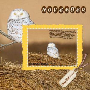
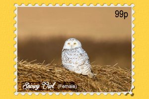
November 27, 2016 at 6:20 pm #11592Hi Cassel, I opted for the template, which as you can see I didn’t follow to the letter. November is when the Snowy Owls migrate from the far north, and make their appearance further south, where I can take shots of them. I used several techniques, made my own postage stamp, drew my own branch, cut out the owl and promoted her to a new layer, and changed the colour of the Month I would appreciate any constructive criticism from you. What would you have done differently using the original photo, which is the owl sitting on the straw bale?
November 27, 2016 at 6:49 pm #11593Wow, Sue, that is quite a neat extraction. If you had not said anything about having drawn the branch, i would not have guessed you did it. I like the little details you added, like the lifted corner. Due to the yellow of the paper and the white of the owl, i might suggest adding a “reverse” shadow (something faint in the opposite of what the normal shadows are), just so it makes some differentiation between the two colors. It is a little trick i use when colors tend to be similar in an area where there is no shadow.
One sure thing, you did a great job of extracting that owl!
November 27, 2016 at 7:14 pm #11596Thank you ever so much for the compliments. As for the reverse shadow I don’t quite understand what you mean, or how I would go about doing a reverse shadow. Please enlighten me. Thank you Sue.
November 27, 2016 at 8:03 pm #11597A reverse shadow (or what i call a Fake shadow) is going to be set with something like these:
Offset : 2
Opacity: 20
Blur: 10
Such a shadow will show up on the top left side (while normal shadows will go on the bottom right) and will be quite faint (the exact settings will depend on the size of the project and the colors). Give it a try and see how it makes a more realistic separation between the layers. I might do a blog post tutorial about that in the future.
November 27, 2016 at 8:42 pm #11599That is cool! Now I understand what you meant. I’ve slightly over exaggerated the reverse shadow a little, I agree, it does make it more realistic, and makes the stamped photo pop, so to speak. Had to remove the shadow from the top and left side of the stamp, as it was on a separate layer for the bottom right lift, and showed through a little. I’ll be implementing that in more of my projects now. Thank you, thank you Cassel that’s another awesome trick!
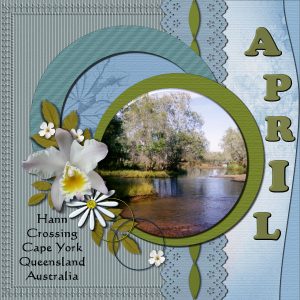
November 28, 2016 at 8:18 pm #11613Using a template is definitely a good idea. One less thing to think about, the layout can then be edited as I go along to my liking. Again, I’ve extracted all the flowers and the Kingfisher from photos which I have taken. I created the bouquets, by placing the flowers in a vase with a light backdrop, then extracted the flowers (as a cluster) to be used at any time for any project. I’m enjoying the challenge.
November 29, 2016 at 5:57 pm #11619Did you notice that I used just a hint of the reverse shadow trick? It does subtly enhance the papers.
November 29, 2016 at 11:19 pm #11620Yes Sue, that “reverse shadow” does wonders. I think i might add that in one of the tutorials of the series. It is a small detail but makes an obvious difference.
May i offer a little observation? In the flower element that has a bevel, you likely had an angle of 45 degrees. To be consistent with the rest of the shadowing, it should be 315 degrees; notice that on the bevel, the lighter area is facing top right, while the shadows say that the light is on the top left.
Keep them coming!
November 30, 2016 at 2:35 am #11622Hello Everyone…..this is a pic of my 1st effort in this Calendar Challenge. Thank you Cassel for all the templates this challenge will provide us. I am enjoying the process very much as it is different to how I usually do my card fronts. I look forward to seeing the coming templates. It took a bit of time to do this one because I don’t usually use templates to do my cards. So for me, this is a good and enjoyable new part of my journey with PSP.
Dawn
November 30, 2016 at 5:22 am #11624Hi Everyone!
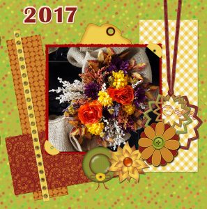
Here is my Day 1 calendar page. I was already working on fun things learned in Lab 5-Module 9, so a lot of this is created from that class, and some other tutorials on the internet. I know it is really busy, but it was fun to use some of the things I’ve created. I found myself trying to find a picture to relate to the layout, rather than the other way around, so I just took a pic of the wreath on my front door. I also am not certain which Month this will be for, so I left it off for now. I really need to work on the shadowing… any other CC you have would be wonderful!! I need all the help and direction I can get. I’m also not sure if it is normal for the resizing of the image for posting here to be so distorted, going from 3600 pixels to 600, or if there is certain method I should use to avoid it looking so crappy when uploaded?All of the other pages posted above are really fabulous! What a creative bunch, also sooo inspirational. I’ll try to catch up a little quicker with the other pages…
Cassel, thank you for all the work you put into this. I don’t know if you created the quick pages, but they are really amazing, and I think I’ll make another calendar out of those as well.
BTW, have I mentioned that I LOVE working with, and creating vectors and Preset Shapes?? I’m hooked!
December 1, 2016 at 7:00 pm #11665I have NOT made my pages yet. I have one page sort of decided on, and 2 pages that I have photos decided on, (probably). I am pretty sure day 7 will be a water scene for me.
The pages so far would fit any month, so I am waiting until the end to make my solid decisions.
December 1, 2016 at 7:59 pm #11667Dawn and Paige, i love looking at your projects. I also appreciate your kind words on the whole challenge and the supplies provided. And i enjoy seeing how you used templates. I am surprised that most participants used templates instead of the quick pages, but i am really happy that you took on that challenge!
Joanne, i am looking forward to see some of your layouts !
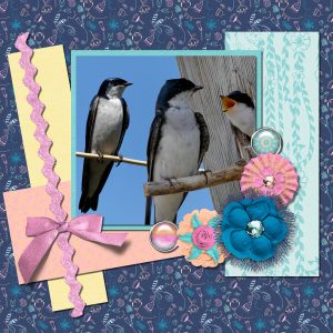
December 2, 2016 at 9:31 am #11669I look forward to opening my email each morning to see what you have sent. Your quick pages are very creative, and inspire one to delve into their photo albums. For a change I used one of the quick pages. I used 3 photos, to make one to fit into the photo slot. Used the smart selection tool, eraser tool, and a mask to blend the perch.
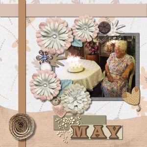
December 2, 2016 at 8:04 pm #11673Cassel, Day 8 is a really sweet design and I was prompted to use the quick page today with a photo of my Mother on her 90th birthday, which was a very happy time… she is now 97. I chose May, as it is the month we celebrate Mother’s day here.
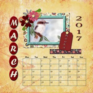
the other pic is using Quick Page Day 2… years ago I did some hand painting and this is a very simple looking Kookaburra one of our wonderful birds here in Australia. Some folks refer to them as just “Kooka”. I also added a calendar on the page as I intend to print some pages out as a 6×6 inch stand alone calendar for the desk. Thanks again Cassel for all the design templates.. it is a challenge… but also a joy to do.
December 2, 2016 at 8:10 pm #11674Sue that photo collage is great. I would not have known it was three photos put into one!
Dawn, it looks like her dress was a perfect match for the colors of the quick page! You might need to use a calendar on a single line on some of the pages where you might not have a large space to add the calendar boxes.
And printing 6×6 pages can definitely be an interesting way to use those pages.
December 3, 2016 at 6:43 am #11677Months 3 & 4
 December 3, 2016 at 10:23 am #11679
Months 5 & 6
 December 3, 2016 at 5:28 pm #11687
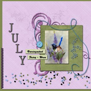
I did 2 versions of Day 2 here is the second one and one for July. Thank you Cassel for the date files received this morning. I am still enjoying this challenge and will miss it when it is finished.
Dawn
December 4, 2016 at 1:32 am #11689December 4, 2016 at 6:51 am #11690Pages 7 & 8. I choose wedding theme for August because that is the month we were married.
 December 4, 2016 at 7:07 am #11691
Hi, Everyone
Only right now I joined the Calendar Challenge, so I don’t have anything to show, but the pages shown above are really beautiful and very inspiring. Congrats to everybody!!
December 4, 2016 at 2:11 pm #11694I am really amazed at how different all those pages ended up looking even with similar templates (or quick pages). You each give them a personal twist, a different angle, add elements i didn’t think of. It is a real treat for the eyes!
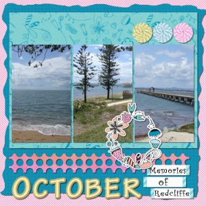
December 4, 2016 at 8:02 pm #11703Hi everyone.. here is Day 7 using the template…. also I just want to say how I enjoy seeing all your creative pages, you all do such lovely work…… hope you are enjoying this challenge as much as I am…
Dawn
December 5, 2016 at 7:35 pm #11721Hello Everyone !……I decided to use the Quick Pages for these 4 days
December 6, 2016 at 2:19 am #11724I am absolutely in love with all the pages you are all showing!! They are all fabulous! This has been really fun. I have my Day 2 Calendar done… very slow at this, trying to think of the elements to use. I guess I’ll get better as I collect more and more that I’ve created along the way. Thanks, Cassel for these great templates and quick pages. I should just use them as they are all beautiful! I’ll still use them in a separate calendar too. 🙂 (Just realized I put 2016 on this page, instead of 2017… Glad I saved the copy in layers so I can fix it now. haha)
-
AuthorPosts
- The forum ‘Showroom’ is closed to new topics and replies.


