Home of the Scrapbook Campus › Forums › Basic Scrap Course › BSC Module 2
Tagged: BSC Mod 2 redo retouched
- This topic has 6 replies, 2 voices, and was last updated 4 years, 10 months ago by
Cassel.
-
AuthorPosts
-
February 2, 2020 at 8:37 pm #38460
Hi Cassel,
My project 2 went OK. I don’t care for the background or the letters that I used but I could not find what I was looking for. How in the world do you keep your scrapbook kits and files organized? I find myself spending most of my time hunting for elements over and over again, so I feel like I am wasting time. Sorry I had to vent. Please let me know how you keep your files in order without going crazy. I like learning the open layer script. It really saves time. My husband is always trying to pry me away from my computer. Ha ha.
SallyFebruary 2, 2020 at 8:54 pm #38461Sally, getting organized is very important. A lot of people will not bother until they are drowned in a chaos of supplies.
Here are some tips:
- if you get kits, keep them together: they will have matching colors and styles, making it easier to create a more cohesive project
- if you have separate items, start making categories to group them (fasteners, papers, frames, etc.). If needed, make sub-folders like Buttons, Staples, Stitching, Brad inside the Fasteners folder
- if you want to be efficient, you can rename the file names to add more descriptive words, if needed. Some designers don’t bother and simply name their files Element1, Element2, Element3, but you might want to have Button1, or Frame2, or Stitching3. Then, you can do a search for elements you want or need for your next project.
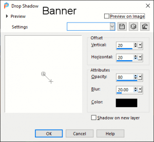
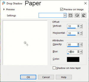
As for your layout, I don’t think the background is odd or anything like that. What I observe is that the shadows are a little strong. What settings were you using?
February 2, 2020 at 10:02 pm #38469I redid my shadows for the banner and rickrack. Do they look better?
Is there a way to clear the drop shadow properties box? I think I was wrong on the settings because the last settings I used were still displayed. I do not know how to clear the drop shadow settings. I feel like if I could clear the last settings my shadows would work better. Maybe that was what messed them up. What do you think?February 2, 2020 at 11:29 pm #38471Yes, I think this would be more consistent. For the banner, here is an additional trick. Since the ends are supposed to be stuck to the paper, if you look closely, the shadow will make them LOOK like they are floating on the ends. Use the Warp Brush and push those ends slightly toward the extremities. Just a little tweak (not sure it was even mentioned in the video) that can be used for many banners-type of elements.
On the initial layout, do you think those were the settings? They look different from the second post.
February 3, 2020 at 12:35 pm #38477Cassel,
The print screen’s I sent are of the drop Shadow properties box settings that I used on the original project Module 2.
The pictures of the banner and the rickrack are the corrected shadows that I redid. I know the response I sent did not display the way I thought they would. I will work on the warp brush.
ThanksFebruary 3, 2020 at 1:43 pm #38479I redid the shadows on my Module 2 so I am submitting it again.Looks better to me. Thanks for catching the details. Much appreciated!
BTW, I left the darker shadow on the Title so they would stand out more.February 3, 2020 at 9:36 pm #38504Those ricrac ribbons definitely look like they are attached to the paper now!
-
AuthorPosts
- The forum ‘Basic Scrap Course’ is closed to new topics and replies.


