Home of the Scrapbook Campus › Forums › Showroom › Bootcamp – Sept 2021
Tagged: Bootcamp Day 5- Project-3-600
- This topic has 239 replies, 20 voices, and was last updated 3 years, 2 months ago by
Susan Ewart.
-
AuthorPosts
-
September 23, 2021 at 6:14 am #64907
I am starting over in BootCamp. Everyone has done fantastic work. Love the pages.
I will need to keep practicing, not really happy with it yet. Font not looking good. I am my own worst enemy.
-
This reply was modified 3 years, 3 months ago by
Helen.
September 23, 2021 at 9:46 am #64910Helen, I don’t want to put you off, but may I make a couple of suggestions, which may help you like your page more. For the text, I would use an easy to read calligraphy font, and not necessarily in black, choose a colour from the photo. Make the photo much larger, if that is possible. The photo doesn’t have to be in the centre of the page either. I often like to use rule of thirds, when it comes to the layout. But that’s just me. The paw prints are a little over powering, try making them smaller. Try using one of the blend modes on the paw prints. Possibly cut out the text on the paw prints, or use white. These are all suggestions, for you to play around with. We all have different styles and tastes, at the end of the day you are the creator. It’s trial and error until you establish a style of your own which you are happy with, and reflects your personality, and who you are. I look forward to seeing what changes you may make.
September 23, 2021 at 9:55 am #64912I’m a little behind with my posting, a busy couple of days. I used filter forge to create the background paper. I updated Filter forge, after the great deal Carole obtained for us, after the master class: Using Filter Forge. I won the much older version I had in one of Carole’s challenges. I can’t remember which challenge it was though.
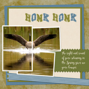
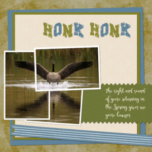
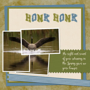
September 23, 2021 at 10:18 am #64913Holy WOW Sue! that’s stunning. I love those colors. I love geese. We lived on a flight path to the local (very small) pond, in Chilliwack, BC. Our windows got pelleted but we didn’t care, the low flying geese were awesome. That little pond got well over 800 geese, ducks and many different waterfowl. Hubby and I would go around dinner to watch them all take off for the farm fields for the night. We and a random stranger (who came everyday for the same reason) counted the groups as they took off. We stopped counting at approx. 800. I’d go in the mornings to watch the landings too. There was also the smaller cackling geese. Best memories for me, I miss it. In Alberta they are too far out in farm fields to be attainable. In Chilliwack you walked amongst them as it was a small neighbourhood park, with nests right beside the foot path and a geese sitting on them, not even a bit concerned about the people walking by. Beautiful layout that take me down memory lane.
September 23, 2021 at 10:22 am #64914Ann, thanks for explaining how you did it. I never thought of using Hue/Saturation. I’m sure I’ve seen Carole do it in tutorials but forgot. I wondered how people keep “changing” the color on a paper and still keep the texture of the paper. they must be using hue/saturation. Boy, my head is sure “thick” sometimes.
September 23, 2021 at 10:59 am #64915Thank you, Sue for the advise, it is appreciated. Again, thank you, for helping me out.
September 23, 2021 at 11:43 am #64916Helen, we have all been there, as Carole has repeatedly said, we were all beginners. Take some time to look at other creators work, take notes of what has caught your eye, and implement them in your pages, you’ll soon establish what you like. We all get times, when we draw a bank, for me I walk away, go outside, I them come back to my project with a fresh look. Never hesitate to ask any of us for any assistance, no matter how trivial it may seem.
September 23, 2021 at 11:48 am #64917Susan, I found this chart on the web that gives the values for Hue/Saturation/Lightness. I keep it bookmarked on my browser under Classes/Resources. Otherwise I was stumbling around trying to arrive at a color in a hit or miss fashion. PSP is very good with precise directions. 😉
September 23, 2021 at 11:53 am #64919Thank you Susan for your kind words on my goose page. I live slap bang between Luck Lake, and Lake Diefenbaker. As the crow flies, 2 miles from Luck Lake, and 7 miles from LD. Luck Lake is a huge man made Lake, by Ducks Unlimited. They have now washed their hands of it, and is no longer maintained, yet it hosts up to 11 million water birds every Autumn. It’s a popular migratory temporary stop off for the birds. You can imagine, the sight and sound I have every morning and evening when they are migrating.
September 23, 2021 at 1:00 pm #64921Ann! Thank You! This is what I’ve been looking for. I wanted something that has true Cyan, Magenta, Yellow from which all other colors are made. Now to learn how to put the hex codes in. Why can’t they just do codes with Hue formula the way the paper processor did in my film processing days, would be so much easier. I am hoping to input the exact amounts of CMY. Also, this will go along with Carole’s PDF tutorial on the Hex codes.
Sue, I would love those sounds. You live in the best place. 11 million is mind boggling. Do you see pelicans too? does it get crazy with birders from all over the world there? It must be an incredibly humbling experience to see the magnificence of nature.
September 23, 2021 at 1:19 pm #64922Susan, I have used hex codes in the past when I was creating web pages with Adobe Dreamweaver and of course in PSP’s color wheel, but for Hue/Saturation/Lightness the codes are different and they are on that chart also. Enjoy!
September 23, 2021 at 1:43 pm #64925September 23, 2021 at 3:12 pm #64930Anonymous
- 335

- Enthusiast
Here is my work for Project 5
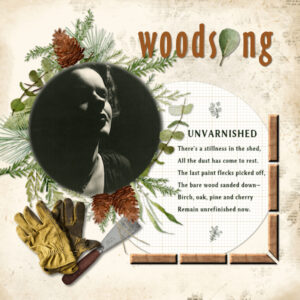
paper is from Hot Cocoa-January Blog Train Freebie from Sscraps – I colored it a little bit. And the photo is mine and the tubes.September 23, 2021 at 3:17 pm #64934Done Project 5 – now I can go back to all those chores that have been piling up! It’s so easy to get kinda obsessed. I added all the parts of the lesson to bevel my “lumber” framing device, use guides to line the pieces up and flip them around horizontally and vertically, use a frame around my photo and substitute a letter in the title with an element. I added a block of text using a selection rectangle to keep it justified and confined. The lovely wreath element is called Kendra_frame_round.png but I’ve lost the source. Everything else is from Soniasscraps, Katie Pertiet and pixelscrapper.
September 23, 2021 at 3:31 pm #64937Anonymous
- 335

- Enthusiast
Anita, I love your work. It is full of summer and happiness. it made me really happy 🙂
September 23, 2021 at 3:58 pm #64939Hello all,
Looks like I’m the first to put Project 5 in the forum, do hate being the first.
I found the photo and the frame online. I didn’t use a bevel I tried but the inside bevel ended up on the outer edge of the frame, I gave up on that. I’ve used bevels before and they have worked ok. I managed to get a promoted layer again, it seems to occur when I ctrl “C” a selection; but it all worked out in the end.
A thank you to Ann Seeber that colour chart will come in handy. I didn’t realise that I had used the artist colour wheel as shown by the diamond shape in the middle of the ring.
This is it the big reveal hope I didn’t make a pigs ear of it and again I followed the design of the tutorial.
Not the first after all, relief
-
This reply was modified 3 years, 3 months ago by
Colin Hooson.
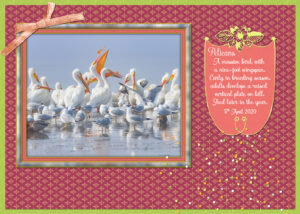
September 23, 2021 at 6:07 pm #64942Susan, you asked about Pelicans. We have lots and lots of Pelicans, I kayak amongst them on the Lake. They gather in great numbers at Gardiner dam, which is where I took this photo. On the South Saskatchewan river side of the dam.
September 23, 2021 at 6:56 pm #64943Thank you Pirkko for your kind comment. As you can tell, I love cats.
Anita
September 23, 2021 at 7:00 pm #64944Thank you Susan for your kind comment. I love to use my cats in graphic projects.
September 23, 2021 at 9:12 pm #64946Project 3 catching up. Tried to make my plaid match her skirt. Used the glitter Carole posted for the mat under the photos. Not sure where I got the bird graphic and I drew the giraffe years ago using a pattern open beside my canvas. My Grand daughter posted the photos on Facebook so not the best quality. The main background I used a Filter Forge texture as an overlay over another layer of the brown color. Lilly is giving the turtle a hug not trying to choke it. LOL
Carole you ask me what is my style. That is a hard question but I can tell you what I do. I open a photo I want to use and my inspiration will come from that photo. I have always had a problem when I try to go by a layout someone else has created. One reason why I keep taking this class over and over is to try to force myself to accomplish that. So far it is not working. This is a lifelong problem for me. I seem to freeze up when ask to work on an assembly line so to speak.
I do learn something or relearn it each time I do a class though. For instance in the project 5 video, I believe, you said use the move tool after locking the layers together that you want to move together. I rarely use the move tool so I guess that is why it always frustrates me that even though locked things refuse to move together.
-
This reply was modified 3 years, 3 months ago by
Wanda (Sue) McGuire.
-
This reply was modified 3 years, 3 months ago by
Wanda (Sue) McGuire.
-
This reply was modified 3 years, 3 months ago by
Wanda (Sue) McGuire. Reason: to add more text
September 23, 2021 at 9:39 pm #64950I finally got my PSP to save but now I am on the road with no way to complete lessons. I arrive home tomorrow…full day Saturday…then back to lessons.
Carole, I am not sure what caused my PSP problems but I think a lot of my other problems were because of the update. I am still dealing with it tonight.
Looking forward to being back home and back on my desktop. I will continue to wrestle with my laptop…can’t stand it when things don’t work!
September 23, 2021 at 10:57 pm #64958Anonymous
- 335

- Enthusiast
Wanda, your work on project 3 is just great. The colors go well together and the little girl is so cute 🙂
September 23, 2021 at 11:25 pm #64959Anita, yes, that pinking effect is so simple, yet mostly unknown!
Helen, did you stretched Peanut’s photo or is she stretching like that when she lays down?
Sue, the multiple frames might have a more “realistic” effect if each individual section had a shadow. Was that a single-layer frame?
Ann, thanks for that chart link!
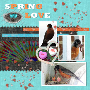
Anne, I think I recognize those heart candies. Is that a freebie of mine?
Pirkko, those are beautiful colors. Have you considered adding a lifted shadow to the flowers?
Connie, glad to see that you find a different use for the guides.
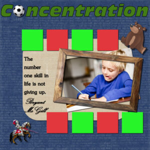
Colin, that photo made me smile as there was a kid in my grade 3 class who always stuck his tongue out when he was concentrating on a writing or a craft class!
Wanda, copying other layouts is always a good “practice”, but at the same time, it is ok to make it more your own by either changing the type of paper, the type of elements, and their numbers. Of course, it is a little different when it is a lesson (meant to practice) but afterward, it is ok to change things around. I also agree that many scrapbookers prefer to get inspired by the photo instead of starting from a template or a sketch. Both work. 🙂
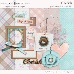
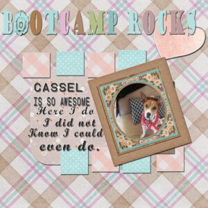
September 23, 2021 at 11:34 pm #64962Thank you Cassel,
ty for the Free mini kit from: The Curio Pantry – Delicious Odds & Scraps
September 24, 2021 at 12:20 am #64963Carole, each frame is created on its own layer. Frames are then merged down, to select the outside of the frames, to delete the outside of the photo. I realize now that I didn’t erase part of one frame. I had a play around, as I always keep a psp copy of the frames. I did one with and without shadows inside. I’m getting a bit careless of late, trying to pack to much into my days. Not paying enough attention to details.
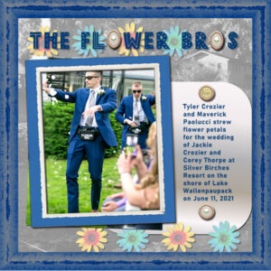
September 24, 2021 at 6:44 am #64967Bootcamp-Project 5 ~ Here are my Flower Bro grandsons, the infamous dancers who strewed flower petals at my granddaughter’s wedding in June. (The wedding guests were laughing out loud!)
I used the same background and frame from the previous layout for the wedding preparations. The flowers are Tubes and I reduced the saturation. The title font is Dingo Nursery (shh-don’t tell the Bros!) I liked that font because though the letters are bold they aren’t solid and you can see what’s behind them. The brads came from one of my wedding kits.
September 24, 2021 at 8:15 am #64969Sue, thank you for the swans layout. It is beautiful, and I never knew about that thing on their bills. It is astounding to me they are in Sask. I think of them as sea birds. What an amazing place you live in. I have relatives in Sask.(my parents were from there) and went there since I was a kid and never knew anything about the diverse bird population and the migratory stop-over locations.
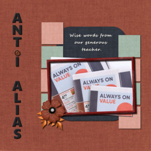
September 24, 2021 at 11:22 am #64975Here is my last project. I know I was going to do only Christmas card photos, but couldn’t resist this tongue-in-cheek layout. I work at a newspaper web press in the inserting department (where flyers are inserted into various papers by machine) and I happen to be inserting this weeks Lowe’s flyer. This is the words I was looking at while loading the hopper the flyer goes into. In my head I could hear Carole’s voice “anti-alias always on” ( or maybe it’s “always checked”, but my mind hears “ON”). Even Lowe’s is helping us to remember those sacred words. Pixel scrapper for all the elements. Font was one that came with windows I believe. I darkened the font, but used the same blue paper. thank you Ann, for telling me about Hue/Saturation. You had a cool job in graphics. Oh, if I had it to do all over again… the things I’d do…. Oh, and I didnt have an “O” to take out so I made a space for a button to dot the eye. The spacing is off, as is on my squares I see.
Carole, I’d love to see a post about Kerning, how to use it, what all of it means in the box that pops up. Is there “normal” settings. Can you move one letter away from another, closer. I’ve done that once, but I cant seem to do it again. I did calligraphy and type fonts never seem to get “O”, “W”, “V” and “A” right, they put them too far away as they need to be spaced closer than normal to “appear” to be correct because of the angle and curves (depending on which letter is beside it).
-
This reply was modified 3 years, 3 months ago by
Susan Ewart. Reason: wrong word
September 24, 2021 at 11:38 am #64978Here is my project four? (Busy Bees) It is not my favorite thing that I have ever done, but here it is. I am not even sure why I don’t like it. I like the layout, but nothing else about it. I tried a lot of different color combinations but nothing made it better.
September 24, 2021 at 4:44 pm #65000Pirkko, I love your gentle, humourous Project 5. It’s a great photo to work with.
-
This reply was modified 3 years, 3 months ago by
-
AuthorPosts
- The topic ‘Bootcamp – Sept 2021’ is closed to new replies.


