Home of the Scrapbook Campus › Forums › Showroom › Bootcamp – Sept 2021
Tagged: Bootcamp Day 5- Project-3-600
- This topic has 239 replies, 20 voices, and was last updated 3 years, 2 months ago by
Susan Ewart.
-
AuthorPosts
-
September 21, 2021 at 11:44 am #64796
Thank you, Susan – I was worried about working with black and white images. I did have to size them all up quite a bit. I also converted them to greyscale because each of them had a different colour cast.
The earlier conversation about fussy vs. tailored spoke to me! I find the visual “clutter” overwhelming at first and I delete and erase a lot! It’s hard to find your own style, isn’t it, when you’re using so many borrowed elements? How do you get started? Do you think about what you’re going to do or do you just jump right in and start mucking about? I’m not much of a planner, so I definitely do the latter.
September 21, 2021 at 12:16 pm #64798Connie, good idea to convert to greyscale. You inspired me to try some of my parents old photos that I love…down the road a bit when it’s not too busy. I spend more time bringing in elements and deleting them. I would like to say I am a planner, and I am in certain things, but an idea is more of a starting point for me. As blocks or issues or problems pop up and I solve those issues more ideas open up to me and the end product is quite different from what I planned or saw in my head. In other words: I much about the same as you. hahaha.
Here’s a question for you and for everyone. Do you start a layout; and you like it, then you hate it, then in the end after its done and you don’t look at it for a few days/weeks then look back and realize you are quite happy with it.
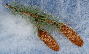
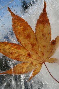
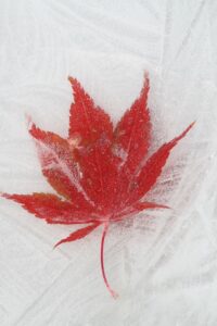
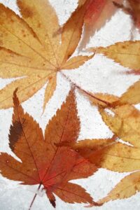
Laurie, if do actually get to photographing the leaves, I will try and do a post. I went through a phase of freezing leaves in ice and photographing them. I filled my tiny freezer with trays of frozen leaves! Here is some samples, I used some in the first bootcamp I did in May 2021
-
This reply was modified 3 years, 3 months ago by
Susan Ewart. Reason: changed picture
September 21, 2021 at 12:43 pm #64804Susan
That is an awesome technique for photographing nature. I love taking and looking at close up photos of flowers, leaves, bugs, you name it. If it is outside and beautiful, it’s probably going to fall prey to my camera!
I too, try to always make the photos in my design the focal point. If a patterned paper is too strong and tries to overpower everything else in my design, I try layering a solid color background under it and reducing the opacity on the patterned paper until it tones down just enough to be interesting but not overpowering.
Connie, when I go in search of borrowed Elements and Papers, I usually open up my photo or photos I want to use first and then I go and search out borrowed supplies that will complement my photos . I hope this helps.
September 21, 2021 at 1:59 pm #64805Laurie, check out Sue Thomas’ work. She is a master at birds, bugs and pretty much anything outdoors. If you love corvids (like I do) June Hunter is worth a look, she is from my home province of British Columbia and she has a fabulous blog post you can subscribe to (The Urban Nature Enthusiast). Like Sue T, she is at the top of her field in this respect with ability and incredible knowledge on their subjects, and I’m lucky to own some of her (June’s) work. For flowers, check out Kathleen Clemons style of painterly flowers (Creative Live has videos, they come on sale often, don’t pay full price – I have two video seminars and love them and I’m not even a flower photographer!) or just google her and see her stuff, not all her work uses “lens baby” lenses so the painterly look is still attainable with telephoto lens.
September 21, 2021 at 2:51 pm #64806Pirkko, I love your Project 3 page for more than one reason. First, it is beautifully designed – I especially like your handling of the clusters of berries – and captures the colours of the season and your photographs very well. And I ADORE picking berries, especially lingonberries, so it touches my heart. Thank you!
And Susan Ewart, those leaves in ice – wow, what a cool idea!
-
This reply was modified 3 years, 3 months ago by
Connie Collier.
September 21, 2021 at 2:59 pm #64808Susan,
Sue Thomas is one of my Heros in this group, and I love her work. I will check out the other Artist you mentioned. Thanks bunches!
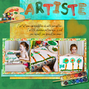
September 21, 2021 at 4:27 pm #64810Ladies, so many beautiful pages ))))) here’s mine with :
Papers by Erica Zwart Designz (recolored)
glitter ChineseOrient (recolored with gadient perso)
Elements Kit Little Artist by StudioPalvinkaDesigns
Brushed alpha Artsy by KristinAagardDesign
Font Betterworks by (c)Letteralle
Photos persoSeptember 21, 2021 at 6:56 pm #64823Anonymous
- 335

- Enthusiast
here is my Project #4 for Bootcamp Day 8
The photos are my own, added Blendmodes
The tubes are from marigolds of photos
Thanks for interesting homework 🙂
September 21, 2021 at 8:02 pm #64826Beautiful, Pirkko. Been enjoying your postings.
September 21, 2021 at 10:54 pm #64827Connie, if you are creating several pages on a single theme, it is ok to use something that ties things together, like those crochet elements. Turning the photos to black and white is a great way to hide those “color issues”. Another way would also be to convert them to sepia, which might be interesting for old photos.
Anita, you are definitely getting more comfortable with PSP. I see that the photos are resized correctly and the shadows are all accurate.
Colin, typically, if the Mode is set to Scale and you use a corner handle, it will keep the proportion. Of course, sometimes, your photo might be wider or higher than the space available. In that case, you have to crop by cutting the excess. It is a VERY common temptation to fit it in the space, but then, that is how we can give a headache to Aunt Lucy by squishing her, or putting 50 pounds on grandma by stretching her! 🙂
Laurie, those are beautiful colors. It is a great page to showcase them. With practice, you will find ways to create your own elements or customize what you have to fit what you need. You’ll be able to change colors, textures, shape, etc.
Nadine, that alpha for the title is absolutely perfect for those photos!! Great pick!
Pirkko, that is interesting to use the same photo three times with different blend modes. I really had to look closely to realize they were from the same photo!!
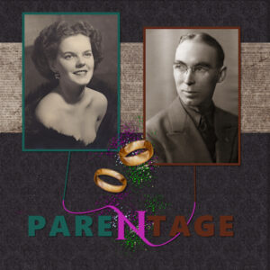
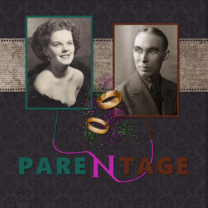
September 21, 2021 at 11:03 pm #64829Project #4 homework is a portrait of my parents with a little pen tool practice to link the two photos to the central ‘N’.
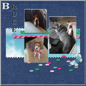
September 22, 2021 at 1:16 am #64831Hi more of Bruce, the Bruce, Bruceanator lol
Thank you for the kit its so pretty https://www.curiopantry.com/2021/03/01/ps-march-bt-spring-skies/
Thank you.
September 22, 2021 at 10:01 am #64837Hi all,
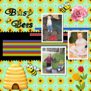
Here’s my offering for project 4, looking at some of the others I don’t stray much from the video content, perhaps I need more confidence in any design abilities I may have. Connie Collier, that’s a very striking image, very nice.
The background is a PSP pattern which I just flood filled the layer. the striped element I created by using the rectangle tool with the fill colour changed each time, the outline width was set to zero. I did the 4 stripes and made a selection of them and just copy & paste. The photos are of my youngest daughter from 2004, she’s a big girl now and has flown the nest
September 22, 2021 at 10:06 am #64838Anonymous
- 335

- Enthusiast
I’ve got to have many small but good ways to speed up image processing. I have also admired your work and seen how differently you can approach the same subject. Thank you very much – I hope that our trip together with this hobby will be fruitful and we will make new friends – from all over the world 🙂
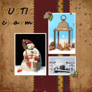
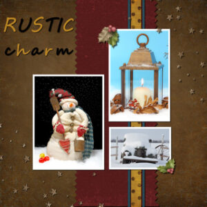
September 22, 2021 at 12:35 pm #64846Here is my Day 9-Project 4. Two versions. the darker one is the one I like. I had about 6-7 papers as the background, hiding and unhiding over and over and finally decided on these two. I worked mostly on the dark one, then revealed the other layer to see. I would brighten the title on the lighter one if I was to keep that one. I did the pinking shear look easier this time through the bootcamp. And one thing I’m learning is not to go into freak-out mode when I click something I shouldn’t. Cassel told me my computer wont blow up. And she’s right, it hasn’t blown up yet. The papers and elements are Pixel Scrapper, the fonts are standard that came with windows. As always, photos are mine. these are from some of the Christmas card fronts I’ve done. I was going for the rustic theme.
September 22, 2021 at 1:30 pm #64853Pirkko: That is really interesting how you made a picture tube of the marigold flower! Never thought to make one in that fashion! Thanks for sharing.
Colin: Like your busy bees. Interesting how you make the striped paper.
Laurie: Enjoyed your layout. (Miss you)
Cindy: Interesting way to do your title!
Connie: How beautiful to portray “Parentage”
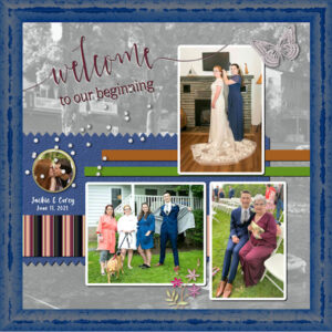
September 22, 2021 at 2:41 pm #64859My turn. I used 3 photos from my granddaughter’s recent wedding that were taken before the ceremony and reception. I snagged a photo on the website of the wedding venue: Silver Birches in Mt. Arial, PA. I made it my background and while lowering the opacity I also used the Luminance (Legacy) treatment on the layer. Well, now I had something similar to Grayscale so I went with it. The headline is actually Word Art from a wedding kit. The top photo is the bride and her sister who was her maid of honor. The left hand photo shows: l-r My daughter (mother of the bride), my granddaughter (the bride), the bride’s sister (maid-of-honor), the bride’s brother and last but not lease, Riley, the ring bearer (dog). On the right are my grandson and myself. I made the striped paper using a selection from the photo with me in it. I used the directions for making a plaid but stopped halfway when you have stripes. Enjoy!
September 22, 2021 at 3:08 pm #64860Beautiful Ann. The background is fabulous. The whole layout looks like it’s framed. How did you do that. That’s a cool tip about making the striped paper. I have tried to use plaid, but I just dont like them. But stripes are A-okay. I will give that tutorial a try.
September 22, 2021 at 3:25 pm #64865Thanks, Susan! I appreciate your kind words. I did apply a PSP frame. I use them all the time. In fact, any time there’s a frame in a kit I pull it into PSP and export it as a Picture Frame. This one I also used the Adjust-Hue/Saturation/Lightness for the first time to make it match the blue in the maid-of-honor’s dress.
September 22, 2021 at 4:16 pm #64872Beautiful work, Everyone! I have been MIA…I am traveling…my schedule should have allowed me to follow the lessons but the gremlins have been up to no good. First, my PSP will not save. I began to create one of the lessons when I discovered that PSP will not save…I use 2019 on my laptop. When I attempt to save, I get an “unspecified error” message. When I click OK I get “unable to create file” message.
Then there was a major windows update and my computer lost its wifi…no internet. The next night I tried again and the wifil works but PSP still will not save.
I return home tomorrow; have a full schedule Saturday…then I will attempt to complete the lessons. Once home I will use my desktop and PSP 2020.
I realize we do not need to explain our work or lack there of, but I thank you for allowing me to vent. Two things I do not handle well are my computer not working and my car not working.
Keep up the amazing creations…I’ll be back soon…
September 22, 2021 at 4:36 pm #64874Here is my project 2. I got over my sickness and then had computer problems so running way behind. My Great Grand again that I mistakenly called Gracie in the first one I posted. The flower and main paper is from pixel scrapper. The rest is either created by me or graphics I find (except the photos which were taken by her Mom). These projects are somewhat difficult for me because they are nowhere close to my usual style but trying to at least stay close to the original layout. My idea of shadowing is usually a lot different and are mostly assumed to be paper on paper and then sometimes I just do something for an effect. I like what Carole and what others create using this style but am never satisfied mine. Thanks to all for your good wishes about my food poisoning!
-
This reply was modified 3 years, 3 months ago by
Wanda (Sue) McGuire.
September 22, 2021 at 5:10 pm #64877Ann – I am always impressed by what you do. Yeah – I am into plaids too. Seems like I can never get enough of them, even though I think I have overdone it (almost obsessive).
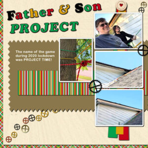
Last project – Busy Bees. As you can see, I did use a plaid- made using tutorial Plaid paper 1. I chose the colors of the rappelling ropes used by my son and his son and adding white and a greyed green. Chose to save the stripe as a paper as well as the plaid; reduced the opacity on the plaid a little (white underneath as Carole taught us in one of the challenges); the cream paper is one I created and am using a lot here lately; the brown is mine also, as well as the cogwheels which are in the picture tube I created. Now I did use a freebie element: the heart brad holding down the ribbons I created – its from PS -Marisa Lerin. I had fun with the font, but I don’t remember its name, however it was a PSP or Microsoft font. What I learned this time even though it was not in the tutorials, is that you can create a palette with the colors for your project and save it by naming it in the group listing of the materials. Oh, yes, I may have learned it before (and forgotten it), and it was taught in this tutorial (again) is that you can color the individual letters of a text – how cool is that!!! Anyway, this was fun. Thanks, Carole, for encouraging us to enter the Bootcamp more than once.
-
This reply was modified 3 years, 3 months ago by
Mary Solaas.
September 22, 2021 at 5:17 pm #64880Ann – I am always impressed by what you do. Yeah – I am into plaids too. Seems like I can never get enough of them, even though I think I have overdone it (almost obsessive).
Last project – Busy Bees. As you can see, I did use a plaid- made using tutorial Plaid paper 1. I chose the colors of the rappelling ropes used by my son and his son and adding white and a greyed green. Chose to save the stripe as a paper as well as the plaid; reduced the opacity on the plaid a little (white underneath as Carole taught us in one of the challenges); the cream paper is one I created and am using a lot here lately; the brown is mine also, as well as the cogwheels which are in the picture tube I created. Now I did use a freebie element: the heart brad holding down the ribbons I created – its from PS -Marisa Lerin. I had fun with the font, but I don’t remember its name, however it was a PSP or Microsoft font. What I learned this time even though it was not in the tutorials, is that you can create a palette with the colors for your project and save it by naming it in the group listing of the materials. Oh, yes, I may have learned it before (and forgotten it), and it was taught in this tutorial (again) is that you can color the individual letters of a text – how cool is that!!! Anyway, this was fun. Thanks, Carole, for encouraging us to enter the Bootcamp more than once.
September 22, 2021 at 5:19 pm #64881I don’t know what happened to my posting a few minutes ago!!!!
September 22, 2021 at 5:20 pm #64883Let’s try again.
Ann – I am always impressed by what you do. Yeah – I am into plaids too. Seems like I can never get enough of them, even though I think I have overdone it (almost obsessive).
Last project – Busy Bees. As you can see, I did use a plaid- made using tutorial Plaid paper 1. I chose the colors of the rappelling ropes used by my son and his son and adding white and a greyed green. Chose to save the stripe as a paper as well as the plaid; reduced the opacity on the plaid a little (white underneath as Carole taught us in one of the challenges); the cream paper is one I created and am using a lot here lately; the brown is mine also, as well as the cogwheels which are in the picture tube I created. Now I did use a freebie element: the heart brad holding down the ribbons I created – its from PS -Marisa Lerin. I had fun with the font, but I don’t remember its name, however it was a PSP or Microsoft font. What I learned this time even though it was not in the tutorials, is that you can create a palette with the colors for your project and save it by naming it in the group listing of the materials. Oh, yes, I may have learned it before (and forgotten it), and it was taught in this tutorial (again) is that you can color the individual letters of a test – how cool is that!!! Anyway, this was fun. Thanks, Carole, for encouraging us to enter the Bootcamp more than once.
September 22, 2021 at 5:37 pm #64725Hi All,
I used a kit from one of our Teachers friends : Kit : ” Fall in love ” kit Novembrer 2019 Blog for the download:
thank for CU :
– lady22
– Marisa Lerin
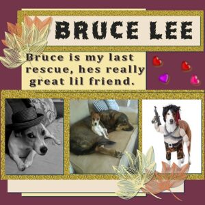
– Jessica DunnThank you. Also I used my paper on the top to Bruce needed more glitters, and a few tube hearts. Bruce was my last
rescue, all his homes fell through and I was so upset for him. But he found his home with me, I spent all the money
on him to be in great shape for someone. I didn’t know it would be me, hes worth million times what I spent on him.
Hes my baby I understand his bad things because he was really made for me, I named him because he is one
tough Dog, my landlady called him killer, but hes really CUJO lol but a lap one lol Thank you Cassel this is the most
fun Ive had doing this, so thankful for finding You. Love the new Scripts in the Campus store!
Hugs Anne hey everyone has one last time to vote for #5, Cassels lil Grandbaby, plz vote now.
https://www.iheartradio.ca/…/cutest-kid-photo-1.9891246…
September 22, 2021 at 10:49 pm #64891Connie, that is quite original work to turn the N into a connection between the two photos!
Cindy, you did a great job with that kit. I suspect you stretched the confetti scatters though because they are oval instead of round.
Colin, sticking close to the project in the tutorial is totally ok. You have to start somewhere, and over time, you will feel more comfortable to change things. In the bootcamp, it is easier for me when I can recognize the “basic layout” so I know what lesson was done, but I see that you already are creating something on your own, so it is showing that you are getting more comfortable. Keep it up.
Pirkko, this community has been fantastic from the start. That is where we have met so many friends from all over the world (or sometimes closer than we thought).
Susan, that is exactly how you would typically do: add, remove, hide, unhide. I do the same too. Even if you were to try to scraplift another project, you will still do it! Do you realize how easy this is to do with PSP, unlike paper scrapbooking?
Ann, creating stripes directly from photos will ensure that it is perfectly matching!
Bonnie, did some of the Campus gremlins decide to move to your place?
Wanda, what would you do differently if you did that layout in “your style”?
Mary, the title, the plaid and the stripes made from the colors of the rope really make that layout pop! I think you might have forgotten one shadow on the yellow tab on the bottom. And by the way, if a post seems to disappear, just drop me an email as it was stuck in the spam filter.
September 22, 2021 at 11:12 pm #64892Carole, that yellow tab on the bottom is actually the bottom on the yellow ribbon. Unfortunately, before I did the shadows on them, I merged them – I guess because it is shorter than the other two, it didn’t get a shadow. I had tried linking them to move them, but it didn’t work for me. So, I knew that if I merged them, I could move them together. I also had tried grouping them so that I could move them – that would have let me move them together. However, I guess I don’t understand how to group elements together. I get grouping for a mask, but not grouping elements together.
September 22, 2021 at 11:49 pm #64895Thanks, Cassel! I realized I forgot to “deckle” the edges of my background paper as shown in the tutorial. But when I opened the file, I found I’d overwritten my original with the 600×600 version. Argh. It’s good practice to go back and try to remember how I got to where I ended up the first time. One of the steps I couldn’t reproduce very well was the manual colour corrections I did on the two photos to make them a similar sepia. Oh well – live and learn! Here’s my second version with holes punched along the edge of the newspaper strip.
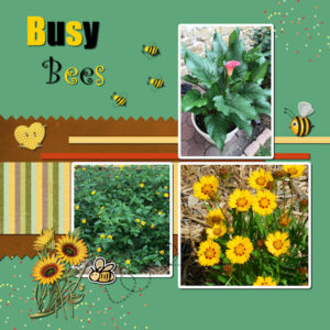
September 23, 2021 at 4:34 am #64905Here is my Day 9 – Project 4. For the base I made my own paper so it would blend in well with the green in my photographs. The brown paper and striped paper is from Digital Scrabbook. (Marisa Lerin. and Sheila Reed). I used the colors from my photo to make the red small paper strip and then used the yellow from the Stripes paper for the yellow small paper strip. Elements and scatters are from Digital Scrabbook, (Marisa Lerin and Janet Kemp). This project was a lot of fun and I loved the new effects for the text tool. I also enjoyed learning how to do cut-outs by using the eraser tool. I never knew one could do the the pinking shears effect in PPS. Thank you Carol for these Bootcamps. Even though this is my second time, I always learn something new and also get a chance to practice what I learned.
-
This reply was modified 3 years, 3 months ago by
-
AuthorPosts
- The topic ‘Bootcamp – Sept 2021’ is closed to new replies.


