Home of the Scrapbook Campus › Forums › Showroom › Bootcamp – Sept 2021
Tagged: Bootcamp Day 5- Project-3-600
- This topic has 239 replies, 20 voices, and was last updated 3 years, 2 months ago by
Susan Ewart.
-
AuthorPosts
-
September 19, 2021 at 6:00 pm #64714
Anonymous
- 335

- Enthusiast
Here they are – again. The string is from PixelScrapper, the butterfly I made myself 🙂 and the paper too. Lingonberry tubes I took from photo.
Thanks for looking
September 19, 2021 at 6:02 pm #64715Oh my goodness, how awful Wanda (Sue) McGuire. I hope you are feeling much better now. Better to have bad chicken than the “C” word. Take Care and speedy recovery.
September 19, 2021 at 6:04 pm #64717Pirkko, I love your papers that you made. You have good color sense. So cute with the black cat helping pick berries (One of mine is black too).
September 19, 2021 at 7:18 pm #64719Project 3–
September 19, 2021 at 9:42 pm #64722Susan, you are giving me an idea that a blog post on Linking might be needed.
Mary, did you notice the shadows on the tiny stars? They don’t seem to match the rest. Maybe that is why there is “something”?
Anita, using a photo as a background is a good idea, and lowing the opacity makes sure it stays in the background without overpowering the photo and the rest of the project. Good choice. If you need a diskette player, they are not expensive, but you might also go to computer places, like Staples, and ask if they can transfer for you.
Ann, CopyMerge is very useful as you say, BUT it does not keep the layers intact so it can only be used in certain situations.
Wanda, take care of yourself first. We will wait! 🙂
Pirkko, that is a great layout. I see that you have the correct shadows and you kept the proportion of all the photos without distortion.
Anne, have you considered trying to “lift” the butterflies with the shadows? It is not necessary but it would be a fun practice after the class on lifted shadows.
September 19, 2021 at 10:20 pm #64727Hi had so much fun making this Thank you Cassel
Love Everyone’s work so Awesome used the kit offered here on our lessons Kit : ” Fall in love ” kit Novembre 2019 de ”
lady22 ” – Terms of Use “PU” only
September 19, 2021 at 10:27 pm #64728Cassel, I would like a post on linking. In my Day 7-project 3 post I linked the upper right flower with a little flower and moved it and then I linked the lower flower/star to move them. Mostly to practice linking. What I found is sometimes I’d link and it would work then I’d go to move it again later and it was unlinked, but one of the layers would still have the link on it, but I think not the second one. Likely from me randomly clicking when I shouldnt be, or is that because I had linked other stuff after that. I thought once you link layers they stay linked until I unlink them. Does this make sense. I will look forward to the blog post.
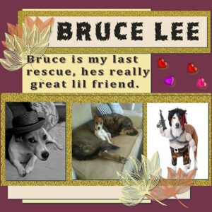
Cindy, love Bruce Lee!
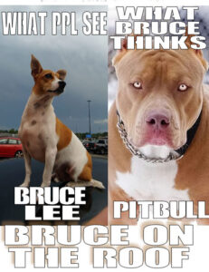
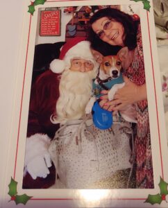
September 20, 2021 at 12:12 am #64731<b> Thank you Susan Ewart, hes so good for me not others ? Very strange huh? Really he think hes Cujo the movie that’s Bruce He think hes a Ganster Not Afraid of anyone or anything, Sticks up for anyone whos being bothered No matter even sticks up for my grandsons punching bag lol Hes so funny but You cant tip toe by him and get away with it. Here is a meem about him one day I was waiting on my food pickup at walmart and he wanted to be on my shoulders lol put him on top of my car then he was happy. then here he is visiting Santa.</b>
September 20, 2021 at 1:47 am #64734Anonymous
- 335

- Enthusiast
Oh, Cindy – I love your work, so cute fellows
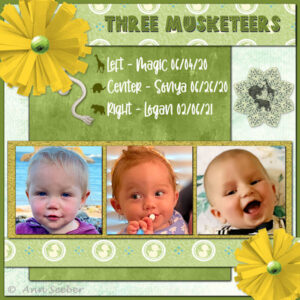
September 20, 2021 at 3:52 am #64739Project 3 – The Three Musketeers [Revised]– my great-grands. Whereas both girls, Magic and Sonya, are walking now. Logan is only 7 mos. so we have that to look forward to. The animal totem silhouettes and the mandala were my idea when they were born and I have used them before.
-
This reply was modified 3 years, 3 months ago by
Ann Seeber.
September 20, 2021 at 7:22 am #64740Ann, that’s beautiful! And so cute
Cindy, love that one, “what Bruce thinks” hilarious.
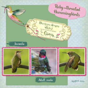
September 20, 2021 at 11:29 am #64744Project 3. The only outside element used is the Hummingbird. I’m not one for using kits. The background paper is a paper template which I colourised, added a hint of a greenish edge all around. For the green paper I added a texture, and a blur. The tag was initially created for another project.
September 20, 2021 at 11:38 am #64746Sue: I like your clean-limbed layout. That tag is beautiful! I know you can correct the spelling on Juvenile but other than that, your design is perfect. Unfortunately, I think I’ve seen the last of my hummers though my feeder is still up till the end of September to catch any stragglers from Carole’s neighborhood. 😉
September 20, 2021 at 12:21 pm #64748Ann, you’d think I’d know by now how to spell juvenile, yet I still continue to misspell it, even after proof reading it. I keep doing it. My hummers arrive on the 1-3 Aug, and leave on the 31st, religiously. I’ve kept one out, which I clean out every 4 days, until the end of Sept, just in case. Saying that I have never seen one after the 31st Aug. At the moment I have an abundance of song sparrows, Warblers, and a few Goldfinches with their young. It sounds like Spring out in the trees. Come the 1st Oct, all the small birds will have gone. Except for the golden crowned Kinglets. They are the last to leave, usually after a fall of snow.
September 20, 2021 at 12:50 pm #64749Beautiful layout Sue. Sending me off to work with wonderful images is always a good thing, especially when I dont want to go. I like the idea of making my own papers. I’m going to try some tutorials to get the ball rolling.
September 20, 2021 at 1:03 pm #64751Hi all,
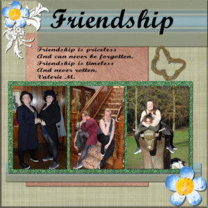
Another project completed, the third; had one little hiccup when I selected the glitter to go under the photos I got two layers one a normal raster the other was a promoted selection. Don’t know how but I just deleted the unwanted layer. The butterfly was my own creation; I took an image, selected a gold glitter pattern, (same way as when we did the flood fill around the photos), then went around the outside of the image with the airbrush tool; after that I erased the original image.
-
This reply was modified 3 years, 3 months ago by
Colin Hooson.
September 20, 2021 at 2:08 pm #64753Ann, Pirkko, Susan Everyone Your all so Awesome
I love the 3 musketeers I love Babies, All I wanted to do was be a Nun, then my teacher went to her new clothes the skirt white blouse sweater ect and I didn’t want that anymore, then I wanted to be a Nurse and work in OB and help deliver babies, then my husband wouldn’t let me even finish high school Then I wanted to have 11 children then I was told he would leave me, he wanted no kids. That was 5 yrs in at least, one day he said I could have one baby and he gave me rules for that, He wouldn’t change a diaper, he wouldn’t get up in the night, it was mine and I had to do it all. I was so happy that’s all I tried to do. What a crazy story, there’s so much as you would know in there. But my Baby Peter made me so happy, I got another baby Matthew, then a REAL ??? 3 pregnancy and my husband told he was having surgery on a date. So 3 with someone who wanted none is like 11 lol or looking back on it. But Gods really saved me and his Angels along the way. Cassel has been one of those in my life, and You guys. Not even knowing it.
THANK YOU ALL.
September 20, 2021 at 2:10 pm #64754omg meant to say if you have not signed up for the Free Kit every Month and they are always so Awesome.
heres the link
September 20, 2021 at 4:04 pm #64756Thank you Susan, as you get to know my style of work better, you will notice that I’m not a fussy, frilly, bright coloured person. I like my pages very minimal, with plain matching photo colours, which are usually earth toned, and natural. I love the brightly coloured pages, filled with elements, that others create, but it’s not my style. Although I have tried. I like order, I don’t like a messy kitchen when I’m cooking or baking, I wash up and put away, as I go along, my office desk is the same, always ,neat and tidy. I’m not a clean freak, but I do like things just so. I have always been the same.
September 20, 2021 at 10:08 pm #64767Carole – you were right; I had not completed shadowing the scatter stars. So I am posting it again.
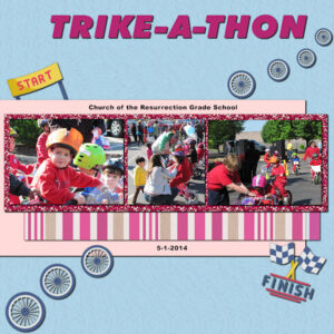
Project 3 is Trike-a-thon. The elements are from NicePng. The pink and blue papers are mine; the glitter is Cass-glitters; the stripe paper is from Gina Jones-Pretty Bird (but colorized by me); the title font is Incised 901 NdIt BT and I used Arial Black for the text on the pink paper.
September 20, 2021 at 10:33 pm #64769Cindy, that is a fun font you used in the title! I would suggest that you tone down the shadows on the text to make sure it does not make the reader feel they are seeing double (or maybe it is just me?). By the way, thanks for the link to get those free kits. I never knew that part of the site!
Susan, the way to link layers has changed over the years. It used to be more “intuitive” than it is now, so I understand why you had to “randomly” click to get something. I will definitely plan a blog post on that.
Ann, that is fun to have animals associated with each child. It can become something to follow them. In your title, I would suggest that you tone down the shadow OR reduce the offset so as to not see a separation between the letters and their shadows.
Sue, that string held by the hummingbird is well done. It is not always easy to draw a string that “makes sense”.
Colin, to answer your question, it is possible that you already had a selection active and when you click on an area that is inside that selection, it makes it float. It is something that happens when you accidentally click or double-click. You had the correct solution to delete that layer. I suspect you distorted the middle photo when you adjusted the size. You probably used one of the side nodes to make it narrower or the top/bottom nodes to reach the correct height. You have to be careful to use the corner handles to avoid that distortion.
Mary, nice to see you create or customize the elements you can find. And yes, with the shadow, the stars stand out more.
September 21, 2021 at 12:29 am #64770Sue, I get what you are saying. I like the fussy pages others make but it is also not me, I like it clean and sparse, to showcase the photos. I try to add stuff and then delete it because it doesn’t make sense to me, but I’m keeping an open mind and trying things that are out of my style. I find using patterned paper hardest of all, it seems distracting. I do like a nice tidy work space (in my studios) as well. the kitchen for me however, is a love hate relationship. I tend to cook Cajun…if you get my drift. One time I commented to my husband about the cool light coming from the kitchen, the way the sun was lighting it….it was smoke from the colander I melted to my pot! He jokes that he’s going to wire the oven/stove so that when it’s turned on the computer is turned off! And baking, I love to eat it but I cant do it. I tried healthy diet peanut butter cookies once (side note: there is no such thing!), took almost a week to soak the pan to get the “cookies” that fused themselves to it, off.
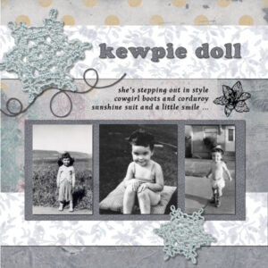
September 21, 2021 at 1:35 am #64772Project #3 … I kept this one simple and followed Cassel’s instructions, although I used a patterned paper as my fill around the photos instead of glitter. I’m till stuck in my crocheted doily phase – all from pixelscrapper.
-
This reply was modified 3 years, 3 months ago by
Connie Collier.
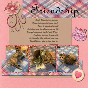
September 21, 2021 at 2:21 am #64777Here is my project for Day 7 – Project -3; I used papers and elements from from Pixel Scrapper (Digital Scrapbooking). The Base paper and plaid paper is from True Friends Bundle by Jessica Dunn, the brown paper is from Sharon Dewi, Heart and Flower elements are from Jessica Dunn, and Swirl is from Brooke Gazarek. The cat outline is from Sheila Reid and I filled it with light Glitter tile and the nose and Bow with dark glitter tile. The photos are mine and picture “Bella” and her buddy “YaPurr”. I had fun and learned a lot about using different shadows, the guides and glitter tile.
-
This reply was modified 3 years, 3 months ago by
Anita Wyatt.
September 21, 2021 at 4:00 am #64784Hi Carol,
Thank you for your comments, I always find them helpful and instructive. It is more than possible that I double clicked the selection under the photos. An increasing problem with age; the centre photo was cropped to fit as it was taken in landscape so what was left is just about a third of the original size. I used the corner nodes to fit the photo to the guides, the cropping and resizing may have distorted the image. the original is below.
Regards Colin
-
This reply was modified 3 years, 3 months ago by
Colin Hooson.
September 21, 2021 at 4:39 am #64786Anonymous
- 335

- Enthusiast
Anita, your work is so beautiful and the cats…cute
September 21, 2021 at 7:43 am #64787Anita, I love the use of plaid in your layout. You matched the colors beautifully. I try using plaid but it never looks right to me. This layout shows just how nice it can look. And cats are always a winner in my book.
Connie, Wow! I love the subtle use of color, almost monochromatic. It’s beautiful and really brings out the photos.
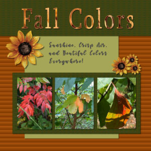
September 21, 2021 at 10:12 am #64793Here is my Project 3 Layout. Fall is one of my most favorite times of the year. My husband Joe and I enjoy hiking in a wildlife preserve near where we are staying. The leaves are just beginning to turn, and I can not wait for even more Fall beauty!
I created all of my papers and the sunflowers came from Pixel Scrapper.
September 21, 2021 at 10:20 am #64794Wow Laurie! that layout is stunning. Is your font filled with a photo? It’s so beautiful. I love the fall colors too. They are in abundance now in Alberta. I was out in my backyard late last night picking up dried fall leaves for my other course and now I think I’ll collect more for a photo project (in-studio). My neighbours must think I’m crazy.
September 21, 2021 at 10:40 am #64795Thanks Susan! Yes, my title font is filled with a photo I took of a pile of fallen leaves in the grocery store parking lot. I would love to see your in studio pictures of fall leaves. Perhaps you could create a scrapbook page with one of the photos?
-
AuthorPosts
- The topic ‘Bootcamp – Sept 2021’ is closed to new replies.


