Home of the Scrapbook Campus › Forums › Showroom › Bootcamp – Sept 2021
Tagged: Bootcamp Day 5- Project-3-600
- This topic has 239 replies, 20 voices, and was last updated 3 years, 9 months ago by
Susan Ewart.
-
AuthorPosts
-
September 17, 2021 at 3:50 pm #64635
Thanks Cassel for the suggestion about the scatter. I did not even think about the flowers maybe not being flat.
Donna- I didn’t even notice you were using 9. I have 8 as well as 21 but have not used it i quite a while and didn’t remember that you couldn’t change the icon size. I did go back and played with 8 but as you said, I couldn’t find a way to increase the size of the icons either.
Ann — I had to chuckle when I noticed you used the black and white for the colors of your title. Nice touch.
Everyone— I wish I had time to post about all the fine pages, each of them are great and unique.
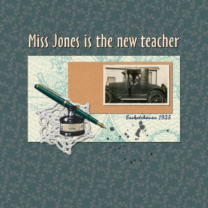
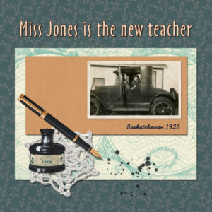
September 17, 2021 at 3:55 pm #64637Project 2 and I’m still sticking with my vintage photo theme, this time using a picture of my great aunt in her new car on her way to her first day as a prairie teacher. I stuck to the lesson pretty carefully, but I decided not to rotate the subtitle because I couldn’t get it to work visually. And I need to find a better handwriting font.
September 17, 2021 at 4:47 pm #64643Anonymous
- 335

- Enthusiast
my friend’s boy with their cat returning home … they were both very tired
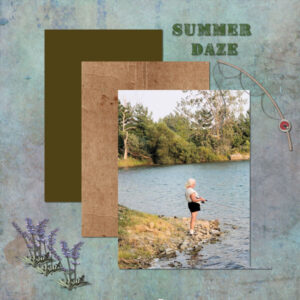
September 17, 2021 at 6:26 pm #64647Summer Daze, fishing fun!
September 17, 2021 at 6:49 pm #64648Anne, beautiful layout. My Mourning Doves left last week. They migrate south for the winter. I miss their cooing!
You are not alone, in calling them Morning Doves, Many here call them that, but they are actually Mourning Doves. I hope you have saved a copy as a psp file, to correct the name.
September 17, 2021 at 6:56 pm #64649So many wonderful pages submitted to comment on each one individually. Well done!
Donna, I hope you enjoyed your visit to Wales. Did you visit the town of Llandudno? I have family in Llandudno. I have spent many happy hours playing along the shores of the river Conwy, when I was a child. Castell Conwy, is one of many spectacular castles in Wales. The Daffodil, and the leak are the national emblems of Wales.
September 17, 2021 at 7:31 pm #64651Wow! What a great display of imagination. But that’s what creating is all about, isn’t it!
Brenda – love your layouts. Great display of your artistic talent. I have your mountain painting hanging up in my “room”.
Connie – your crocheted doily is hanging down over the edge of the photo as if hanging off the edge of a table!
Pirkko – I like your display of color and line and a fine photo of a boy and his pet.
I agree with Anne Lamp – everyone’s designs are so good; difficult to comment on each of them.
September 17, 2021 at 8:04 pm #64652Hi Everyone, hey did you vote for our Teaches Grandbaby yet, or today? You can vote once a day for next couple days
Please Help hes #5 lets make him #1
There all so adorable but Our teachers always there for us… vote every day #5 🙂 I am.
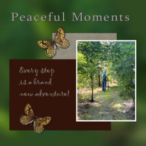
September 17, 2021 at 8:13 pm #64654Just finished with Project two. I have started experimenting with creating my own paper. The butterfly was downloaded from pixelscrapper.
September 17, 2021 at 9:15 pm #64656Sue. Thank you for letting me know the correct name for these doves. They are common where I live but I never knew they were Mourning Doves. Yes I did save it as a psp file and will correct it there.
September 17, 2021 at 10:09 pm #64657Donna, in PSP9, the only option is to enlarge the icons (to a certain point only). Customization for the text size only came in 2021. One thing I found is that if you reduce the resolution of your monitor, it will give a slightly larger display.On your first layout, I think you could use a bit more shadows on the circles as they give the impression of being fairly thick. To make a circle, you would likely need to use the Ellipse tool, and use a stroke and no fill, but if you have never worked with vectors yet, it is kind of a different world.
Mary, the shadows definitely add some depth. In the resized version, it LOOKS like they are a bit more opaque than they should but that might also be due to the resizing. And yes, flipping the top of an envelope is definitely a good way to play with lifted shadows.
Anita, glad to see that you are transferring techniques from one project to another. And I agree that it is often longer to find the right paper in the right color, but with practice, you will be able to change the colors of any paper, and even more, you will be able to create your own papers and elements, so you will be able to pick all those “perfect” colors.
Laurie, good use of the shadows. Your layout brings up an interesting point to make about shadows. You must have heard me say often that ink has no thickness so it does not need shadows. In your layout, you have little hearts that are hand-drawn. Although they CAN definitely be made of cutout papers and have shadows, that style of elements can ALSO be interpreted as being drawn directly on the paper, with ink, and therefore, would not have shadows. So, depending on how you interpret them, you can have shadows or not. Isn’t that interesting? As for creating your own papers, beware: it can become addictive! 🙂
Nadine, even with the same “base” as the tutorial, your use of the elements makes it completely different.
Ann, I am amazed at how good a photo you could take at night! Once you know how to add those borders, isn’t that fun to be able to do it whenever you feel like it is needed?
Bonnie, I never would have thought to use a plaid in that manner, but the result is great! You are giving me more ideas! Can you imagine all those seamless patterns that could also be used full-size with a blur??
Colin, that is a great choice of alphabet for that layout (I love that alpha, if I can say so myself!). Using the two guides is actually something we will see in the next project so you are already ahead of many! That is great! Keep it up!
Anne, I think I would love to see the sunflower just overlap the photo a tiny bit instead of being squished under it. Remember that you can use a wider, and fainter shadows on flowers to give them volume.
Connie, you picked a very good element with those ink spots! What version of PSP are you using? If you are using 2021 or 2022, you could consider sizing up that photo so we can appreciate it more (in earlier versions of PSP, it does not give great results to enlarge photos).
Pirkko, you have a very interesting background for your page. Is it a paper made like that or did you overlay different papers to create that effect?
Brenda, I like how your fishing line overlaps the photo. I am a bit intrigued by something: did you cut your photo with the Selection tool? It LOOKS like you made a selection on the right side and deleted that area, but a tiny bit was left at the bottom. I probably would not have noticed since the color blends well with the background, except for the shadows that seems to give it away.
If you have not yet posted, don’t be shy. It is not too late to start.
September 18, 2021 at 12:00 am #64658I’m using PSP 2021, Carole. I’ll make another version tomorrow – I assume you mean using the AI setting in “Resize.” I hadn’t noticed it before. Thanks!
September 18, 2021 at 12:14 am #64660Hello All,
Day 5, Project 2
Thank you Pixel Scrapper for this layout https://digibrandidesigns.blogspot.com/2021/04/blog-train-pixel-scrapper-april-2021.html
Thank you Cassel for posting them and all the Links you share with us.
Sorry thought I resized it to 600×600, redid it. 🙂
-
This reply was modified 3 years, 9 months ago by
cindy harris.
September 18, 2021 at 1:52 am #64663Anonymous
- 335

- Enthusiast
I added paw marks and a little color to the background paper, that’s it :).
oh, here is so beautiful works… I feel like we are kindred spirits with Brenda; we like a similar color scheme
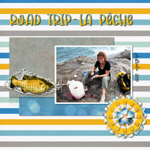
September 18, 2021 at 3:42 am #64665hi everyone, it’s working hard here))) bravo everyone !! For this page, I wanted a little more vivid colors (the weather is too gloomy), a little sun wouldn’t hurt. So I chose a photo of my daughter, during her trip to Australia for almost a year, couchsurfing, then on a road trip with people she had met there. From time to time, she found work to improve her daily life (from picking grapes … to caregiver for the elderly). Here, the boys have been fishing and while they are preparing the campfire, Mademoiselle is peeling the fish. Ah adventure, she loved it. I admit that she had courage. I would never have dared to go alone in a foreign country like her. But she trusted the human being. On the other hand, my husband and I have never been so scared when she was so far away. It’s not near France if something had happened to her. (°_°)
Kit “Seaside” Collab GingerBreadLadies
Fonts “SugarDream” by (c)Dm Studio & “Storyline” by (c)Lettersiro
Photo persoSeptember 18, 2021 at 11:40 am #64671My Project 2 again with a bigger picture as Carole suggested! The AI function in PSP 2021 worked very well with this old beaten up photo, but I didn’t want to push it too much. In fact, the original photograph has a big hole in it.
September 18, 2021 at 12:36 pm #64673Wow Connie, that made a big difference. It pushed the photo to being the main subject. My eye goes right to it first. I love old photo’s. And the crochet snowflakes, they are special. I have my mom’s on my tree every year.
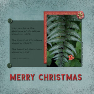
September 18, 2021 at 1:26 pm #64675Day 5 Project 2, a wee early for Christmas (well…not for me, it’s NEVER too early for Christmas). Photo is mine, the elements and papers are from Pixel Scrapper. The dark green paper I lowered the opacity. The border was Marisa Lerin from PS and I lowered the opacity to 42 (I think) because the orginal was a black border. I knew I needed something around the border, especially at the bottom but I couldnt find an element(s) that made sense to the design. The font is called Sea Garden from Creative Fabrica. I tried all kinds of sizes for the cut papers and had them all in my layers pallet so I could hide one and see what the other looked like. The red papers are two different ones that I layered together and then merged them so I could move them as one. I do understand once merged I can not undo it. In this case I wasn’t going to be needing to separate them. Still, might have been wiser to just link them to move them together. What do all of you think about Merging or Linking as the solution? Which is the better way to always do it?
September 18, 2021 at 9:51 pm #64684Connie, yes, I was referring to the AI resize, which is such a great addition to PSP. Where is the hole on that photo? If you want to test, you can try to enlarge even more, just to see how far you can go. You would then know for future reference.
Cindy, those colors perfectly match your mask!
Nadine, yes, she is a brave girl. My daughter spent one year in Germany when she was 15. She was gone for 10 months. Some people love adventure!
Susan, although we might take Christmas pictures in December, we rarely scrap them at that time, so it can be Christmas in your layout all year round. To answer your question, merging should be a last step in a project and if you can avoid merging elements, it is even better. Linking, however is great as you can link and unlink at will and allow you to move groups of elements together without losing their relative alignment. Grouping is a little more work and will be needed if you want to copy several elements to paste them on a different project, without changing their alignment or having to merge them.
September 18, 2021 at 10:17 pm #64686thank you Cassel. I want to form the “good” habits now at the beginning. I’m going to work on using Linking to start. Grouping will come later when I have a better grasp on it.
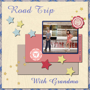
September 18, 2021 at 11:56 pm #646882nd Project. That effect that is so elusive in my 2021 version, worked today. Anyway, made 2 plaid papers for this layout and went with the blue and grey one. The cream paper is also mine, as well as the beige and pink small papers. All of the elements are from PS-Sheila Reid from her space adventure kit. Not sure of the name of the font, but it is the same one I used for the 1st project. Not as happy with this one. Not sure why not, but I made 2 different pspimages for this LO, and went with this one – the other one concentrated more on the papers and elements than on the photo. Anyway, here it is.
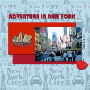
September 19, 2021 at 2:10 am #64690Here is Day 5, Project 2. I wanted to do something a little bit different than in my recent first Bootcamp in February.The Photo is my own from the time we lived in upstate New York, about 60 miles from the Big Apple where we spent a lot of time. I do miss it, especially around Christmas, but I do not miss the snow and cold. Both papers are from Digital Scrapbooking, (J. Morgenstern and Janet Scott). I decreased the opacity on the New York City Paper and added the off- white paper from J Scott as background. Elements are from D.S. and Pikpng. For the rectangle colors I picked the red colors on the photo.
September 19, 2021 at 4:24 am #64692Anita: Your page is very effective. I do love NYC; we used to go there weekly for film screenings. I live about 60 miles north of that city in Middletown, Orange County. Were you nearby?
September 19, 2021 at 6:40 am #64696Cassel: I’ve never heard you mention Edit/Copy Special/Copy Merged. I’ve found it to be very useful when I have a layered file and want to transfer it elsewhere but don’t want to merge my original.
September 19, 2021 at 1:00 pm #64701Thank you Ann. What a small world it is. We lived in the town of Wallkill (Ulster County) until 2005. I fondly remember making many trips to Middletown which was just a few miles away. I loved the Mall at Crystal Run. Is it still as busy as I remember? I enjoy looking at your projects here, you are very creative.
September 19, 2021 at 1:37 pm #64702Anita: I used to drive through the Hamlet of Wallkill on my way to SUNY New Paltz when we lived in Warwick. I was dipping my toes back into school after many years of working and since I had never finished the first time around I was determined to take it up again. I did finish my AA degree in Visual Communications/Graphic Arts in 2000. I used to go to the Galleria Mall, especially to the AMC movie theater there which now has 16 screens. After enduring lockdown for the last 18 months it all seems like a dream now. I love your design using New York City; one the the greatest places in the world, in my opinion!
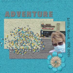
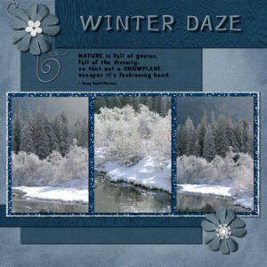
September 19, 2021 at 4:52 pm #64704Here is my Day 7 project 3. I was obviously in a monochromatic mood today. Photos are mine, elements and papers from Pixel scrapper. Title font (and quote, I think) is Little Pigeon from Creative Fabrica. I used two papers on the bigger blue one that I couldn’t decide on. None was the color I wanted, either too blue or too green. When I played with opacity I still had the other one behind it and the color showed through. It was the color I wanted. A happy accident for sure. I had a better time with using the glitter tile and flood fill tool (took 3 bootcamps and one basic course to get it!). I put the lighter glitter behind the dark blue one to separate it from the background better. As such, I didn’t put a drop shadow on the blue one, it looked weird when I did. My flowers were flatter looking so I kept the drop shadow as if it was thick paper, and the wire looked thin (24 or 28 gauge) and did the same as the flowers.
September 19, 2021 at 5:08 pm #64710Well I hardly got started before I got sick. I think I got food poisoning from a local grocery store deli. Woke up about 3 A.M. with the most awful digestion and things went downhill from there, could be a stomach virus or maybe even covid instead. I know of one person that only had stomach problems with covid. I really think it was the chicken pot pie though. It was made from scratch in the deli but no idea how long it had been in the warmer. It is now 4 in the afternoon so hoping it gets better before the boot camp is over. Just wanted to let Carole and all know I did not abandon ship from lack of interest. I have managed to look at most and everyone is doing a great job on the projects.
September 19, 2021 at 5:30 pm #64711Oh, feel better soon, Wanda (Sue) McGuire! That sounds awful; praying it’s not Covid as there are too many stories about lingering effects…take your time, this Bootcamp goes for awhile yet. Tea and toast and all that.. 😉
September 19, 2021 at 5:40 pm #64712Ann, I spent a lot of time in beautiful historic New Paltz. I remember when Robert DeNiro bought a house there and was often seen downtown. I also loved the walks up to Mohonk Mountain House, especially around Autumn when all the “Leaf-Peepers” came to town. Kingston, Rhinecliff and Woodstock with all the many artists, were also one of my favorites, along with Hyde Park in Poughkeepsie, etc. I think I am getting a little homesick for these places and will take a look at my old photos. I have a lot of them on the small diskettes and the new PC’s do not have a slot for them anymore. I will have to check if I can get a diskette player so I can move then onto a flash drive and then I can use for scrapbooking. If not I can always try and scan the photos.
-
AuthorPosts
- The topic ‘Bootcamp – Sept 2021’ is closed to new replies.


