Home of the Scrapbook Campus › Forums › Showroom › Bootcamp – Sept 2021
Tagged: Bootcamp Day 5- Project-3-600
- This topic has 239 replies, 20 voices, and was last updated 3 years, 2 months ago by
Susan Ewart.
-
AuthorPosts
-
September 15, 2021 at 10:34 pm #64539
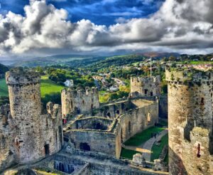
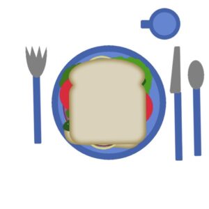
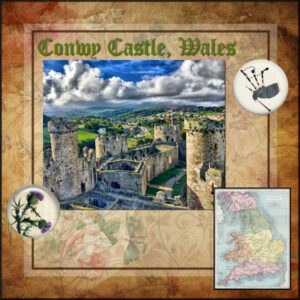
Hi, I am Donna. I joined bootcamp today, Sept. 15 so I’m a little behind. I don’t know how all you folks knew how to make your tables look so nice, but here is my simple one, sans tablecloth or adornments! Here is a travel picture I would like to include somewhere in a layout (Conwy Castle in Wale).
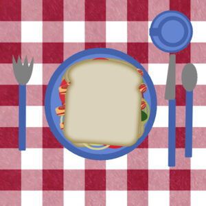
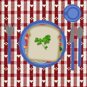
September 15, 2021 at 10:38 pm #64541Here is my sandwich. I added another slice of bread, more lettuce, 3 slices of bacon, another tomato and onion. The tablecloth is from Pixel Scrapper (Janet Kemp). Now I am very hungry.
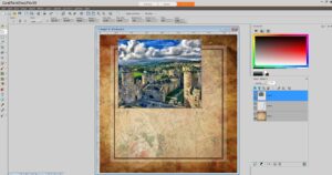
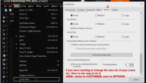
September 15, 2021 at 11:48 pm #64544Help! I will upload an image of my workspace. See how small all the labels are? I can hardly read them. I’m sure this is a dumb question, but can I get them larger to make it easier to work with?
September 16, 2021 at 1:16 am #64546Here is my same Sandwich with added bread, bacon, lettuce, tomato and onion. I changed the tablecloth (Pixel Scrapper-Janet Kemp) and added a sprig of parsley to top of bread. I also added a light drop shadow to the parsley.
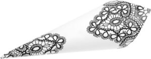
September 16, 2021 at 3:17 am #64548Mary Solaas: Ok, you got me. I only have one napkin and decided it was too distinctive (see, YOU remembered it!) plus the colors didn’t work, so I left it out this time. Here it is if you need it… 😉
September 16, 2021 at 5:49 am #64554Hi all, Start with a note to Carol I didn’t add anything else to the Sandwich project the comment was just that. but I made and a silly error I only saved the project as a jpeg file, oops.
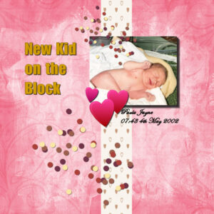
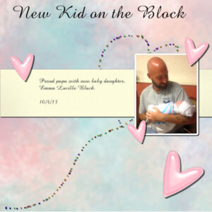
Now on to the day 3 project I followed the video and dived into my photos and found the birth of my youngest daughter she shares the same birthday one of her siblings. This time I save the project as a PSP file, a jpeg and a jpeg at 600 pixels; Also, I didn’t put the drop shadows on separate layers.
-
This reply was modified 3 years, 3 months ago by
Colin Hooson.
-
This reply was modified 3 years, 3 months ago by
Colin Hooson.
September 16, 2021 at 7:45 am #64560Donna, that is fine. You are asked to resize to 600 pixels before uploading to the forum. It is ok if we don’t read your labels. We all have a PSP so we would at least recognize the workspace.
September 16, 2021 at 10:18 am #64565Anonymous
- 335

- Enthusiast
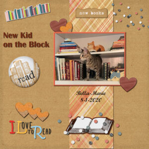
I have no newborn grandchildren, so I did this 🙂
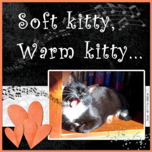
September 16, 2021 at 10:41 am #64567Bootcamp Project 1 – I ran out of new great-grands so I’ve moved on to wildlife and pets. Here is my Eve, who doesn’t sing. The song “Soft kitty” is from the tv series, Big Bang Theory, which is my go-to show when I don’t have anything else to see or just want to relax and laugh. I made the background paper with an addition of fur texture, the white strip is from the famous linoleum pattern that Cassel teaches. The headline font is Curlz and the text on the right is Copperplate Gothic Bold. I had used the musical notes in a layout last year. At that time they were not available as a PSP Tube. They are now, though, with a special tutorial on how to use them.
September 16, 2021 at 10:45 am #64569Donna — If you meant the size of your icons, text, etc on your work space this is where I found you can do it. View down to Customize over to Options. If that isn’t what you were talking about, maybe this will help someone else.
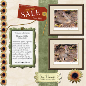
September 16, 2021 at 11:15 am #64571I didn’t have the opportunity yesterday to use PSP. It’s that time of year again, which comes round all to quickly. Fetching cows home from their summer grazing pastures. It was a long enjoyable day in the saddle. I was rather tired last night, so decided to get up at 4 to create this page. As I’m off shortly, kayaking. Anyway I cracked on whilst listening to the Great Horned Owls out in the trees. As usual I got a tab carried away with my page. I started by choosing the subjects, created the frames for them. Always, selecting colours from the photos. I always start my pages with the photo/photos. For the background paper I selected a small section of the twigs on the ground, effects. For the green strip I used an overlay and other effects. Used the green paper to create the green frame. I often create tags as a way to add info. I think it give a nice touch. I used the repeat script on the sunflower. The staple, and the brad on the frame, are my own. I created the brad specifically for this project. (There is a tut in the creative scrap for a brad, called ‘simple brad’ . I love decorative swashes, glyphs and corner fonts and brushes to create all sorts of elements. That is what I did to create the label at the bottom. As I said I got a tab carried away, but it didn’t take me very from start to finish.
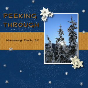
September 16, 2021 at 1:20 pm #64582What beautiful pages to see today. Here is my page, the photo is mine, the rest come from pixel scrapper. I used “stardust” (that’s what it was called) instead of scatter as none of the scatter I had made sense with the idea I was going with. Shadows are hard to see on the darker background and wonder if the shadows are too big on the flowers. I think the bottom paper flowers are okay as I’ve made these origami flowers before and they are quite thick. The white frame was from “Selection-Modify-Selection Borders” where I chose a white frame on the outside of the photo. This makes rounded corners which I dont really like, but going on the inside of the photo would cut off some of the picture I didnt want to cut off, but I’d have gotten those crisp 90 degree corners I like. Is there a way to get get the 90 degree corner and stay on the outside of the photo.
Sue T, you have such a cool life!
Ann, I LOVE cats, keep ’em coming (I have two myself). Actually any animal picts, I love all critters.
Pirkko, that opacity is really effective and beautiful
Colin, that is so sweet, love the color of the background
Donna, Stunning photo! Is that HDR?
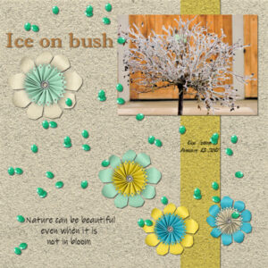
September 16, 2021 at 1:25 pm #64584Day 3 project 1 I used the kit offered. I blurred the background paper to make the small fonts show up better. I thought the scatter from that kit was too dense for this page so I used a different one and duplicated it several times. I believe my theme for this boot camp will just be nature.
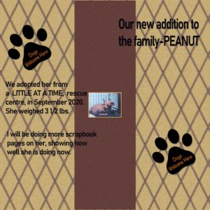
September 16, 2021 at 1:32 pm #64587GREAT JOB, EVERYONE. I had fun doing this, I did create my own background with a tutorial from the campus in the Creative Scrap section, used paw prints from the net. I did add some shadows. By the way, I will be using my little Peanut for my scrapbooking pages. She is our baby girl and brings so much joy to our house. Have a great day everyone.
September 16, 2021 at 2:50 pm #64590Ann Seeber – thanks for the napkin!
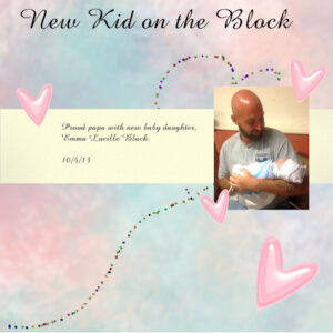
Project 1, Day 3 for Scrapbooking. Background paper is from Helpful from Rush Ranch; pink enamel hearts are from PS; confetti is a picture tube; cream paper is from Cass-Fire and Ice; font is Amazone BT. I really tried hard to keep to the tutorial this time. Can’t say I will all the way through, though, but I’ll try.
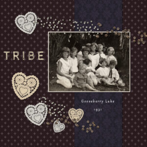
September 16, 2021 at 5:21 pm #64595Project 1 for Bootcamp Day 3. Most of the elements come from DigitalScrapbook.com (thank you!) and I had fun using more muted, vintage colours.
-
This reply was modified 3 years, 3 months ago by
Connie Collier.
September 16, 2021 at 7:15 pm #64601September 16, 2021 at 9:17 pm #64604Donna, your sandwich is perfect. The idea is to practice manipulating the layers. If you did that, it was correct. Those who have “fancier” table setups, have all been through this exercise more than once. You’ll see, after the Bootcamp, you will already have more supplies.
Anita, did you draw the bacon yourself or did you download it?
Colin, I bet you will remember to save in .pspimage format later! Good start on your first project. I think the vertical piece of paper is missing a shadow. If you have a PSP version, you can still add one if you want.
Pirkko, although children, grandchildren and great-grandchildren are popular themes for projects, we have many others who prefer to showcase other themes, and nature is probably the second most popular theme. I like how you used the transparency as the vertical element.
Ann, I am also a fan of The Big Bang! And yes, if anyone else wants those musical notes, they can follow that link you shared.
Sue, I see that you used a lifted shadow on the bottom label. I think the shadows for the flowers could probably be a bit softer and wider, I think.
Susan, yes, shadows are always harder to see on dark backgrounds, but we can still see them. For the flowers, I think that they are ok, although I would have used a smaller offset. If they are on separate layers, you might be able to move them a little “inward”. I think the blur and opacity are good.
Anne, that other scatter is good. I would adjust the layering because I am not sure how those elements would hold on the flowers.
Helen, what version of PSP do you have? You should be able to enlarge that photo so we can really appreciate it and see your Peanut!
Mary, very nice photo. I think you either forgot to add shadows OR you posted the wrong version of your page.
Connie C., that is a great first layout. And yes, some people like bright and vibrant colors, while others like more muted ones.
Brenda, you placed all the shadows correctly on that first layout. You could probably put the edge of the tent to overlap the photo if you want.
Keep them coming. And if you are starting late, don’t worry. You will have time to catch up. Share your work!
September 16, 2021 at 9:26 pm #64605Carole, I downloaded the bacon from Pixel Scrapper (Marisa Lerin), resized and rotated it. Found the parsley in my older files.
September 16, 2021 at 10:14 pm #64607Thank you Carole. The label was a nice element to practice, lifted shadows. I increased the shadow by 2 pixels, and the opacity from 60 to 50. It made a difference. I don’t know why the opacity was set at 60, as I always like to keep it at 50 or 55. I prefer softer shadow.
September 16, 2021 at 11:09 pm #64608Anne Lamp , that is exactly what I meant!! Unfortunately, I have version 9, and going to view—customize—options–
doesn’t give me the same screen and size choices that you have in version 2021. My tool bar is sooooo tiny that I can barely read the words: File Edit View Image Adjust Effects Layers Objects Selections Window Help
All of these are very tiny in my version 9 workspace. Does anyone else know what I might be able to do in version 9 to increase the size of the words on my toolbars?
-
This reply was modified 3 years, 3 months ago by
Donna McCord.
-
This reply was modified 3 years, 3 months ago by
Donna McCord.
September 16, 2021 at 11:16 pm #64610Here is my first layout. I used elements from Pixel Scrapper.
I wanted to circle or draw a line to the city of Conwy on the map, but I couldn’t figure out how to do it.
September 16, 2021 at 11:53 pm #64614OK, Carole. I did add the shadows and a frame around the picture. This afternoon I got around to watching the webinar I missed – lifted shadows. It has given me some ideas for a layout I want to play with later on for putting an object in an envelope, lifting the flap, and having the object peep out and putting a slight bulge in the envelope where the bottom of the object will be. Anyway, that tutorial gave me a lot to think of.
September 17, 2021 at 6:33 am #64616Here is my project 1. I used papers and elements from Pixel Scrapper and the photograph is my own. I placed a rectangular border around the photograph with the selection tool just like Carole showed us in a recent webinar and then I filled it with one of the colors from the plaid paper. What takes the longest time is to look for papers and elements etc. that will go with your photograph. I did enjoy looking at all the wonderful kits that are available and I am looking foward to play with those. Thank you Carole, I realized how much I have learned so far and I do enjoy my PSP program so much more.
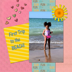
September 17, 2021 at 9:12 am #64618This is a picture of my Grand-nieces’ first trip to the beach. I didn’t realize that Lake Michigan at Indiana Dunes looked so much like the ocean! It was a really fun trip.
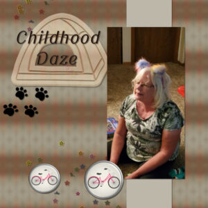
September 17, 2021 at 11:25 am #64620Day 3: Project 1 (This time, I didn’t get out of the tutorial)
paper background and band Kit “Faded Flowers” by KeepInTouch Designs
bamboo Kits “Cherry Blossom” by Marnijoe’s House of Scraps & “Rock Garden Blog Train Scrap Twist” June20 by Lady DGScrap
Scatters “Ride a Bike” by Sahin Designs
Fonts “Hobo Std” by (c)AdobeSystemsIncorporated & “Kristen ITC” by (c)InternationalTypefaceCorporation
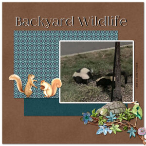
Photo persoSeptember 17, 2021 at 1:44 pm #64625Bootcamp Project 2 – Adventure. On Monday I looked out my kitchen window and there they were, my neighborhood Striped Skunks. Their fur looks positively luxurious! Luckily my little iPhone XS takes pretty good photos in the middle of the night (3am), Following Cassel’s style for this layout, I used parts of my Animal Kingdom kit (papers and embellishments). I felt I needed a border around the photo so I used Select/Modify/Select Selection Borders set to 20 px. and flood-filled it with white. The headline font is Foglihten No 7 that I duplicated in black and in white and offset the white. The font on the right is my old standby Copperplate Gothic Bold.
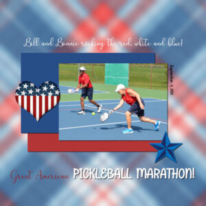
September 17, 2021 at 2:28 pm #64629Strips of paper, Pauline Thompson, Patriotic Palette textured solid 2 & 3.
Background (heavy blur) and heart: Americana Marisa Lerin.
Star 6 from Public Discourse by Marisa Lerin.
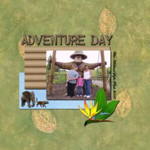
September 17, 2021 at 2:28 pm #64631Hi all, Boot Camp Project 2. Bit more challenging I used the wooden alphabet to do the main heading. I loaded each letter and pasted into the project, each on it’s own layer. I set two guidelines to give me the same height for each letter. once I got them positioned I selected all the layers and merged them together before adding the drop shadow; for the rest I followed the video. Yes I did remember to save in PSP, jpeg and jpeg resized to 600 x 600.
-
This reply was modified 3 years, 3 months ago by
Colin Hooson.
September 17, 2021 at 3:34 pm #64634 -
This reply was modified 3 years, 3 months ago by
-
AuthorPosts
- The topic ‘Bootcamp – Sept 2021’ is closed to new replies.
