Home of the Scrapbook Campus › Forums › Showroom › BOOTCAMP November 2020
Tagged: project 5
- This topic has 172 replies, 18 voices, and was last updated 4 years ago by
Jacques.
-
AuthorPosts
-
November 22, 2020 at 7:31 pm #49653
I love the tutorials so far. Carole’s explanations are so easy to understand and follow. I just have to quit instinctively trying to do things the way they are done in CorelDraw which I have used for years. Here’s my second project.
Day 5 Project 2
November 22, 2020 at 9:16 pm #49658BOOTCAMP November 2020 Day 7 project 3 Friends
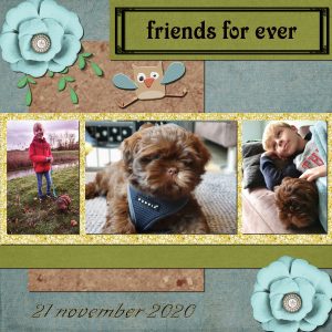
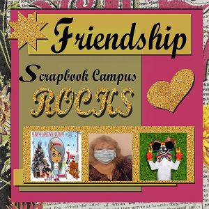
for this project I used 3 pictures of my grandson Guido and his puppy Bobby that he got yesterday.November 22, 2020 at 10:49 pm #49663BOOTCAMP November 2020 Day 7 project 3 Friends
My PSPimage also had a date but I did something wrong while converting.
Therefore now the version with dateNovember 22, 2020 at 11:20 pm #49666Cristina, nice and simple layout. That is a great example of how one does not need to add a ton of elements to showcase a photo.
Shirley, you used the glitters very well. It happens to everyone that a particular project does not seem to “hit” us the right way. Well, if you keep a pspimage version, you can come back to it later, in a few days, a few weeks or more, and maybe then, something will come up and inspire you.
Anne L. you found some fun items for your layout. May I suggest that you reduce the shadows on the title letters as they are fairly flat on the paper. It will also add a little definition if you increase the opacity a bit too.
Sandra, great use of the glitters. I also notice the “hand made” shadow on the curly ribbon. A small detail that adds realism.
Margo, welcome to the Campus and the Bootcamp. As your first digital layouts, I would say I am impressed! You even managed to use the shadows correctly, which is often a challenge for beginners. Were you already familiar with PSP?
Jacques, that will be a fun layout to share with Guido when he grows up! You are really getting comfortable with those projects!
Out of 100+ registrants, only 15 have posted anything. Where is everyone else?
November 22, 2020 at 11:22 pm #49667Just wondering Cassel, how was everything else? I don’t think I got my showdowns right and there was probably more.
November 22, 2020 at 11:41 pm #49668Day 7 _Project #3
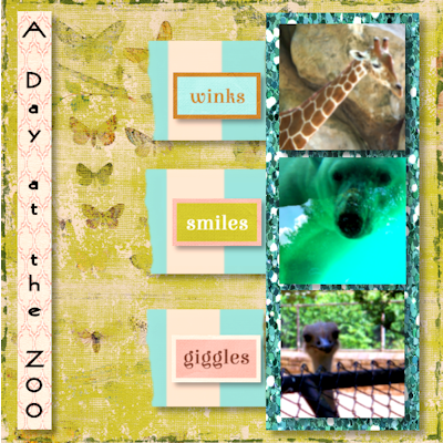
My husband and I often go to the Philadelphia Zoo on my birthday. These photos are part of a series taken in 2012. This year the pandemic prevented us from going. I used a kit by Marisal called Pretty Things.
November 22, 2020 at 11:48 pm #49669Shirley, as tiny details, I would suggest moving the bottom flower away from the edge, so it is not cut off! I think the rest was very well done!
November 22, 2020 at 11:53 pm #49670Thank you! That is the ONE thing I didn’t notice! Lol
I do have a psp image saved of this so I can go back and fix that
Hopefully next project will be better.
Thank you for taking the time to follow up with my question. I really appreciate it!!
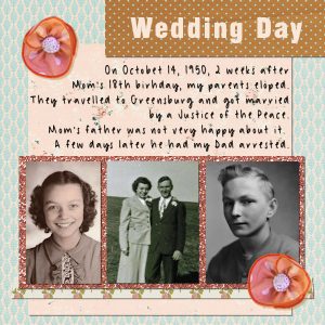
November 22, 2020 at 11:55 pm #49672Page 3, again I am using photos from my parents early years. Using the same kit, so maybe they will coordinate. Not entirely sure I am happy with this page. But I had time tonight and decided to get started. I don’t know if I will have time tomorrow.
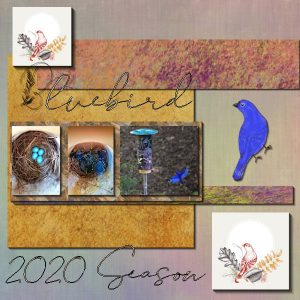
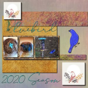
November 23, 2020 at 7:35 am #49682I thought I would try to use small bird images instead of the flower, mmmmm……..just a little tooooo “girly” for me as Carole stated. Smile. I also thought I would try an element for the letter B and by using the transparency lock tool was able to darken it and with the Drop Shadow made it a little wider? The pictures were from my 3 broods of bluebird nests I was fortunate enough to have this year. I feed them mealworms in a hanging feeder on the back porch and they stay the winter. I started with 2 pair last year, had 12 fledglings but I think most of them find other housing so as not to interbreed.
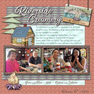
November 23, 2020 at 4:02 pm #49696My computer or PSP 2021 decided to give me grief the past couple of days – I thought I would have to go to 2018 to finish Project 3, but finally thwarted it. I used an old kit of mine with a camping theme as I worked with these 4 beautiful people at Yogi Bear’s Jellystone Park in New York’s Catskill Mountains. Jean was my mentor when I first started working there in 2018, and her husband, Ron, managed the outside, seasonal employees. They retired in 2012, just before the park was sold to a huge corporation. The new owners prefer to hire college students through the J-1 Visa Program – an international exchange program, where the students pay their own way to work at various locations, in different capacities. Our park is a RV resort – hence the camping there.
riverside Creamery is a great place to take friends. I took our Chinese students, Katina and Sabrina there for a treat on a day off we had together, and they were generally enthralled. No plasticware there – all old-fashioned glassware and metal silverware. They had only seen such a place in old movies. I suggested they try different things to sample each other’s, which they did. Katina’s only remorse was that her grandmother would never be able to enjoy such an experience and the best ice cream they had ever tasted.
I took the photos, and rearranged the LO a bit. I also used Carole’s old-chain tube to hang my sign. I used the fonts, Two Cent MT, Sweets Delight and Black Tea.
Thank you again, Carole – it was sure enjoyable to use some of your great shortcuts!
November 23, 2020 at 5:51 pm #49702Hi All,
Still finding the buttons and levers on this program.
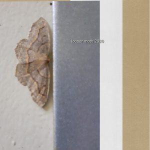
Am on the West Coast Canada and this summer we had short infestation of the Western Hemlock Looper moth.
The colours and subtle pattern, that I love, remind me of a gypsy skirt. The beige door and the steel jam it was on matched its own colours.
Since creating, I have found the feather button that I could have used on the side bars of colour to soften the edges.
Was nice to feel I produced something.November 23, 2020 at 11:47 pm #49722Linda J.W. Great way to display those old photos. They always need to be cherished as we rarely have many of them. On your title, assuming that the letters were cut out from paper, could use a shadow to give it some thickness.
Raymond, it is quite ok to change the theme from flowers to birds! I have a suggestion for you. NOTHING to do with “improving” something that needs fixing, but the font you are using might be a perfect font to apply a chrome effect. Fonts that are thin and even all the way, are often great for a wire effect. Keep that font in mind if you ever want a wire effect!
Vicki, what can I say other than “yummy”!!!?
Rootbear, welcome to the Campus and the Bootcamp. If you find a different element (button or others) and you want to resubmit the project, you are welcome to do so. It can also be interesting to see the change that one or two elements can make. I think you could use a bit more shadows on the paper elements to give them more definition. (be careful as some pieces seemed to have slipped from the top of the image).
November 24, 2020 at 12:15 am #49724I have had a lot of trouble with this tutorial. This is my second attempt at it. CTRL Y did not work for me as well as my material palette did not give me the options of category. I could not get to another palette to find my glitter paper. So I could not do the flood fill. Would this be because I am using a trial version of PSP? As far as being able to post I had to slide in on another persons email post. When I click on the forum it takes me back to September.
November 24, 2020 at 1:09 am #49729Carole thank you for the advice. Is there something in tips and tutorials about Chrome Effect? I don’t see it in your book, “Tips and Tricks for Paintshop Pro”
November 24, 2020 at 1:48 am #49732I think I found it? Effects—Artistic Effects—Chrome……..I changed the color to one of the default settings, used the dropper tool to see what specific color that was and after locking the transparency layer added that color to the Element “B”. I did notice one of the default colors had a “wire” type of effect. Is that what you meant?
November 24, 2020 at 7:31 am #49733Raymond, you can also check out this tutorial in the membership. The Chrome effect will give different results depending on what color you start with and what color you select inside the dialog box.
November 24, 2020 at 11:01 am #49737I had begun on this project before today’s lesson so tried to modify it with the scalloped edges, frames, a little different placement of the pictures. Carole, thank you again for the tutorials. I have been saving them and hopefully will be able to hear them again whenever I would like?
November 24, 2020 at 11:05 am #49738Yes Raymond, those tutorials are always available, and the one for the Wire Text, which is inside the membership, it is accessible as long as you are a DIAMOND member.
November 24, 2020 at 3:49 pm #49740Added a couple of elements and sorry for the repeat post.
November 24, 2020 at 4:51 pm #49742Trying to do the project for today (day9 project 4) and having problems with flood fill on the inside border of the pic. Will not flood fill at all. What am I overlooking? Watched the video at least100 times to get settings right. Help!!!
November 24, 2020 at 6:44 pm #49748Day 9 Project 4.
This one was a real hair puller for me. Flood fill wouldnt work on inside frame, shadows were all wrong and had to redo. This is my best for today out of all my tries.
November 24, 2020 at 6:48 pm #49749To anyone with issues with the Fill tool, there is a setting that I never thought of mentioning in the tutorials as it is set “as default” for me, but causes issues to others. I wrote a blog post about this tool. Read it here, and it should help.
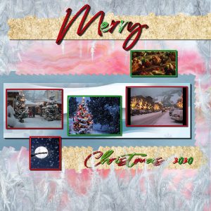
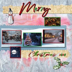
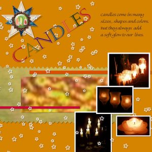
November 24, 2020 at 8:49 pm #49754November 24, 2020 at 10:31 pm #49756Here is my project # 4. I love trying to get a decent picture of candles and have a bunch of them from over the years with different cameras.
November 24, 2020 at 11:09 pm #49757Day 9 _Project 4

These photos were taken at the California Academy of Science in San Francisco, 2015.
November 24, 2020 at 11:34 pm #49758Pat, whether you have a trial version or a paid version, it is the same and all the tools should work the same. There might be a different setting that is causing the tools to work differently than what you expect. Can you share a screenshot of the Material palette that does not have categories?
Raymond, for the pinked edges, did you click on the corners to get the whole length of the paper with the even cutout? It looks like you might have done it like with scissors: piece by piece.
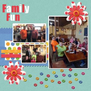
Shirley, check the tutorial HERE about the Fill tool. It might be the Mode setting that is different than mine. Great colors on your Family layout!
Cindy, you are doing great with your layout! Did you compare that with your very first layout? You have come quite a way from that first one.
Anne L, candles can be hard to photograph and you did a great job. You had fun with those pinked edges?
Priscilla, beautiful photos and a great layout. I would personally use a narrower and darker shadow on the photos as the blurred shadows give the impression that the photos are floating a little.
November 25, 2020 at 9:46 am #49760Carole, on the Eraser tool I used a rotation of 25 on the middle one instead of 45. I liked the way it was sort of “uneven”. I did use the Shift tool to make it go end to end but on an end it may have left a point or spike? so I snipped it off here and there. On the upper one I used a rotation of 75. I wanted to make it a little uneven and see what would happen. Thank you for asking.
November 25, 2020 at 4:49 pm #49771I really liked that eraser edge tip, Carole! I can see lots of potential with that for great photo edges!!!
I have really been enjoying all the diversity shown in the layouts here at Boot Camp – thank you so much, Carole, for making this opportunity for us. I have recommended it to several friends, who like me, have been on outdated programs for years and need to get up-to-date.
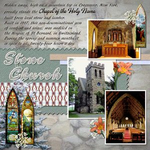
Here’s my project 4. With the exception of the photos and photo elements (all my own photos), the papers were created for this challenge, using the photos as a base. The stone background photo paper is a photo I took from the side of the church. Because of the topic, I opted against using different colors in my title, but I am comfortable with doing so, as Carole knows. I added noise to the background instead of a separate scatter, and included some of the beautiful stained-glass windows as elements. I did add a contrast white shadow to my text as I could not find a good color to use due to the color variations in the stone.
November 25, 2020 at 5:04 pm #49773Carole
I changed the setting on the fill tool and it worked! Tried on just a single picture for now to make sure I did it right but will redo the project the correct way when I have more time. Thank you so much for all you do!!
-
AuthorPosts
- The topic ‘BOOTCAMP November 2020’ is closed to new replies.


