Home of the Scrapbook Campus › Forums › Showroom › BOOTCAMP November 2020
Tagged: project 5
- This topic has 172 replies, 18 voices, and was last updated 4 years ago by
Jacques.
-
AuthorPosts
-
November 17, 2020 at 7:22 pm #49300
Anonymous
- 14

- Rookie
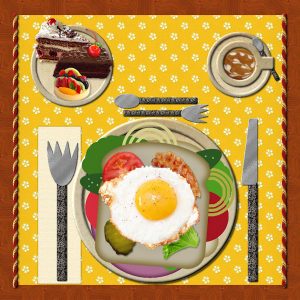
I really like the spoon on the cup plate. Aren’t you clever! De
November 17, 2020 at 8:45 pm #49319
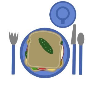
My table holds a sandwich, small side plate with tomato slices and a pickle, accompanied by a soothing cup of hot tea.
Priscilla
November 17, 2020 at 10:51 pm #49335So Idi the customizing of day 1. After that was done I felt like it was old home week. It looks a lot like what I am used to. Starting to feel like I just might be able to do this. Can’t upload picture I keep getting file extension error.
November 18, 2020 at 12:03 am #49337Euka, you can still join if you want. Otherwise, you are more than welcome to browse and comment and let yourself be inspired.
Priscilla, I am curious; where was that photo taken? I hope you will add those details when it is time to showcase it in a scrapbook page. So, you prefer your veggies on a separate plate?
Shirley, I reuploaded the Sandwich exercise and the Table file should now be compatible with PSP9.
Anne L, what did you add in your sandwich? Did you add more meat? It is definitely ok to add a placemat.
Jacques, welcome to the Campus, and you are correct: if you have a question, just ask!
Vicki, you are welcome to tweak the exercises to add a touch of creativity. It can also serve as a way to practice some tips if you add elements, and it makes for fun stories too!
Sandra, tasty sandwich! I can also go without the onions and pickles myself!
De, I just find those stories so much fun. I think you are the first one to do a “keto sandwich” 🙂
Pat, customizing PSP allows you to make it feel like what you are used to. When you get an error, are you uploading a jpg or a pspimage file? the forum will only take jpg or png. You will get an error if it is something else. Did you save the image as a jpg file first?
November 18, 2020 at 12:49 am #49339Ok so where are the pictures going?? I save them (after resizing them of course) in my folder I have set up. When I go look they are there. When I try to post them they are gone.
November 18, 2020 at 1:03 am #49341I don’t know if this is right. Will I get used to this? 1am Im off to bed.
November 18, 2020 at 5:15 am #49360As I mentioned before, I have participated a few times in the previous Bootcamp Challenges, so I always take the opportunity to practice different tutorials that Carole offers on the Diamond Membership.
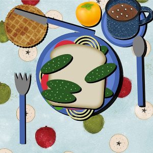
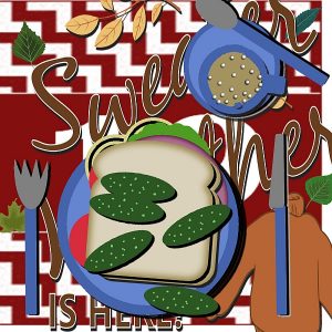
This time I created an Eyelet pattern paper and added tons of food! I used some of Cassel’s Picture Tubes: Burger Toppings and Metallic Rope
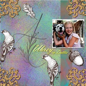
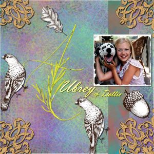
November 18, 2020 at 10:06 am #49375I used some elements from DesignCuts, the corners, birds, acorn, the leaf, and the letter A. The background was made from Carole’s class on “Messy backgrounds” a couple of weeks ago. DesignCuts will send a “freebie” every Friday. Carole, thank you again, you made it easy following your excellent video.
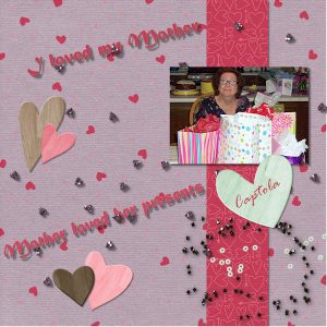
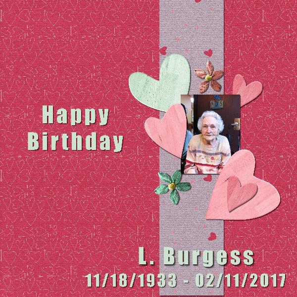
November 18, 2020 at 1:34 pm #49392Day 3 lesson. In memory of Mother . Edit: I didnt do the scatter embelishments. Didnt see any i really liked , will probably go back and add some at another time..
 November 18, 2020 at 2:37 pm #49405
Day 3. I downloaded one of the suggested kits and used some of the elements for this project. Mother was a generous loving person, but boy did she love to get presents. It didn’t need too be expensive, but it better not be to practical either. NO ONE dared to get her a vacuum or iron for Christmas.
November 18, 2020 at 8:09 pm #49413Anonymous
- 14

- Rookie
Second attempt. Second attempt to post this.
 November 18, 2020 at 8:16 pm #49415
I have really enjoyed seeing every one’s pages. They are really awesome!
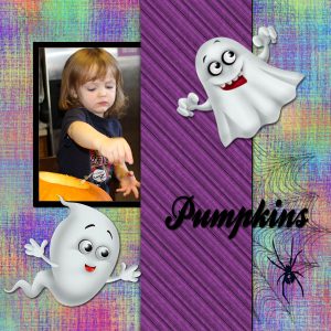
Mine is of carving pumpkins on Halloween day.
I made the background papers. The colorful one is from the Master Class called “A Beautiful Mess’ by Cassel. The kit elements came from a kit called a Bootiful Night from Designs by Stina.
November 18, 2020 at 9:12 pm #49410Anonymous
- 14

- Rookie
This is my second attempt at this project. I used some of the stuff in the kit. As you can probable tell I’m already ready for spring. I have a small garden, but I love all flowers. I walk around my neighborhood and snap pics of other people flowers, but this pic is mine. I’m reposting the first attempt on the bottom. I liked the first attempt the best, but I thought it might be to busy. Are there any composition rules for scrap-booking? Also I can not figure out how to un-tab the view, so you can see more than one picture at a time. I know it’s probable very simple. Thanks in advance for your help.

2nd attempt above, 1 attempt below.
 November 18, 2020 at 9:43 pm #49420
Hi Everyone, so happy to be here. Yes Dear Teacher i will post pics of my hair lol. I’ve chopped it 11 inches so far, feel light as a feather.
November 18, 2020 at 9:51 pm #49421My name is Linda, and I am just getting started here….late, I know.
I did the Bootcamp a year or two ago, I learned lots, and hope to learn even more. I will be using 2019. I like the med gray with a white background.
But I have 3 tabs at the top! Manage, Adjust and Edit?
I am not yet sure what photos I will be using.
Linda
November 18, 2020 at 10:05 pm #49422I am really struggling with this! I have tried downloading kits. When I click on them it takes me to another page I have to join. I joined then I get taken to another page to join. The kit I wanted I cant get. I have been at this for over two hours. I sure hope this gets easier. I wish my computer did not crash and make me loose everything I had. Im am getting so flustered.
November 18, 2020 at 10:12 pm #49424Pat, which kit did you try to download?
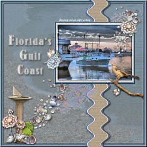
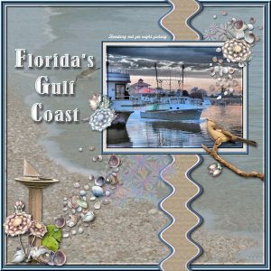
November 18, 2020 at 10:18 pm #49425For my Day 3, Project I, I returned to the Gulf of Mexico, on Florida’s western shore, where I often went during the colder winter months. I dusted off an old kit I made a few years ago, called Caladesi Island Adventure. this was an area my brother, Charles and I often went for photo shoots. I happened to have two scatters in that kit – one, floral and the other shells. I used Carole’s free basic ric rac script to alter the trim slightly. I took the photo one evening at New Port Richie, arriving just as fishing boats were heading back to sea at sunset . . . this fellow turned on his lights as he passed the city limits, and entered the Gulf waters
November 18, 2020 at 11:04 pm #49427Day 3 – Project #1
I took this photo at the Arc de Triomphe in Paris,
 France where my husband and I had gone to celebrate our 40th wedding anniversary. The couple standing under the Arc, as well as celebrating 40 years of marriage, reminded of Robert Browning’s quote “Grow old along with me! The best is yet to be, the last of life, for which the first was made.”
Priscilla
November 18, 2020 at 11:18 pm #49429Working to catch up.
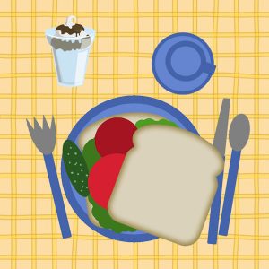
My lunch is a BLT, bacon, lettuce and tomato sandwich…but I seem to be missing the bacon!
That is my favorite, if I have tomatoes from my garden. But sadly, garden season is over for this year.
November 18, 2020 at 11:41 pm #49432I don’t think I have worked so hard in all my life. I couldn’t get the one that was used in the video so I found another. I sure hope that is ok.
November 19, 2020 at 5:19 am #49438Hello happy to be here 🙂 I used golf ball tubes to make marshmallows in my coco, really enjoyed being able to do this.
November 19, 2020 at 9:31 am #49440I wanted to make the large letter A more visible so used the transparency lock to color it Yellow with some black highlights. I wanted to see if I could decrease the stroke on the other letters but cannot seem to highlight the text. Any suggestions?
November 19, 2020 at 4:38 pm #49452Here is my Day3 – Layout#1.
I used a kit called “Winter Fun” by DiHiller – PixelScrapper 2017Feb.
Font: Angelface
November 19, 2020 at 11:38 pm #49462Grrr… gremlins ate my post of last night!
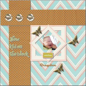
Pat, you did manage to post those images. It is totally fine to use a different kit than what I post. I only offer them there to help those who are totally new and never downloaded any supplies. on your New kid on the block layout, I would suggest that you darken a bit your shadows. If they are still on their own layer, you can go to Adjust > Brightness and contrast > Brightness and contrast and lower the Brightness value a bit like maybe -20 or -30. See how it makes a difference.
Cristina, you have to invite us to eat all that food! For your project #1, we can see how simple is very effective!
Raymond, it is great to see you having fun with making those colorful backgrounds! About the text, was it still in Vector format?
Shirley, you did a great job with the shadows too! Nice page to honor your mother.
Anne, L, I hope you find a way to add that story to the page because it surely adds to the interest. I would like to point out the shadows you used on the title; it seems a little too “offset”, giving the letters the impression they are floating. On the other hand, I think you might have forgotten the shadows on the white beads.
De, great page to showcase those flowers! I would like to point out that the shadows are inconsistently oriented (maybe you flipped the top left hearts?)
Sandra, you are also having a lot of fun with those backgrounds! You should consider adding details to your page, like a name and a date.
Cindy, what kind of pie did you choose? You will have to share that with everyone else! It is a great idea to use the golf balls as marshmallows! From a distance, it does the trick!
Linda J. W. welcome back to the Bootcamp. You have three tabs on top because that is a version before they added the Photography workspace. Also, if you go to File > Preferences > General Program Preferences > Tabs, you can select which tabs you want or don’t want to see, especially if you don’t use them. If you add a chocolate sundae to your lunch, I want one too!
Vicki, that is a fun way to use the ricrac! May I suggest that you darken the shadow under the text to make it stand out a bit since the text and the background are both light in color?
Priscilla, I love the way you have a wide shadow on the strings element. However, I would like to share a little trick with you: do you see how that shadow has a gap on the very top? Since you should not raise the shadow, raise BOTH the shadow and the strings, just enough to remove the gap. It is not much but will add realism. Oh, and did you forget the shadow on the paper under the photo?
November 20, 2020 at 12:32 pm #49485Here is my adjusted Project 1, per your suggestion, Carole. Now to check out the next one before I have to take my daughter for her eye appointment!
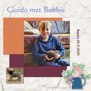
November 20, 2020 at 1:03 pm #49487hi, i’m Jacques and i used a photo of my grandson Guido for day 5.
He will have a puppy this weekendNovember 20, 2020 at 1:43 pm #49488Day 5 adventure was fun even though finding photos to use is more of a challenge to me than anything, lol.
 November 20, 2020 at 1:44 pm #49489
Day 5 adventure was fun even though finding photos to use is more of a challenge to me than anything, lol.
 November 20, 2020 at 3:27 pm #49491
Anonymous
- 14

- Rookie
Hi Carole,
I meant those shadows, on the hearts, to be more like brackets around the picture. I guess that didn’t work. Do I need to redo it, or just move on to the next project? Thanks in advance. D
-
AuthorPosts
- The topic ‘BOOTCAMP November 2020’ is closed to new replies.


