Home of the Scrapbook Campus › Forums › Showroom › BOOTCAMP May 2021
Tagged: BOOTCAMP May 2021
- This topic has 156 replies, 13 voices, and was last updated 3 years, 6 months ago by
Susan Ewart.
-
AuthorPosts
-
May 22, 2021 at 10:13 pm #58419
Cassel, thanks for the tips to make on my Project 2. I didn’t know what value to use for changing blur using Gaussian blur method so I just deleted and re-added the shadows with a higher blur value. For my Project 3, I googled how to crop a photo into a circle although his instructions weren’t as thorough so it took some trial and error to get it right.
May 22, 2021 at 10:31 pm #58420Thanks Susanne. I would like to do that. Your babies look truly beautiful … little characters too! 🙂
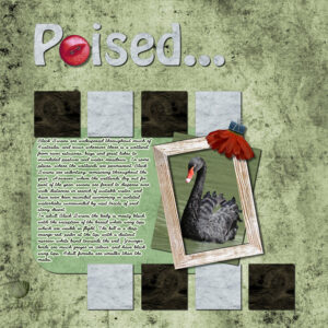
May 22, 2021 at 10:45 pm #58424Oops … finished this a day or so ago and forgot to post. The concentration project for me is titled Poised. Thanks for takin a peek my friends. ;D
May 22, 2021 at 11:08 pm #58427Wowsers! You are forging ahead in leaps and bounds Cindy. I love your My Baby is Ducky page and I love the story you told about how ducky came into being. Gorgeous colours in this one Cindy … keep on keeping on my friend. ;D
May 23, 2021 at 12:39 am #58429Yay! I fixed my project 2. I started over and then I compared the layers and fumble finger me accidentally deleted the background layer. Which brings me to a question. If you add a layer and you dont like it is okay to right click and delete the layer or is it better to click on undo. Sometimes I add an element and I dont like it and want to get rid of it. I figured out the text indent thing is normal. here’s the new version with drop shadows. The cool thing was I did this faster than I’ve done the other ones and without having to refer to the instructions. This is a first for me.
May 23, 2021 at 12:41 am #58430Stunning! You have such good design sense. Very inspiring.
May 23, 2021 at 12:46 am #58431Thank you Cassel. i will try your fix. I kept the first version in case i could fix it. Hoping to post project 3 tomorrow. Really enjoying this, okay, sometimes pulling out my hair. But rewards await if I persevere.
May 23, 2021 at 7:37 am #58433Day 5
Here I came up with a Scrap about my little granddaughter Elisa. I used some elements from CreateWings Design.
I hope it’s not too bad that I used a Wordart instead of the texttool? This Wording suits so perfect with the layout. But I can change it when it’s necessary.Now with shadows :o)
-
This reply was modified 3 years, 7 months ago by
Susanne Lietz.
May 23, 2021 at 7:43 am #58434Annie, this is so nice! Are these cats all yours?
May 23, 2021 at 11:37 am #58436Day 7
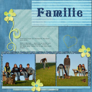
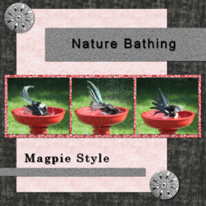
This is my Scrap about happy and wonderful holidays with our kids. We had so much fun with the dogs.May 23, 2021 at 12:53 pm #58438Project 3 done. yay! I’m getting the hang of this. Lots of “undo” sometimes, but learning by way of mistake making. haha. My sister in law gave me this red bird bath and I thought no way would any bird use it as it was slippery ceramic and bright red. It was the favorite of the corvid group (crows, magpies, bluejays) but I was surprised at all the LBJ’s (little brown jobs; that’s what we call them) that would skim across the surface. So I put a big rock in as I had one sad accident of a LBJ drowning. I was horrified. Since then all has been good. It’s warm enough now I can put the baths out (I have 3). Hubby and I love watching out the window, with the cats (indoor girls). Mother nature has supplied all we need for therapy – nature style. I used the bigger shadow settings on the buttons. My brain want to put the bottom right button the same as the top button, in the corner. At the same time I wanted it on the paper corners to look like it’s holding it there. a designer I’m not. I love this bootcamp.
May 23, 2021 at 12:54 pm #58439Susanne, this is so pretty. Love the colors and design.
May 23, 2021 at 12:58 pm #58440OMG! Annie, I love the cats.
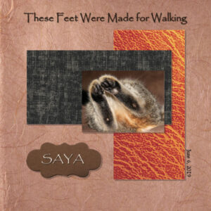
May 23, 2021 at 1:02 pm #58441I just noticed I put “these feet were made for walking” on my project 2. It was supposed to say “these feet were made for mischief”. I was humming the song when I was typing. Must’ve saw something shiny and lost my train of thought.
May 23, 2021 at 8:54 pm #58465Project 4 in the books. I used the pinking shear edge as cutouts instead. This went pretty well. I have a problem moving the words around. Sometimes it doesn’t grab the work, but the background layer underneath. Or it moves the word and leaves the word behind, having two of the same word offset. Other times I can move them fine. I’ve tried being on both the copy of the vector layer or the raster layer of the word. Not sure what I’m doing wrong or if it’s my computer not catching up. I have used mostly designs I was greatful to download from pixelscrapper. And found some that were already loaded from Corel. Onto project 5, later this week (I have to “adult” now and go to work, do housework etc etc). All images used are mine. This has been an eye-opening course for me. Thank you all for posting your awesome scrap-pages, they have been very inspiring. Thank you Cassel for your instruction, I love that you go through the steps each time, it becomes the words I say to myself when I’m doing the actions.
May 23, 2021 at 9:17 pm #58466Annie, nice to see the difference in shadows for different thickness of elements.
Susan, to answer your question about layers, you are allowed to do whatever you want with those layers. You can delete them, or you can hide them, “just in case” you change your mind. Once you are done, you can delete those hidden layers to reduce the file size. But either way, make sure you save a .pspimage format of the project. On the SAYA layout, I think you can use darker shadows. Did you use grey or did you lower the opacity? Although you CAN redo them, if they are on separate layers, you can duplicate those shadow layers and see if it would make them darker.
On the birth bath layout, you are correct to use a larger shadow than for the thin papers. You are getting the hang of it!
To address your issue about “catching” the wrong layer, here is a super useful tip: hold the Shift key when the layer is active, and it will move the whole layer, even if you don’t “catch” a pixel on that layer. No more risk of catching the bottom layer.
Susanne, Elisa has such a nice smile. That is a really fitting title for that page. I think you might have forgotten to add the shadows on the papers and photo (unless you were hiding those layers) on your Day 5 project. On the other hand, you have them all in place on Day 7 one.
May 24, 2021 at 1:53 am #58479Here is my Project 4 page using Military Girl kit from godigitalscrapbooking.com. It shows my daughter, an Army Flight Surgeon, currently stationed overseas. I plan on making more pages of her experience.
May 24, 2021 at 6:04 am #58480Good Morning @All
Thank you all for your nice comments. I have a lot of fun starting from zero! I’ve joined a few graphic and design schools 10 years ago – I remember that I create even gifs in the hard way 🙂 backgrounds, frames and so on, but unfortunately I forgot so many details and technics. When I searched for a tube yesterday I found some of my layouts from that time and it makes me smile. So many hours I spent for being a good student.
Question: If Cassel replies to my layout that I forgot the shadows in one of my Scraps shall I upload again here? Is it possible to replace it?
Have a nice dayMay 24, 2021 at 6:35 am #58482Hi Susanne: Yes, you can change your post and uploaded image if you go back to the original and see if it shows the word “EDIT” on the top right. Click there and you can change/edit your text. You can also click the (X) at the top right of the image and it will be deleted. Then you can upload an edited version if you wish. Good luck!
May 24, 2021 at 9:14 am #58486Thank you, Ann!
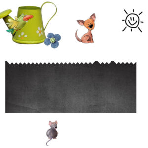
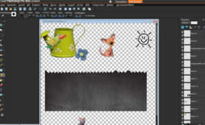
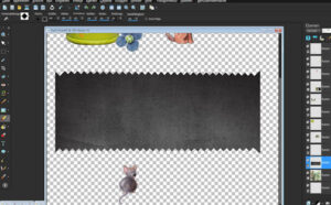
Help, please!
This one drives me crazy!!! It’s not possible to cut these edges out in the correct way. I’ve tried for a thousand times …
I only get this result:-
This reply was modified 3 years, 7 months ago by
Susanne Lietz.
May 24, 2021 at 10:11 am #58494Susanne, that behavior is really odd. You have the Smart Edge checked. Try unchecking it. I am not sure it will change but I know that it has some bugs and not working properly so you might as well uncheck it. Another thing I would look into is the Brush Variance Palette (F11) and see if you have any jitter. Reset everything to default with the icon on the bottom right of that palette. See if it helps.
May 24, 2021 at 10:41 am #58498Cassel, unchecking the Smart Edge was a good idea except at the ends. Do you see it? I had to readjusted them.
May 24, 2021 at 10:51 am #58499Susanne, for the ends, it might be because it would have an incomplete brush impression so it skips it. You have to options:
- start and end with clicks somewhat further than the edge to make sure there will be at least one full brush imprint at the end
- trim the right side of the paper (which might not be a solution if you had a photo!)
May 24, 2021 at 12:14 pm #58500Thank you Cassel I will try the fixes you suggested. Just watched the Project 5 video and will get to it this week. Off to work now (even though it’s a holiday. sniff sniff). Just want to stay home and play with PSP. I dont want to lose what I learned. I did sign up for the Basic course because I need that accountability. Thank you so much for the discount code.
May 24, 2021 at 12:41 pm #58502Carole, answering your question, yes, comparing both, the layout with the larger shadow looks more realistic. Thank you!… And again, this was a great challenge to participate in. : )
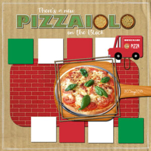
I finally finished Project#5.
Credits: Kristin Aagard “PizzaPizza” kit papers and the 2 pizza elements in the title.
Fonts: Half Baked – Gill Sans Ultra Bold – heavenfield
May 24, 2021 at 8:11 pm #58508None are mine Susanne. I have a 17 yr old tortoiseshell female … Minerva, and a pure black female … Izzy who is 4 yr old. Love em both but it has taken the full 4 yrs of her life for me to come to terms with Izzy. She is a very demanding little minx and always wants to be on the kitchen benches and the dining table … I have needed the patience of a saint and patience is not one of my virtues, lol!
May 24, 2021 at 8:13 pm #58509Thanks Susan … they are lovely but none of them are mine … freebie photos off the web! ;D
May 24, 2021 at 8:17 pm #58510Thanks Cassel … I am starting to get the hang of those darn shadows! Warp brush, selection tool and eraser do come in very handy! ;D
May 25, 2021 at 12:00 am #58524I did it! I completed all the projects. I feel empowered. Sometimes I hit buttons and then don’t know how to undo what I did, because I dont know what I did. Instead of giving up I took a couple deep breathes and got it figured out. Thank goodness to rewinding the video, over and over. I remember my calligraphy teacher’s words; Practice, Patience, Perseverance. I can see the need to be able to make your own papers to get just the right color for your projects. This has being amazing and in this unsettled year+ it’s nice to having a positive accomplishment. I never thought I could learn this. I’m a happy bootcamper.
May 25, 2021 at 3:24 am #58528Susan: Very nice! I admire layouts that are simple and effective. Way to go!
-
This reply was modified 3 years, 7 months ago by
-
AuthorPosts
- The topic ‘BOOTCAMP May 2021’ is closed to new replies.


