Home of the Scrapbook Campus › Forums › Showroom › BOOTCAMP – May 2020
Tagged: Bootcamp may 2020 welcome
- This topic has 231 replies, 29 voices, and was last updated 4 years, 6 months ago by
Ruth Seibert.
-
AuthorPosts
-
May 19, 2020 at 1:14 pm #43020
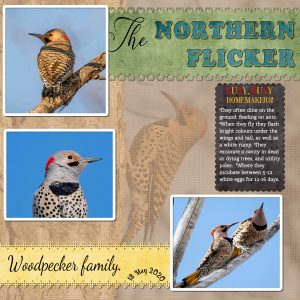
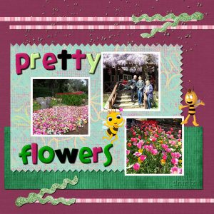
Project 4. Many of you will know I like to use a photo as a background paper. This one I textured. Scalloped edge on the black paper, which is one of many tutorials in the creative scrap, in the campus which I subscribe to. Cassel has an array of fonts to choose from in the store. I used 2 of those fonts on the other two strips of paper. I have the bee kit, so I used all the papers in that kit in my project. Green and yellow strips, blue for the text, and black to type the text on. All the colours to be found in my photos.
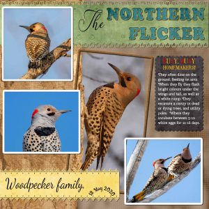
May 19, 2020 at 1:20 pm #43022This is an extra, not part of the boot camp. I selected the Flicker, inverted, textured the remainder of the photo. Created a frame.
May 19, 2020 at 2:44 pm #43024Project 4
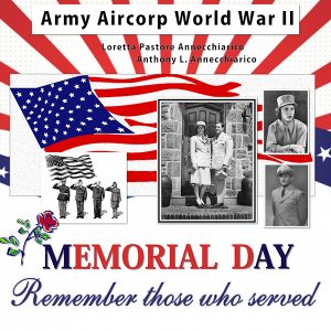
In keeping with the military theme and Memorial Day…This is my Mom and Dad during their military service. They met in the service and married while in the service.
May 19, 2020 at 3:19 pm #43026Howdy!
I managed to go back and make the suggested changes. The shadowing does give the elements more ‘pop’ for sure. I am still having problems with the text but will continue to work through things.
On to the next project.
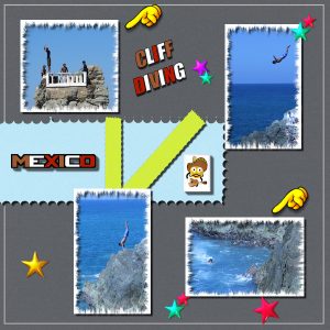
May 19, 2020 at 3:23 pm #43028The page today is from a trip to Mexico. Saw some Cliff diving. hands are PS Tubes pointing from the beginning to the end where he lived just fine from the jump. They make a living by diving and then collect a dollar from the tourist. I have a lot going on today so have a good day!
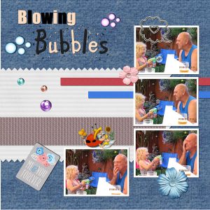
May 19, 2020 at 3:57 pm #43031Project 4 (Day 9) Busy Bees, although I titled mine, “Blowing Bubbles”, as this was the theme of my 4 pictures, rather than three. Took me a while as I created the two thin paper strips using Filters Unlimited 2.0. I still find the text tool a little challenging. The coloured text ended up somehow on a separate layer, so I had to merge down. Not sure what that is all about. I got there in the end.
Loved using the eraser as a cutting tool to create the sheared edges, that was new to me.
I find that I like making background papers, and on experimenting with different effects I have a couple more added to my collection. The accents used were also from collections I had from many years ago. Tried to make my own bubbles, but that’s another story, and it didn’t go very well so I lost some time there.
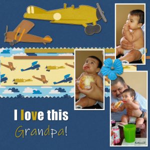
May 19, 2020 at 7:33 pm #43041Day 9 — Project 4. I enjoyed this class as well as the other one’s. Carole, I am so in awe at how I am learning so many new things in each lesson. I loved the eraser one, wow that is amazing. The baby (Baby Ray) on the the pictures is my great grandson. He was eating sweet bread for the first time. My youngest son is the one on the picture, he is the baby’s grandpa. Thank you so much Carole.
May 19, 2020 at 10:40 pm #43045Mireille, excellent montage. N’oublie pas dy ajouter une date; tu risques de ne pas t’en rappeler, dans 10 ans!
Glenson, that is cool that you had that same kit! I am a little puzzled by your shadows. Typically, I would say that those are making your elements look like they are floating, BUT, they are so consistent and realistic that the whole project almost looks like a “shadow box” as if those elements were voluntarily layered and spaced from each other. The result is quite eye-pleasing!
Mary, maybe what is “missing” is balance on your layout. Find an element or a piece of paper to occupy the bottom left corner. Maybe just move those flowers and make a little cluster in that area? Just an idea.
Fiona, that is definitely a colorful layout. When you need to fill a thin area, you might have to zoom in so that you can see where you click.
Sue, it is always a delight to look at your wonderful photos! Those woodpeckers are gorgeous.
Lynda, the black and white photos are beautifully displayed in that last project.
Marica, good improvement on that project. And yes, shadows can make a BIG difference in a layout.
Jose, what are those frames? They are great. I think I would reduce the opacity of the shadows a bit more. They show as very “hard”. But they are very consistent, which is good.
Krystyna, did you create the two words separately? If so, that is why they were on separate layers, and that is ok. You can always rearrange the layers and personally, I do find it easier to have separate words or texts on separate layers.
Isabel, you are definitely showing all that you are learning and in the process, you are making wonderful pages.
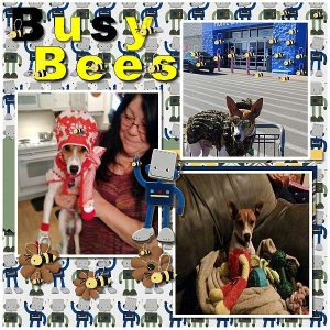
May 20, 2020 at 3:52 am #43051Hi Carole I had so much fun and I could do everything. I did get stuck but I remembered to check settings. Thank you! Your the best Teacher, Nicest Lady. Oh man I had so much fun and I borrowed your little bee and put em all over my page. Oh I made a tube from the bee, and tubed walmart and a car, and I put a bee in Bruces Christmas Bonnet. hahahah so much fun. I must of spent 700 dollars on scrapbooking stuff and never used any but stuck some stickers on some cards. This Scrapbooking this way, so
much fun. I mean when you know how to tweak this setting and that setting. And the layers didnt bug me this time at all. Oh man this is fun! Thank You Carole. I love this page the most.Invasion of bees at walmart in Arkansas lol The bottom pic is Bruce sitting with his toys. And the walmart is his Fall Camo outfit, did you see his sunglasses. Yes hes a service dog, everyone loves him. But Men he dont let men come near us without telling them, that’s close enough. Bruce Lee was my last rescue, all his homes fell thru 3rd one I gave up. And told him were stuck with each other Bruce Lee. He is the only dog I couldn’t stand from git go. But now I couldn’t part with him hes my baby.
May 20, 2020 at 4:39 am #43053Love Cindy’s enthusiasm (and her pages) it is quite catching!! So many interesting pages, great work being produced.
I am still on the same colour theme with my page, I went a little off course from the tute but think I covered all the elements and it was nice to learn a couple of new things again – the erasure cutting and the border selection both will come in handy. My centre paper was cut from one of the photos and I never used any paper strips. The back ground was once again a photo, actually the bottom right one using the Simple 4 way average filter. The autumn leaves this time were a tube. Changing the colours of the main heading didn’t look right to me on this page but I did it on the smaller wording.
One thing I notice Carole you always ‘accept’ when using the text tool, that is something I had never done until the Wise Words challenge but I find it is not always available to click after the very first typing. Is it important to accept? What does the accepting actually do? Thanks.
May 20, 2020 at 4:50 am #43054Thank you Cassel, yes I did put the words on their own layer. I feel the text tool is something I need to practice with more.
Everyone has posted some lovely work, and I have noticed that some have mentioned a Simple 4 way filter, is that a free download, or is it in the PSP programme?
I am now going to have another play at the text tool.
May 20, 2020 at 5:29 am #43056Thank you Euka, just you know how nice it works when everything goes like you think its gonna. I had so much fun putting a bee even on my sweet stinky weirdo Bruces Christmas hat lol and I put a bee on the robots hand, cause a thought came to mind, of my baby brother showing me a fist and saying sissy I caught a bumble bee wont mommy be proud of me, och and acts like he got stung while singing the bee stung me. lol
Question: Cassel What is a simple 4 way filter? And if its free can I get it too.
🙂 lol I pushed my bedtime long enough good night
May 20, 2020 at 2:03 pm #43061Thanks a lot Carole. My daughter-in-law, Laurie, said that the glitter tube I used to kind of tie the bottom left corner with the top right corner just wasn’t right. I like your idea to cluster the flowers in the bottom left corner instead.
On another note, I am not the only one interested in the “Simple” set of filters. I am still working on trying to get a handle on it. I feel sure that somewhere there must be an *.exe maybe that has the missing *.dll’s. Anyway, I have a support question in Corel addressing it. When I get an answer, if it solves the problem, I will let you know so you can get it to all who ask about it. One thing I notice, is that EukaEuka’s use of it in the last project does not have the same effect it had in the first project!!!
I am late in getting up this morning as I was really stressed out yesterday trying to get a handle on it. So – my Busy Bees project will have to wait a bit.
Love all of you and am really impressed with everyone’s project!
May 20, 2020 at 3:18 pm #43062Hi Cassel,
I googled the Filters Unlimited 2.0 their talking about and I didnt want you have to answer my question, I don’t want it but seen its free right now. thanks
May 20, 2020 at 5:33 pm #43064Hello All!
Taking me a bit but I’ve completed project 3 and ready to begin 4. I get a bit confused with everyone talking about filters, tubes, using photos as backgrounds, etc. but those skills too will come! At least I hope so.
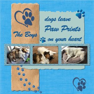
Our boys are helping to maintain sanity in these trying times but their favourite thing to do is “sleep” – especially in the front window in the sun.
Some wonderful projects that have been completed. I really enjoy opening the Forum to see what everyone has created.
Stay Safe.
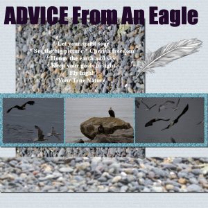
May 20, 2020 at 6:09 pm #43066Trying to play catch up. This was from Day 7 I found a feather to put on my page I don’t think the shadow is noticeable. I did 3 vert and 3 horizontal opacity 45. Getting text in took me a few attempts I kept missing a step.
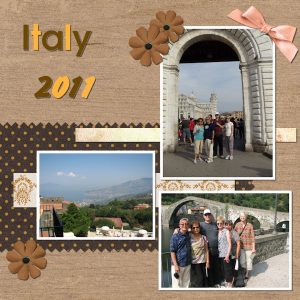
May 20, 2020 at 6:37 pm #43068This was a fun exercise. I probably should have left the bow off…but I got carried away.
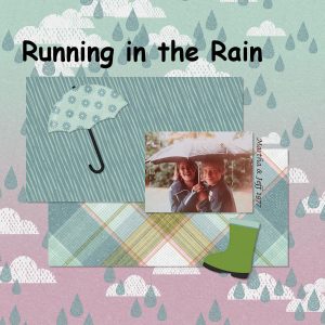
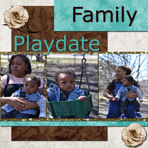
May 20, 2020 at 7:48 pm #43074Finally finished Project 2. For some reason the title text didn’t change color. Well, it did and I didn’t like it so I tried again and it stayed black. Decided after several times that I like it black. Jeff is my son and Martha is my niece. They had a great time running around the backyard under the umbrella while it poured.
May 20, 2020 at 10:28 pm #43082Cindy, I am happy that some of those checking are becoming more “automatic” for you. That will make your work easier and easier over time. I also notice that you have no more distorted photos!
Euka, when the Accept is not available, it is usually because it was not edited, and was previously accepted. There are ways that it will automatically accept for you, for example, if you change layer in the Layers palette.
Marica, nice page. All those new terms for you can make your head spin! Plugins and filters are extra little programs that can help apply some effects to your photos or elements. Tubes are typically Picture tubes, which are tools integrated in PSP. We have had a couple of classes about picture tubes, but if you want a little bit more information, you can read this article and this one.
Darcy, for your feather, the shadow is visible. Since the feather is something light and “fluffy”, you can try with a larger shadow but more blurred and fainter.
Joan, your bow would be ok but you might have wanted to change the color to match the yellow from your title. You can do that with Adjust > Hue and Saturation > Colorize and adjust the left slider to get a yellowish color. That is the beauty of using PSP for scrapbooking: you can tweak the elements you have to match what you want (without having to buy another one!)
Ruth, in order to change the color of the text, was the whole text highlighted? If not, the color is not applied to anything.
For those wondering about the 4-Way Simple Filter, let’s say that it is an OLD plugin that is only a 32-bit plugin so it will only work on the 32-bit version of PSP, however, it might not work with newer versions. I am not sure if it is because of missing dll files, but right now, it does not work for me on any version (but I upgraded my computer and my Windows version so maybe that is part of the cause?). You can find it under S on this page.
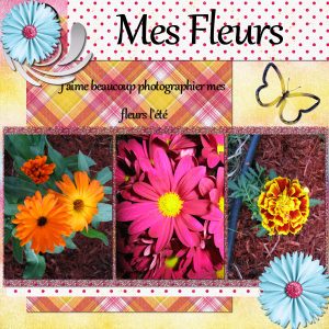
May 20, 2020 at 11:24 pm #43084Projet #3
Je n’ai malheureusement pas beaucoup de temps à consacrer à mes projets alors je fais de mon mieux. 🙂
May 21, 2020 at 12:01 am #43087I am so glad we have some flexibility in doing the lessons! I am behind, but looking forward to catching up! I used PSP many years ago but I really need a refresher!
May 21, 2020 at 1:37 am #43091Project 7. Finally here after a glitch in the software. Taken on a visit to Araleuan western Australia. Such a pretty place to visit especially in tulip time. I forgot to put the pinked piece back to the edge, but I am not going back after the trouble I have had.
May 21, 2020 at 8:20 am #43098Day 10: the one main thing that I have learnt:
Rubber: creating fancy edges to a paper so that it looks like it has been cut by shearing scissors. I now have other ideas on how I can use it to create different cut-outs.
But that is not all I have learnt:
Text tool: duplicating the vector layer and promoting it to a raster layer for when you want to add shadows etc. Then, should you find you have a typo you can go back to your vector layer and amend the text.
Scrapbooking: I have not been a scrapbooker before and found that I quite like it. It adds another dimension to your photos, rather than just adding a border or a shadow. I have also been inspired by all the projects that have been posted, everyone has submitted awesome work. I am now looking forward to creating my own projects and see where they take me. I have some digital photo albums to create that will make lovely keepsake presents.
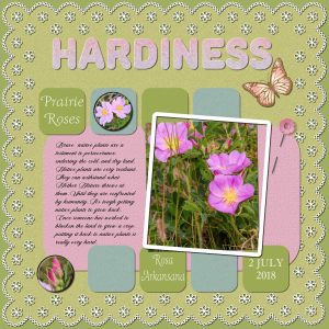
May 21, 2020 at 10:47 am #43102Project 5. I didn’t use a kit. I created my own papers, added aa little noise to them to give a little texture. Flair buttons are my own using my photos, also the pin and the eyelet/embroidered edge paper. Tutorials for these three elements are in the creative scrap, in the campus, which I subscribe to. I got the butterfly off the internet. I have a template in greyscale that I can keep using over and over, all I have to do is select either the eyelets or the background to change the colours, to suit any project.
May 21, 2020 at 12:09 pm #43104Here is my day 7 I used a scrap kit by Farrahs Designer Scraps called Nature
May 21, 2020 at 12:17 pm #43106This is my 2nd incorporating the suggestion you made, Cassel. However, I still wanted to bring the eye up to the top right corner as well, so I removed the glitter tube, copied the flower several times with an adjustment in the size, and grouped 3 in the bottom left corner and one in the top right corner. I think I concentrated more in this scrapbook, and have learned a lot.
Thanks – I really am enjoying all the ideas each participant has.
May 21, 2020 at 12:58 pm #43108Carole, you asked on Day 10 to share one thing we learned or discovered so I can say that within the discovery of a new hobby/activity of Scrapbooking (which I had not encountered before) the technique of Pasting as a new Layer (Ctrl L) is a fundamental learned.
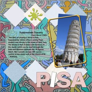
For our last project (5) I have not added much embellishment as it was already quite busy looking. I created the shape of the translucent paper behind the body text by using the Pick Tool’s Free Mode option. The I in PISA I created from a duplicated text layer and then merged the two layers.
I have had trouble saving the file as a jpg; after resizing to 600 pixels, the body text vanished so I have made a Windows Snip of it for the forum.
Apart from the saving issue the Materials Palette seems to require multiple clicks before applying a colour or pattern. The Move Tool (is this also called the Pan Tool?) does not snap to Guidelines so I gave up on that.
Problems aside it has been a useful exercise and thank you for your relaxed tuition.
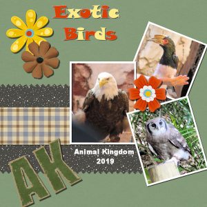
May 21, 2020 at 2:06 pm #43112Day 9, Project 4. My 3 pictures are from a trip to Disney’s Animal Kingdom in 2019. The exotic Birds were magnificent and it was a hard choice picking among them. For the project, I think I hit all the design points in the tutorial. From a learning standpoint I am getting much more comfortable with using text and modifying it along with layering elements Next up Day 11 and the final project.
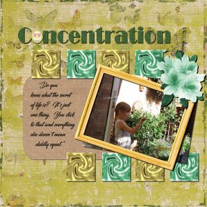
May 21, 2020 at 2:10 pm #43113Day 11 – Project 5 Concentration. I really enjoyed this tutorial and have learnt a lot from this bootcamp. Thank you Carole for your tuition and for all the tips you have shown in your videos. I closely followed this one as well. I am getting to grips with the text tool, and liked the idea of an object being used for one of the letters.
So, here is my finale, this is my other granddaughter who is giving someone a telling off, (probably her grandad)! I have been waiting to do something with this photo for a long time, and this was just the right opportunity.
The background was from one of the scrapbook downloads, the square swirls I had in my store of backgrounds, together with the frame, and flowers. I did use the colourize button to change the colour of the flowers and the frame, a really useful tip Carole, thank you. The words were from the film “City Slickers” a great film, although I changed the last word to “diddly squat” rather than “**@!” used in the film.
I had not used the select tool before to enter text into, or notepad so that I can have my text ready and waiting, yet another good tip!
BTW Sue, love your graphic that background is awesome.
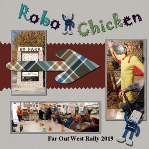
May 21, 2020 at 3:15 pm #43115I’ve enjoyed playing with the layouts. This one was from our camping rally in October. I added the robots and did a harder shadow on both the robots and arrow. I thought the arrow was cut out of a thicker fabric, in my opinion
One more project to do
-
AuthorPosts
- The topic ‘BOOTCAMP – May 2020’ is closed to new replies.


