Home of the Scrapbook Campus › Forums › Showroom › BOOTCAMP – May 2020
Tagged: Bootcamp may 2020 welcome
- This topic has 231 replies, 29 voices, and was last updated 4 years, 6 months ago by
Ruth Seibert.
-
AuthorPosts
-
May 17, 2020 at 7:40 pm #42918
This is my second project, I’m having a great time. So much faster than working nondigital. After I finished the class I worked a page for our Senior Center Scrapbook, which went pretty good.
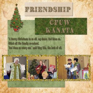
May 17, 2020 at 7:41 pm #42919Project 3 Day 7 Friendship
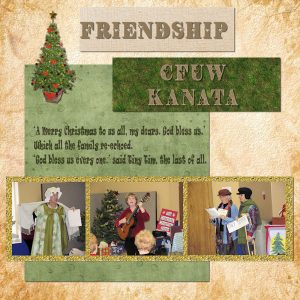
I have lots of photos of my friends & I but we are all just sitting around drinking beer or tea (coffee) and solving the problems of the universe so I started looking at the photos for my wife’s friends.
Here We have a Christmas party for the Canadian Federation of University Women of Kanata (a suburb of Ottawa). They allowed us men to come!!!
The members are reading a skit they called The Cratchit’s Christmas Dinner. They seem to have a lot of fun.
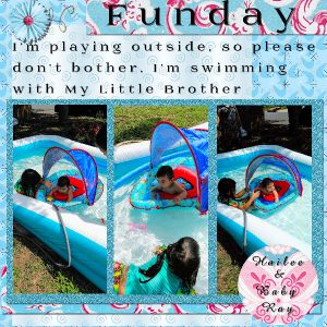
May 17, 2020 at 7:52 pm #42923Day 7 Project 3 I enjoyed this class as usual and had never used the “Guides, snap to guides” that was so interesting and informative for me. Also the “Control-Y” for shadow. I downloaded the free paper and painted most of them to blend the colors with the pictures. I took the pictures today after church, the children are my great grandchildren whom I love very much. I also wrote the poem. Thank you so much Carole. I will try to practice more since I am barely working with scrap book. I am sorry I have not congratulated the beautiful people for their work, but I don’t know where to reply to their posts.
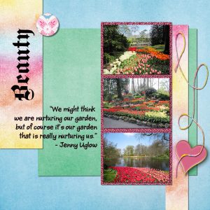
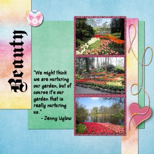
May 17, 2020 at 8:03 pm #42929My photos were so large, I couldn’t size them down enough to fit three horizontally and still see the details good enough, so I stacked them vertically. The photos were taken at the Keukenhof gardens in the Netherlands.
May 17, 2020 at 9:43 pm #42948Joan, loved your 3 photos of gardens and that gives me inspiration for my project. Thanks.
May 17, 2020 at 10:05 pm #42949Darcy, your observation about the shadows is an interesting one. When the elements don’t seem to have an edge on the right or bottom, those “traditional” shadows look a little odd. One way to address that is to slightly move the elements so those right/bottom edges are visible. Another way (which was not addressed in this Bootcamp) is to add what I call a “fake shadow”, which is a small and faint shadow in the opposite direction (top/left) to give a sense of dimension. It is not an exact science but it is one way around. On the other hand, you made the choice to change the orientation of the shadows but you were very consistent and applied the same one to all the element and that means that you do understand the principles behind them. Kuddos!
Theresa, did you have coffee or tea or something else?
Euka, thanks for answering Mary’s question about the Four-way average filter.
Sue, those robins are showcased in such a lovely way. Thank you for all the explanations you are sharing with our newcomers (and not-so-newcomers too).
Jose, you are correct in the fact that the colored glitters might not suit all types of photos or projects and you are quite resourceful in finding an alternative. I am happy that you found a picture tube too. Those are often underused tools in PSP!
Krystyna, you certainly managed to get a nice striped paper. Inside the membership, we do have a few tutorials just on how to make those striped papers from scratch with exactly the colors you need, but your creativity shows that you are not afraid of going a step further, and the result is lovely!
Lynda, what is the font you used for your Garden layout? I find it so interesting!
Shirley, I love how you ACCIDENTALLY added a 4th image! Good work.
Janice, in your project, i think your shadows are a little bit wider than they should be and a bit lower opacity than they should, at least for the paper/photo elements. That shadow is ok for the thicker elements, but for the flat and thin elements, try to adjust those values. You will see that different shadows on different elements, will give even more realistic look. And yes, working digitally is definitely faster (and less messy) than traditionally. Your other project for your Senior Center Scrapbook is great! Is that the first page of that scrapbook?
Glenson, the text to read is a little difficult to read at this size. Is it easier with the full-size project? If so, maybe you can try removing the shadow completely on that element? Those photos are really telling a fun story! I hope you share that with your friends!
Isabel, happy to see that you are learning about those new tools. You will see that they will be useful in the future. On your project, I think you might have forgotten the shadows on the photos and the round tag at the bottom. Is this possible?
Joan, your tweaking the layout to fit your photos is an excellent strategy. That is how you can use the same technique, in a different way and have a project that suits YOUR photos. One suggestion I would make is to try to avoid writing over two (or more) different surfaces. When you think of it, you would probably not write with a pen over two papers, would you?
May 17, 2020 at 10:52 pm #42953HI
Carole did I do something wrong lol. I am doing day 3 and 4 now
May 17, 2020 at 11:09 pm #42954Theresa, nothing wrong. I was commenting on your sandwich project you posted (post #42887). I’ll add comments, on every project when they are posted. No rush. You always have an extra day between each.
May 17, 2020 at 11:11 pm #42955Thanks, Carole, for your feedback about my day 7 offering.
I realize that I should have stepped back to get a better overall look at it.Looking at that text, I can see that the shadow detracts from the clarity.
Another problem is the contrast between the font and the somewhat patterned background.
I’m going to go back and blur that background and lighten it. I’ll also darken the font.
I started doing that but ran out of time. I’ll finish it tomorrow.
Thsnks for your observations.
Glenson
May 18, 2020 at 12:49 am #42958ITs fun when you can get it 🙂 I kinda had a time with my layers and the sparkle paper.
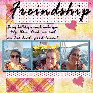
May 18, 2020 at 2:26 am #42960Once again it is great to come and see the amazing pages being produced ..(umm Cindy you might like to change your spelling of Friendship – sorry hope you don’t mind me saying). What a great birthday present from your son.
Today I broke my own rule something I rarely do.. . right near the end of my page I closed a window I thought I was finished with BUT it was my main window and I lost everything. I am usually paranoid about at saving all the way through work that I do after learning my lesson early on. As I was making my papers as I went I had to re do those as well. I didn’t use glitter but a combination of airbrushing and mosaic antique and colourised till I found something I liked. The papers and photos are all mine including the words (I can’t remember what I had for the last line).. the leaves are the only element used that I didn’t make.
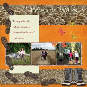
May 18, 2020 at 7:56 am #42963For the Friendship Project 3 I have chosen photos from walks with some friends (needless to say before social distancing measures). I have a greater understanding this time of the relationship between the values of the drop shadow effects: for an imagined thicker object being portrayed the offsets should be increased (these tend to work together) but the opacity needs to reduce. Because the opacity has reduced the blur needs to increase.
I had trouble with the Pick Tool on one layer but found out why. I had the Pick Tool option set at Perspective instead of to Scale. Must remember to check that in future.
I have a question about text. How can you easily alter the leading in text?
May 18, 2020 at 8:22 am #42964Fiona, the Leading value is “hidden” under the icon on the left of the Text toolbar, where you see three horizontal lines. When you hover over it, it will show “More options” and that is where the Leading is set (in addition to the Kerning and Line Style).
May 18, 2020 at 8:48 am #42965Thank you Carole, for your continued supportive and encouraging comments. Lynda and Krystyna, I thank you both for your very kind comments on my Robin page. It’s always appreciated.
May 18, 2020 at 11:45 am #42972Lots of creativity and inspiration here. Great job, Everyone!
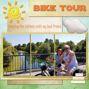
Here is my project #3
I used Cassel’s glitter, but duplicated it and changed the Blend Mode. I added some texture to the background paper based on Cassel’s Masterclass “Touch It“. I will tweak the image I created for the texture later.
Credits: Papers “WeLoveSummer” by Palvinka — WordBits “FunInTheSun” by Kristin Aagard — Cloud “Great Outdoors” by Kristin Aagard — Sun “Summer Clipart” Corel freebie
Fonts: JuiceITC and SF Distant Galaxy
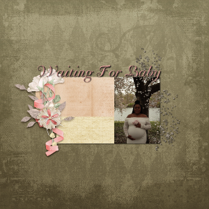
May 18, 2020 at 12:39 pm #42976Well I am enjoying the lessons but I find that the hardest part is figuring out what materials to use to compliment my photos still with practice I hope to get better at this here is my day 5 layout Oh yes I used a mix of two kits from Karens Scraps and Graphics one kit was called Mother’s Memories flower and glitter as for the papers the kit name was Loving Memories
May 18, 2020 at 12:58 pm #42978I did some more work on the text. For some reason, I have a hard time changing the text once I’ve deselected it. I decided to keep at it until it looked like I wanted.
May 18, 2020 at 2:33 pm #42980Project 3 Day 7 Friendship Revised
Revising took more time that I’d thought because I had put the shadow on the same layer so when I tried blurring it it screwed up my shadow.
May 18, 2020 at 6:43 pm #42987Hello Everyone,
My name is June and I am from Michigan. I love taking all kinds of photos and continue to work in PSP but I don’t always have the time since I work a full time job. I continue to upgrade my PSP and currently have the 2020 program.
Below is my 1st scrapbook page I completed and didn’t get a chance to post until today. I hoping my post work and I am doing it correctly. If this goes well I’ll post my second project. 🙂
May 18, 2020 at 6:45 pm #42989Well, that seemed to work. So, here’s my second project. 🙂
May 18, 2020 at 6:49 pm #42990So lastly, I’ve been trying to work on the last project and my pictures are too large. When I copy my image and control L to the background they fill the full page. So then I tried to resize just each image and then they’re too small. So I was able to complete the background paper, then the smaller paper but as stated my pictures are huge. Please help.
Thank You,
May 18, 2020 at 7:09 pm #42991June, if your image is way too large, go back to the image and resize it with the Image > Resize command. Choose a dimension of about 2000 pixels so once you put it on your project, you can tweak it further with the Pick tool.
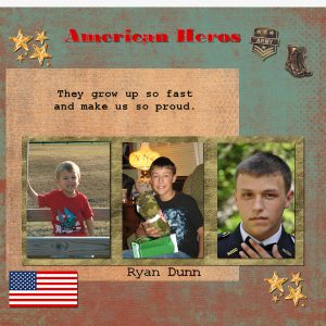
May 18, 2020 at 8:35 pm #42993Day 7 Project 3 – align 3 photos. I don’t usually take pictures of people, but I do have grandchildren who have been subjects from time to time. I chose pictures of my grandson growing up. He is now all grownup and serving in the Army in Kuait. I tried to use masculine and patriotic papers and colors. I used a camouflage pattern for the fill area behind the pictures. I found some military PNG elements to decorate the page. I am not happy with my text font and style but I will continue to work on it.
May 18, 2020 at 8:49 pm #42995My Teacher is the Best, The Best! Carole is Awesome. Thank you for helping me get this good, I really like this its my favorite hobby.
Euke thank you, fixed it. Yes, I had not been out of my home for a month. I needed that so much. Trish thank you for helping me Your always so nice to me just like Carole. You two ladies are so
nice. I couldn’t do that gitter changed so many things but it wasn’t till Carole helped me I got it. Other than that I had such a blast. Cant wait till tomorrowI still get to messed up in the Puzzle, layers but I like this. CAROLE THANK YOU. sorry forgot the ship
May 18, 2020 at 10:19 pm #42997Cindy, great to see your Friendship project and all the photos are resized correctly: no distortion at all! One suggestion about the text: when you use a handwriting font, it typically looks like it is handwritten, and that is always a little bit harder to read, and never needs a shadow, which is unnecessary if you had written with a pen, right? It is different with a title as it is usually large enough to read.
Euka, did you save your project once before you closed it? If the file has been saved once, you might have had an auto-saved version of your project. Something to look into and one reason to save at least once, in the beginning, so there is a named file to “auto-save”. Your alternative to the glitters is a great one and works well with your project theme.
Fiona, the Pick tool IS picky in that it often reverts to the Perspective mode without warning! In older versions, it would stay to the mode you last used, but for several versions now, it does that. Very annoying as you found out!
Cristina, that is an interesting way to use the “three-photo arrangement” for a single photo!
Dawn, choosing the supplies or the photos is probably the toughest part of digital scrapbooking 🙂 One thing that you will discover is that, with PSP, you can alter the color of an element or a paper to suit your photo!
Joan, I have added an article on selecting text once it is applied if you want to edit it. You can read it HERE.
Glenson, removing the shadow from the journaling makes it much easier to read, even in the small format of 600 pixels.
June, welcome to the Bootcamp. Your first scrapbook pages are adorable. What a great photo to showcase first! Good use of the shadows.
Joy, you found some great supplies for your project and it is a perfect match for the theme.
May 18, 2020 at 11:21 pm #43000Projet #2
May 19, 2020 at 5:46 am #43011Carole, the truth is I was not finding photos that would fit this layout, so I got tired of looking up, got my “scissors,” and cut the picture into three parts. 🙂
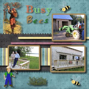
May 19, 2020 at 8:41 am #43013Day 9 Project 4 Busy Bees
Here is my result for this Busy Bees project.
You say that the kit you used in the video was no longer available but I have it so I used it.
My middle brother, who is shown standing with me in one photo and alone in from of his cottage in another photo, has built himself a farm in New Brunswick (which looks like a village). He loves building things. He has about eight buildings now. The main cottage (shown), a bunk house to house visiting family members, a tractor shed, a workshop, a joccizzi, a covered eating area and a couple of others whose functions I have forgotten. My younger brother is shown on the tractor.
The three graphics which did not come from the dedesmith_6Bes kit are CC0 from Pixabay.
May 19, 2020 at 12:20 pm #43015Finally ready with the 3 picture project (not the BusyBees). The colors for the various papers and the glitter pattern were not working out for me so I experimented with changing colors and this is the result. Also used glitter in the “tube”. I am not completely happy with the final result as it seems to be lacking something. But here it is anyway.
May 19, 2020 at 12:37 pm #43018Hi,
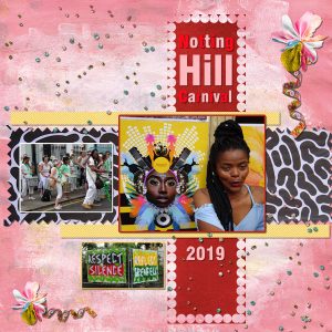
For Project 4 I chose my own subject based on an amazingly colourful and fun day at Notting Hill Carnival last year which turned out to be one of the highlights for my niece-in-law’s first ever visit to the UK and to Europe. My image just gives a flavour of the day so I’ll have to do some more and send them to her.
My difficult bits on this project came when using the Selection to create the border in that it was difficult to hit the right part on the border when applying the colour. I concluded that I needed to click on the outer edge of the selection border. Not sure whether that was just luck though. Also to highlight the border with the Magic Wand tool I had to click twice each time otherwise the selection appeared around the whole page image. Again not sure if that was luck or technique.
Thank you Carole for your useful replies to previous queries.
-
AuthorPosts
- The topic ‘BOOTCAMP – May 2020’ is closed to new replies.
